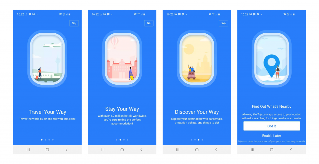
You might remember the days before the brilliant concept of onboarding was introduced.
How puzzling it was to figure out an app on your own. As if it was a game of guessing about which option directs to where, what it does, how to do certain things, etc. – the list runs long.
In a hurry? Jump directly to –
Table of Content:
- What is Mobile App Onboarding?
- How many types of Onboarding are there?
- Benefits of using App Onboarding
- Mobile App Onboarding Best Practices Checklist [2020 Updated]
- Live Examples of App Onboarding Done Right
However, the ordeal was over when mobile app onboarding started to gain momentum. It assisted users in navigating through the app with ease and explored its features and functions. Almost all the industry-giants are having a sip of this elixir of a concept and are obtaining remarkable conversion rates.
Wait, did we just lost you there?
No problem, let’s take it from the top, starting from what is on-boarding to what are the best onboarding practices for 2020.
What is Mobile App Onboarding?

App Onboarding is an efficient method used by organizations to enable users to comprehend your app and its functions. It is a walkthrough process or a tutorial that is meant to help users interact with the app and easily figure out what that particular app does and what they can achieve by continuing to use it.
Essentially, it is a series of screens that guide users through the app’s interface. Now, the mobile app onboarding screens typically have three purposes for which they are being used rigorously:
- To enlighten the users about the utilitarian functions and benefits of the app.
- To enable the users to register on the app via a login option.
- It is aimed to gather useful profile data of the users, later used to offer personalized notifications and content.
How many types of Onboarding are there?
There are essentially three types of best mobile app onboarding that help fulfill these distinct objectives.
1. Progressive

This is one of the app onboarding best practices that displays new information on the screen while users progressively navigate through the app. It is in a way a step by step process directing and encouraging the users to take actions. The information depicted is relevant to the specific page.
2. Function-oriented
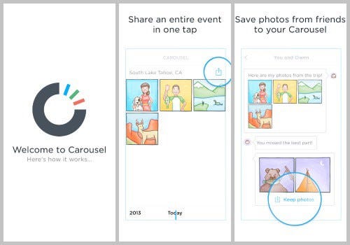
It is a mobile application onboarding approach that is typically focused on app functionality and explaining users the ways to operate the app. The function-oriented approach ensures the demonstration of common and rudimentary actions performed in the app to the users.
3. Benefits-oriented
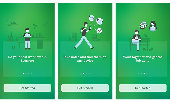
As the name clearly states, this approach is employed to showcase the benefits of the app or the value the users are expected to gain by using the app. The basic aim of this approach is to increase conversions. It helps in describing what the app does without elaborating on how to use the app.
Now as you know the types of mobile applications onboarding prevailing in the market, let’s take a look at the benefits they offer before moving to the core part of the article. Aka, Mobile application onboarding best practices checklist.
Benefits of using App Onboarding
1. Positive User Experience

You wouldn’t want your app to just lay there in the user’s phone not being used for months, or worse yet, being uninstalled. To ensure active users on your app, onboarding comes in handy. As the first user interaction plays a pivotal role in deciding whether the user will use your app again or not, you need to give them the best app onboarding experiences.
Guiding the users via onboarding on how to use the app and what features it possesses, will help them navigate with ease and they won’t feel lost. They get a fair idea of why they should use the app and most importantly how to use it efficiently.
Once you get this right, you will see how amazing the benefits of onboarding are.
2. Proper utilization of features

It is a given that it takes some time for users to get used to your app and figure out their way around it. Sometimes, users are unable to make themselves familiar with certain features on their own, which is a great impediment in our view for your app to increase conversion. Practicing the best onboarding approaches resolves this issue before it has a chance to arise.
3. Increases App Retention

Onboarding is highly crucial for making your app an absolute favorite of the users. You ask how it does it? Well, when you provide users with insights into your app and direct them towards effectively using its features and functions, the users are inclined to stay with your app. Hence, it improves the app retention rate by multi-folds.
Mobile App Onboarding Best Practices Checklist [2020 Updated]
Here are the top app user mobile onboarding best practices that will point the scale in your direction.
1. Prioritize Value Proposition
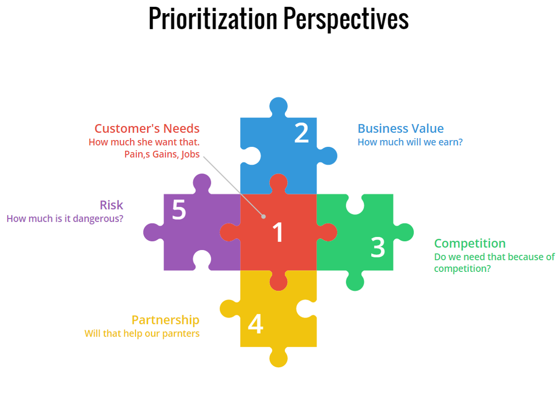
It is a belief that by displaying all the right cards to the users, you can convert them into active users. Meaning, by showing all the best features of your app you can entice users into using your app. However, it will be more effective if you first highlight the value proposition of your app.
Rather than flaunting your app’s features first, start with explaining what the user will gain by using your app. It will not only encourage them to use your app in the future but also will assure them that the app is useful and serves what it claims.
After this, you can go on with showing the prominent features and functionalities of your app that will assist in completing the tasks the users plan to accomplish.
2. Request Only Mandatory Information
It wouldn’t make sense if your app is about, say learning languages, and you are asking questions about their favorite books, would it? In this case, you would need to ask for relevant and most crucial information. A report supports this statement as it shows almost 60% of the users do not install an app or uninstall it later once they feel the app is asking for too much personal information.
Also, make sure not to bombard them with excessive questions. In short, try to make your question’s list as concise and precise as possible. This is one of the most effective onboarding techniques to boost app user engagement.
3. Compact Onboarding Screens
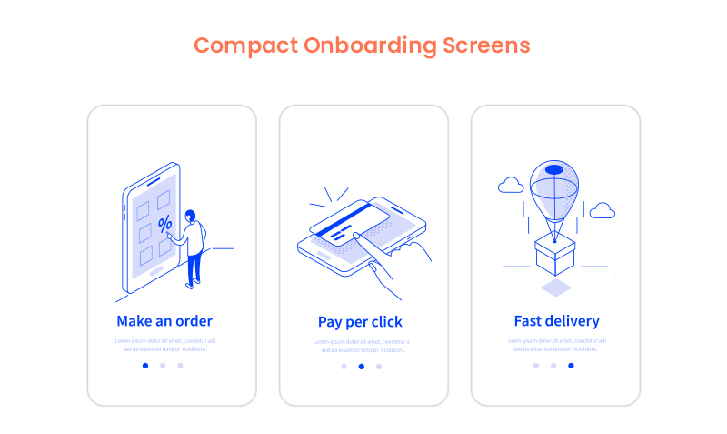
A tediously long and extensive user onboarding process may overwhelm the user to an extent that they might not use your app or end up finding a substitute. You neither should use text-heavy explanations nor add a foray of screens.
What you should do is to employ progressive onboarding approach and use app screenshots and illustrations to convey the message. Also, see the fact that you only introduce a single feature on each screen. In fact, you can use coach marks to help users understand how the app works and how to steer in it.
You can also make this approach more attractive by placing tutorials and gamifying the whole user experience.
4. Concise and Simple Sign-Up Process
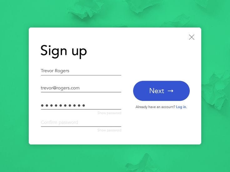
No one likes to spend excess time on the application onboarding process which is also mentioned in the report by The Manifest. So, the more concise your login process, the better.
Providing the options of logging in with other accounts such as Facebook or Google is a major time saver and a popular strategy among the users. It decreases a significant amount of friction in the user onboarding process introduced by the sign-up mandate.
5. Request for Permissions

Asking for permission is an important part of business ethics, especially when it is about users’ personal data and information. Now, if you have an app that requires a camera or microphone facility, then instead of just taking things into your hand, it should be a mandate to first ask for the consent.
If the user trusts your app or wants to continue using its features, they will agree. Moreover, users are more likely to respond positively to permissions requests if they understand what they will gain by doing so.
6. Promote App Content Preview

Promoting app content preview is also one of the onboarding app best practices to consider in 2020 and beyond. This is because a sign up option can act as a barrier between your app and the user. And therefore, it is always better to give the users access to the features of your app before flatly asking them to sign up.
For instance, if you own an eCommerce app, then let the users go through the products offered on your website, and when they want to make a transaction, they can simply login then. Or, you can enable the login option after the users have discovered your app.
7. Make Use of Empty States
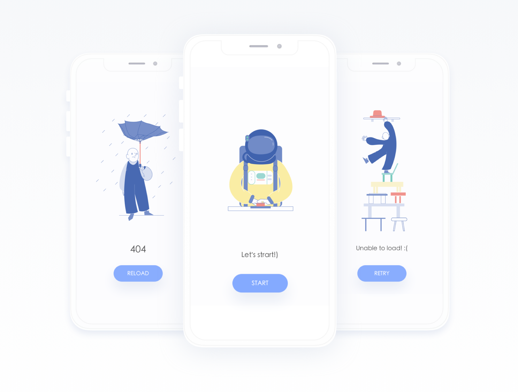
Empty states refer to the screens which show when users have not performed any activity or no content has been added yet. You can use these empty states to your advantage by making them encouraging. Instead of leaving a blank space, you can educate, guide, and promote users to take action.
For instance, Instagram displays “No posts yet” instead of just leaving it blank. This way it encourages users to initiate any action and use the app further.
8. Use Visual Hints for Guidance
Instead of hand-holding customers, while helping them explore the app you can employ progressive visual hints. All you have to do is strategically place the hints on the places where you predict users may get stuck while browsing the app. This way, you not only avoid tedious and monotonous instructions but save the time of users in reading them, which can rather be spent on using the app.
9. Preach Personalization
Why wait to show your personalization to customers in your app’s features, when you can give them a taste of it in the onboarding process only. Many popular apps personalize the content of their app based on individual preference in the starting.
Let’s take Spotify for instance. No wonder it is huge among the users as
it provides them with choices based on language, genre, artists, etc. to start personalizing the content referred to them since the start.
10. Take advantage of Success States
Just like the Empty States, Success States prove to be a great leverage for engaging the user on your app. They create a positive impression of your app in the users’ minds. These states refer to the screens or popups that show appreciation after a task is performed.
For example, pop-ups including emoticons or animations congratulating the users once they achieve something in the app or complete an action for the first time.
11. Test before Final Implementation
Anything is the sum of its whole. Your app will be considered remarkable when it is perfect overall. How different elements seem together once integrated is what makes an app great and appealing. In which case, it is crucial to test and measure the user onboarding flow for your mobile app on different screens and monitors to make sure the transition to each screen is seamless and smooth.
12. Include A Balanced Mix Of Multiple Channels
Using several channels to enhance the effectiveness of your onboarding procedure is an ideal way to encourage users to come back to your app, especially in the case of Retail apps. You can use channels like emails, push notifications, and in-app messages to remind the users of any incomplete action on the app like an unattended cart or simply send gentle reminders.
13. Monitor and Track (liquid state)
Keeping tabs on app usage and analytics is an incredible way to determine where users are facing problems in the onboarding flow and app.
Tracking these problems will provide you insights on where you need to improve in order to provide a smooth app onboarding experience. One should not ignore it as it is one of the prominent deciding factors whether your app is preferred by the users or not.
14. Provide CTA
Once your onboarding is about to complete, it is recommended to incorporate a CTA at the end. It provides a natural step for users to take the next step. A contextual and well-designed CTA would ensure the involvement of the users in the app.
15. Offer the choice to Skip
![]()
Providing different and alternate choices is what users around the world appreciate the most. Some users might like to skip the whole app onboarding process for some reason, so giving them this choice will instantly improve your app’s reputation and they might continue to use it in the future.
Live Examples of App Onboarding Done Right
1. Slack

Slack is an app designed specifically to facilitate communication between teams of small and large enterprises alike. It displays its features right when users open the app. Slack practices value-oriented onboarding which can be seen in the four walkthrough screens. It allows users to see how they can establish communication and share data among teams via the app.
2. Reddit

Reddit is one of the most famous QnA apps ever. Its onboarding process is exemplary – the reason why the app is here in our list.
It provides the “Skip for now” option which allows users to skip the process of account creation and login, immediately allowing them to explore the app and have an amazing user experience.
Moreover, Reddit also performs another one of the onboarding process best practices, which is asking for permission for sending notifications.
3. Calm
Calm is a popular meditation app helping users around the world with problems such as stress, irregular sleeping patterns, anxiety and more. The first onboarding screen in the app familiarizes users with its features and value-proposition such as sleep stories, breathing programs, guided meditation and so on.
Then it smoothly takes the user to another screen which allows them to set goals, for instance, choosing the top areas of improving, developing, building, learning, etc. It is after two screens that it asks users to signup via different platforms and asks for permission.
Higher conversion and retention rates of your app are certain once you hone these best app onboarding practices for 2020 and successfully implement them in your app. By imbibing incredible features along with the onboarding flow into the app, you double the chances of your app’s popularity.


