One of the first things to understand is that as much as UX of the dashboard is important, so is the UI of the dashboard. They are both equally essential. Before jumping into our main motive, let’s take a quick sneak peak into the most prominent features of a great dashboard:
- A good dashboard allows its users to interpret, analyse and present the key pointers, or say insights.
- What an efficient dashboard do is present the user with useful information that can be put to use. As well as compile a visual representation of the otherwise complex set of data.
- The desired dashboard will always be customizable and it generally is quite intuitive.
- As an additional point, they are always organized when it comes to use of space. There might be a lot of data on the dashboard but it won’t seem like a mess that is cluttered all in one little space. Rather it looks neat.
NOW WE’RE AT THE HERE’S HOW SECTION
CONSISTENCY MAKES IT EASY
The dashboard should always be consistent. Considering that the users access the dashboard through different devices that also vary in screen size. It is important that the design looks consistent, whether it’s with respect to the colours, font, style of charts or navigation. The user should not get distracted because of the inconsistency in the dashboard design and so sheer attention should be paid to how the design dashboard looks on multiple screen sizes. The key is to start with smallest screen size and then move up along the way. This way of approaching the design is a golden rule, this helps in creating a visually appealing dashboard, which gives both a great UX and a great UI.
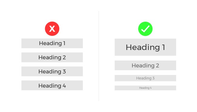
SIGNIFICANT INFORMATION APPEARS FIRST
Let’s talk about the heart of designing a dashboard, ‘content hierarchy’. Although this goal is achieved at the UX stage of designing, but is essentially through visual design that conveys the most important information in the most efficient way. This not only guides the layout but also the design guidelines. A couple of things to note here is that; (a) Centre alignment is the most recommended as found out from the users’ behaviour pattern on the dashboard. They acquire that part of the information in the first place ; (b) Another thing is that 18 pixel font is the maximum to be employed and information should be highlighted through the use of distinctive colours.
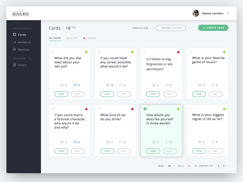
COMFORTABLE CUSTOMIZATION

Never use the ‘one size fits all’ approach. There are different users with varying business needs and requirements. Designs should be scalable, so that the user experiences customized dashboard. Now this in turn will empower the users, which is the designers’ ultimate goal. Users should feel that they can adjust their fit in consideration to their individual business requirements. This can be as simple as adding or deleting a column, or even adding a whole new table or sheet. The things to remember here are: (a) Always allow for easy modifications like addition/deletion of modules; (b) Give different yet comfortably usable options for viewing and deleting data separately; (c) And lastly, try using easy drag and drop interaction for the users to experience customizable dashboard design.
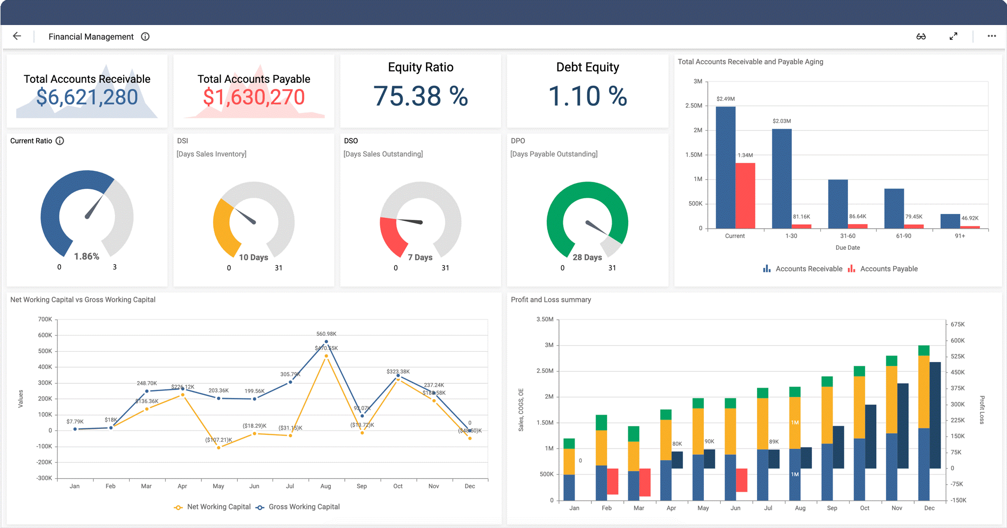
CHARTS? LESS IS MORE!
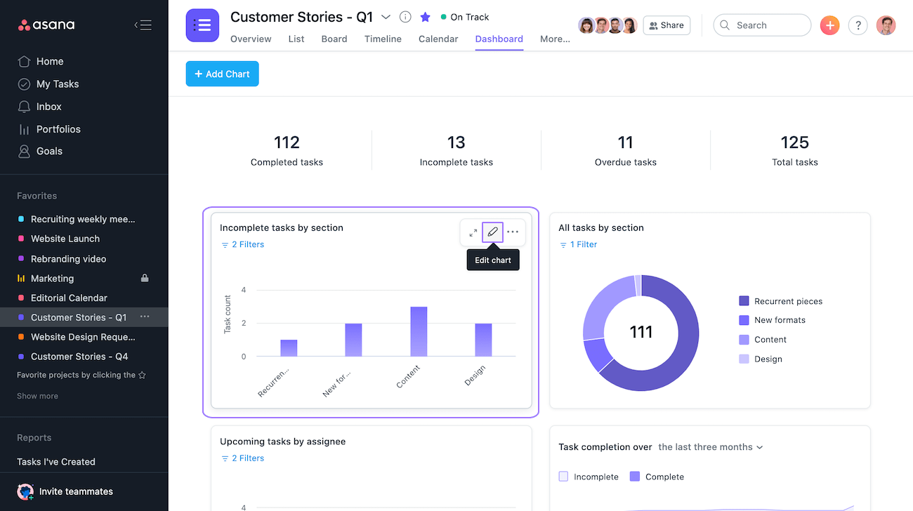
When it comes to presenting data visually, i.e., via pie charts, bar graphs etc., they should always be put in simpler form. Cluttering the charts with heavy tools and representation techniques only hinders the user from understanding and using the said data. Instead of using 3D graphs and animation, using flat-laid charts and graphs makes it a lot more comfortable for the users. Colour differentiation although, is sheerly appreciated, since it allows the users to understand the separate sets of data clearly.
ICONS CATCH THE EYES
What is generally ignored in the process of designing a dashboard UI is the ‘icons’. The best dashboard designs always include icons that are familiar to the users. For example, the pen/pencil icon is usually the edit tool. Likewise, the trash icon is for the option of deleting anything. This way, the user would have less time wasted in processing what the icon means and would have more utilized time in wrapping up their work. Thus, familiar icons help create great UX and UI.
RIGHT FONT REMAINS IMPORTANT
Employing the right style of the font and its size is equally important in both the UX and UI designs. It is advisable that while designing, not more than two fonts shall be employed. This is done in order to maintain a clean dashboard design. Creating a visual hierarchy by employing the inverted pyramid style in all the written content is quite significant. This can be done by putting the most important sets of information in the largest and the not-so-important sets of information in the smaller font, along with a hint of colour differentiation.
FILL COLOURS IN DESIGN AS MUCH AS IN LIVE

The concept of colours is such that, it might seem simple, but it also has a complex side. Different colours signify different things. Just like red colour is usually employed to denote danger and green colour is used to denote ease and agreement. Now, imagine if their use is reversed, won’t it be confusing? Therefore, designers are required to be really mindful whilst working on the colour palette of their designs. Besides, it is best not to go overboard with the colours, even if you’re tempted to do so. A good start would be picking two colours in the initial stage, that too something like contrasting contemporary colours.
MAKING THE FINAL POINTS
All of this would be worthless if you don’t know your users’ preferences. Whatever the studying concept maybe, if you don’t have the emotional connection with your users and if you don’t know their choices and requirements, then the whole work would just remain pointless. Therefore, besides knowing the tips and right ways of employing the tools to create a great dashboard, you should also know your users. Research, understand, analyse and imply your methodologies and tools.
Taking your leave with,
“Graphic design will save the world right after rock and roll does.”
– David Carson