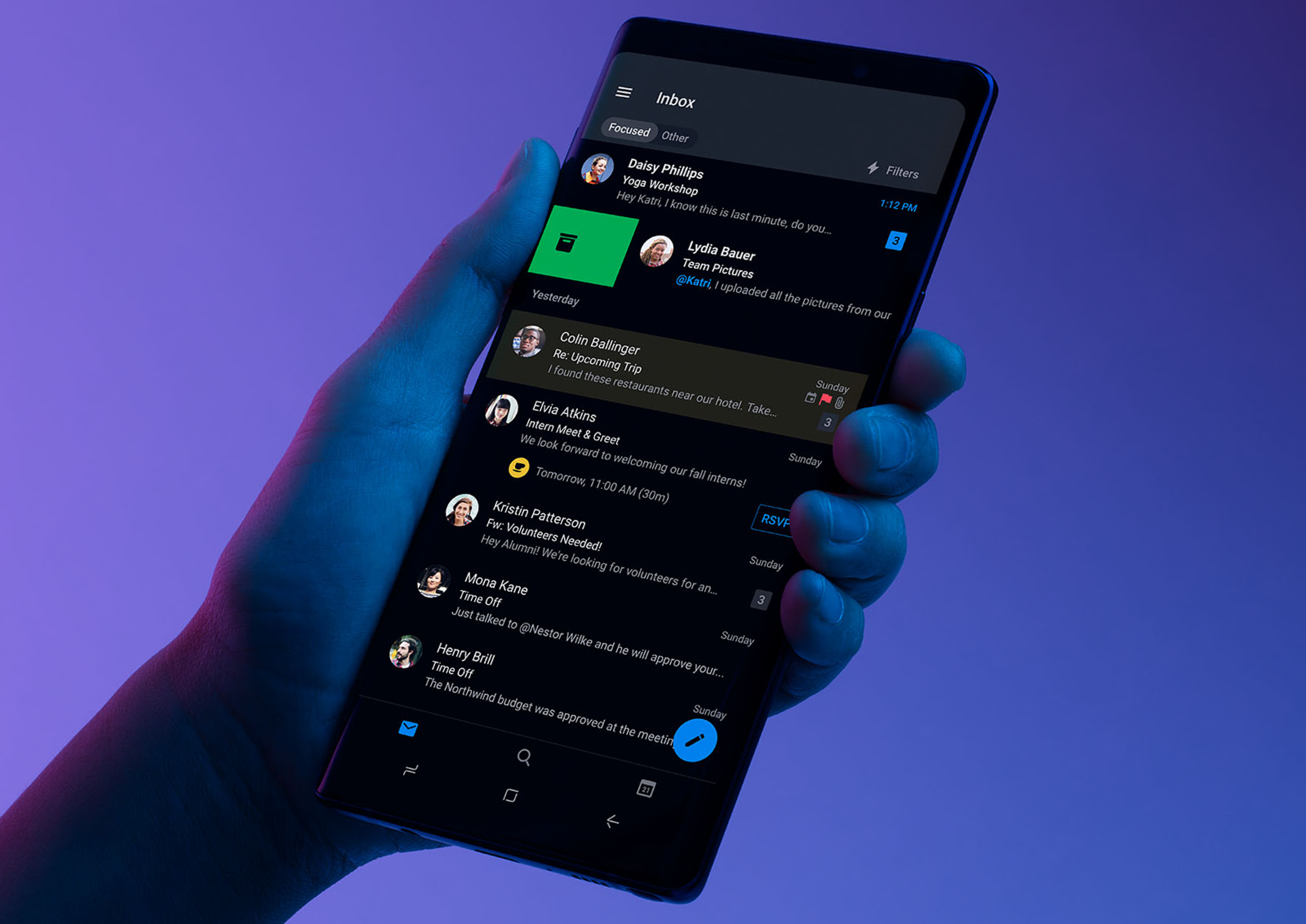
While operating in the market for a long time, the talks and then the official launch of Android 10 and iOS 13 brought Dark theme User Interface in the limelight. Both Apple and Google have been dedicating their resources and attention to the dark mode since the past one year.
With several ophthalmologists too getting on board with the dark mode initiative, the general user perception is also now inclined towards the adoption of the theme in their digital experiences.
Delivering the users what has now become a norm for them is something that the mobile app designers has to keep up with.
In this article, we are going to look into how the mobile app designers can get started with delivering a dark mode UI design experience to their users.
Table Of Content:
- Why should you pay attention to dark mode?
- What makes up for an unhealthy dark mode?
- How to design dark theme for Android app?
- How to design an app for iOS in dark mode ?
- Tips for efficient dark theme design
Why should you pay attention to dark mode?
1. An In-demand Trend

Any trend-focused mobile app design company would tell you that for an app to be in trend, it is necessary that it is designed according to the recent market demands. Dark UI is the one design element that has been in-demand since the past one year. And seeing the present situation, it is only going to grow.
2. Health & Wellness

We all have in one or the other point in our life faced the shock of opening an app in a pitch dark night. The light that is emitted is too high and too sudden for eyes. Prolonged use of these apps have resulted in several instances of dry and itchy eyes among users.
Benefits of the dark mode comes into the picture by making it relaxing for users’ eyes to open and work on apps in the dark. It helps solve these persistent health and wellness issues, thus answering why is dark mode popular.
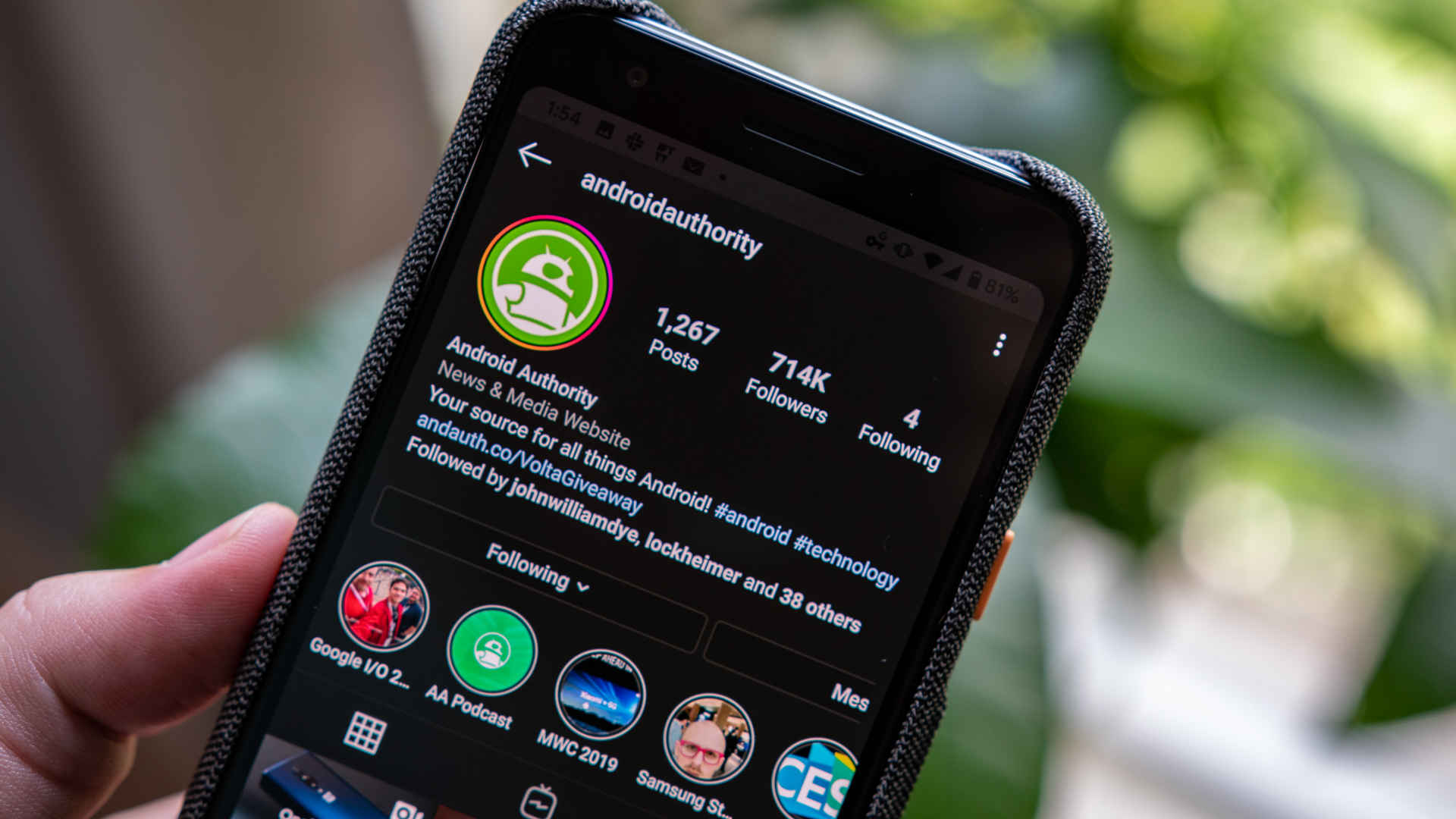
3. Saves Battery
Dark mode app design helps in prolonging the device’s battery life. Google confirmed that dark mode on OLED screens has been a game changer for the device’s battery life. YouTube, at its 50% brightness saves upto 15% more battery life in dark mode compared to flat background.
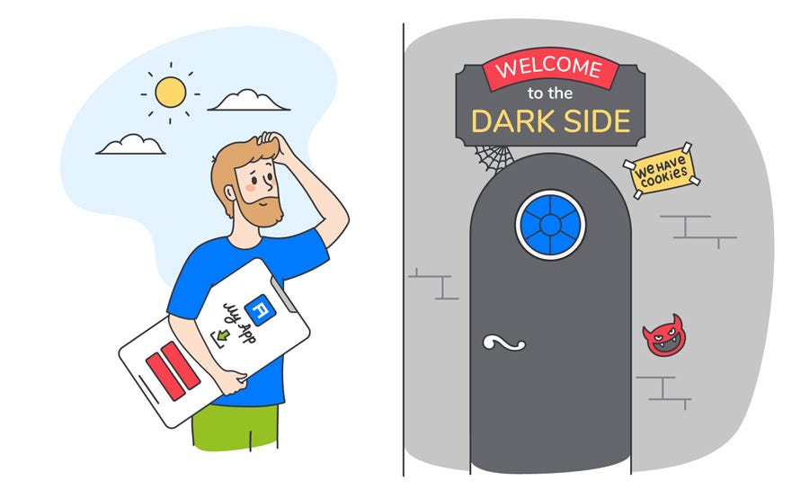
The benefits surrounding the holy dark mode are too popularized now to be ignored. But what is less talked about are the ill effects of dark mode UI – one that is UNHEALTHY.
What makes up for an unhealthy dark mode?
When reading a white text on black background, iris opens up more and gets in more light and lens deformation develops a fuzzier focus at eyes. This is called Halation or Fuzzing Effect, a.k.a one of the biggest dark mode app design challenges.
Unhealthy dark mode tends to be very harsh on the eyes because of the high contrast and can strain them very quickly.
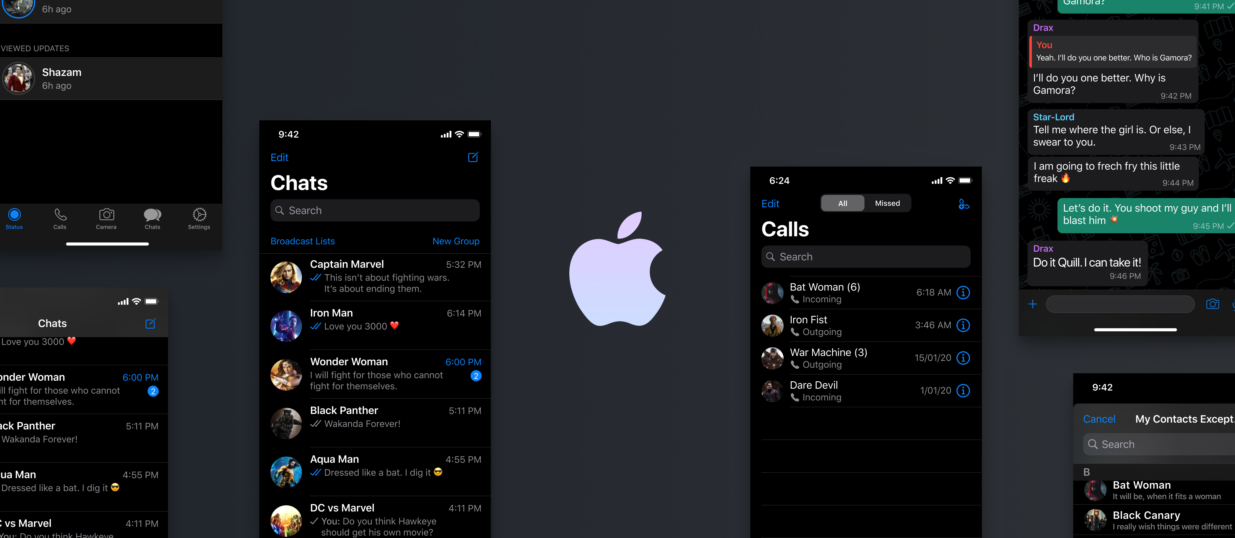
If your phone or laptop is on highest brightness, you would have felt how straining it is to read the text on the left image.
But isn’t dark mode supposed to help with extending the battery life? Well, to some extent, Yes. However, it only impacts the devices having OLED and not ones with LCD.
In OLED, every pixel gives out its own illumination meaning to show darkness, the pixel must not light up at all. But since most of the OLED panels are limited to 60Hz refresh rate, scrolling makes the pixels light up and because of the slow refresh rate, a jiggly effect is caused.
Users, when exposed to this effect, end up feeling tired and worn out of their digital experience very soon. This event is what brings in the need and prevalence of design for dark themes.
How to design dark theme for Android app?
Google comes with an extensive documentation support that helps designers get started with understanding how dark theme operates on the Android ecosystem.
The tech giant has established four principles that defines the dark UI design and gives a starting point for how to design dark mode –
1. Dark with grey

When designing a dark mode, use grey color instead of solid black for showing space and elevation in an environment with wide depth range.
2. Color with accents
/Livingroom-accentcolors-GettyImages-97432761-5919276d3df78c7a8c7e095f.jpg)
Apply limited color accents in dark theme UIs, so the majority of space is dedicated to dark surfaces.
3. Save energy
When designing the dark mode in products that require efficiency (such as devices with OLED screens), conserve battery life by reducing the use of light pixels.
4. Enhance accessibility

Accommodate regular dark theme users (such as those with low vision), by meeting accessibility color contrast standards.
There are different properties they have fixed in the Google Material Design Guidelines for Dark color scheme and overall mode –
Elevation: In the process of designing dark theme, the components retain the same default shadow components and elevation levels as in case of the light theme. What differs is the illumination of the surface of elevation levels.
The higher a surface elevation, the lighter would be the surface. The lightness is shown through a semi-transparent overlays’ application. Overlays also make it possible to differentiate between the components and see the shadows.
Accessibility & contrast: The background in dark theme UI design should be dark enough to show white text. They must use a contrast of a minimum of 15.8:1 between the background and text. Doin this ensures that the body text passes the WCAG’s AA standard of 4.5:5:1 when added to surfaces at highest elevation.Colors: The dark theme UI must avoid saturated colors for the induce eye strain. Instead, designers should focus on using desaturated colors for they increase legibility. The choice of primary and secondary colors must also depend upon the consideration of both light and dark UI themes.
Light text on dark backgrounds: When a light text comes on dark background, it must use these opacity levels:
- High-emphasis text has an opacity of 87%
- Medium-emphasis text and hint text have opacities of 60%
- Disabled text has an opacity of 38%
States: States communicate the status of interactive elements for dark theme layouts or components by using the overlays. In dark theme, states must use the same overlay values as the default light theme. There are two containers which inherit the state overlays: Surface and Primary.
Surface containers which use the Surface color must apply an overlay which match the color of text or icon. For the surface containers which use the Primary color, the state overlay must be white.
How to design an app for iOS in dark mode?
With dark mode, Apple has revisited the meaning of UI styling and colors in iOS. Let’s look into the changes that Apple has brought to help you with designing for dark mode on iOS 13. 
Semantic colors
For standardising the look and feel of the iOS apps in both dark and light mode, Apple has come up with semantic colors for the commonly applied UI elements. These colors do not come with an absolute RGB value, they directly adapt to iOS interface style.
They have also introduced semantic colors for handling the text and overlay color in the dark mode.
System colors
In addition to the semantic colors, Apple has also come up with 9 predefined system colors which are dynamic and supportive of dark system-wide appearance. This means that these colors adapt to selected interface styles like the semantic colors.
Vibrancy and Blur Effects
With iOS 13, Apple has introduced 4 blur effects and 8 vibrancy effects, which automatically adapts to the iOS interface style.
Here are the blur effects in the dark and light mode:
Apple has also introduced 4 vibrancy effects in iOS dark mode typography suite, 3 in overlay and 1 for separator. Here they are:
SF Symbols
Apple, in their Human Interface Guidelines, offers a collection of more than 1500 symbols for Product developers and designers to use in their applications. They automatically look amazing in the Dark Mode for they have been optimized for both light and dark UI.
Tips for effective mobile app dark theme design
As you must have reckoned, the preparations to provide the users a healthy UI experience is something that both Apple and Google is focusing on through their dark mode design principles.
But as shared above, not giving dark mode design theme its fair share of attention can do more harm than good.
And thus, it is important to know the effective tips for dark theme design.
1. Avoid the pure black color

A dark theme must not be of white text on black background. In fact, it can be difficult to look into a high contrast screen.
When you add dark mode to your app, it is safest to use dark grey as the primary color for the dark mode components, as it lowers the eye strain and also it is a lot easier to look at shadows on a grey surface compared to black.
2. Avoid the use of saturated colors on the dark themes

The saturated colors that look great on the light surfaces can vibrate against the dark background, making the text extremely difficult to read.
You should use light tones for they have better readability and they don’t make the UI unnecessarily expressive, which saves unnecessary eye strain.
3. Consider the emotional side of your app design

When you design a dark theme for your app, chances are that you must be aiming for translating the same emotional feel of your light theme design in the dark theme as well.
But it is unwise to do so. Because, ultimately different colors project different emotions. As a result, your dark mode colors will evoke a different feeling. This is why it is necessary to find a common ground emotional set for both your theme UIs.
4. Test the design in both the appearances
Just like how your users would toggle between both the theme UIs at different times of the day, it is necessary to test the app two times of the day to see how it is functioning in different light conditions. And to ensure it meets your criteria.
5. Incorporate dark theme into animations and illustrations
If your app contains animations or heavy graphical elements, you will have to prepare for their adoption in dark theme as well. In case the illustration contains a subject and a background, it would be good to fully desaturate the background colors to help keep the attention on the subject.
With this, you now know everything there’s to know about designing the dark mode version of your app. The next actionable step is to talk to a team of experts who have implemented the UI in applications. You should see this as a way of getting closer to achieving your intent to offer a healthy experience to your end users.