They confessed that they dreaded checkout as if some unknown calamity would fall upon them and they’d be forced to leave their cart. Sometimes they indeed had to abandon their cart because they didn’t get upfront information about shipping or tax charges. Other times, the steps were too hard to follow and they had a hard time placing the order.You think I am making this up? Below is an image which shows the results of a survey done with people in the US who gave reasons for abandoning their e-commerce cart-Among all the reasons, Extra costs (60%) and Create an account (37%) are the two topmost areas where users feel dejected.
Think of it this way- you go to a brick-and-mortar store, you put everything you need in your cart and stand in the long queue to wait for your turn. But just when you reach there, the person at the counter says that you need to pay 13% convenience tax as a first time customer. And, in case you want to waive it off, you need to register at the store. Isn’t that abominable?
Moving ahead, the third most cited reason for abandonment is- “too long/complicated process”. This is the area where, I feel, that designers can greatly help improve the user experience.
How?
By designing with the utmost care and keeping your end users in mind. You need to understand how people accomplish tasks and the role human psychology plays when people are browsing on the internet. It will help you design better interfaces.
For the checkout page, I have figured out five ways that can help you design a better experience.
Design a checkout flow that customers can see
You know how trekkers gather the strength to climb to the top? They look at the summit and it gives them the adrenaline rush to conquer the mountain. A bit overboard of an example because the checkout process is nothing like mountain hiking. But you get the drift, don’t you?
In short- If you can see it, you can achieve it!
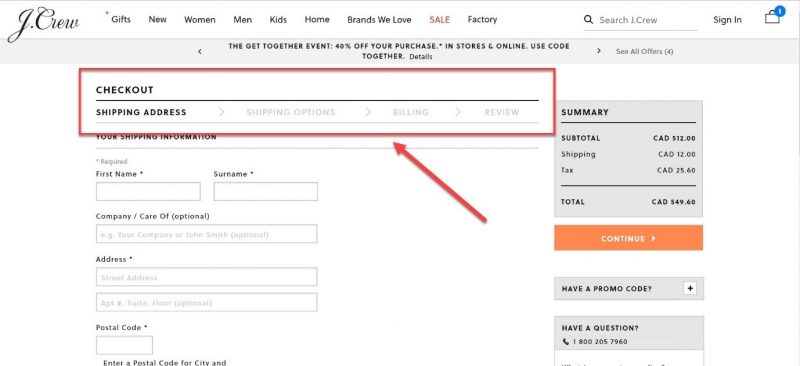
For example- once a user has added all the items in the bag and wants to go ahead and purchase, display the entire checkout flow up front. Show it with a progress bar so that the user knows what information s(he) has to fill at each stage. This also breaks down the process into chunks and the user is not burdened with everything on one page.
The above example of the checkout page of Myntra shows that there are three steps- BAG, ADDRESS, and PAYMENT. Each stage is highlighted so that as the users proceed in the flow, they know which stage they’ve reached and can review their order.
Display the right visual hierarchy
Visual hierarchy helps the users in two ways- it gives them the clarity on the items they are buying and it gives them control over their actions. When done right, visual hierarchy helps users understand what needs their attention.
For example- if they need to review their order or if they need to proceed to the payment page.
Visual hierarchy can also be used to attract the user’s attention to some promotional offer (eg- free shipping on orders over $X) or to motivate them to check out an interesting offer which can be clubbed with their existing one.
For example- in the screenshot below, the “bank offer” is highlighted so that users who are eligible (and interested) can look at it and decide whether they want to use it or not.
Keep the form fields minimal and clear
Designing forms that result in better conversations is an art. The number one principle that you need to keep in mind while designing forms is- don’t ask for unnecessary information.
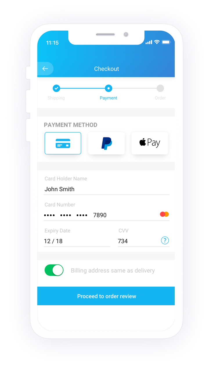
For example, in the screen below, the payment form is precise and it helps users fill out the card details in the same sequence as they appear on the card. All payment options are listed in the left navigation menu and in case the user is unable to remember the card details, (s)he can use the other options.
The labels are correctly placed and they help the user enter the right information in the right input field. Apart from that, the security marks on the right-hand side (‘verified by VISA”) leave a positive impact on the user and they are assured of their money going in the right hands.
However, there is one more aspect which can be taken care of in this particular interaction. When I enter the card number (I entered an incorrect one), it didn’t show me any error.
Instead, it allowed me to move ahead in the journey. It was only after clicking on “make payment” that it showed me the error message on the top of the form. That too, incorrect. The error message is misleading and I can’t spot a “red” field anywhere.
A better approach is to handle errors on the go. It’s possible to validate the card number as soon as users enter it. So, why not make them aware of their mistake right when they make it?
Make customer sign up optional
It happens to most of us. We look at something and we instantly want to buy it. But then we change our mind the moment the merchant portal asks us to sign up. Even in the survey conducted by Baymard Institute, “the site wanted me to create an account” is the reason given by 37% of people for cart abandonment. As customers, it’s natural to feel uncomfortable sharing our personal information (name, address, phone number) during the first interaction with a new store. Moreover, it’s tedious to create a new account on every site we browse.
A better option to fix this problem is to offer them guest checkout. By giving them the freedom to choose their way, you enhance their user experience. If they are already flattered by your service, they’ll make an account. If they are yet to discover that you’re awesome, you’ve given them a reason to love your page by giving them the “guest checkout” option.
Here’s an example from Nike’s website. When you “proceed to checkout”, it asks for your shipping details directly (no login required). However, it also gives you an option to sign-up in case you want faster sign up in the future.
Offer them all good things, including your help
Not all users sail smooth. Some hit a dead end, some get confused and some become frustrated. Even after taking care of everything (forms inputs, error messages, etc), it’s fair to assume that some users will still face problems.
In such situations, it’s crucial to provide users with assistance instead of sending them to help pages (that are not always helpful) or FAQ-pages that are hardly specific to their problems.
Nike’s website takes care of this aspect of user experience.
Knowing that someone is there to help you out brings more credibility and confidence in users and they can peacefully shop to their heart’s delight. It may not be a grand feature in the bigger scheme of things, but it’s the small things that matter the most.
The design of the checkout page is crucial in the consumer journey. If the design is good, it can help convert a customer into a returning user. However, if the design is bad, it not only causes loss of business but also gives people a chance to badmouth your website’s experience.
Therefore, it’s important to design a well-thought-out checkout page. There are many other methods that can guide you to create easy and creative checkout pages which delight users and make their shopping experience fun. But I believe that if the ways listed above are followed it can drastically increase the conversion rate through the checkout process.