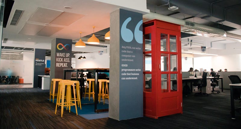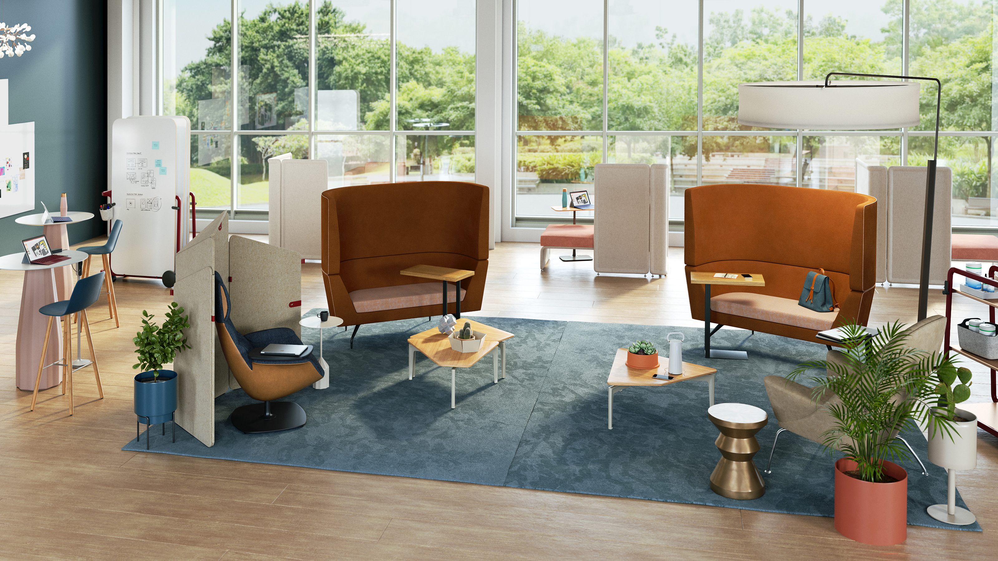
We began to realize that limited space was causing hindrance to our creativity and lowering our productivity. We wanted everyone to participate in our design thinking sessions, wanted them to see user personas, snapshots of the existing UI, and sketches of proposed solutions so that they could critique it. But we realized that our paraphernalia needs physical space. One can’t just do all of this effectively without any board to draw/sketch and without any space for people to sit/stand.
And this isn’t some fancy thought that we made up ourselves. It’s backed by research and many design leaders agree that fluid design spaces improve creativity. Scott Witthoft, author of Make Space: How to Set the Stage for Creative Collaboration shared in an interview with HBR–
“When you’re generating ideas, it becomes really important to be very fluid and have the ability to move in and out of different concepts and different people’s voices as an idea’s coming to fruition. So creating a space that allows movement, allows active posture to really help collaboration move more smoothly, and can forward creativity by allowing people to participate when they want, step out when they don’t, and allow leadership to move throughout the group.”
So, we did something big. We moved our entire office to a bigger, better place. Well, there were other reasons too which aided our decision. But, you could say that it was mainly because we realized that we can’t trade our happiness with anything. If people aren’t happy with their workplace, then they’re probably dragging their feet to work. We couldn’t bear that thought!
It’s been almost a year now that we’re in our ‘new’ office. We used this opportunity to rethink how we wanted to make the best use of the available space. We have made conscious choices in making design thinking sessions more productive and interactive. Most of it was inspired by companies like Apple who have made commendable efforts in popularizing the idea of such fluid spaces to espouse creativity. We owe it to them.
So, let me take you around our office then-
Elevated tables and chairs

This is my favorite spot. It especially works during mid-day design sessions when people are caught up with deadlines and it’s hard to get their attention. The high-tables, as we call them, allow them to take a break and stand together close in the upright position. It’s a space where people can get comfortable, but not too much.
You can spread your ideas, sketches or prototypes on the table and open the discussion for everyone. When you have this setting, it makes people aware that you are open to critique and they feel more inclined to share their honest feedback.
Also, these tables are located at places where people have high chances to bump into each other while walking around. So, imagine you’re sitting at the high table, working on some design and a fellow designer walks past you carrying her coffee mug. She stops by and appreciates the color gradient you’ve used, asks you to teach her how good gradients are made and also tips you on two new Sketch shortcuts to speed up your execution. Isn’t that a great conversation?
Whiteboards and Glassboards

At Quovantis, we value simplicity in the processes that can help us get our ideas out quickly. So despite all the digital tools that are out there, we still are a huge fan of whiteboards and glass boards where we can draw, doodle, write and paste Post-its quickly- a fast and efficient way to communicate.
So when an idea bubble appears, we quickly gather on the nearest wall and put it up for people to see and critique. And then we let it stay there so that everyone can see it, reference it, and can go back and share their thoughts on the pile. The visibility and accessibility are very important in every design session.
Meeting rooms
Our meeting rooms are a manifestation of the fantasy world we admire. They were named after voting democratically within the organization. One wall of each meeting room has the famous quote of that fictional hero/place. For instance, Diagon Alley and Shire have quotes about Hogwarts and the mystical land of Narnia.
From the design point of view, we’ve kept the visibility of meeting rooms neither too protective nor too revealing. It’s such that people who are inside the room don’t get distracted by what’s going outside. And, people who are outside can steal a glance and get to know if the meeting room is available or occupied. Such visual cues help people in overcoming mental blocks to rush into a room and start a discussion.
Abundant open space
We all have this natural tendency to crumble to negativity when things don’t go as we plan. And that’s why we have tried to keep the office interior spacious, happy and uplifting. The empty space allows us to make use of what Scott refers to as “impromptu pop-up team spaces”
There is one corner near the bookshelf and plenty of space near the couch to sit and have a discussion if one is bored with their sitting space. One can even walk around with some hilarious quotes and illustrations around. I remember, one of our teammates, told me about how he found creative inspiration in the office cafeteria.


