Often, we hear the terms ‘UI’ and ‘UX’ being used in context of websites and mobile applications. Haven’t we all heard or made statements such as ‘I just couldn’t understand the UI of the application so I didn’t install it’ or ‘the UX of the website is so great I keep going back to it.’ What are UI and UX actually and how do they impact a mobile application’s performance? And more importantly, how can mobile application design be enhanced using UI and UX?
This blog will talk about the vital UI and UX aspects of a mobile application and also provide handy tips that are proven to improve an application’s UI and UX.
User Interface (UI) and User Experience (UX)

User Experience (UX) and User Interface (UI) are commonly used interchangeably, but the fact is that UI and UX are quite different from each other. “Design is not what a thing looks like or feels like; design is all about how anything works.” Steve Jobs’ legendary words sum up the co-dependence between UI and UX. A great product design strategy for your mobile app will keep end users’ needs in mind and meet the bottom line of conversion, every time.
Both UI and UX work hand in hand to make interaction with a mobile application as painless and smooth as possible.
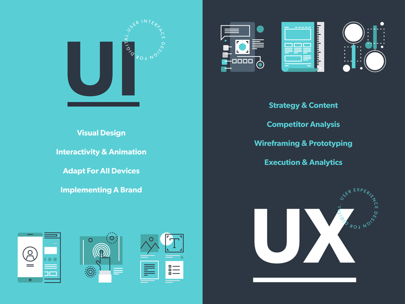
User experience refers to the interactive side of a website or application. It governs the kind of experience a user has while interacting with a product. An application having a great UX will put new users to ease and actually encourage them to explore the application. So, UX developers have to actually anticipate how a user will think when they use a product and then design it in such a way that the interaction becomes seamless and intuitive. When talking about a website’s UX, site map, page load, responsiveness, and content are relevant aspects and for apps, navigation and layout are relevant UX aspects.
User Interface on the other hand refers to the visual elements in a website or app. The typography, color schemes, and layout of various design elements are usually a part of UI design. So, if a call-to-action button has to be placed on a webpage, its color and fonts will be decided by the UI developers but its placement, resolution, and functionality will be determined by a UX expert.
So, while UX professionals make designs centered on user’s needs and research, UI professionals create visual designs based on a client’s needs and requirements. But the end objective of both UI and UX is to please website visitors and app users and encourage them to return to the app or website again and again.
Tips to Improve Your Mobile App’s UI
Designing the perfect UX and UI is an art and a science. Your mobile application’s design can make or break its fate. While style certainly can’t beat substance, it’s a definite deal breaker for app users. All users love apps with familiar layouts, quick load times, and seamless experience across devices and screens, cohesive visual elements and strong branding. So, for your app to be a hit, it needs to be appealing inside and out.
Have a Unique app icon

A killer app icon will make your app stand out among the dozens crowding a user’s screen. Facebook, Google and WhatsApp icons are recognizable by people across the globe. Ensure that your app icon reflects your brand’s colors and style. Use the icon consistently across screens and pages and on all marketing collateral. The aim is to forge a strong bond between your brand’s message and its icons so that people make the connection instantly.
Keep in mind the following when designing your app logo:
- Either use a unique image or your brand name’s initials in the icon. Your company’s logo is also a good choice as it might already have established repute and visibility in the market.
- Avoid incorporating long words in the icon as it affects readability adversely and crowds the screen.
- Submit several iterations of the icon while publishing your app.
Prioritize interaction design
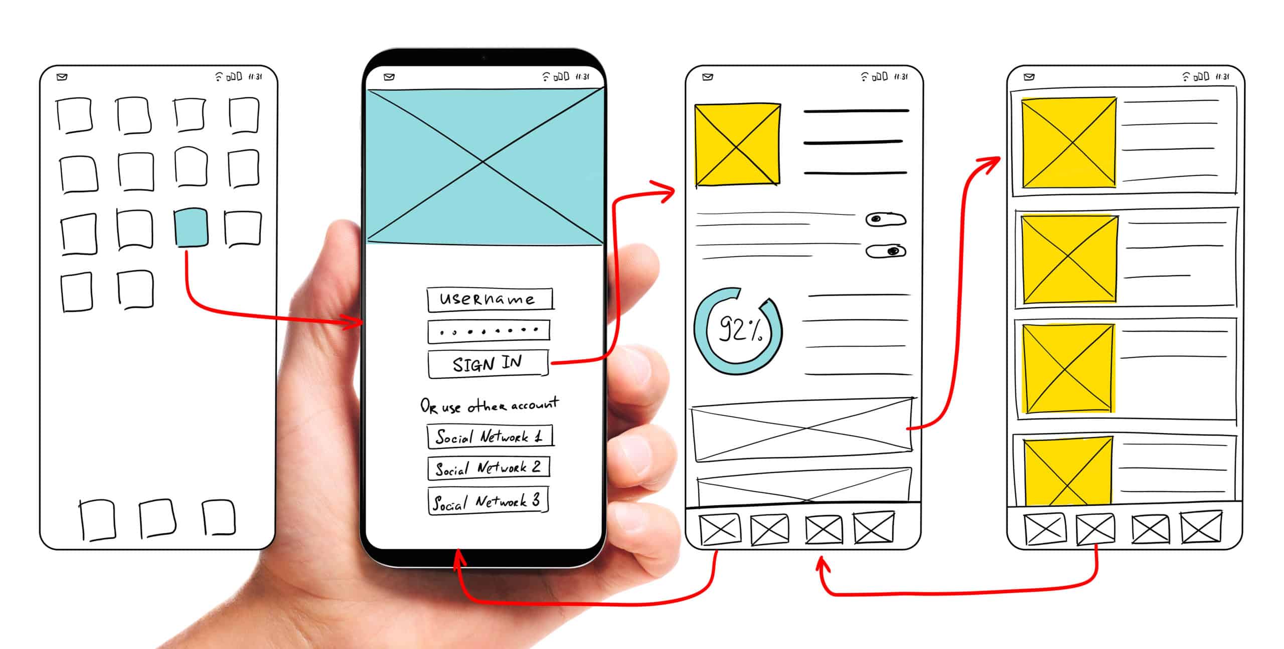
Interaction design is an essential aspect of mobile app design. Apps with great interaction design are simple to use and seem like second nature. Users are able to figure out how to use these apps without reading lengthy tutorials or seeing complex demos. Each element of the app just fits together perfectly such that design becomes secondary and functionality gains priority.

The three pillars of interaction design that can enhance your app’s UI are:
- Goal-driven design: User research and use case scenarios should be made for numerous situations so that you understand how a user will behave in a particular situation. Your app should not lose users at any point. Since it’s relatively easy to acquire an app from play stores, users don’t hesitate to abandon an app that isn’t meeting their needs instantly and opt for a competitor app. So your UI developers have to only attract visitors but also retain and convert them efficiently through brilliant design and interactivity. Customized workflows have to be designed for different use cases. Familiar navigation and simple layouts are best to guide users to the next steps. Uncluttered typography and contextual content are absolutely essential to maintain attention.
- Usability: Usability testing is arguable the most important phase of app development. It allows real users to interact with an app under construction. Careful observation should be made to identify breakpoints and incoherence in the app’s UI. Usability testing should be repeated a number of times with different users and in different environments. This will probably give the most authentic feedback to your developers even before the app hits the market.
- Feedback: Users need to be validated after they complete an action, especially new users unfamiliar with an app’s functioning. So, provide timely feedback in the form of visual cues, sounds or prompts as a user performs an action. It’s also a great strategy to include a prompt about the next step they should perform to guide them towards conversion stage.
Reduce, Reduce, Reduce

While mobile applications are becoming the go-to source for every kind of transaction, it’s a harsh truth that people’s attention spans are reducing by the second. Web users have no patience to read walls of text or go through lengthy how-to guides.
- Keep your app copy clean and engaging. Also adhere to the context of the content. The aim is not to wow audiences with long, technical terms but to endear them with simple easy to understand content.
- Use pictures and icons lavishly. They not only make your app attractive but also occupy less space and are more effective that textual cues. Keep in mind that pictures used should not be generic stock images. They should be customized to platform and screen size and have a comfortable resolution.
- Mobile apps have trouble with multitasking. So focus on limited features. Don’t try to accomplish everything with a single app. Remove all extraneous elements and features and make your app screen uncluttered. This will appeal to users and also up your app’s performance.
Concentrate on Responsiveness

- Finger-friendly design is a must for mobile applications. Your app should run flawlessly in different devices and screen sizes. Whether this requires tweaking media queries or JavaScript, no stone should be left unturned to keep users engaged when they switch between laptops, smartphones and tablets.
- Use images in suitable format that fit the platform on which your app runs. Stretchable graphics are a great choice for Android app design.
- Follow platform rules and design for best utilization of the particular platform. Don’t try to reinvent the wheel and create unfamiliar screen controls an interface elements. Take cues from the platform about the look and feel of your app. This will not only reduce redundancy of efforts but also delight users.
- Adhere to the UI guidelines prescribed for mobile applications. There are norms for buttons, menus, widgets and every mobile element. All applications are scrutinized for these guidelines by play stores before they are published there.
Know Your Visual Elements
Visual elements such as fonts and colors although a part of UI, contribute substantially to the holistic user experience with an application.
- When choosing typography for your app copy, focus on readability rather than attractiveness. The aim is not to distract users from your app’s features by using large, whacky fonts. Too small fonts become miniscule on smaller screen sizes. So, keep font size above 12 pt. at least.
- Understand colors thoroughly and use them smartly to enhance visuals and show screen transitions. Fade out between screens will soften screen transitions. Highlighting a button can prompt a user to perform an action. Changing a button’s color after it’s been clicked will show a goal-driven action has been completed.
- Use popular icons to show typical actions. For instance, a heart can be used to signify favorites and a tick mark to show completed action. Replacing text with representative icons will help your app’s international users who may not understand your app’s copy.
- Keep an eye on app design trends as they keep changing rapidly. Material design, flat design, minimalistic design- choose wisely to give your mobile app a contemporary look.
Designing a mobile app with a great UI is a tough task. It requires years of patience and an in-depth understanding of user psychology. But practice makes perfect. So, keep iterating and testing to get the perfect mobile app design. Anteelo’s skilled UI and UX team has created more than 350 Android apps and iOS apps. We even provide comprehensive design consultancy to audit your app’s design elements and enhance its performance and usability.


