“Perfection is achieved, not when there is nothing more to add, but when there is nothing left to take away.”
– Antoine de Saint-Exupéry
There was a time when adding too many elements into the mobile app was a norm. But, with time, user behavior has changed.
Users have started inclining towards minimal interactions and elements; hoping to interact with limited things while enjoying the same level of services.
This changed need in turn has made it imperative for app designers and UI UX design agencies to incorporate the concept of minimal app design and build engaging designs with limited elements.
In this article, we will talk about the much talked about designing concept starting with the simplified definition to what is minimalism.
What is Minimalism?
Minimalism in app design, as depicted from the name, is described as a process that operates on the ‘less is more’ principle. Here, the least possible elements are added to your app design, such that it forms the most atomic form of the application. Meaning, you cannot achieve the core functionality of the application on removing elements further.
The concept has gained a huge momentum in the UI/UX design world because of the number of benefits it offers.
What Should Minimal UI Design Look Like?
Minimalist web and mobile UI UX app design should be brief, clear, and consistent. The communication of the program’s segments should be pointed toward solving the customer’s problem, be it texting, online shopping or something else, which infers user convenience.
Generally, minimalism powers UI/UX professionals to track down a legitimate method to say more with fewer means. To accomplish such an outcome, you need to follow certain minimalist UI design principles. They’re direct, simple, and consistent.
Benefits of Minimal Design in App Design Process

Delivers a polished message
When multiple elements are added to a screen, it is likely to confuse users and make it hard for them to understand the core value you wish to deliver. But, on the flip side, minimalism, when added to the mobile app interface makes it nearly impossible for users to not be able to understand what message you wish to deliver.
Fast load of app screens
Naturally, when unnecessary components are eliminated, an application turns out to be quicker. This brings the advantage of minimum to zero instances of application crashes. When the performance of an application is improved, the experience improves, eventually expanding the timeframe of usability of applications on consumer’s devices.
Eases navigation process
Another reason why minimalist web and mobile app design is going viral is that it enhances app navigation.
Users interact with less elements on a screen. So, there’s less chances of them finding an alternate navigation path and get distracted.
Requires less maintenance
Since the time, effort, and cost required for app maintenance varies with the no. of elements available on the screen, the value gets lowered in the case of minimalist UX design.
Enhances brand value
Last but not least, a minimalist app design helps brands increase their app stickiness. Through the design concept, users are able to stick to the interface for long, and all the while, their interest keeps spiking.
Concise call to action
On account of the moderate plan technique, any accentuation will be striking. The conciseness and simplicity of the interface permit you to take the user’s attention to what you truly need them to see.
Need your users to utilize your application for any reason? Or do you need them to subscribe to your top video? Whatever be your activity, its call would project itself delightfully onto the application.
Knowing the benefits of using minimal UI design, I am sure you would be keen to get started with the implementation of it in your app design.
But, wait!
Before asking your hired mobile app design and development company to follow the Minimal Design approach, it will be useful to get a head start by looking into how different apps are leveraging advantages from it.
Popular Apps Using Minimal Design Concept
Google Calendar

Google calendar uses the grid layout to show all the information in a simplified and organized style. Also, an analogous color scheme is opted to give a fresh and positive look to the interface.
Instagram embraces the concept of white space and added the simplest form of icons to give a pleasant feel to the target user base.
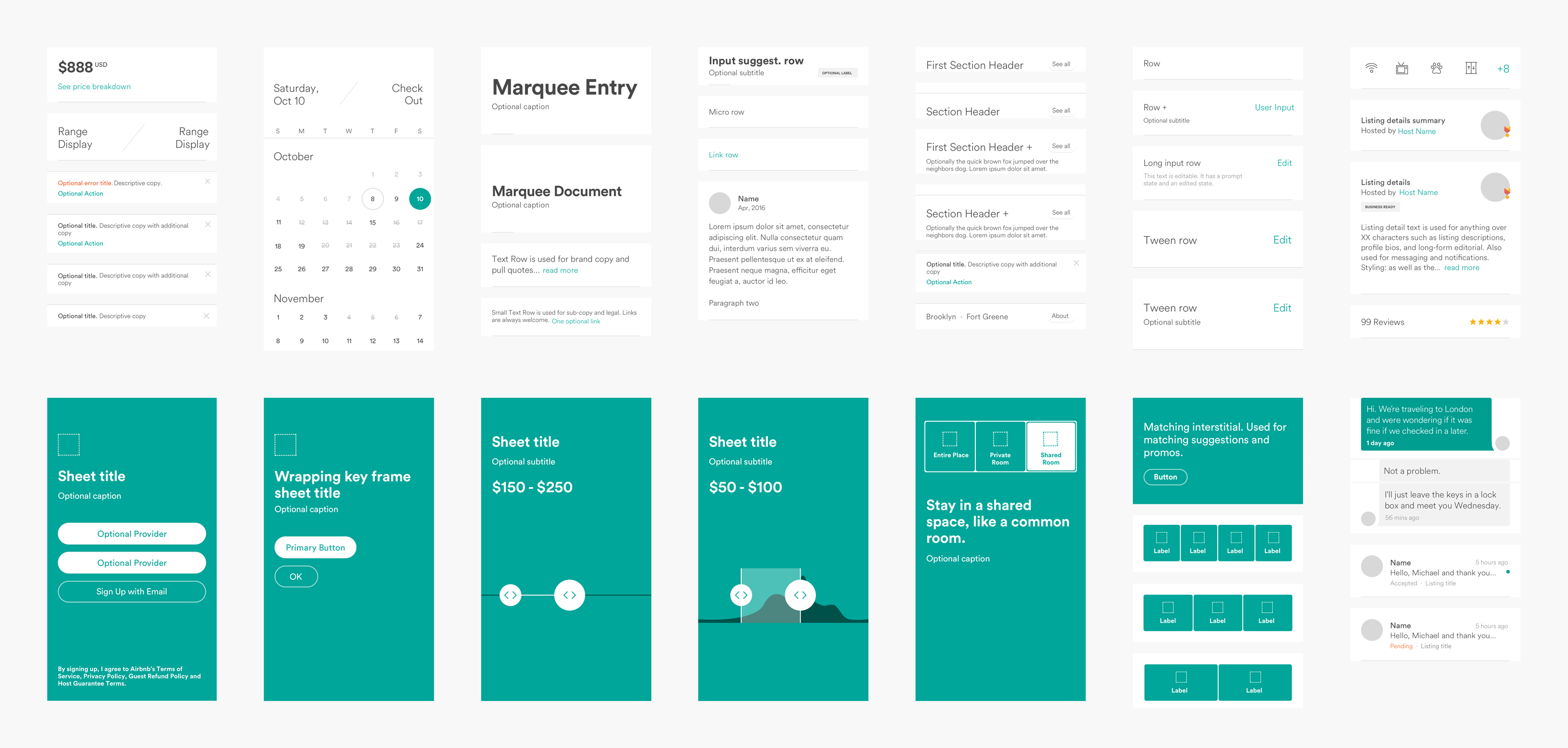
Airbnb
![]()
In Airbnb, a single typography is being used to make the app interface look clutter-less. Also, icons are used smartly to define a purpose.
Medium
The typography, photos, and every element are used in a grid format in the Medium application.
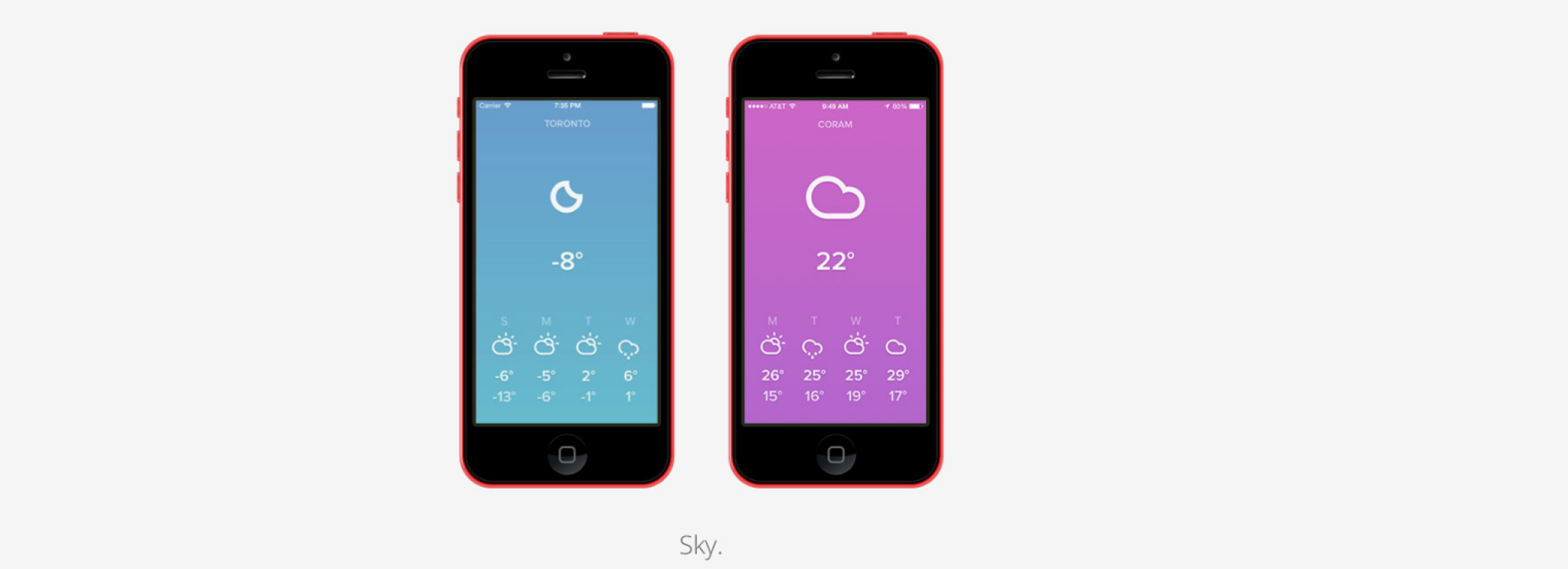
Lyft
![]()
Lyft is an apt example of how to add an analogous color scheme into your app design plan to bring out the best outcomes without investing heavily in terms of app design cost.
With this covered, let’s dive deeper into the technicalities of Minimal designing – starting with the core features of Minimalism design concept to keep an eye on.
Characteristics of Minimal App Design
1. Simplicity
A minimal app design uses less and not complicated elements, which gives a simple and clean look to the application.
2. Clarity
It not only looks simple, but also simplifies the process of getting an understanding of the core app purpose.
3. Functionality of each element
Every element on the app screen performs some action, and not just makes the app look attractive.
4. Expressive visual hierarchy
The elements in the case of minimal app design are placed such that they showcase a visual hierarchical structure.
5. Higher attention ratio to proportions and composition
The UI/UX design is created by keeping The Golden Ratio into consideration.
While these are the traits that an application designing through Minimal design approach shows, let’s turn towards the elements it compose of.
Elements of Minimal Design to Watch Out for While App Development
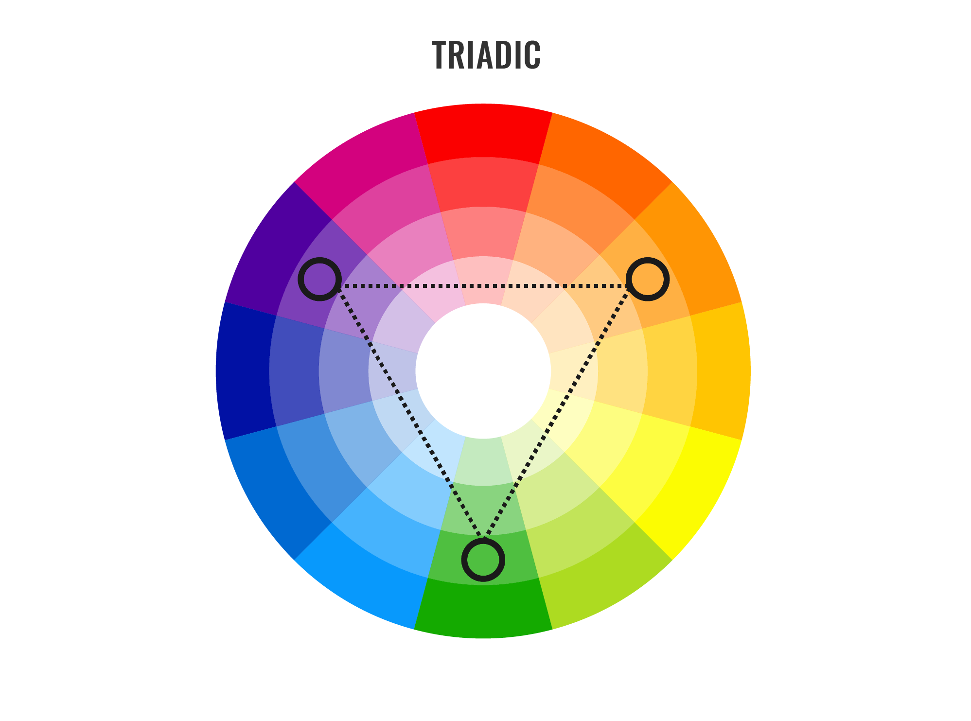
Color scheme
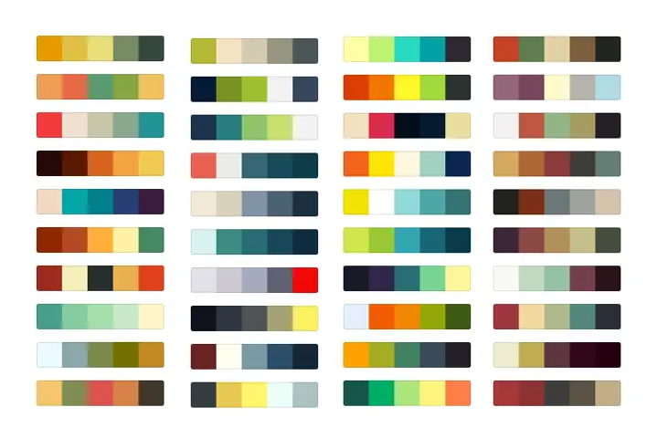
One of the primitive elements of minimal design is the color scheme.
The type and quantity of colors you pick for your app’s interface leaves a major impact on the target user base, on the emotional front. If your application has too bold or too many colors at the same place, the app might seem cluttered and confusing. While, on the flip side, calm colors or a single color on the interface might make the app appear boring and affect user retention rate.
In such a scenario, the two ways you can build engaging app interface are:-
- Use Monochromatic Colors Scheme – Multiple colors are created from changing the hue brightness and saturation of the same color; making it easy on the eyes.
- Opt Analogous Colors Scheme – Three adjacent colors on the color wheel are used to create different aspects of the application.
Typography

Another element that gives a different aspect to minimal designs is Typography. Defined as the technique of representing written words, it improves communication between users and the app interface.
If picked wisely, it can bring more eyeballs on your app screen. While, on the other side, it can give a disorganized and negative feel to the users, especially when going with multiple typography fonts.
In such a scenario, having knowledge of the best typography tools as well as the idea of how many typography one should consider for building a sophisticated look is necessary.
White Space
When talking about implementing minimal design in apps world, another element that designers and developers need to focus upon is the white space. Considered as the space between text lines, it gives a clear and clutterless impression to the app interface; making users feel positive about interacting with the page.
Icons
Iconography is a visual language used to address functionality and content. A good icon is simple with visual components that are easy to spot and comprehend. Since bar symbols fill in as navigation to different sections of the application, it’s essential to indicate which section is active by highlighting the icon.
Enhancement
Enhancement is yet another mobile app UI design tool element that builds up minimalistic design in the mobile app world. That means, the way you bring more focus on a particular image or text while multiple being present on the page.
Now as to what exactly Minimal design in app means and which and how apps are introducing it into their app design, let’s look into some tips and practices you can consider to create minimalistic interfaces of your application.
Best Practices to Build Minimal Design for Your App Effortlessly
Go for flat design

Following Flat Design in your app design is the foremost method to introduce minimal design in your application.
A Flat design, unlike other designing styles, focuses on using limited 2D elements and avoiding shadows, textures, or gradients. This makes it easier for the designed images and other visual elements to look neat, take less space, and enhance usability in the interface.
Make a grid layout
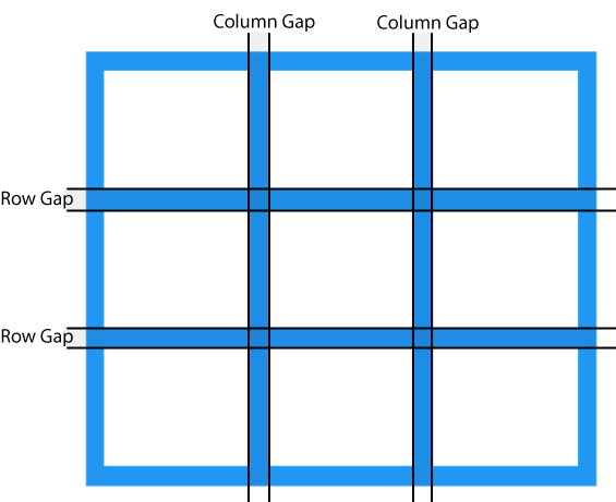
Another factor that every UI/UX app designer must consider while creating minimal app UI designs is Grid layout.
The layout not just adds convenience to the app interface, but also highlights the visual elements. It also serves designers with an ease of maintaining the same feel throughout the page in case of responsive design.
Remove extra elements
One of the best practices for minimalist design is to ensure that no unnecessary element is added to the screen. Meaning, only those elements are introduced to a screen that serves a purpose there.
Now, when it comes to deciding which elements to keep in the design and which one to remove, here are the two tips to keep an eye on:-
- Do not add images unless they aid in making your message clear to others.
- Use simple and limited words to communicate, such that meaningful information is being served to the audience.
Do not oversimplify design elements
Simplicity leads to minimalism. However, this does not mean that you have to oversimplify your app design.
This is because an over-simplified user interface can make it difficult for users to understand the purpose of your application. Also, it can break the navigation flow, which can further result in lower app engagement and retention rate.
So, it is a must for UI/UX designers to ensure that they keep a balance between simplicity and minimalism while designing their mobile application.
Employ negative space
Negative space, i.e., the white space created due to removal of extra elements from the interface, is the backbone of the minimal design.
This element, when employed smartly, plays a crucial role in preventing distraction, increasing engagement, and delivering the right message to customers. However, this is possible only when you focus on the following requisites:-
- Content to be on the left side.
- Focus on Hierarchy of elements.
- Interaction made simple, without compromising on information.
- Variations in negative space maintained for different resolutions.
Pick the right icons
Icons, when employed wisely, help designers cut down the need for content, enhance the visual appearance of the application, and add to the accessibility.
So, designing the right app icons and implementing them at the right places in your app design is also an effective way to get higher profits.
Write crisp content

As already shared in the ‘Negative space’ pointer, writing simple and succinct text copy improves the app metrics. An extension of it would be to express your thoughts with limited yet meaningful and catchy words.
Go for bold typography
Typography in app UI design, just like icons and other visual elements, also helps in enjoying minimalism in app design. Especially in the form of bold typography.
The bold typography shifts users’ attention to the focused words and helps in crafting a high visual experience. So, do not forget to introduce them into your app design plan.
Embrace the idea of contrast
Using contrast elements helps designers create a visual hierarchy and bring attention on particular design elements. So, it is again a good practice to invest your time and effort into building a contrast interface.
When talking about embracing the power of contrast, it is good to introduce black, white, or dark backgrounds with bright and colored typography and pictures. It is important to note here that if you are thinking of incorporating dark mode design theme, the contrast rules would be entirely different.
Use limited colors
Using too many colors on the same app screen leaves a negative impact on users. So, to ensure that your design imparts a positive vibe and engages a wider audience, use limited colors. The best way of which is to use different shades of the same color.
Likewise, using bright colors alongside soothing and complementary hues, simple typography, and less-complicated animations can also help you achieve minimalism in app design.
Focus on concise and intuitive navigation
When it comes to working upon the navigation element, many designers often turn towards techniques like hiding some part of the navigation. This might help to keep the design minimal but reduces the discoverability of menu elements. This makes users confused somewhere in their journey and fail to experience the kind of user experience you wish to offer after ux reviewing process.
So, it is necessary to go with the philosophy, “measure thrice, cut once” while designing your app navigation.
Embrace functional animation
Another factor to watch out for while ensuring minimal design in the app is to embrace the idea of functional animation.
This element of motion design is added to the user interface as a part of any functionality. And is focused on improving discoverability and delivering a meaningful purpose, without asking for more space.
Follow operating system design guidelines
Both Apple and Google have set rules around the type of design that a standard application should have. Considering those design guidelines while introducing minimalism in your application can also be an effective way to ensure higher success rate.
Ditch some rules
Last but not the least, bending some rules of minimalism design is also a good practice. This is so because when you break some rules, you get the freedom to experiment with your design and add creativity to it, aiding in bringing more eyeballs on your app page.
10 Quick & Actionable UI UX Tips for Mobile App Design
Blur effects
The blur effect emerges as a logical answer for a minimal product design UI, permitting a specific measure of play with the layers and hierarchy of the interface. Blur makes it simpler to make layers of data in the UI. This likewise offers minimal designers an ideal chance to explore different overlay solutions.
One app, one typeface

More typefaces seldom bring about better client experience. Actually, blending several different fonts can make your application appear to be fragmented. Decreasing the quantity of font styles on a screen can uncover the power of typography. One of the mobile app design tips is that when designing an application consider how you might make the typography amazing by playing with weight, style and size.
Simple background
Web designers some of the time create complex background themes, like those including photograph pictures. However mobile app design service providers have long deserted such a training in favour of simple and monotonicity. Very bright background under restricted space confounds the way toward exploring the application and slows down the loading stage, which isn’t acceptable.
Simple navigation

There are no intricate patterns of features, pages, or functionalities however just conveniently arranges experiences. Thus, through this clients will get to explore from one module onto the next flawlessly and complete things quicker than they would otherwise.
Declutter UI
It is wise to keep best app UI design mess free. Clarity is a significant attribute of a mobile design. An excessive amount of design components like buttons, text, images, etc. can make any mobile application complicated and incapable to utilize. Keep it basic and minimal, or else you will not be able to convey the message to the user in a clear and concise way.
Accessibility

With organizations taking measures to make products accessible for everybody, minimal designers need to have sympathy and provide different experiences to various individuals through the similar mobile plan. A well planned item ought to be accessible to various users like users with low vision, any sort of visual deficiency, motor and hearing impairments. With comprehensive app design features, individuals with disabilities can explore and interact with your product.
Thumb zone
With each new mobile release, the screen size has expanded, holding the gadget with one hand and browsing the application is getting troublesome. Thus, the mobile application design ought not be aesthetically planned but additionally should focus on the movement of the fingers and thumb.
Remember all zones when mobile application design is being made. Wider the phone, more hard for the user to hold the phone with one hand and tapping on targets if they are out of reach zone.
Set expectations

Numerous associations with a webpage or application have outcomes: clicking a button can mean spending cash, erasing a website, or making a disapproving remark. What’s more, is that with clicking a button there are ramifications, there’s additionally anxiety.
Thus make sure to tell users what will happen after they click that button before they do it. You can do this through a nice design plan.
No extra details
All components of the minimal design play out specific functions: a circumstance where each UI detail fills a particular need. It implies you can securely dispose of application segments with no direct undertakings. They’re unnecessary.
This additionally applies to the content, i.e. decrease the quantity of words utilized and communicate as briefly as possible.
Intuitive app interface

The entire issue boils down to the last important point that is the making of an easy to use interface.
Eventually, no one needs to feel dull and moronic, and unplanned usability would provide the user with simply unwanted impressions. In this manner, your application interface ought to be intuitive, working on all devices in a comparable coherent manner. What’s more, is that accomplishing responsiveness in planning minimal applications isn’t so difficult.
Conclusion
Minimal app design has been a popular approach for some years now and is likely to be one of the UI/UX trends as well. So, it is advisable for everyone who wishes to enter into the UX/UI domain or are getting their application designed to focus on this concept and elevate the chances of success. Something for which you can refer to the rules and practices shared in this article. Or simply, connect with our UI/UX design company in USA.