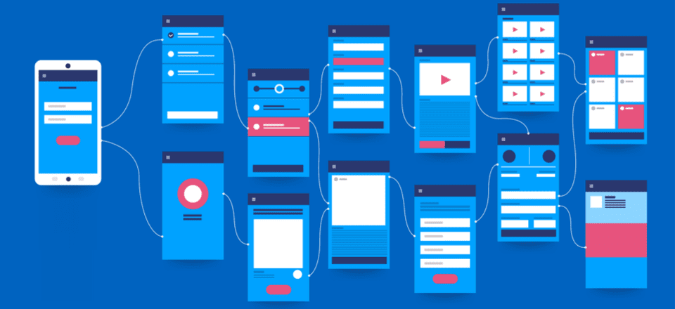
“The text is too big.” “The words are placed too distantly.” “The words are not going with the image” Such comments have been passed continuously ever since the day user experience established itself as a crucial element of the mobile app design industry. With users spending a major portion of their day on applications, consuming information, and interacting with words, the importance of carefully crafted typography has come to the forefront.
Let’s walk you through the concept that holds the power to lower app abandonment and play a crucial role in increasing the app revenue – Typography.
A Basic Introduction to Typography
Typography, in simple words, is an art of organizing written text, point sizes, line-spacing, and other elements in a way that offer a pleasant and readable user experience. It is a craft that enables designers to transform human interactions into durable visual form.
Now, when talking about what is typography, it is good to have a familiarity with elements it comprises of – something we will discuss in the next section of this article.
6 Typography Elements You Must Know About
1. Typeface
Typeface refers to a set of symbols, numbers, letters, and characters that share similar features. For example, Garamond, Helvetica, and Baskerville is a typeface.
2. Font
Often used as a synonym of typeface, Font is basically a typeface that is set in a particular style, size, and height.
3. Line Length
Another typography design element you should be familiar with is line length. It refers to the area covered by a block of text positioned between the left and right margins.
It is usually calculated as the total number of words or characters in a particular line.
4. Line Spacing
Also termed as Leading, line spacing is the distance between two baselines, i.e, imaginary lines where the text resides.
5. Kerning
Kerning is defined as the spacing between two particular characters or letters.
6. Tracking
Tracking is another typography element used by UI designers for crafting a better experience. It is termed as the spacing between two individual blocks of texts and is also known as letter spacing.
Now as you know the definition and typography elements to consider for user interface design, it’s good to look into why is it necessary to focus on this UI design method.
So, let’s go through the advantages of focusing on Typography in UI design.
Reasons Why It Is Important to Consider Typography
1. It Sets a Mood/Tone

The foremost reason why typography is important in UI design is that it helps in setting the tone of the message. While plain and simple typography shows that content needs to be considered with seriousness, innovative typography adds fun and excitement to the screen.
2. It Helps Deliver Better Visual Experience’
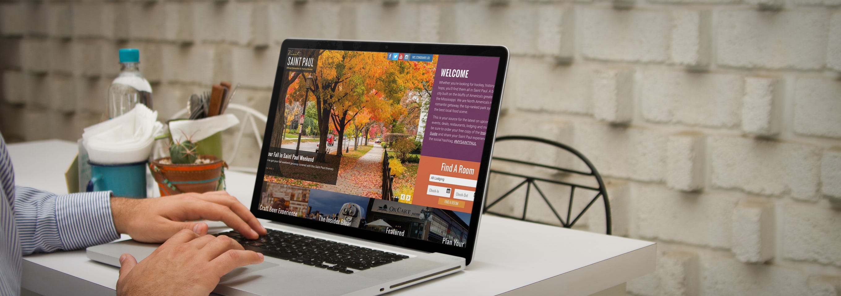
Typography also boosts the visual appearance of a mobile app. When chosen wisely, it infuses positive vibes and helps to deliver a delightful experience to your target audience. Whereas, wrong typography ruins the user experience and compels them to exit the platform soon.
So, it is profitable to consider typography as a key element of your mobile app design process.
3. It Enhances Readability

Another reason why focusing on typography is one of the proven tips to enhance mobile app UI design is that it eases the process of reading content. It simplifies how users comprehend every single detail you mentioned in your app while helping in building better connections.
4. It Shows Professionalism
![]()
Typography also adds a tint of professionalism in your mobile app UI design. When you pick a typography which goes with your brand vision, customer behavior, and market standards, it brings a positive impression on the audience. It encourages them to trust in your brand and thus, support you in achieving expected goals in stipulated time and effort.
5. It Boosts Sales Conversion

Typography encourages users to spend more time on your application and understand the context more effectively. This increases the chances of motivating them to perform the desired actions and ultimately, boosts sales.
6. It Creates Brand Recognition
/brand-awareness-01e3446286534c93a8ea93b4e8bd813f.jpg)
When you use a particular set of typography and use the same pattern throughout your content, users start relating it to your brand. They begin to remember your work via the typography you have used.
With this attended to, it is likely that you would be interested to know how to use typography in UI design, next.
While hiring a reputed mobile application design and development services provider is a good idea, having information about popular apps to get inspiration from can be really significant.
So, let’s look at the list of apps that have over time, amazed users through their mobile design system typography.
5 Mobile Apps to Take Inspiration From
1. Hotel Tonight
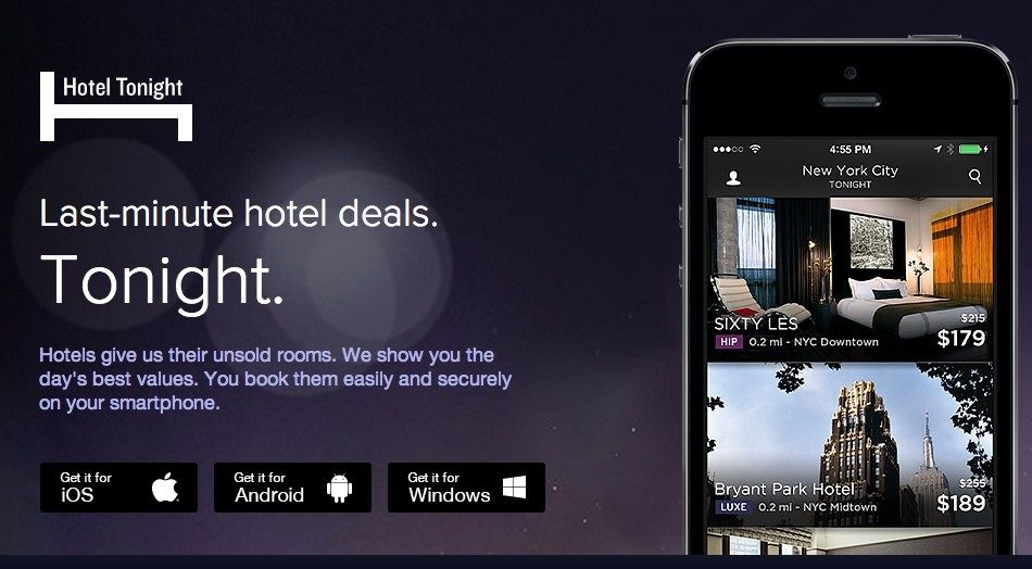
Hotel Tonight has used different fonts and styles on both platforms. While the brand implemented various weights of Google’s Roboto for its Android application, it used Gothan for its iOS platform.
2. FIFA

FIFA mobile application has used Miso for typography in UI design, though in different font sizes and weights to bring better emphasis on particular content elements.
3. Fancred

Fancred has also focused on using different typography elements in their app UI design. Besides, they have also experimented with the idea of adding text to pictures and did UX reviews to give a seamless user experience.
4. Citroen Lifestyle
Citroen Lifestyle is another impressive iOS application that has worked with the idea of using font pairing, text-in-picture, and other ways of implementing typography in their app design.
5. UltraVisual
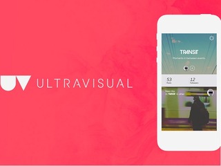
Another mobile application that has inspired users with its typography is UltraVisual. The application, in its iOS version, has used different fonts and added content on photos to deliver better information with minimal space.
Now, as we have seen what Android and iOS applications you can consider for getting an understanding of the rightful implementation of typography UI design, let’s take a look at what UI typography style guide to follow while creating a design strategy for your app.
8 Typography Principles to Focus Upon While Creating Your App
1. Complement Mood to the Message

As per the best mobile design experts, every typeface comes with a unique vibe. While some are fancy and friendly, others are simple and yet professional. In such a scenario, picking the one that goes with your brand message is a must.
So, do not overlook this fact while pondering upon how to improve your UI design through better typography.
2. Pick the Font’s Point Size as per Design Context

Choosing too small or too bigger fonts altogether makes it difficult for users to continue reading with the same flow. It affects the readability of the app content.
In such a scenario, it is important for mobile app designers to select the right font point size for their app’s UI design.
Now when talking about picking the right font point size, it is profitable to invest your time and effort in the general thumb rule-keeping body text between 10 and 12 points for print projects and 15 to 20 pixels for the web.
3. Stick to a Limited Number of Fonts
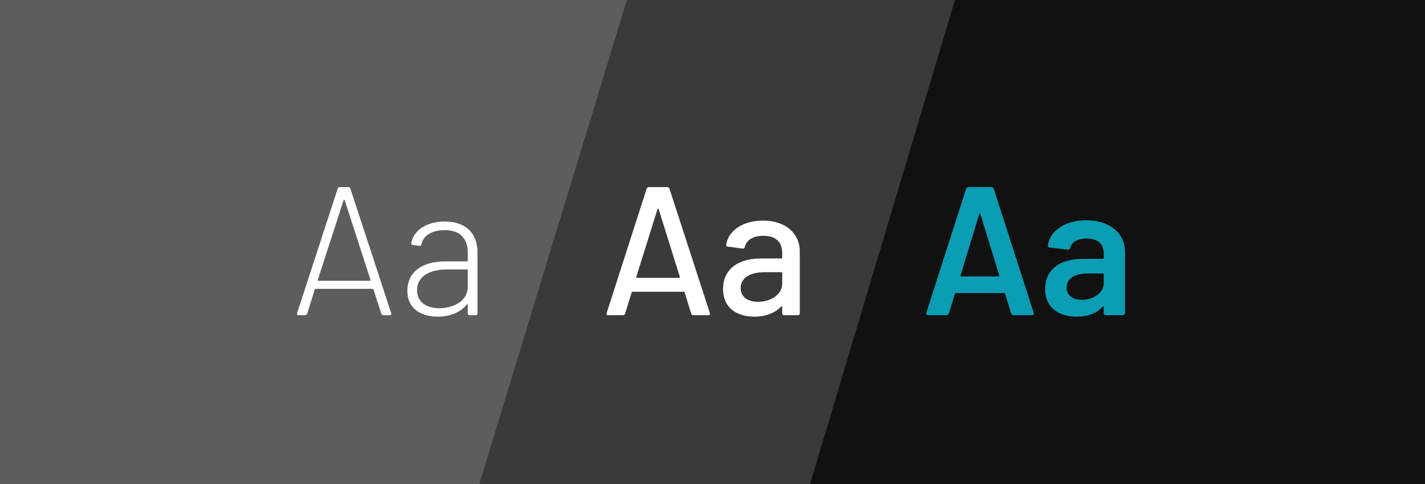
Adding too many fonts on the same page can be a barrier to readability. So, it is again vital to keep yourself limited to a certain number of fonts – usually those who are not drastically different in look and feel.
4. Build a Hierarchy
Another rule to follow when talking about typography in UI design is to create a good hierarchy. This will help in easier navigation, better organization of every element as well as simplifying the process of finding information.
Now, when focusing on creating a hierarchy, the basic things a UI designer must know are:-
- Employing text size to prioritize information by importance.
- Adding appropriate spacing to make content scannable.
- Arranging related items together.
- Introducing headings, subheadings, etc. in the content.
5. Focus on Grammar

Since a wrong spelling can break the flow and make it difficult for the audience to comprehend the whole meaning, it is again imperative to focus on the grammar aspect as well.
6. Don’t Overlook Spacing and Alignment
Spacing and alignment also make a huge difference in the overall app UI experience. When you introduce the right amount of spacing and alignment in your app content, users find it easier and faster to grasp the information and respond effectively.
For example, when you use center or justified alignment, users have to struggle with maintaining a continuous communication flow. Whereas, this is not so in the case of left-aligned content.
Likewise, when the letters in your app content are too tightly hugged or at significant distance, users fail to continue reading with the same pace and often exit the platform. But, this does not happen when you pay attention to proper spacing between all the words and letters.
So, do not forget to focus on this principle when considering how to use typography in UI design.
7. Prevent using Design Fads
Another thing you should focus upon is to prevent employing design fads. This is because the fads do not prevail in the market for longer. They have a shorter time span, implying you might have to change your app’s UI design with some other typography later.
So, do not prefer going with any such design fad.
8. Observe and Practice
![]()
Last but not the least, invest your time and effort into practicing different typography and evaluate their success rate. This will help you in receiving better user experience outcomes.
Now while these principles of typography will help you with crafting a perfect UI design plan, it is incredibly important to keep a watch on the typography trends as they were one of the crucial mobile app UI design trends for 2018.
So, taking the same thought into consideration, let’s end this article with a focus upon top typography trends to watch out for in 2019.
Typography Trends You Should Stick to in 2019
1. Hand-Drawn Fonts are Popular

The foremost typography trend to follow in 2019 is using hand-drawn fonts, i.e, the fonts resembling with our handwriting.
Such fonts are highly preferred by brands like Etsy and Fiverr because of the fact that they add a human touch to the app design and encourages users to connect more easily.
2. Glyphs are Gaining a Huge Momentum
Not only text fonts, but designers are also focusing on a varied set of symbols and non-alphanumeric characters like dividers and icons in their app UI design to enhance the user experience.
3. Font Pairing Will Go Trendy

Another answer to what are the typography trends to focus upon in 2019 is font pairing.
As the name depicts, it’s the practice of using a combination of two or more different font types in a particular design in order to add a surprising element in the content.
4. Variable is the New Responsive
Another typography UI design trend for designers to focus upon this year is to introduce variable fonts.
Unlike the traditional fonts that are static, these fonts showcase content in different smooth yet non-discrete transitions. This makes content more appealing and engaging.
5. Variant Sizes Will Create a Perfect Match
UI designers will also experiment with contrasting fonts this year and for some time to come. They will use the same font in varying sizes to create a ‘hierarchy like impression.
And in this way, direct users to focus more on particular texts instead of giving equal attention to all.
6. Photos Will Go Expressive

In 2019, UI designers are taking another route to deliver visual storytelling experience to their audience. They are adding text and other elements to photos. And in this way, delivering more information in minimal space and that too without making it unpleasant to eyes.
7. Geometric Typefaces Will Take a Lead
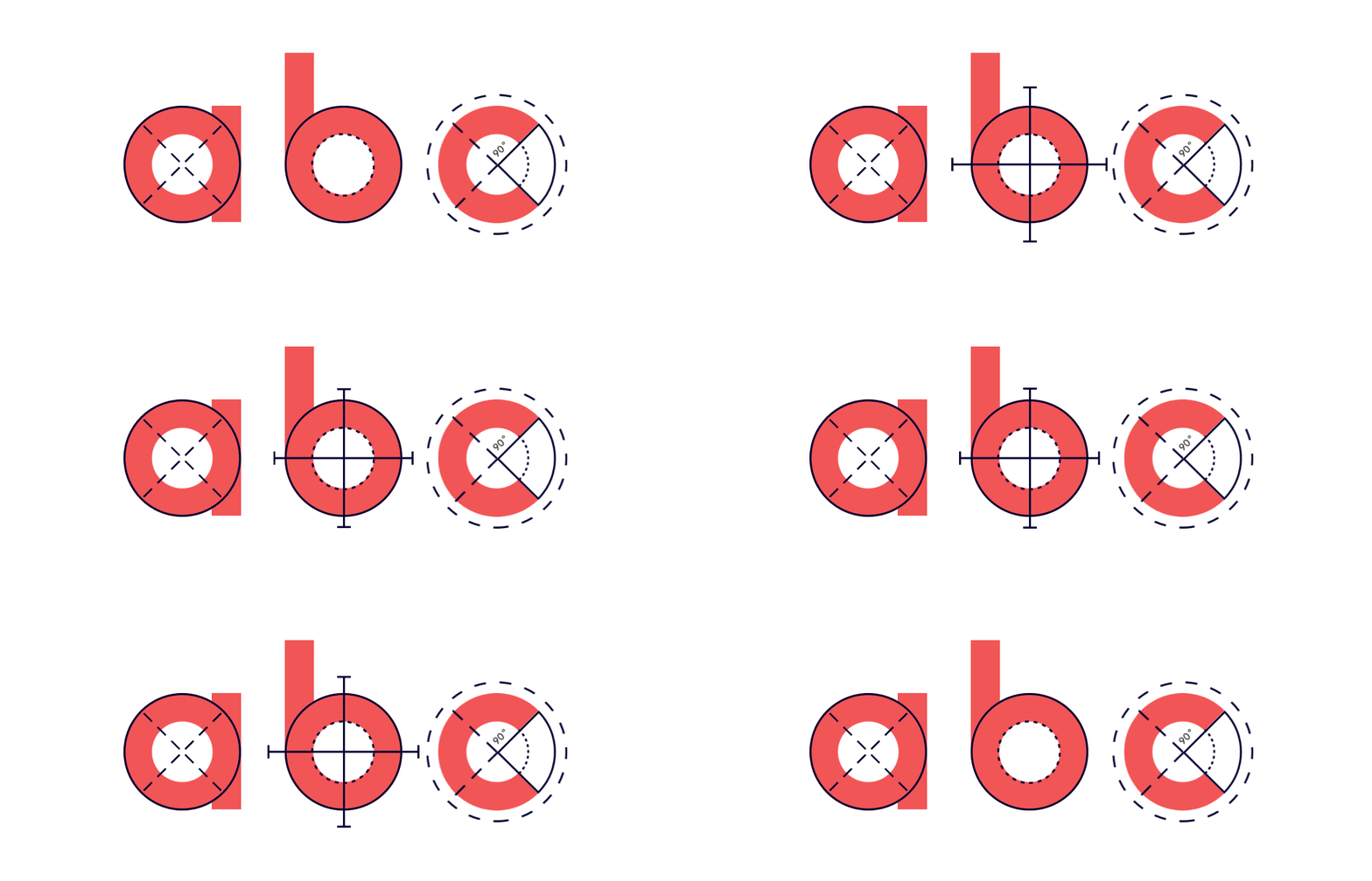
Last but not the least, Geometric typefaces will also take a lead in the marketplace this year. The typeface, created with the help of straight lines and round forms, will add a futuristic vibe to your content and make it easy to scan and readable.
It will be highly used in the process of creating branding and logo designs, especially in the field of Science, Technology, and Engineering.
Frequently Asked Questions About Typography in UI Design
1. What is good typography?
Good typography is defined as the one that complements the tone of the design while helping spread the desired message. When talking about picking good typography for any design, there can be more than one option available.
2. What are the principles of typography?
While there are various principles related to typography, the prime ones are:-
- Pick typography that enhances the tone of the message.
- Pick the Font’s point size according to the design’s perspective.
- Set up a Hierarchy.
- Pay attention to Spacing and Alignment.
- Observe, Get Inspired, and Practice.
3. Is typography an element of design?
Yes, typography is a part of the design. The technique enables designers to present their app content in an engaging and knowledgeable manner – resulting in a better user experience.
4. Why is typography important in graphic design?
Typography is important in graphic design because it:-
- Sets a tone/mood to the message,
- Encourages visual experience,
- Shows professionalism,
- Enhances readability,
- Boosts sales conversion,
- Creates brand recognition.


