Creating a great UX is all about learning, observing, analysing, interpreting and testing. It’s the process of making good experiences for the users. Although every designer is aware of the UX core principles, but, there are a few mess-ups that can be troublesome for their projects.
LOREM IPSUM < REAL CONTENT-
Internet usage ultimately boils down to content consumption. What users consume on the internet is what affects them and their thoughts. In the majority of the cases, the consumed content manipulates the users’ decision, which may or not lead to the right conclusion. As designers, you can easily fall into the trap of using ‘lorem ipsum to wrap up your design as quickly as possible. Reality is that, using placeholder copy makes your design look like a half cooked product and so it becomes hard to relate to. Our aim is to create design experiences, not templates. And this is possible only if real content is used in your design. It helps you to create a finely tuned experience tailored specially for your target-audience (TA).
The way to solve this? Is research:
Research your domain thoroughly. From methodologies to terminologies, everything. Use real content that will catch your end-users attention. Start with writing a provisional copy to set a tone and strategy and then later it can be revised again if required. A content writers’ team can do that for you. They can separate the content that matters and the ones with flaws. This ultimately helps experience what the live page would feel like and in return discussions and reviews would be made much easier.
NOT HAVING A DEFINED TA-

Generally what users find on the internet is universally generic content. They find that content, take time to process what they are looking for and then understand it. All of this creates a certain distastefulness in the users. A very common mistake is that designers writing content like it is for them and not for the users. Now, this can land as an issue.
Answer to this mistake? Create Personas:
Persona is the users’ voice. Research your users, their behavioural aspects, preferences and requirements. Now filter out your research and throw your focus on what needs to be done. Create various groups according to the condensed information and then create realistic personas, based on their experiences, needs and behaviours.
IGNORING DIFFERENT LAYOUTS-
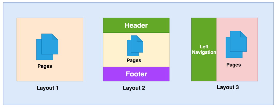
You might easily love the ideas and designs that you come up with, but they might not always work. Sometimes they will fail and hence leave your goals incomplete. Even the good ideas fail. And this happens to the best of us.
Want your goals achieved? Answer is testing:
Merely creating designs is not enough. Conduct user experience tests with different variants, so that there’s something to compare your main design with. Such testing techniques will lead you to know, whether or not the intended effect on your users is working.
PLACING IRRELEVANT INFORMATION-
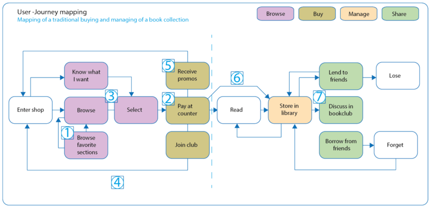
Every user is on a different user phase when they are at your product and hence they might be looking to seek different information. So if you bombard them with truck loads of data, they will get confused and their needs would remain unfulfilled. It is critical to provide your users with only relevant information. The users also might be using your product in a different context, according to their own needs.
Analyse your user(s) journeys to solve this:
The easier it gets for the users to find their required information, the more better acquired your product gets. Based on the realistic personas that you created, further create user journeys. Consider the scenarios your user might be in, the experiences they felt and so the information that would make sense to them. Think of, (a) the users geographical position; (b) what they did before and what they want to do now; (c) and what they want to do next.
UNORGANISED INFORMATION-

When there is a massive amount of information available on the platform, the users might find it hard to find. Now in this situation, unstructured information is just like cherry on top. A user can find it hard to navigate through the product and will end up having a bad experience.
Solution? Become an architect for the information:
Prioritize the most significant features and then create the required navigation. The goal should be to make it easy for the users to navigate through the product. Consider, predict and make it clear as to what their possible actions and scenarios might be. Sort through the information and structure it the right way. remember , it is not for you. It’s for the users. Information hierarchy is very significant for the product to be successful.
Ask yourself the relevant questions and then you will be able to find the answers to solve the said problems. Research, analyse and imply the refined ideas.