
With every second person using their mobile device to access information over the Internet, there’s no option left for business houses than to build websites customized for smaller screens; because if they don’t, they risk losing out on a substantial share of potential customers.
But building a website that fits on a smaller screen is a challenge in itself since with the variety of mobile devices currently available, there are a plethora of screen sizes for which websites need to be customized.
So do organizations need to build a different website for every different screen sizes?
Well, of course not!
That’s where an approach called Responsive Web Design comes into the picture. Using this approach, an organization can suffice with creating one website that can fit onto any screen size. There are some code changes to be done to the programming of the website to make it mobile “responsive,” and that’s it!
So what is this Responsive Web Design approach, and what are its key benefits? Let’s find out.
What is Responsive Web Design?

Ethan Marcotte was the first person who came up with the term “Responsive Web Design,” and he also contributed significantly to developing the first mobile responsive websites. The man has deeply explained the basics of the design approach in a book called Responsive Web Design and also in this article on A List Apart.
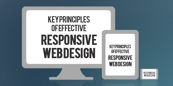
According to Marcotte, a truly responsive website is one that “responds” or adapts its layout according to the screen size on which it is being viewed. The layout of a website changes based on the size and capabilities of the device being used. For instance, suppose a website has content and images laid out in three columns on a desktop. Now for that website to become responsive, it needs to automatically show the same content in a layout with two columns on a tablet and one-column on a Smartphone.
For any website to deliver optimum user experience, it must be responsive. Imagine what impression a potential customer would carry of your organization if, on his first visit of your website on his Smartphone, all the images you carefully handpicked appear at haphazard positions with content broken up and displayed at non-matching locations.
We’re guessing it wouldn’t be that appealing!
Is a responsive website and a mobile website the same?

Not really. A responsive website is one that changes continually and fluidly based on several factors and device capabilities. In such a case, the same website is equipped with code which enables it to transform its layout at run time to fit any screen size.
Alternatively, a mobile website is one that is explicitly built on a new domain for mobile users. Such websites have their code, which is usually pretty lightweight, but often barred by constraints like obtaining two separate domains (one for desktop and one for mobile), browser sniffing, and more.
While several organizations opt for having two separate websites to serve two different sets of customers, it is not a great idea to have a different mobile site for your business. Having the same site adapt to smaller screen sizes is better since it maintains standardization and upholds your brand’s unique identity through a common portal.
How to make a webpage responsive?

We need to program HTML and CSS to automatically resize, hide, shrink, or enlarge the webpages to make them look good on all the devices so that the website becomes responsive. To start, you need to include a meta viewport tag in the document’s “head” section, which acts as an indication to the browser instructions as to how to control the displayed page’s dimensions.
To make a webpage responsive, add the following <meta> element in it:
<meta name="viewport" content="width=device-width, initial-scale=1.0">What this command does is this:
- The “viewport” tag tells the browser that an instruction to control its width and scaling follows
- “width=device-width” matches the screen’s width in device-independent pixels
- “initial-scale=1.0” works to form a 1:1 relation between device-independent pixels and CSS pixels
Attempt to deliver the best user experience, mobile browsers render non-responsive pages at desktop screen width first and then attempt at making the content look better fit by increasing the font size and scaling it as per the screen size. Thus for such pages, the font-size may appear to be inconsistent, and users may have to double-tap or pinch-and-zoom to read clearly.
However, if you include the code mentioned above in your webpages, mobile browsers match the screen’s width in device-independent pixels. It enables the page to reflow content such that it matches varying screen sizes, whether displayed on a Smartphone or a desktop.
While this is just the first step towards making a website responsive, there are several other aspects involved, like auto-scaling images, text, and CSS, to become truly responsive. Here’s an excellent resource where you can read some more about this.
The Basic Principles behind Responsive Web Design
The three critical principles detailed below are what makes responsive web design services possible:
1. Flexible Images
How many times have you visited a webpage where an image is so large you have to scroll horizontally to view it completely? While it is possible to view the image in this way, doesn’t it ruin the whole UX? Thus, resizing images such that they fit entirely into the screen on which they are being viewed is a necessity for making websites responsive.
A great way to make images responsive is to use CSS’s max-width property. Using this property ensures that images load in their original size unless the viewport is narrower than their width. If you set the width to a maximum value of 100 percent of the viewing area, images shrink proportionally as the screen or browser becomes narrow.
2. Fluid Grids
Fluid grids stand for grid systems, which scale based on a user’s screen size as opposed to fixed-width layouts that always appear the same. Although the term is frequently used interchangeably with “liquid layouts,” fluid grids ensure that all elements on a page resize concerning one another.
3. Media Queries
A majority of the modern browsers support CSS3 media queries that enable websites to collect data from individual visitors and apply CSS styles conditionally. The media feature “min-width” lets designers implement particular CSS styles once the browser window falls below a specified width.
Say hello to a few Responsive Web Design Frameworks

A great way to introduce responsive within your websites is by using existing CSS Frameworks that offer responsive design. Such frameworks are usually free and easy to use. Here’s a quick look at some great responsive web design frameworks:
1. W3.CSS
W3.CSS is a responsive stylesheet which makes it easy to develop sites that look nice at any size; desktop, laptop, tablet, or phone.
2. Bootstrap
Another popular framework is Bootstrap. It uses CSS, jQuery, and HTML for making responsive web pages.
Key Benefits of Responsive Web Design
Responsive Web Design brings many benefits to the table. Some of the most important ones are:
- If your websites don’t distort at the change of screen size, there are more chances of users sticking around
- Making a website responsive takes less time and resources than building a separate mobile website. It is also easier to maintain
- A responsive website usually loads faster than a non-responsive one since it is optimized for smaller screen sizes
- Responsive websites offer improved online as well as offline browsing experience
Along with the above mentioned vital benefits, having a single responsive website helps a business achieve better SEO rankings, analyze traffic reports better, convert more customers, and reduce bounce rates.
Summary
Responsive web design means making websites that automatically adapt to the size of the visitor’s viewport. Modern businesses need to make websites responsive so that content can render them appropriately on the screen, depending on their size. The activity aims to ensure that visitors have an optimal experience no matter how they access a website. The key advantage of this strategy is that websites load quickly, and they do so without any distortions, such that users don’t need to resize anything to view content manually.