UX Designer Role and Duties

blog – Cold Bear

The UX designer role occupies an exciting place in businesses today. In today’s marketplace, the customer is the KING! Every business needs to ensure that its customers are having the time of their lives with their products and services. The User-Experience domain is continuously climbing up on the ladder of priority of organizations. This has given the UX designer role a very prominent place in the industry. It has become one of the most sought-after jobs and has opened the gates of enormous scope for anybody who can shine in this niche. However, the definition of how a UX Designer should be like differs from company to company as each of them has different requirements and different customer bases. Nonetheless, the primary aim of a User Experience Designer is to ensure that the customer is not just satisfied but delighted with their services/products. They work towards improving the overall experience of the customer with the brand. It comprises of improvements like making the product more intriguing, engaging, and user-friendly. User-Experience designers think from the perspective of the customer to create the finest UX and solve any problems that a customer might face will indulging with the brand. Although the expectations from a UX Designer can vary from company to company, the general duties of the UX Designer include the following:

User Experience Designer Role:

Generally, the duties of a User Experience Designer includes the following:

1. Finding Innovative Ways To Solve Common UX Problems
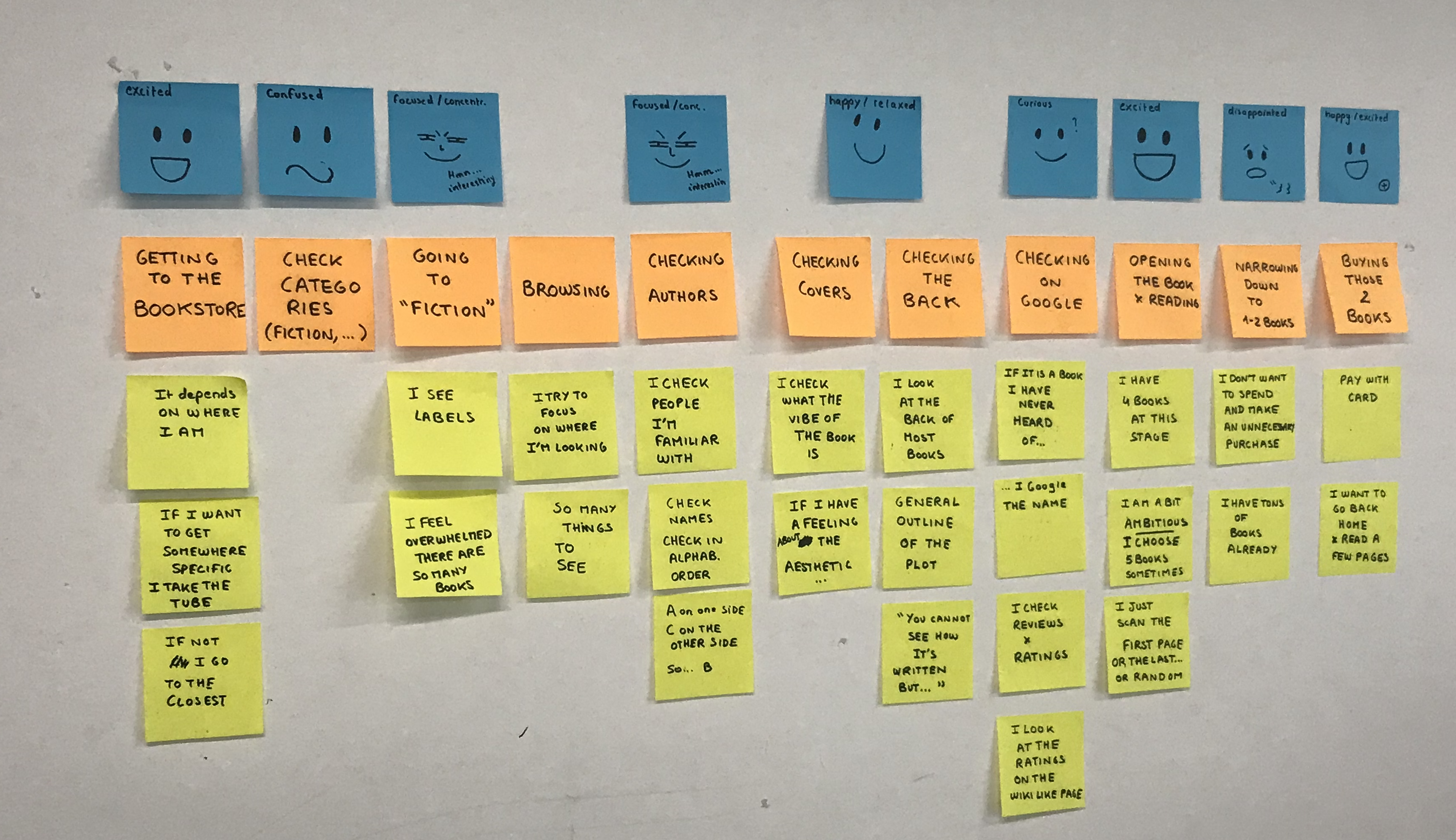
UX Case study — Solving a user's problem in a two week design sprint | by Pierre Degeorges | Prototypr

A good UX designer is expected to think and move as a user would. He is responsible for figuring out the general issues that a user might face while using the product or indulging with an app. For instance, if the font is too small on your website or if the sign-up process of your mobile application is just too long and tedious. All these parameters come under the UX Designer role.

2. Product testing
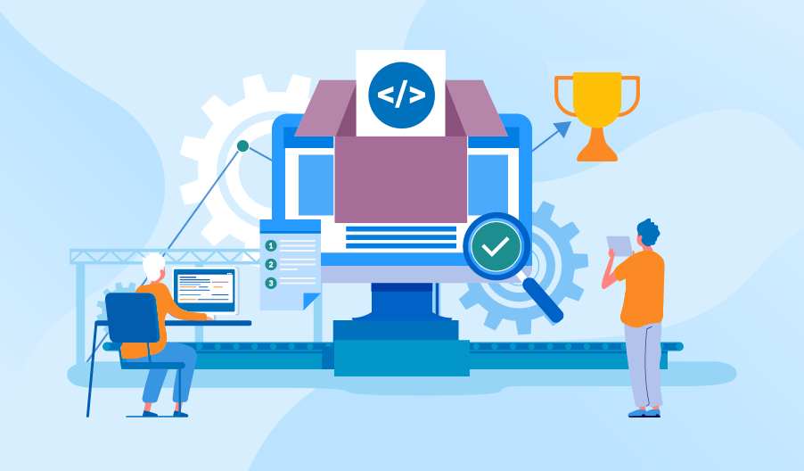
The Specifics of Software Product Testing

A very crucial part of a UX designer’s job is to test various products to see how they are working with the users. A UX designer can conduct multiple surveys, interviews, usability tests, or take thorough feedback from the customers regarding their experience with the products/services and then gather the data and analyze it accordingly. The whole process of being with the users while they use your products creates a better sense of understanding and gives an in-depth knowledge of the customers’ experience with the product.

3. Conducting Comprehensive Product Research

Product Research Can Increase Sales on Amazon

This step is the most initial one while beginning a project. Detailed product research makes a firm ground for the designers to start building their projects and avoid assumptions and work with more factual data. This research enables designers to understand exactly what a user is looking for. It provides them with information about market requirements, customer expectations, and customer behaviour. It helps UX Designers to fathom industry models and perceive prospects for the product/service in a given region. It additionally boosts the planning and prioritizing of various parts of the products.

 4. Describing Information Architecture

Complete Beginner's Guide to Information Architecture | UX Booth

The primary task involved with Information Architecture is organizing the data and information athwart the product in a way that enhances the whole user experience. They ensure that the information is displayed across the product in a manner that is easily comprehended by the users.  IA is the development of a framework for an application, site, or whatever that product/service that empowers users to know where they are on a site or an application, and data about the present location the user is. IA brings about the formation of routes, arrangements, and hierarchies.

 5. Wireframing
Benefits of Wireframing a Website Design | Reasons to Wireframe | Blue Flame Thinking

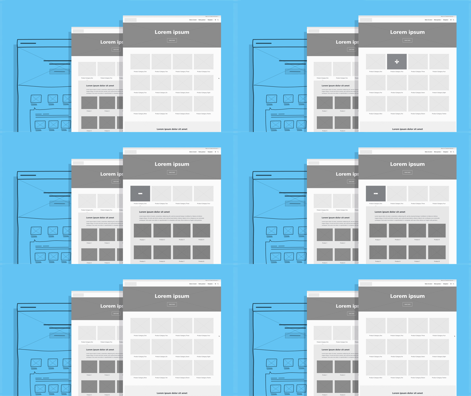
Wireframing is essentially a mock display of how the final product will look like. This strategy is very crucial to envision the product design and augmenting the entire UX. Wireframes depict each and every phase of the product and give comprehensive information about what a user might go through while interacting with the product. It provides an upper hand to the brand as it can figure out the drawbacks without actually presenting the product to the users. It saves time and maintains the brand’s reputation. However, wireframes are not used for actual product testing.

6. Designing

Designing people-friendly technology

UX designers sketch the item’s plan dependent on the persona made toward the finish of exploring the target client. In this stage, the UX designer structures the substance per the situations/scenarios. Scenarios are narrative methods for speaking to the client’s excursion or a day in their life. They clarify how the item (regularly a site or application) fits into the client’s life. It is essential for a UX designer to precisely consider every phase of the client venture. In such a manner, UX designers regularly utilize the design practice of information architecture.

7. Testing

Emerging Software Testing Trends to Watch For in 2021

At this stage, UX designers find out about any issues that may emerge when clients connect with the product/services. Product testing might be as straightforward as observing clients or it might incorporate complex test strategies, for example, exhibiting differing renditions of the product to realize which performs the best. Designers may likewise conduct overviews and polls. Additionally, UX designers may talk with clients on the off chance that they recognize issue territories. The least difficult of all the client testing techniques is watching clients while they connect with the product/services.

8. Implementation

What is Implementation Engineers?

On the off chance that you’ve not had a lot of experience working with web developers, at that point, it’s critical to think about this pivotal part of the job. During implementation, you will be working personally with engineers to arrive at your ultimate objective for a venture. The engineers will be striving to change your thoughts and ideas into a genuine, working website; how you approach this relationship will decide the achievement or disappointment of your task. Keeping your engineers tuned in all through the procedure will make this last stage simpler for everybody included; you as the UX designer will have realistic expectations of what the developers can deliver (and in what time period) and the designers won’t get any terrible stuns ultimately.

A UX designer is answerable for this whole procedure, and its execution. In any case, bigger organizations will segregate this task into a couple of smaller jobs so that that attention is not divided.

Conclusion

UX Aesthetics – How to Approach User Experience Imagery | Toptal

UX Designing is a very vivid field as it does not just cover developing a product or selling it; it involves the through-out journey of a user with the brand. A different approach to the UX Designer role is to ensure that when a user uses the services/products, each component should be efficiently optimized and emerge as extremely easy-to-use and very practical.  A company depends on its users, and ensuring that they have a pleasant experience is a serious business. Being a multidisciplinary field, UX Designing has an extensive scope. UX designers come from diverse backgrounds like psychology, engineering, designing, and even hospitality. To structure for human clients also implies that you need to work with an elevated degree of responsibility in regards to as inclusive as possible and consider the limitations and expectations of the masses. A User Experience (UX) Designer must have a solid comprehension of user conduct and business objectives and must be equipped for a wide assortment of aptitudes, going from psychology to structure and innovation. Even though UX designing is a field that feels essential to product improvement, its inherent capacity stays unidentified to numerous in light of its relative freshness.

AI Chatbots in Healthcare: UX Research

Designing conversational UI is a challenging task. I say this from my experience of designing a conversational AI chatbot in healthcare. From the moment I began working on it, I knew it wouldn’t be an easy feat. Questions like what kind of visual elements would I use, how can I reduce the user’s cognitive load in effort-intensive activities, were always on my mind. Prior to this, I had worked on UI design of many web and mobile apps. But none of them was as challenging as this one.How A Chatbot Can Help Your Healthcare Business | by Michelle Parayil | Chatbots LifeThe most challenging part for me was designing to handle the human-machine interaction. Each user is different. Unlike in websites/apps, where users can simply browse and leave, the chatbot users open the chat window to interact. They come with all sorts of questions- vague /smart /genuine /rogue /irrelevant and (sometimes) absurd. When they type a query, they expect the conversational UI to adapt to their needs–digest questions and construct intelligent answers/follow up questions.
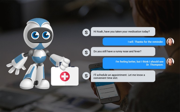
The uncertainty of the usage makes the design process complex. Unlike websites/applications, there are no specific UI design principles for designing conversational interfaces. It might appear as a small thing but the limited knowledge on the UI design patterns for healthcare chatbots ultimately affects the customer experience.

So, what can a designer do to make sure that the conversational AI solution caters to most, if not every, user persona? I can share a few suggestions. Since I worked on a healthcare chatbot, most of my suggestions would be about best design practices for healthcare conversational user interface.

Chatbots are now making their way into healthcare solutions like patient engagement solutions, handling emergency situations or first aid, medication management, and so on. To create a great user experience, it’s crucial to pay attention to the process of designing the chatbot. One of the ways to do this is streamlining the process of UI design through UX research.

When I started working on UX research, I borrowed a few tried-and-tested methods applied in web and mobile apps. However, healthcare is a complex domain where data security is a major concern. Therefore, I modified a few of them to suit my needs.

Let’s talk about a few UX research methods which are important to conduct before deep-diving into UI design of a healthcare chatbot.

AI in healthcare | Artificial Intelligence in the healthcare industry

Discover users’ pain points

To discover users’ pain points, you must first know who your users are. So, the first step to any good UX research is defining your user persona. Your user persona should include demographics profiles, health profiles and task profiles.

The persona diagram must include needs, difficulties, frustrations, motivations, aspirations of your end users. For instance, a 56-year old woman’s persona should include pain points like– “I’m an old woman, I don’t have the patience to repeat the same thing over and over again” or “I am ageing towards dyslexia, I forget conversations I had 15 minutes ago.”

After you’ve defined your user persona, the next step is to figure out how they will interact with the chatbot. For that you can invest in any of the below attitudinal approaches-

  • Gather inputs by rolling out surveys to your target audience and asking them related questions.
  • Conduct interviews and listen to what users say.

Depending on the kind of healthcare chatbot, your choice of the method will change.

For example- if you’re doing UX research for a chatbot that guides people towards better mental health, then you can do anonymous email surveys as people don’t openly talk about issues like depression and anxiety.

How Chatbots Can Help Your Healthcare Industry? | BCC Healthcare

Observe users in their natural environment

Direct observation (a primary research method) is the key to understanding user needs and preferences for a new product. During observations, record verbal comments and the time spent on various tasks.

For example, if you’re designing a chatbot for surgeons, then observe them when they plan the pre and post surgical procedure. If the patient has a lot of complications, what dietary guidance do they offer? How do they perform the surgery? What instruments they use and how its usage differs from surgery to surgery?

By conducting interviews with people while they perform tasks, you can collect valuable inputs from them and use it to recreate a similar experience in a conversational chatbot.

You can also create interactive mock-ups to show artificial interactions. This gives sufficient scope to test the chatbot with users without requiring the engineers to actually build it. This helps in quick iterations with the users after validating the user experience and understanding their perception of the chatbot.

Research through complementary data gathering techniques

A quick and rewarding UX research method is secondary research. This is done by doing competitor analysis to see how others are solving the same problem. This approach isn’t useful if you’re developing something unique. But, if it’s something you are trying to improve, this method is easy and gives quick results.

You can experience real conversations, access failure threads and use data to improve your chatbot’s experience. Secondary research also includes searching through customer service logs, FAQs, online reviews or comments on blogs.

For example- if you’re building a patient registration chatbot, look at other chatbots available in the market. What is the tone and personality of chatbot? How much time does it take to book an appointment on the chatbot? What are the demographics that the chatbot covers?

Study the chatbot as a user and find out things that they are doing right or things where the experience could be improved. You will find some unsolved problems that could become a major feature in your chatbot.

Get help from stakeholders

There may be situations where you wouldn’t get time to do surveys and interviews with end users. In such cases, ask for help from people who want to build this chatbot. Get to the behind-the-scenes of the problem. Go to their sales and marketing calls. Understand the ‘why’ behind building a chatbot and what problems they are trying to solve.

Talk to the sales team to understand what kind of customer support calls/tickets they receive frequently. Interview their marketing team to understand what vision they have for their end users. What motivates their users? What do they need in order to be happy? What’s their idea of a good chatbot?

Gather real quotes/statements from the end users and use them to draw an empathy map and user journeys. This will help you identify major pitfalls and crucial moments.

The UX research phase is a crucial part of developing a great customer experience. When it’s given its fair share of time and effort, UX research helps discover important insights and reduces the number of iterations required to build the chatbot.

However, there’s no surety that your research findings will translate into a flawless user experience. All the research findings must be implemented and tested in real-time for you to discover if your research was right or not. Sometimes, a wrong method of research or the timing of the research may give you erroneous information.

I hope you figure out the right UX research method for your chatbot. If you have worked on a healthcare chatbot, I would love to hear the UX research methods you used.

Basics of Integrated Information Architecture in UX design

The 7 principles of UX design—and how to use them - 99designs

Your website may have a lot to convey but if the content is not structured properly on your website it could mean people leaving your website soon after landing on it. It is no secret that websites that do well have been designed well and the information on them is easily accessible. However, it needs to be acknowledged that such websites cannot be created overnight and requires a lot of planning.

Well- planned Information Architecture is the secret sauce here that can be the difference between a website that is high on bounce rates and a website that has visitors staying on it for a long time.

By now you’re are probably thinking – But isn’t Information Architecture just another fancy word for UX and UI design?

The answer is No. Information Architecture is the scientific process of structuring the content that needs to be displayed on a website. IA helps to create a blueprint that will outline the hierarchy of information on your website and also tell you about what to highlight or how much to display.

IA helps to organize a website’s content in such a way that it helps a user to easily find it and use it.

UX on the other hand has a much broader umbrella under which IA is also included.Â

Thus to sum up, Information Architecture is responsible for ensuring that there a good user interface in place and it is the starting point for UX design.

Here are five innovative tips that will help you integrate Information Architecture into UX design.

Keep the goals of your products in mind

How to Achieve Your Company Goals in 6 Steps

Before you start constructing your information architecture you need to be clear about the expectations of your users from your website or app. This means that you should be able to see the bigger picture of what is the end goal of whatever is being offered on the website. There should be a clearly outlined product objective and product strategy that is understood by all the members of the creative team. Understanding of objectives means that there is a clear understanding of what to do and where to begin. When goals are clearly outlined, it helps to get all the teams on the same page and designers can get started without the possibility of wasted man hours due to clarity of targets to achieve.

Consider Gestalt principles of Psychology

The Gestalt principles of design: how psychology shapes perception - 99designs

Cognitive Psychology involves the study of the mind and mental processes which help people to acquire, process and store information in the brain.

Familiarity with psychological principles can help designers create designs that will facilitate users performing those actions that are desired of them. For example – making a purchase.

There are psychological principles known as the Gestalt principles that can help designers come up with effective designs.

These principles are

Similarity: Objects that look somewhat similar are going to be perceived as part of the same group. This similarity could on the basis of shape, colour, size, texture or value. This similarity helps users to see unity between the design features. The different circular tabs on the website which talk about the different areas that the WWF works on is are examples of the principle of similarity.

Similarity (geometry) - Wikipedia

Continuation: This principle talks about the flow of the human eye from one object to another. Elements that are arranged in a continuous line are considered by the brain as grouped together. In UI design, the continuity principle helps draw attention to grouped information that will create smoothness on a page and help a reader to move from one content slice to another. Amazon uses the principle of continuity to communicate that each of the products below are similar and related to each other.

Related products, Upsells, Cross-sells in Magento

Closure:  The principle of closure works on the human eye’s ability to close a shape or perceive a shape as complete even though the image or shape might not be complete by mentally filling in the missing pieces of the shape. Artists have long recognized the ability of the human mind to complete an incomplete image and used this in their art. The logo of the World Wildlife Fund www.worldwildlife.org  is   an example of the closure principle.

The Panda Behind the World Wildlife Fund's Logo | PopIcon.life

Proximity:  The principle of proximity says that when objects are placed next to each other, the human eye sees them together as a group even though the elements might not be related to each other. Lines or shapes can be used in UI to surround elements and create proximity. For e.g. putting words and a picture in a box can give the message to the brain that both are in proximity to each other and hence related. Pinterest uses the principle of proximity to great effect to group images together and create the impression that all the images are related to each other although they are not.

Get Pinterest - Microsoft Store

Figure/Ground: This principle concludes that the human eye will separate an object from its background and thus highlight the correlation between an object and the space surrounding it.  AngelList does a very good job with the figure-ground principle and tells us that the focus should be on the white on top of the black background.

AngelList - Wikipedia

Using the principles above designers have created powerful content that draws in visitors from the word go.

Plot the navigation system

A Step-By-Step Guide to Marine Chart Plotting

Navigation can be defined as a number of steps and procedures that guides users through an app or website to explore the various parts of the website or app and complete a successful interaction on the site where their goals are fulfilled.  When it comes to Information Architecture, users should be able to move seamlessly through content on the website or app.

So, navigation is inherently dependent on good IA.

Create Personas

How to Create a User Persona (with Examples) | CleverTap

Different people with different personalities will visit your website or app. Creating personalities or personas’ which are hypothetical representations of the people who will visit your website or app is also a good way to find out how to best position the content on the site.

Based on your research you can create these personas of different users who will visit your website or app for their different needs. These personas will help you understand the needs, aspirations, behaviour and targets of your real customers. The personas will help broaden your horizons about the different kinds of consumers that are out there and help you relate to them. Using personas will ease the process of designing and also help create a good UX for your target users.

Integrate Principles of Visual Hierarchy

12 Visual Hierarchy Principles Every Designer Should Know

The main agenda of visual hierarchy is to ensure that content on a website or an app is designed in such a way that the user on the site understands the amount of   importance that needs to be assigned to each block of content on their own.

This technique takes advantage of the fact that the brain differentiates between objects based on things such as size, colour, alignment and contrast.

Visual hierarchy is of utmost importance in interpreting the content on a website or app and also enhancing the visual performance on the site.

One of the core aspects of  visual hierarchy that designers should keep in mind  while working on the web pages is the scanning patterns of people  as studies have shown that people first scan a web page before reading it.

Designers who familiarize themselves with the principles of visual hierarchy can create an information architecture that will integrate vital elements of content on the areas that are most scanned and thus drive users towards taking the desired actions.

Conclusion

It is important for you to understand the people don’t want to wade through a maze of ambiguous content to finally reach what they need and this means that they should easily get access to whatever it is that they have come for in the first place. Here, information architecture is key to building an interface that will give your users exactly the kind of value that they are looking for. Remember, good information architecture and good UX design are mutually inclusive.

error: Content is protected !!