Responsive Web Design : Let’s peek in

Tablet and smartphone use is growing rapidly. This means that there is a huge paradigm shift in web design, and for digital agencies focused on keeping up-to-date with web design and development practices, there is a need to adapt to the growth in mobile website traffic. Mobile websites need to look, and function, just as efficiently as desktop websites.

Prior to the birth of modern responsive web design techniques, designers needed to create several different versions of a website and code each specifically for different web browser sizes. For example, creating a separate file of code that applies to Nexus tablet browser sizes, a separate file of code that applies to iPhone browser sizes, a separate file of code that applies to iMac Desktop browser sizes, and so on.

Additionally, since there are several different browsers — Google Chrome, Safari, Internet Explorer, Mozilla Firefox, Opera, etc.– it is necessary to design according to the levels of code support each browser offers. This requires the designer to create several design prototypes, developers to code all of those different designs, and the client to pay that much more per version. With the number of devices and browsers that currently exist, you can see how time-consuming and costly this ended up being. This is where responsive web design comes into play.

RESPONDING TO YOUR VISUAL NEEDS

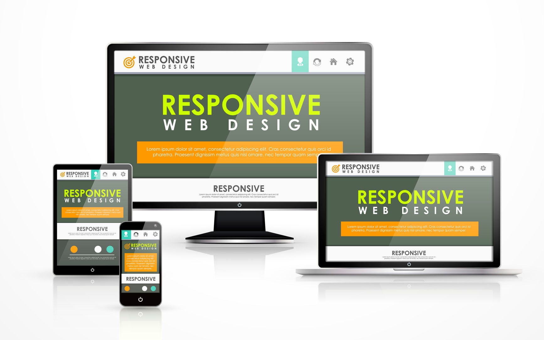
Responsive web design (RWD) allows designers and developers to carry out multiple design styles with just one set of code. When coding a website, a developer creates one set of code that applies across different window sizes and browsers. In order to create this type of coding scheme, the developer has to make sure, among other thing, that all images and media are flexible, the columns or tables are movable, and elements can be hidden. The developer is able to achieve this by using dynamic sizing, specific CSS styles, and media queries.

When viewing the website on your desktop or PC, you can make the browser window bigger and smaller to see how the content changes in size and layout depending on the dimensions of the window. Also, if you view either site on your smartphone or tablet, the content will display differently as well. For a better understanding of RWD in action, a great working example to refer to is The Next Web’s site.

On the desktop version of The Next Web’s site, as shown in the image above, the content is spread out based on the amount of space it has to use. The screen size for this is 1280 x 1024, which is the average screen size of a laptop.

When viewing the site on a tablet, which has an average screen dimension of 1024 x 768, the content shifts according to the amount of space it has. The content still looks great, is very user friendly, and the shifted design eliminates the margins of blank space that you could see on bigger screens.

Thanks to responsive web design, when viewing this site on mobile, which has an average screen dimension of 320 x 480, all of the content can still be displayed in an orderly fashion. While the content is mostly all the same, it’s optimized to look aesthetically pleasing, no matter what you’re using to view it.

As each day goes by, technology evolves to make our lives more efficient and easier. As web developers, designers, or even strategists, we need to make it a point to keep track of all of the major changes that are happening with technology, and adapt to them to provide the user with the best possible web experience.

Responsive web design is one of the latest, and most important, design changes that is buzzing through the developing world and making cross-platform browsing seamless and beautiful.

Time feasibility of Setting-Up a Website

How Long Does it Take to Build a Website?

Having a website has emerged as the need of the hour. Every business wants to establish their online presence and there no solution better than having a website for the same. However, one of the most common queries that pops-up in the mid of anybody dreaming of having an impactful online presence by building a top-notch website is ”How long does it take to build a website?”., which is reasonable enough. Each company has its timeline and budget and therefore, an idea of how long would it take to bring their idea into a highly functional website is very crucial.

Be that as it may, the straight answer is that It will take longer than you would anticipate that it should. However, you ought not to surge it. Building a custom site without any preparation requires some serious energy. In case you’re contemplating a substantial undertaking with a real spending plan, you may be taking a gander at a course of events of weeks or months. That is ordinary, yet it is likewise conceivable to get an astounding site off the ground a lot quicker, contingent upon what you need.

There are three primary factors in a website’s development timeline that affect the duration of the project:

  • How soon do you start?

Top-notch designers are typically reserved, so can’t begin your work right away. Therefore, they might take some time to begin working on your project, which might cause a delay.

  • Time is taken for the review

Most web engineers have a reasonable procedure for building a site and can generally depict how long will take to get a site in your grasp.

  • How long does it take to launch?

This last factor is the most significant variable and relies to a great extent upon you, the customer. It includes investigating the site, making change demands, and concluding substance.

Let us assume that you plan to hire someone to build your website for you. Whether it’s an individual or an agency, the advice still applies, although lengths of time can vary depending on the scope of your website. Before knowing how long it takes, you should be thorough with the procedure that goes around while building a website.

1. Know your requirements: No matter what project you are working on, you know that knowing your needs is the first step towards beginning the venture. The same goes for building a website.  You must discuss with your team and jot down the aspirations that you have from your website. Having a clear picture of your needs will enable you to explain what you are expecting from your website clearly and simplify your planning process. This process generally does not takes more than one week.

Communicating Your Requirements: Step 3 to a New Intranet

2. Drafting a plan: Realizing what you plan on doing with your site is a significant initial step since it will direct you on the best way to create it along the way. A well-thought plan will boost up the chances of you building a successful and efficient small business website. However, strategising and planning is easier said than done. A good website work-plan must comprise of finding your target userbase, the primary objective of your website, the functionality of it, its significance to the visitors, along with your web analytics to measure your success. This process generally does not takes more than one week.

Eight Steps to a Great Business Plan - My Own Business Institute - Learn How To Start a Business

3. Finalising the Design: From variable text styles to moderate formats, web design is very crucial, and it additionally requires some serious energy as well as time. Discuss with your web designers what you have in mind and ask them for suggestions. Experiment with your web composition, and test out which patterns work best for your website. Before putting anything on the web, think about all possible devices and screen resolutions. Having a webpage that isn’t streamlined for smartphones and other gadgets can drive away clients, hurt your SEO, and look amateurish. Therefore, you mustn’t rush through this process and give it a decent time of around 3-4 weeks.

Mobile App Development: Finalising the Minimalistic UI Design | Vinova

4. Development Phase: This stage is the place where the foundation of your website is laid. Your engineer will take the data you’ve given them, and transform it into a completely working site that (ideally) resembles the prototypes that you have affirmed. This part may take some time, somewhat in light of the fact that there are consistently some inevitable errors in each undertaking. You might want to have some modifications a part of the website once you see it in real life, or in case of any other inevitable errors. In any case, it will take at approximately a month or two to build up an independent website for business ultimately. It’s imperative to keep in contact with your designers during this stage. Great engineers will keep you on top of it and let you know how things are advancing; however, you too, ought to be proactive about reaching them.

Demystifying Machine Learning for Global Development

5. Final Review: Before you can say that your site is completed and ready to launch, it needs to experience rounds of reviews and testing. You would need to analyse how all aspects of the website look, work, and feel and decide whether or not does it meets the plan you and your developer followed out together at the underlying degree of the development procedure. There are consistently revisions that should be made, especially in the event that you are focusing on a fault-less and highly-functional site. In a perfect world, you’ll rectify all the major issues during modifications for the prior steps during the review and testing. Now, there should only be minor fixes left to be made; however, your mileage may shift. Regardless, if nothing significant is broken, anticipate that this procedure should take somewhere in the range of about 1-14 days.

2021 CPA Exam Final Review Strategy [Don't Miss Out on Exclusive Tips!]


CONCLUSIONHow to Write a Conclusion: 9 Steps (with Pictures) - wikiHow

Indeed, even sites that look minimal from the start can take a lot of effort to fabricate. Most websites nowadays offer a lot of cutting edge usefulness and that implies additional time must be spent on creating them. Likewise you can also have a brief idea about how long does it your website take to design out and structure. So since you have prior info of what variables go into the planning of a website, you might be asking yourself what you can do to guarantee your undertaking moves as fast as possible. Undoubtedly, time is one of the concealed expenses to value your site. With regards to completing your site rapidly, the most significant thing to concentrate on first is your sitemap. The sitemap is the engineering of the considerable number of pages of the site and how they relate together. Getting completely clear on the sitemap, characterizing the number of pages, which of them will be particularly planned and how they will all identify with one another will go far in adequately describing the extent of your site venture and guaranteeing that it is conveyed quickly.

error: Content is protected !!