Employing Automation to test Data Interface

Say, you got a DB comprising of huge data with billions of records. You have to showcase it on UI only after making sure that everything you want to represent on UI is accurate and as expected. Incorrect data could impact your business in unknown and serious ways that can lie undetected for months.So, here you might need to plan a new strategy, which should lead to answers of all your questions.One of the finest approach among this strategy should be- to make sure that everything you are showing is validated and verified. This leads to a special type of testing called as Data Interface Testing.

What is Data Interface Testing ??

What is Interface Testing? Types & Example

Before we go ahead with Data Interface Testing, let’s first discuss about data interface. Lots of application in the market are nowadays based on Data Mining or Big Data concept. This helps to streamline the big data and showcase on UI in an adequate manner.

Now, as many people say that there is always some pros and cons for each process. Similarly, even this one has few. One of the biggest one is showcasing huge data. But I have a solution.

There is always a challenge to show the huge data on UI where everything is placed at their respective place with correct data set and correct orientation (if you’re showing the data in graphical representation).


So, the interaction between database and User Interface brings the term Data Interface. And to make sure that it works well both ways i.e. request and response results, we call it as Data Interface testing.

Big Question !! 

Can I test this much of data and all of that manually??

Answer is yes, it is possible. But practically not a good way to do the same.

So what …?? Automation ??

Yes.

But what if I don’t have any good knowledge for it ?

Don’t you worry, we got a cheat for you !!!  A tool to test data interface automatically, with a very basic knowledge for Automation/coding.

Automation Tool

Some Info Regarding this tool
This tool is made to test validation and verification of data between database and user interface. To make this tool useful, one can easily use it on it’s own working environment, by customizing the details in provided file and coding as per their requirements. .

How this tool works ?

With it’s main class, it reads multiple files which further executes the methods written in those properties.

For reference, the source code is mentioned below:

Representing Main Class of Tool

Method written in above class is dependent upon various files. One of them is called as Property_Reader file.

This is a custom made file, which executes multiple methods and brings result for main class.

1. Property_Reader_Method

2. db_property

This file comprises of all properties, which helps in setting up connection with server/DB.

Following are the properties used in this file.

  1. Url=jdbc:presto://10.0.11.198:8080/test/default
  2. UserName=root
  3. Password= 12345
  4. ClassName=com.facebook.presto.jdbc.PrestoDriver
  • You can change your URL and credentials as per available server(s).
  • Password can be null too. Depends upon the server details.
  • For current we are using presto as DB.

3. query_column

This comprises of column name for which data needs to be fetched from DB. For every query there should be a unique query name which must be identical in all property files for that query.

For below mentioned example. “testA_count” is the name of query which is unique from rest of the two but same in other property files for queries with same conditions.

Apart from that, irrespective of number of columns available in expected and actual query, it will only bring data for “Column A” column in the result set.

Same case for others too.

4. query_actual

This property file contains the queries created by developers or fetched through server logs file which are created while accessing the application through UI.

5. query_expected

This property file contains the queries created by testers.

By running the above mentioned code for main class, it will create a new result file every time. This file will comprise of end result for executed queries, having expected and actual result with numbers and pass/fail result.

For Failed Case:

Let’s change the actual query to-

Points to be considered:

  • Make sure that the query name should always be the same in all expected, actual and column property file.
  • For every query there should be a unique query name.

Benefits of using this tool are:

  • Any Structured DB can be used for this eg. Presto, MySQL, MS-SQL etc.
  • Platform independent. Can be run on Windows/Ubuntu/Linux.
  • Can be run on a project written in any language.
  • Doesn’t require any prior coding skills or automation knowledge.
  • One can easily put the expected and actual test case in respective property files and can have the result set, with complete information.
  • Can be easily customized as per available resources/requirements


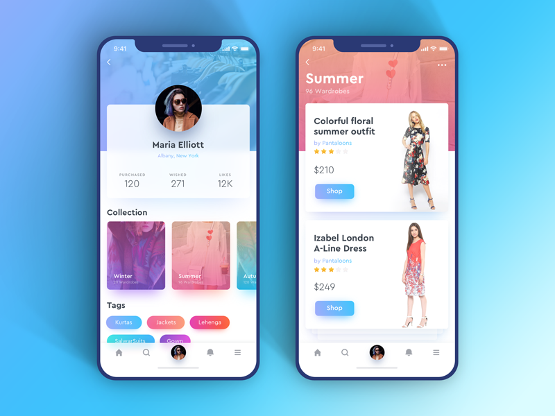
Mobile App Interface: With UX-UI Strategies

When was the last time you bought a movie ticket from the multiplex counter? When was the last time you went out to Crosswords to buy a new release from your favorite author? Or when was the last time you went out for dinner without reading its reviews on Zomato? And oh! When was the last time you went to bank for checking your monthly statement?Take your time!Ages ago, no?

Life is sorted. Everything is available on mobile apps now. We’re living in revolutionary times. The power that web has given to us is enormous. It has made our life, both, easy and difficult. Every one of us has now access to a plethora of information. A swarm of mobile applications is available on the store to make your life easy. For things as small as which baby stroller to buy, we have become dependent on our mobile devices.

UI/UX Strategies to develop Mobile App Interfaces | Humble Bits

Our eyes and ears are always open to that new cool app which is making waves in the market. And every mobile app which becomes a craze among its users has one reason behind it- excellent User Experience. A lot of people believe that design is about making applications look pretty. Ofcourse, a part of it is true. Anything which looks good improves the user experience. But what if it doesn’t satisfy customer needs?

A good design includes creating each and every interaction to delight users. Remember what Steve Jobs said?

“It’s not just what it looks like and feels like. Design is how it works.”

A bad user experience will give you a thousand thumbs down within minutes. The application must delight its users, both with functionality and experience. The mobile app interface should appeal to the users. I am sure you can relate to the experience when the mobile application works perfectly but doesn’t excite user to use it? What if the application looks pretty but its functionalities are broken? In these cases, you need to look at what works for users and what doesn’t.

Well, there is no one-size-fits-all solution. But here are some strategies that you can implement which have always worked wonders-

Design long-lasting products

7 Winning Design Tips and Strategies For App UI/UX Developers - iqonic

The argument to stay up-to-date with all the latest trends might clash with this but when we say design long-lasting products, we mean that the products should not age prematurely. The product should not become out of style with time. Design something neutral, which can live longer and is not just a passing design fad.

Dieter Rams, a very famed industrial designer, says-

You cannot understand good design if you do not understand people; design is made for people.

He conceived these 10 design principles fifty years ago. He says he didn’t intend these principles to be set in stone forever. If you read them, you will understand why these didn’t mutate with time. They are still accepted and implemented till date. So your design should follow the latest design trends, but do it while keeping in mind your end user.

Keep It Simple, Stupid!

Less is More– this famous proverbial phrase emphasizes on why you should keep things simple and clear. The idea is that simplicity and clarity in thoughts lead to good design. When you are designing, take instances from your real life. How do you like to keep your stuff at home? Clean and organized? Use that thought in your design. Move away from clutter.

Every element in your design should serve a purpose. It shouldn’t just sit there as a pretty object. Minimalism is a tricky thing. Offer your user space where they can find action buttons easily. Reduce the load of information, keep navigation flow easy and let the user win. So, even if you are designing a web page to sell potato or onions, don’t make the user think!

The large clear fonts set the message straight- loud and clear. The background color places the user’s mind into the right frame of mind. The CTA buttons allow users to move directly to the action. Minimalism does not mean you start removing elements from the design, it’s about removing the unnecessary and keeping just enough which can depict your story.

Make an impressive user-onboarding flow

Follow these 7 steps for creating a bulletproof UI/ UX strategy

A lot many people uninstall apps they just downloaded when their onboarding experience is ruined. If you ask for too many permissions (camera, Gallery, contacts, location) then the user might become irritated. Collect only relevant information which is usable for you. Give your user flexibility to log in from different platforms- Facebook, Twitter, being two very popular options.

After you have made the user signup successfully, offer him a quick tour of what is the app about- where are the profile settings, where is the action button, which features are available and where. Even here, provide an option to ‘Skip’.

Use appropriate colors to make a connection

According to the color theory, if we apply logic to the selection of colors, it can greatly enhance our user experience. In visual experiences, colors should be pleasing to the eye. Anything which is pleasing increases engagement of the viewer and encourages him/her to get involved. On the other hand, when something is not pleasing to the eye, it is either dull or chaotic.

If the visual experience is boring and dull, then the monotonic appearance will keep user disengaged. The human mind will not perceive that information effectively. On other extremes, if the use of colors is overdone, it becomes chaotic. So much so that the user cannot comprehend the motive.

So color harmony which delivers visual interest to the user and a sense of structure is essential. And that is why it is important to create emotions with colors in UX Design.

Make Navigation Simple

Gps Navigation designs, themes, templates and downloadable graphic elements on Dribbble

You can have a pretty website with colorful and stylish design and astonishing images, but it pains my heart to say that it will be an utter failure if users don’t make any purchase from it. Simple and intuitive navigation helps them take an action. Every step should guide them to a result and help them understand trivial things, like:-What brand they are looking at
-What is the particular page about
-Where can they find the menu
-How can they get back to the previous page or next page
-Is there a way they can apply filters or search a particular product
-How can they make a purchase
-From where can they contact a concerned person
-How can they give feedback or suggestions

All this is vital and needs to be designed with utmost care because if user is made to waste time on these crucial things then they will immediately switch to a better option.
The digital era is here to make our experience faster & more convenient as compared to real life experiences. Make it worthwhile!

Conclusion

Just as a well dressed and a well-mannered person will always attract attention; similarly a mobile app interface with good design which solves users’ problems will always attract user’s attention. The most important thing which you need to keep in mind is to make sure that your design is both useful and intuitive. The world of app development is bursting and it will continue to grow by leaps and bounds. You, my friend, must learn to create an outstanding user interface that makes your mobile application amazing.

error: Content is protected !!