App or Website? Choose ‘the one’ for you!

As the world is going digital, all start-ups and businesses are indulged in developing their website and mobile applications. However, the question that arises is which amongst the two makes your business thrive and skyrocket its profit? The broad idea is that everyone in the coming times would have a mobile phone rather than laptops or any other. Besides, mobile apps are the latest things due to the popularity of mobile phones.

So far, the mobile apps get developed after the website has been launched, but is this the best decision for your business? However, should it be the only thing you start with? Especially if one’s budget doesn’t allow to launch both? Does that mean the web is dead?

Furthermore, having a mobile phone does not merely translate into downloading mobile applications. So, how to surpass your competitors on the web? Through a web vs app? There are many advantages and disadvantages involved in both. You must opt for the right platform for your start-up. The answer is, of course, selected according to your needs and the kind of customers you want to attract.

Should I start with an App or Website?

Therefore, before you choose, you must consider the importance of a mobile-friendly website as well as a mobile app. Going through this guide answers the most frequently asked question – What should I begin with – Mobile App or Website?

1. Product Line
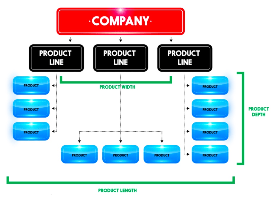
Product Line

Does your product include GPS, navigation, or location-based elements? An instance of it would be Ola or Uber. Such start-ups must have a mobile app rather than having a website. Their business links the passengers with cab drivers willing to drop them to their desired destination. Similarly, if you plan to build an application for people to track their route or an application facilitating the runners map the distance covered and the number of steps taken, then you can provide your clients with the best possible experience only through a mobile app since GPS is the lifeline for a business.

Similarly, a flight or train booking business needs an app to make it accessible from everywhere. If you are into developing Android applications or even online games, to-do lists, notes, alarm clock, reminders, social media, or email, then mobile apps involve more users and interact with them in the best way possible. The business can only be successful by comprehending the requirements of its audience and target market first.

On the contrary, if you are an event management company who needs people to go through your catalogs and know about your business, or if you are a photographer or a hairstylist who needs people to checkout pictures or samples of your work, you can very well go with a website as it serves your purpose better.

2. Budget

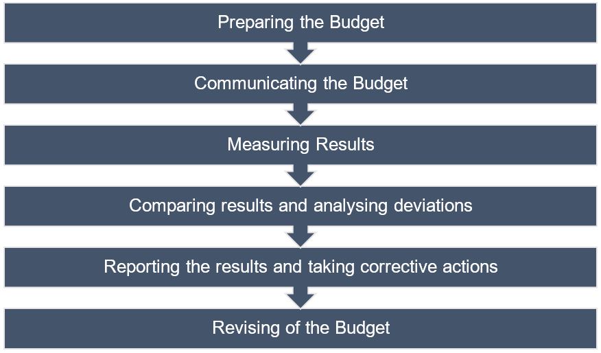
A budget with a vision and direction; The Times of India, February 2, 2018

The first thing that you need to think about after getting your Company Registration completed is the budget you have for going over the internet. Furthermore, you need to set aside at least some amount to keep your platform, weather website, or mobile application, updated. Most Web Designing and Development Companies suggest that you develop a website first and then a mobile app since it is an economical option. You get the advantage of showcasing all the content on a single interface on a website. Besides, updating the content takes fewer efforts in case of a mobile app as compared to a website.

Furthermore, the UI of an App must be adjusted for every platform like Android, iOS, and Windows. An app-only business model might face issues reaching out to consumers across all the platforms. It is said that you are required to spend more on developing different apps for different platforms. It reduces your cost per OS. If you have started your business with a limited amount, it won’t make sense to start developing a mobile application.

3. Marketing Plan

Advantages and Disadvantages of a Marketing Plan

In the beginning, all the businesses only have restricted resources. As the business scales up, you can go for additional platforms. Still, if a company is opting to go app-only, it risks missing out on a broad market of potential customers. Mainly, if their app does not happen to feature amongst the top few apps of choice for a consumer.

A famous example is Myntra, the leading fashion e-commerce marketplace in India. A few years back, it announced that it is going app-only. The company claimed that this step was taken to improve personalization. Without a doubt, the loyal users of Myntra were compelled to download the mobile app. This approach was adopted to push out the competition. As consumers would be more captive in a particular environment and shopping around for discounts would decrease. But the move only backfired. Within a year, Myntra was compelled to relaunch its mobile website.

4. Tools Required

Tools Required

Are you launching something complicated? Would you require to show data analysis or reports and more? Will your users need sophisticated numbers, reporting, or calculations? It is almost impossible to utilize these tools on a website. So in this parameter of the website vs app, the mobile app is a clear winner due to its optimized UI, which displays all the data. For instance, if you will be needing complex calculations, numbers, reporting, then you should acknowledge that it will be next to impossible to use these tools without a dedicated app.

5. Frequency of Usage

Coronavirus: online food & beverage sales delivery methods U.S. 2020 | Statista

Do your targeted customers need to access your services on a daily or hourly basis? If you want your users to check into your platform a few times a day, then it makes more sense to start with an app. It is far more convenient, faster to access, and it has the option of notifications for the users to keep updated. But you must make sure that your app is not slow to launch or perform the desired actions. It will become a barrier that stops people from using your app.

6. User-Friendly

What makes an E-commerce Store user friendly - VAR Sales Management Blog: News, Tips & Many More By VARStreet

Most of the websites have a navigational UI. However, mobile apps need to have an interactive UI to be successful.  Again the example of games comes to mind. A mobile app will be a better choice for a game development company as compared to a website. A responsive web design approach acknowledges as well as resolves many of the usability problems for a mobile-friendly website. So, you must consider the needs of your business and the choice as well as the comfort of your users.

7. Accessibility
Evaluating Web Accessibility Overview | Web Accessibility Initiative (WAI) | W3C

Even today, accessibility to the internet is a major problem in many parts of the world. So, do in-depth research on how long would a customer need your services. For offline accessibility, you must build location-dependent, parallel apps. Therefore, mobile apps will be more appropriate for offline mode of navigation rather than a website. If you think that your business would serve mostly to offline users, then it is much better to develop a mobile app where the user can access your services whenever they need it. For instance, dictionaries facilitate accessibility to know words, even without an internet connection. Users can use it whenever they need, wherever they need.

8. Speed

Speed

Those who’ll use your app or website pretty often during the day would want to have their interaction to be smooth and lag-free. Nobody would want to wait even for a minute to play games during their 15-minute metro ride or while waiting for a cab. Nobody has the time to bear with a slow platform for their needs. Imagine if you always had to access your favorite Social Media like Facebook, Instagram, or LinkedIn through your browser first and then having to sign in. Only after doing all that every time would you be able to read that message or know of the newly vacant position. Wouldn’t it be much better to get an immediate notification as soon as you receive the message? However, if you are targeting customers who would not be accessing your platform frequently, then installing a mobile app will be more time consuming as compared to visiting a website.

Conclusion 

Many companies and businesses may want to go for a mobile app first. It is a much more advanced and trending way to connect with consumers. But it can be a huge mistake too. Unless you have a mobile-based start-up, developing a website first, is the way to go, rather than spending some significant part of your budget in making a mobile app. Instead, you can try to make your website more user-friendly or even pay extra to make it rank up on the Search Engines. The final verdict is that there are many points that you must carefully consider before you make a choice should I start with an App or Website?. Amidst the Website vs. Mobile App, it’s challenging to pick an absolute winner. It all depends on you and your business requirements. With this article, we have all the advantages and disadvantages served before you, which you will have to weigh for yourself.

The laid out path to responsive web design

With every second person using their mobile device to access information over the Internet, there’s no option left for business houses than to build websites customized for smaller screens; because if they don’t, they risk losing out on a substantial share of potential customers.

But building a website that fits on a smaller screen is a challenge in itself since with the variety of mobile devices currently available, there are a plethora of screen sizes for which websites need to be customized.

So do organizations need to build a different website for every different screen sizes?

Well, of course not!

That’s where an approach called Responsive Web Design comes into the picture. Using this approach, an organization can suffice with creating one website that can fit onto any screen size. There are some code changes to be done to the programming of the website to make it mobile “responsive,” and that’s it!

So what is this Responsive Web Design approach, and what are its key benefits? Let’s find out.

What is Responsive Web Design?

Responsive website design - adapt, respond and overcome

Ethan Marcotte was the first person who came up with the term “Responsive Web Design,” and he also contributed significantly to developing the first mobile responsive websites. The man has deeply explained the basics of the design approach in a book called Responsive Web Design and also in this article on A List Apart.

According to Marcotte, a truly responsive website is one that “responds” or adapts its layout according to the screen size on which it is being viewed. The layout of a website changes based on the size and capabilities of the device being used. For instance, suppose a website has content and images laid out in three columns on a desktop. Now for that website to become responsive, it needs to automatically show the same content in a layout with two columns on a tablet and one-column on a Smartphone.

For any website to deliver optimum user experience, it must be responsive. Imagine what impression a potential customer would carry of your organization if, on his first visit of your website on his Smartphone, all the images you carefully handpicked appear at haphazard positions with content broken up and displayed at non-matching locations.

We’re guessing it wouldn’t be that appealing!

Is a responsive website and a mobile website the same?

What is a Mobile Friendly Responsive Website? - Digital Consulting

Not really. A responsive website is one that changes continually and fluidly based on several factors and device capabilities. In such a case, the same website is equipped with code which enables it to transform its layout at run time to fit any screen size.

Alternatively, a mobile website is one that is explicitly built on a new domain for mobile users. Such websites have their code, which is usually pretty lightweight, but often barred by constraints like obtaining two separate domains (one for desktop and one for mobile), browser sniffing, and more.

While several organizations opt for having two separate websites to serve two different sets of customers, it is not a great idea to have a different mobile site for your business. Having the same site adapt to smaller screen sizes is better since it maintains standardization and upholds your brand’s unique identity through a common portal.

How to make a webpage responsive?

Responsive websites: 30 examples and 5 best practices - Justinmind

We need to program HTML and CSS to automatically resize, hide, shrink, or enlarge the webpages to make them look good on all the devices so that the website becomes responsive. To start, you need to include a meta viewport tag in the document’s “head” section, which acts as an indication to the browser instructions as to how to control the displayed page’s dimensions.

To make a webpage responsive, add the following <meta> element in it:

<meta name="viewport" content="width=device-width, initial-scale=1.0">

What this command does is this:

  • The “viewport” tag tells the browser that an instruction to control its width and scaling follows
  • “width=device-width” matches the screen’s width in device-independent pixels
  • “initial-scale=1.0” works to form a 1:1 relation between device-independent pixels and CSS pixels

Attempt to deliver the best user experience, mobile browsers render non-responsive pages at desktop screen width first and then attempt at making the content look better fit by increasing the font size and scaling it as per the screen size. Thus for such pages, the font-size may appear to be inconsistent, and users may have to double-tap or pinch-and-zoom to read clearly.

However, if you include the code mentioned above in your webpages, mobile browsers match the screen’s width in device-independent pixels. It enables the page to reflow content such that it matches varying screen sizes, whether displayed on a Smartphone or a desktop.

While this is just the first step towards making a website responsive, there are several other aspects involved, like auto-scaling images, text, and CSS, to become truly responsive. Here’s an excellent resource where you can read some more about this.

The Basic Principles behind Responsive Web Design

Key Principles of Effective Responsive Web Design | Web Design | Graphic Design Junction

The three critical principles detailed below are what makes responsive web design services possible:

1. Flexible Images

How many times have you visited a webpage where an image is so large you have to scroll horizontally to view it completely? While it is possible to view the image in this way, doesn’t it ruin the whole UX? Thus, resizing images such that they fit entirely into the screen on which they are being viewed is a necessity for making websites responsive.

A great way to make images responsive is to use CSS’s max-width property. Using this property ensures that images load in their original size unless the viewport is narrower than their width. If you set the width to a maximum value of 100 percent of the viewing area, images shrink proportionally as the screen or browser becomes narrow.

2. Fluid Grids

Fluid grids stand for grid systems, which scale based on a user’s screen size as opposed to fixed-width layouts that always appear the same. Although the term is frequently used interchangeably with “liquid layouts,” fluid grids ensure that all elements on a page resize concerning one another.

3. Media Queries

A majority of the modern browsers support CSS3 media queries that enable websites to collect data from individual visitors and apply CSS styles conditionally. The media feature “min-width” lets designers implement particular CSS styles once the browser window falls below a specified width.

Say hello to a few Responsive Web Design Frameworks

Best Framework for Responsive Website Designing

A great way to introduce responsive within your websites is by using existing CSS Frameworks that offer responsive design. Such frameworks are usually free and easy to use. Here’s a quick look at some great responsive web design frameworks:

1. W3.CSS

W3.CSS is a responsive stylesheet which makes it easy to develop sites that look nice at any size; desktop, laptop, tablet, or phone.

2. Bootstrap

Another popular framework is Bootstrap. It uses CSS, jQuery, and HTML for making responsive web pages.

Key Benefits of Responsive Web Design

10 Essential Benefits of Responsive Web Design - KeyCDN

Responsive Web Design brings many benefits to the table. Some of the most important ones are:

  • If your websites don’t distort at the change of screen size, there are more chances of users sticking around
  • Making a website responsive takes less time and resources than building a separate mobile website. It is also easier to maintain
  • A responsive website usually loads faster than a non-responsive one since it is optimized for smaller screen sizes
  • Responsive websites offer improved online as well as offline browsing experience

Along with the above mentioned vital benefits, having a single responsive website helps a business achieve better SEO rankings, analyze traffic reports better, convert more customers, and reduce bounce rates.

Summary 

Responsive web design means making websites that automatically adapt to the size of the visitor’s viewport. Modern businesses need to make websites responsive so that content can render them appropriately on the screen, depending on their size. The activity aims to ensure that visitors have an optimal experience no matter how they access a website. The key advantage of this strategy is that websites load quickly, and they do so without any distortions, such that users don’t need to resize anything to view content manually.

Outsourcing your app? Ask Right!

When it is about outsourcing application development work, there’s no one-size-fits-all approach. It’s all about looking for the right partner that is the most appropriate fit for your team. As per the Computer Economics study IT Outsourcing Statistics 2014-2015, 62% of big organizations are outsourcing at least a part of their application development work.

As time-to-market needs increase and IT budgets decline, the trend of farming out development work is both rising and broadening to contain new services. In response, service providers have extended their offerings to comprise of product, technical, and process services. Notably, this runs the gamut from product management, information architecture and quality automation, analytics, and more.

If a mobile application is developed and executed in the right manner, it has the capability of offering increased efficiency, growth, and revenue for your business. That’s why development is so essential, as faults in this phase can lead to the development of a dysfunctional app that wouldn’t give you the preferred results.

To attain success in mobile app development, you need clarity of purpose and focus. To make this possible during outsourcing, you and your team have to sit down and ask some crucial questions before outsourcing, so you can attain success and avoid some of the most expensive pitfalls.

Things you Should Know Before Outsourcing an Apps

Here are some of the most critical questions that you must ask to select the correct partner for your organization’s specific outsourcing needs.

1. What is the purpose of the mobile app?

The Importance Of Mobile Applications In Everyday Life!

Are you developing an app just for building an app or because you are caught up in the hype about mobility? Will your application be a business version of your website, or will it have a particular purpose? Asking yourself the intent behind developing a mobile app can help you come up with a capable mobile app that aids a definite purpose. To make your mobile application successful, it must be extraordinarily focussed and address a specific purpose/function. You can discuss with the outsourcing team and narrow down on a definite problem that it is going to resolve or the particular purpose of your app. Ponder about why your mobile app is needed, how your customers can profit from it and how the application can be a more convenient alternative when compared to your website.

2. What should be a probable deadline for the completion of the app?

How to Create a Project Management Communication Plan | TeamGantt

Narrowing down to a deadline for the app is very important if the mobile app is to be developed for a particular event or occasion. If the mobile app is not finished before the event, the entire development is futile. Even a delay of a few days might make an enormous difference and cease the mobile app from serving its purpose — moreover, the plan for the release schedule for the app. In case your application is released in different versions, you have to prepare for the release date accordingly.

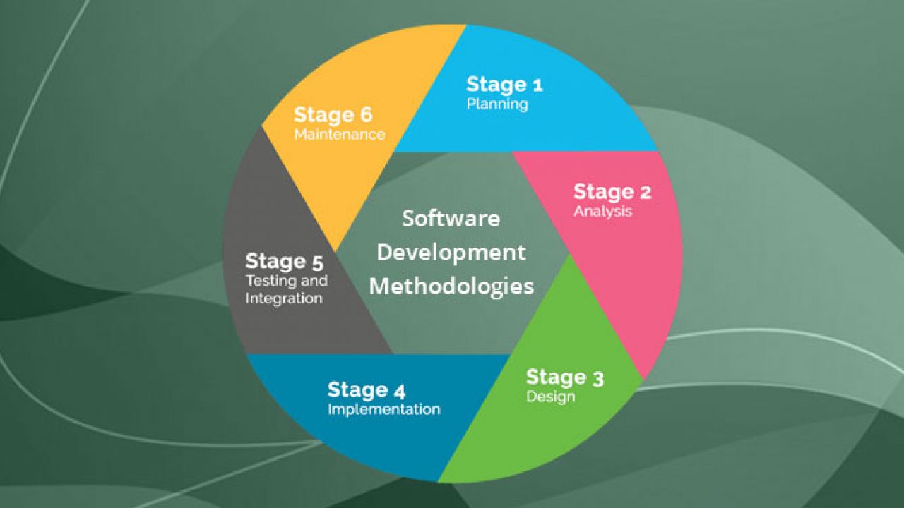
3. What programming methodology do you want?

Top 12 Software Development Methodologies & its Advantages & Disadvantages

How do you wish your end-users to interact with your application? This supports the outsourcing developers to create an appropriate wire-frame. Also, think about the visual design needs and User Experience. Briefing the developers about the non-functional and functional needs of your application can help them to develop product backlog. You would also want to explain the required programming interfaces, outside services/systems, and third-party vendors, sharing such details is important.

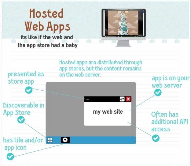
4. How do you need the app to be hosted?

Hosted Web Apps explained | by Jeff Burtoft | ThisHereWeb

Do you need your mobile app to be plugged in to a new or preexisting infrastructure? Ponder about the hosting space that you would want. Brief the outsourcing developers beforehand about the post-launch support that you might need to fix the bugs and tweaks that you may get from users.

5. From where do you need the app to be downloaded?

How to Download and Update Apps on Android Phones and Tablets

Did you have an idea that the delivery channels of an application can significantly affect the design of the application? Getting listed on the App Store and Google Play is essential. You need to inform the developers in advance about your requirements for listing and get them talked at the development and design stage itself.

6. What level of security is needed?

Corporate network security levels

Tell the developers that you are expecting security protocols that ensure that is the app is protected and secure from hackers trying to attack and breakthrough code vulnerability. Also, ensure that you get the privacy policy of the application drafted.

7. Does your application need to adhere to guidelines?

8 steps in the selection process for hiring [A complete guide] | Workable

Ensure that your business app adheres to corporate guidelines like consistent screen design, design of icons, and branding conventions.

8. What are some of the risks involved?

Risks Involved in Forex Trading | Reputable Forex Regulators by Country

Through the course of mobile application development, you might face risks and uncertainties that can hinder the project. To steer clear of such hazards, make sure that you build a risk register at the onset of your application so that you can file the actions at every step. This way, you can hold your stakeholders responsible for each risk factor.

9. Who are the main stakeholders involved in the development process?

Key Stakeholders in Agile Product Development

It is crucial to identify the main stakeholders who are involved in the development and usage of your mobile application. Who would be funding it? Who would be owning it? Who would be benefiting from it? Who would keep the app active? Who would maintain the app daily? Asking such questions and trying to understand the involved decision-makers can lead to the successful development and running of the app. By comprehending the needs of the stakeholders, attaining clarity about their role, and taking responses to help in developing a successful application.

10. What budget can be allotted?

Budget, Budgeting, Budgetary Control - BBA|mantra

Many times the budget is overlooked when it comes to developing mobile apps. This is a significant reason why it becomes tough to estimate one. Make sure to sit down with the developers and discuss the various variables at play, be it multiple operating systems, testing environments, and more.

Summary

If you have made your mind to outsource your software development, you must have found some software development companies that you’re considering working with, and you are on the horns of a perplexity of making the correct choice. There is nothing better than talking to them and satisfying every query that you might have. Choose the web development company that passes all your parameters and comes out as reliable and trustworthy as a lot of your business now lies in their hands.

error: Content is protected !!