The UX Deliverables Timeless List

A Complete List Of UX Deliverables | by Nick Babich | UX Planet

The efforts of the UI/UX team can be translated and measured into a whole list of UX deliverables. The deliverables which are then passed on to the stakeholders, both internal and external to get an idea of what the app’s users would experience.

Being the leading mobile app design agency that has helped brands like Dominos redesign their offering, we often get asked questions in the line of –

  • What are the deliverables that you provide at the end of the project?
  • Will the development team be able to convert the design in code and then a functioning app, with the help of the deliverable?

To address all these questions, we have prepared a brief description of the different UX deliverables to help you understand what to expect as an outcome when you partner with a mobile app design agency.

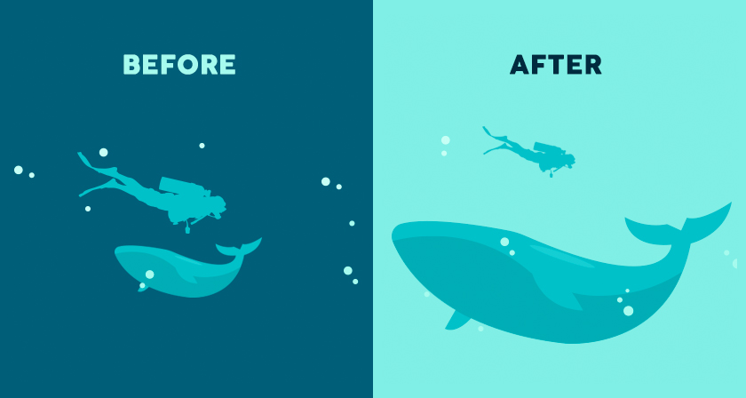
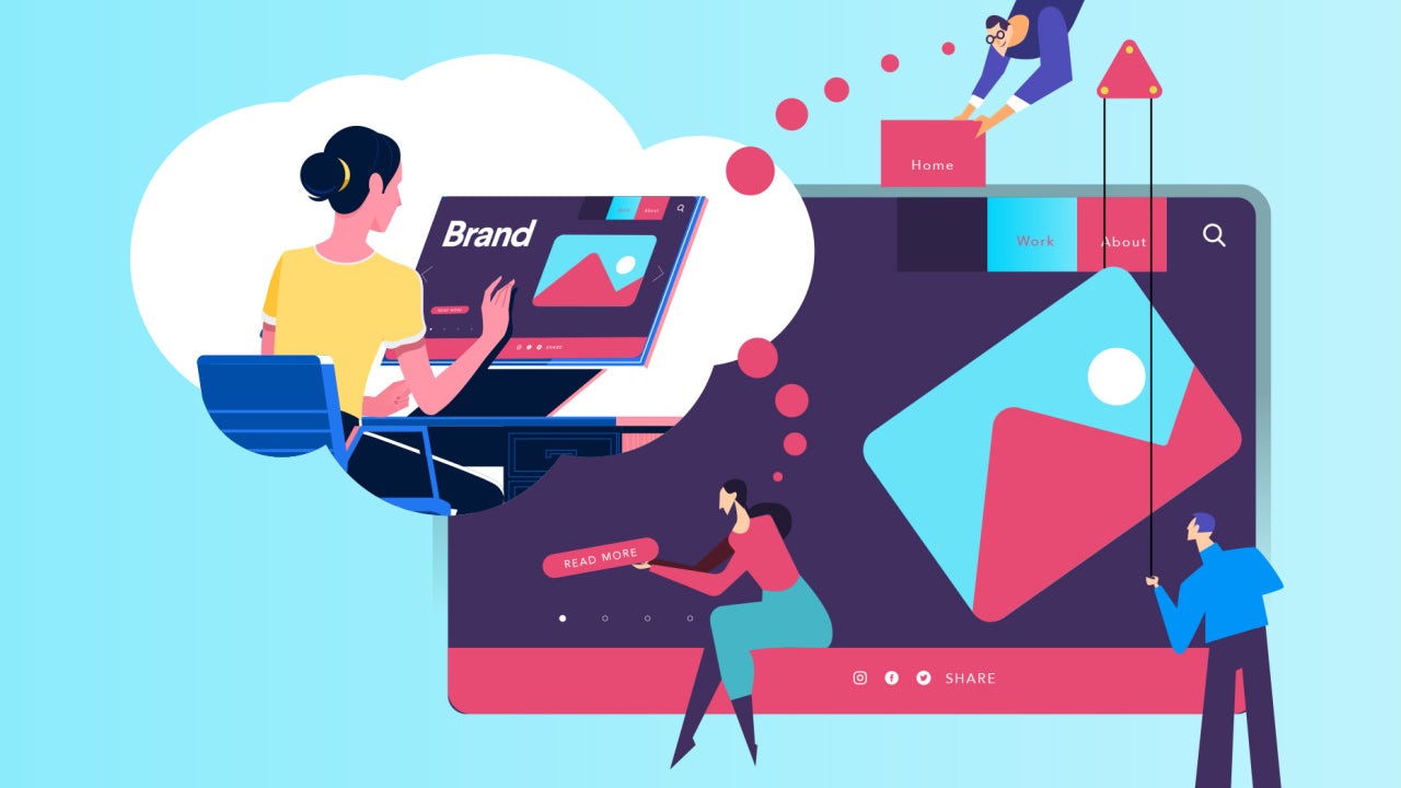
The end result of our UX Design process which is what is shown in the illustration below, are all the deliverables that we are going to read in the section that follows

An Entire List of UX Deliverables

The deliverables that present themselves as an outcome of the Mobile app UX effort is a family that can be divided into four subsets –

User Research

Market Research

Design-Centric

Testing Deliverables

User Research Deliverables

This part of the UX deliverables is concerned with looking into the users’ side of the story – who they are, what they prefer in an application, etc.

User Persona

User Persona Template and Examples | Xtensio

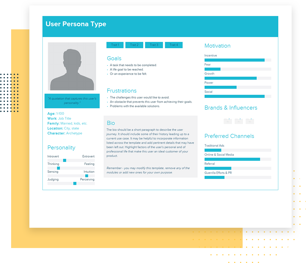
The first deliverable that app UX designers work towards is the creation of a user persona. It is about drawing out an image of your probable user – who are they, where do they live, what do they like, what irritates them, what is their pain point, how do you prefer solving it, etc.

The study gives designers and the business as a whole the idea of whom their software design process is intended for – above all, whom they are not developing the app for.

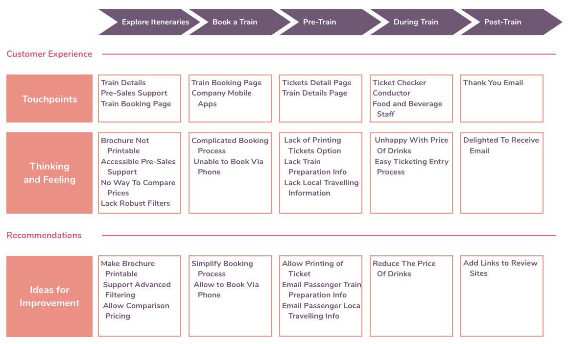
The next part of user research specific UX deliverable is knowing how the user would move inside the application, something that helps draw out a customer journey map.

It is a visual representation to show the actions that a user would take to reach the end goal in an app.

Being in a visual form, the deliverable makes it easy to identify the steps needed to redesign or improve the app, thus setting the ground for understanding what counts as the UX for perfect user flow.

Experience Map

When & How to Use an Experience Map in UX Design | Adobe XD Ideas

This deliverable here is basically a diagram that looks into the many steps that are taken by the users when they engage with the application. It enables the designers to frame users’ needs and motivation in every step of the journey and create a design solution which is appropriate for every step in the customer journey map.

Use Cases

It is the written description of how the software design process would be and how your users would perform tasks inside the application. It showcases the users’ point of view and how the app would behave when their request is responded. Every use case inside the app is shown as the sequence of easy steps, starting with users’ goal and finishing when their goal is achieved.

Storyboard

A Comprehensive Guide To Product Design — Smashing Magazine | Storyboard design, Ux design, Storyboard

Inspired from movie industry, this part of the list of UX deliverables deal with creating an outline of users’ action and the motive behind them. The idea behind this stage is to not just show what is the environment that makes users behave the way they do inside the application.

Market Research

This part of the UX deliverable deals with the market part of the elements that are known to help businesses get an idea of how their app market is moving.

Competitive UX Analysis

EMD Website Flowcharts by Eric Miller, via Behance | Flow chart, Web design, Flow chart template

Designers while researching for the app design will be able to analyze your competitors’ apps – helping you understand the industry standard and find out an opportunity for innovating in a specific segment.

The next part in the list of UX deliverables is specific to the core designing part of the application.

Design Centered UX Deliverable

Moodboards

Mood board, a wise tool — DAY 23. Mood board is an useful tool to be… | by Roberto Pesce | Product Coalition

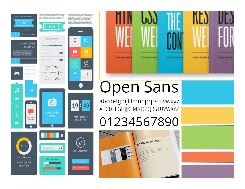
It is that UX design method where a collection of references and images are found which evolve as the product’s visual guide. It allows the designers to showcase the proposed look for the app to the stakeholders before they put any time, efforts, and money behind it.
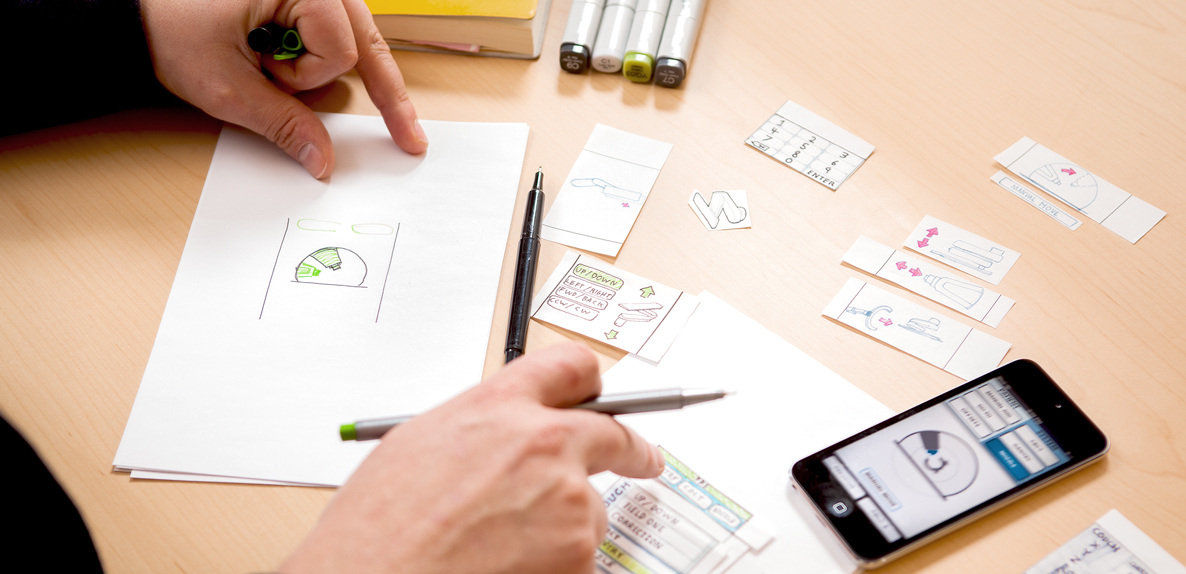
Sketches

One of the quickest ways to visualize an idea – Sketching is what is next in the list of design deliverable. Made using nothing but a pen and paper, it is used to validate the concept of products and the approach related to design taken by both users and the team members.

Wireframe

It is the UX design method cum visual guide which showcases the structure of the page along with its key elements and hierarchy. They have proven to be very useful when the designers have to discuss ideas with stakeholders and team members.

Prototype

UX design deliverables - Best practises of how to use different UX deliverables - Marvel Blog

This part of the UX design process is the simulated version of a semi-final app which is also used for testing purposes before the software is launched. The aim of the prototyping process and answer to What is the role of prototyping in user experience design? is to test the products before developers are involved to move on to the MVP stage.

When it comes to creating them, there are multiple prototyping tools that you can make use of to share a clickable version of your design with the stakeholders, all of which can turn out to be pretty useful when it comes to conducting an A/B test for UX designing.

Once all the market, user, and design related UX deliverables are worked upon, the time comes to look at the deliverables which would help test the design in the market.

Testing Deliverables

Quantitative Survey

The need to prepare questionnaires and surveys that help measure user satisfaction and collect app feedback is what comes under the KRA of app UX designers

Usability Report

These reports rightly summarize the findings related to usability in a descriptive and precise way helping teams identify issues and then work for its solution.

Analysis Report

There is a huge number of insights that analytics tools like Google Analytics fetch and show how users are interacting with the application.

Sitemap

Website Flowchart & Sitemap for Illustrator, OmniGraffle or Sketch – UX Kits

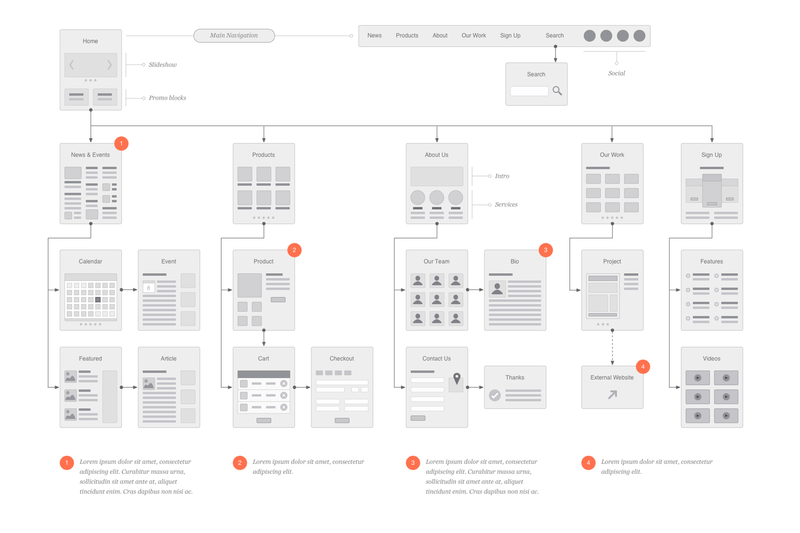
The last UX deliverable, which is also an important part of the UI design methodology that acts as the outcome of the designing efforts is Sitemap. It mainly shows the navigation and hierarchy structure of the application – which helps in giving out the information on how content will get organized in sections or screens.

Which UX Deliverable is For Which Audience?

The stakeholders of your design are not just your users but also your teammates and the company’s board and the clients. So assuming that all the UX deliverables you just read would be intended to explain the concept to any one stakeholder category would be a grave misassumption. Your chosen deliverable will have to vary from your audience to audience.

Let us look at all the different combinations that you should work around.

A. In-house management

When it comes to communicating with the managers or internal stakeholders, the UX deliverables which are mostly deemed ideal is the prototype model and the analytics report.

The prototypes give the stakeholders an experience which is a very close reflection of the final app and thus prove to be a solid tool for showcasing what the users would experience.

On the other hand, usability and analytics reports are also found to be very useful when sharing information with the management, for they present clear evidence of the UX recommendation made.

B. Clients and External Stakeholders

When you have to share the UX designs with the external stakeholders like your client, interactive prototypes and mockups are usually the most opted for deliverables.

The idea behind this is when you work with people who have limited knowledge of UX design and ux review, it is always better to give them deliverables that would place the entire focus on visual design. Doing this will help them see the app’s functionality, its information architecture, and the interaction design which is integrated inside the realistic mockups.

C. Engineers and Mobile App Developers

Outstanding Set of Software Engineers Vectors 180258 Vector Art at Vecteezy

When we talk about communication the UX idea with the developers, interactive prototypes are once again chosen as the right option. But there are other deliverables as well which come across as ideal – site map, style guide, and flowchart.

Because of their detailed focus on interaction specifics and structural details, these deliverables prove to be very useful when it comes to the actual implementation process.

With this, we have seen everything there is to know about not just the types of UX deliverables to expect as an outcome from the UX/UI designing agency but also which deliverable is best for which stakeholder.

Now that you have the necessary deliverable related information, it is time to get started with working on your own app’s deliverables.

Basics of Integrated Information Architecture in UX design

The 7 principles of UX design—and how to use them - 99designs

Your website may have a lot to convey but if the content is not structured properly on your website it could mean people leaving your website soon after landing on it. It is no secret that websites that do well have been designed well and the information on them is easily accessible. However, it needs to be acknowledged that such websites cannot be created overnight and requires a lot of planning.

Well- planned Information Architecture is the secret sauce here that can be the difference between a website that is high on bounce rates and a website that has visitors staying on it for a long time.

By now you’re are probably thinking – But isn’t Information Architecture just another fancy word for UX and UI design?

The answer is No. Information Architecture is the scientific process of structuring the content that needs to be displayed on a website. IA helps to create a blueprint that will outline the hierarchy of information on your website and also tell you about what to highlight or how much to display.

IA helps to organize a website’s content in such a way that it helps a user to easily find it and use it.

UX on the other hand has a much broader umbrella under which IA is also included.Â

Thus to sum up, Information Architecture is responsible for ensuring that there a good user interface in place and it is the starting point for UX design.

Here are five innovative tips that will help you integrate Information Architecture into UX design.

Keep the goals of your products in mind

How to Achieve Your Company Goals in 6 Steps

Before you start constructing your information architecture you need to be clear about the expectations of your users from your website or app. This means that you should be able to see the bigger picture of what is the end goal of whatever is being offered on the website. There should be a clearly outlined product objective and product strategy that is understood by all the members of the creative team. Understanding of objectives means that there is a clear understanding of what to do and where to begin. When goals are clearly outlined, it helps to get all the teams on the same page and designers can get started without the possibility of wasted man hours due to clarity of targets to achieve.

Consider Gestalt principles of Psychology

The Gestalt principles of design: how psychology shapes perception - 99designs

Cognitive Psychology involves the study of the mind and mental processes which help people to acquire, process and store information in the brain.

Familiarity with psychological principles can help designers create designs that will facilitate users performing those actions that are desired of them. For example – making a purchase.

There are psychological principles known as the Gestalt principles that can help designers come up with effective designs.

These principles are

Similarity: Objects that look somewhat similar are going to be perceived as part of the same group. This similarity could on the basis of shape, colour, size, texture or value. This similarity helps users to see unity between the design features. The different circular tabs on the website which talk about the different areas that the WWF works on is are examples of the principle of similarity.

Similarity (geometry) - Wikipedia

Continuation: This principle talks about the flow of the human eye from one object to another. Elements that are arranged in a continuous line are considered by the brain as grouped together. In UI design, the continuity principle helps draw attention to grouped information that will create smoothness on a page and help a reader to move from one content slice to another. Amazon uses the principle of continuity to communicate that each of the products below are similar and related to each other.

Related products, Upsells, Cross-sells in Magento

Closure:  The principle of closure works on the human eye’s ability to close a shape or perceive a shape as complete even though the image or shape might not be complete by mentally filling in the missing pieces of the shape. Artists have long recognized the ability of the human mind to complete an incomplete image and used this in their art. The logo of the World Wildlife Fund www.worldwildlife.org  is   an example of the closure principle.

The Panda Behind the World Wildlife Fund's Logo | PopIcon.life

Proximity:  The principle of proximity says that when objects are placed next to each other, the human eye sees them together as a group even though the elements might not be related to each other. Lines or shapes can be used in UI to surround elements and create proximity. For e.g. putting words and a picture in a box can give the message to the brain that both are in proximity to each other and hence related. Pinterest uses the principle of proximity to great effect to group images together and create the impression that all the images are related to each other although they are not.

Get Pinterest - Microsoft Store

Figure/Ground: This principle concludes that the human eye will separate an object from its background and thus highlight the correlation between an object and the space surrounding it.  AngelList does a very good job with the figure-ground principle and tells us that the focus should be on the white on top of the black background.

AngelList - Wikipedia

Using the principles above designers have created powerful content that draws in visitors from the word go.

Plot the navigation system

A Step-By-Step Guide to Marine Chart Plotting

Navigation can be defined as a number of steps and procedures that guides users through an app or website to explore the various parts of the website or app and complete a successful interaction on the site where their goals are fulfilled.  When it comes to Information Architecture, users should be able to move seamlessly through content on the website or app.

So, navigation is inherently dependent on good IA.

Create Personas

How to Create a User Persona (with Examples) | CleverTap

Different people with different personalities will visit your website or app. Creating personalities or personas’ which are hypothetical representations of the people who will visit your website or app is also a good way to find out how to best position the content on the site.

Based on your research you can create these personas of different users who will visit your website or app for their different needs. These personas will help you understand the needs, aspirations, behaviour and targets of your real customers. The personas will help broaden your horizons about the different kinds of consumers that are out there and help you relate to them. Using personas will ease the process of designing and also help create a good UX for your target users.

Integrate Principles of Visual Hierarchy

12 Visual Hierarchy Principles Every Designer Should Know

The main agenda of visual hierarchy is to ensure that content on a website or an app is designed in such a way that the user on the site understands the amount of   importance that needs to be assigned to each block of content on their own.

This technique takes advantage of the fact that the brain differentiates between objects based on things such as size, colour, alignment and contrast.

Visual hierarchy is of utmost importance in interpreting the content on a website or app and also enhancing the visual performance on the site.

One of the core aspects of  visual hierarchy that designers should keep in mind  while working on the web pages is the scanning patterns of people  as studies have shown that people first scan a web page before reading it.

Designers who familiarize themselves with the principles of visual hierarchy can create an information architecture that will integrate vital elements of content on the areas that are most scanned and thus drive users towards taking the desired actions.

Conclusion

It is important for you to understand the people don’t want to wade through a maze of ambiguous content to finally reach what they need and this means that they should easily get access to whatever it is that they have come for in the first place. Here, information architecture is key to building an interface that will give your users exactly the kind of value that they are looking for. Remember, good information architecture and good UX design are mutually inclusive.

error: Content is protected !!