Features
Any machine learning algorithm requires some training data. In training data we have values for all features for all historical records. Consider this simple data set
Height Weight Age Class
165 70 22 Male
160 58 22 Female
In this data set we have three features for each record (Height, Weight and Age).
Any algorithm takes into account all the features to be able to learn and predict. However all the features of the data set may not be relevant.
Suppose we have 1000 features in a large training data set, using all features may exhaust all the system memory and computational power. So we must choose most relevant features and transform them according the the input required to algorithm. After this process we may find that only 100 of 1000 features are contributing to labels.

We can prepare training data by following two techniques
- Feature Extraction
- Feature Selection
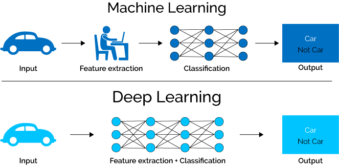
Feature Extraction
Feature extraction is the process of extracting important, non-redundant features from raw data. Suppose you have 5 text documents. Suppose there are 10 important words that are present in all 5 document. Then these 10 words may not be contributing in deciding the labels for those documents. We can omit these words and create new features excluding those words.
TF-IDF technique
TF-IDF technique is a feature extraction technique based on frequency of features in documents
Suppose there is set of documents D(d1, d2, d3)
TF(t,d) is term frequency = frequency of a term/feature value t in document d.
IDF(t,d,D) is inverse document frequency of term t for document d in set D. Here N is the number of documents N = |D|.

TF(t,d) x IDF(t,d,D) is a measure based of which we can say that term ‘t’ is important in document ‘d’. The words for which this measure is really low, we can omit those words in features.
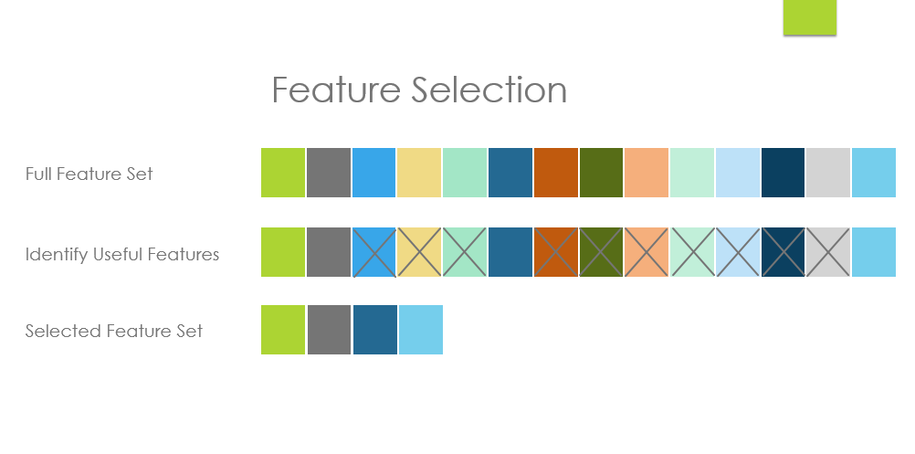
Feature Selection
Feature selection process tries to get most important features that are contributing to decide the label.
Chi Square Test
Chi Square test is a test that tests feature’s independence from class/label and then select ‘k’ features that depend most on class.
Example
Suppose there are some people living in four neighborhoods A, B, C and D and they are labelled as White Collar, or Blue Collar or no Collar
Chi Square test may determine that 90 people living in neighbourhood A are living by chance and not because they are White collar. Chi Square test depends on probabilities.
Chi Square is calculated by below formula for a feature.

Where O values are observed and E are expected.
In the above example, expected values for neighbourhood A for each class can be calculated as
E(A,White Collar) = (150/650) * 349
E(A,Blue Collar) = (150/650) * 151
E(A,No Collar) = (150/650) * 150
After Chi Square has been calculated, its closest value is located in below table for probability in the degree of freedom row.
In the above example for neighbourhood A the chi Square is equal to 2 (rounded off) and degree of freedom here are (no of rows – 1) x (no of columns – 1) = 6
We get 2.20 in 6th row that is most close to 2, it gives us p = 0.9.
This means there is a 90% chance that deviation between expected and observed is due to chance only.
So we can conclude that labelling doesn’t really depend on neighbourhood A.
On the other hand if p values come to 0.01, it means there is only 1% probability that deviation is due to chance, most of the deviation is due to other factors. In this case we can not really ignore Neighbourhood A in our predictive modelling and it has to be selected.