Designing the Right Forms

When I think about forms, I remember the ones that gave me shudders more than the ones that were a cakewalk. And one major difference between the two which I can recall is that the easy ones talked to me in a human language, while the difficult ones looked like I was filling out a form for buying land on Mars.

*sigh*

What’s even more distressing is that these forms still continue to haunt us, even in the digital world. Wasn’t life supposed to become easier in the digital age?

So what can be done to save the world from bad forms?

Design with Empathy.

Usability experts and UX researchers have figured out common mistakes that designers make while designing forms. So, the ball is in our court now. It’s upon us, the creators of forms, to make sure that no form should deteriorate the experience of users.

Before I begin, I want you to go to your design repository and pick up all the forms that you have designed till today. Look at them and answer the below questions for me-

  • Are there any questions that sound confusing to you as you read them now?
  • Are you asking for too much irrelevant information from the user?
  • Have you given enough choices to the users in your multiple-choice questions? Is there a field where they can write their response if none of the options match their answer?
  • Did you give instructions to the user to help him/her understand the form & its purpose?
  • Did you add a disclaimer in the form about how you are going to use/not use this information for other purposes?
  • Did you ask for personal information? Like blood group, marital status- which was, somewhat, not needed for your perusal?

With this exercise, I want you to put yourself in your users’ shoes and answer this- how would you feel if someone asked you to fill this form? Bored, panicky, irritated, satisfied, happy?

Whatever your response is, it will help you figure out your mistake and design better web forms. But first, let’s see what are the common problems that we see in present-day forms-

They lack human conversation

Most web forms lack empathy while conversing with users. They present questions with are confusing, long or just burdensome. But it doesn’t have to be like that. Forms, like any other means of communication, should flow with ease. They should be clear, concise, sometimes clever, and at all times cooperative.

They ask for too much-unrelated information

We all love data but hate filling forms because they ask too many questions. People dread filling forms that ask for too much personal information.

Think of it this way- you meet a stranger while you are on a holiday. You indulge in some small talk but after that, the stranger picks on you and starts asking personal questions- like marital status, hobbies and your source of income. Does it freak you out? Of course!

Web forms are quite similar to that weird stranger.

They lack coherence and character

Nick Babich says-

“A form is a type of conversation. And like any conversation, it should consist of logical communication between two parties: the user and the app.”

Users who land on your form are here to start that conversation. But, when small things like input fields, alignment, spacing, text color, labels are inconsistent and look visually cluttered, it puts them off. It creates confusion and they either skip it or fill incorrect information.

And the list is probably endless. The only conclusion that we can draw from here is that bad forms are omnipresent- a form for registration, another one for a newsletter, a bigger and more complex one for the checkout process.

So, now the mental model is such that when the users come across three to four bad forms while interacting with the website, they assume that it’s going to be a waste of time and effort. They don’t even like the idea of ‘filling a form’. This is the major roadblock to designing forms– how to design a form so that people want to fill it?

We might help you with some suggestions. Here are 7 ways in which you can design better forms by keeping our end users in mind-

Know your users

Most forms on the web are “for anyone, for everyone”. Blame it on our mindset that just wants to collect more and more data, just for the heck of it. More signups=more users. But does more users equals loyal users? Certainly not!

In that mindless race to collect more user information, we often spoil the experience for the real users- the ones whose aspirations we want to meet. So, it’s important to know who is your targeted audience, why they visit your website and what do they want to achieve with the form? Do they want to purchase a product? Or, do they want to receive promotional offers in email?

Avoid collecting unnecessary data

When you ask for users’ personal information, it raises a red flag in their mind and they immediately start weighing if they should leave or continue. For instance, if you’re filling a form for becoming a blood donor with Red Cross and they ask for your email id, wouldn’t you wonder why they need your email id and not your phone number?

Now, as a blood donor, I would want to be notified on my phone, not my email id. And if a form asks me for my email id I would think- will they send me regular emails? Damn! My inbox is already full of spam emails. Should I proceed or skip?

So, carefully devise the questions that you want your users’ to answer. And if there’s a reason behind collecting specific personal information, mention it explicitly in your form.

Explain why you are collecting personal information

Information such as date of birth, address, physical characteristics (e.g. body weight, birthmark), marital status, sexual preference, religion, income, socioeconomic status, cultural background, and educational background are all considered to be sensitive personal information.

So, be aware of what information you’re asking users to fill in the form. Chances are, most users will drop out of the form if you ask them for too much personal information.

Ask questions that are easy to understand

Every user on the web is different. They belong to all age groups and they have their own reasons to browse the web. Some are experts, some are naive. Therefore, it’s important that your form doesn’t feel intimidating to any of them.

If you use abbreviations or terms that are regional or are understandable only to a certain age group, it will confuse people. They will either skip that part or answer whatever they feel is right.

Write labels that help users in answering

Labels are the text which identifies text fields, checkboxes, drop-down menus, and every other information field in a form. They instruct and inform the user about the information that they need to fill in. So, through them, you can communicate the action you want the users to take.

Therefore, make sure that labels are written in a language that helps even the first-time users in answering the questions easily. However, don’t write too long sentences. Labels should be crisp and short. As an example see Amazon’s previous sign-in page as compared to the current one with shorter, better labels.

Group related things together

Grouping related information in logical blocks helps users understand the flow of questions. When you group similar information, users are more likely to grasp things in a better way.

Consider the example below- in the first one, every field is thrown into the user’s screen and it feels a bit overwhelming. The first thought that will come to your mind is- “Am I supposed to fill this entire thing?”

However, when you group things together with proper labels, users understand what part of the information they are filling in personal, account-related, contact information.

Help them when they make errors

When users don’t have a clear understanding of what they need to do with a particular input field, they are more likely to make errors. So, it’s important that you don’t scare them with a red mark. Instead, guide them to success. Make them aware of the correct way with a helpful message.

For example- Facebook helps its users marvelously when they enter a wrong password. if the password that they have entered is incorrect, the interface reminds them that they had changed it a while back.

There are many more ways to simplify the form design. However, there aren’t any fixed steps to follow which will always lead to creating better user experiences. The only thing that you need to keep in mind is- keep it short. And simple. Users love it when they are left to do more without putting much ‘thinking’ into the process. So, respect their time and they’ll respect your designs.

 

Designing with Code

It is an old saying- “A picture speaks a thousand words”. But not everyone can understand that language. So to make a design understandable we use code for designing.Code takes the design more near to the real product functionally/behaviorally. As in terms of professional language for a customer-“Interface is the product”. So the interface need to be interactive. And for a better interactivity a designer should design a functional layout. And to make those functional layouts functioning we use code, combination of -Markup language(HTML, XML etc.), Styling language(CSS, LESS, SASS), Scripting language(Javascript, jQuery, AJAX etc.).Should designers code or developers design? | by Anna Arteeva | The Startup | Medium

There are lots of experiments, inventions that are done to give more life to designs, the mockups are now no longer used or are not enough to satisfy the customer to sell a product. No matter how much strength you put to design a beautiful template, unless it is interactive, even a group of static layouts can’t tell the whole product story. I am saying this because our interface now became more device independent, transitional and alive like a real product.

If we think of a human body, then design is skin and interface are bones, which gives shape to skin and gives it a meaningful body structure.

Let’s stop talking shit and let me show how code do magical designing…

Suppose we have a layout for which our client wants that, it should be viewed properly on all browser supportive devices. So, here comes the magic of code and we will code it once and it will work on all devices automatically. Let’s see how:

Just copy all the code and paste in a text editor and save it as, lets say test.html. And test it on browsers (advanced browsers).

There is a lot more stuff, like a new term which has evolved now a days is “RAPID PROTOTYPING“. It is something we do after design and before we start working on interface designing. The need of this is to demonstrate 20% of the actual product which users use 80% in the product most of the time.

Fluid spaces in design organisations

Back in 2010, when we were a handful of designers working in an apartment, there was just one spare wall where we had mounted a huge whiteboard and named it “The divine wall of ideas”. Whenever we were stuck, we thronged to that wall and drained all our shitty thoughts. And after hours of brainstorming, it would bless us with some great ideas.As our team grew, more designers joined our team. With more people in our tribe, our hearts grew but our rooms shrank. Our “divine wall of ideas” was no more divine. When all of us were together, we felt like chickens in a coop. Everyone blocked each other’s view and we heard frequent elbow-knocks and sounds of ouch and oops when someone tried to reach the wall.Why it's important to have fluid spaces in a design organization | by Quovantis | UX Planet

We began to realize that limited space was causing hindrance to our creativity and lowering our productivity. We wanted everyone to participate in our design thinking sessions, wanted them to see user personas, snapshots of the existing UI, and sketches of proposed solutions so that they could critique it. But we realized that our paraphernalia needs physical space. One can’t just do all of this effectively without any board to draw/sketch and without any space for people to sit/stand.

And this isn’t some fancy thought that we made up ourselves. It’s backed by research and many design leaders agree that fluid design spaces improve creativity. Scott Witthoft, author of Make Space: How to Set the Stage for Creative Collaboration shared in an interview with HBR–

“When you’re generating ideas, it becomes really important to be very fluid and have the ability to move in and out of different concepts and different people’s voices as an idea’s coming to fruition. So creating a space that allows movement, allows active posture to really help collaboration move more smoothly, and can forward creativity by allowing people to participate when they want, step out when they don’t, and allow leadership to move throughout the group.”

So, we did something big. We moved our entire office to a bigger, better place. Well, there were other reasons too which aided our decision. But, you could say that it was mainly because we realized that we can’t trade our happiness with anything. If people aren’t happy with their workplace, then they’re probably dragging their feet to work. We couldn’t bear that thought!

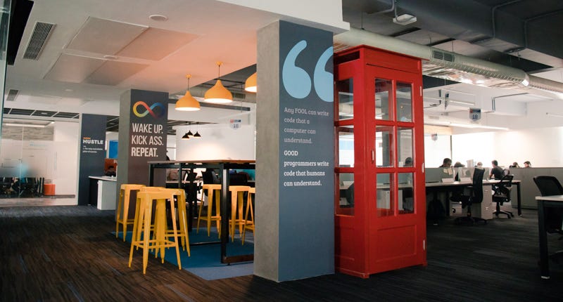
It’s been almost a year now that we’re in our ‘new’ office. We used this opportunity to rethink how we wanted to make the best use of the available space. We have made conscious choices in making design thinking sessions more productive and interactive. Most of it was inspired by companies like Apple who have made commendable efforts in popularizing the idea of such fluid spaces to espouse creativity. We owe it to them.

So, let me take you around our office then-

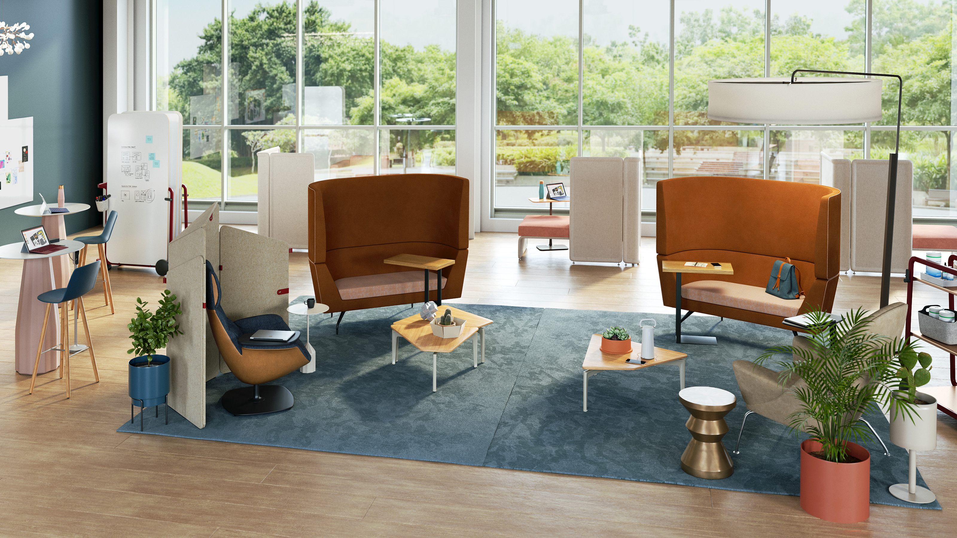
Elevated tables and chairs

Collaborative & Social Space Design After COVID-19 | Steelcase

This is my favorite spot. It especially works during mid-day design sessions when people are caught up with deadlines and it’s hard to get their attention. The high-tables, as we call them, allow them to take a break and stand together close in the upright position. It’s a space where people can get comfortable, but not too much.

You can spread your ideas, sketches or prototypes on the table and open the discussion for everyone. When you have this setting, it makes people aware that you are open to critique and they feel more inclined to share their honest feedback.

Also, these tables are located at places where people have high chances to bump into each other while walking around. So, imagine you’re sitting at the high table, working on some design and a fellow designer walks past you carrying her coffee mug. She stops by and appreciates the color gradient you’ve used, asks you to teach her how good gradients are made and also tips you on two new Sketch shortcuts to speed up your execution. Isn’t that a great conversation?

Whiteboards and Glassboards

Glass Whiteboards and Glass Dry Erase Boards by Clarus | Whiteboard wall, Glass dry erase, Glass dry erase board

At Quovantis, we value simplicity in the processes that can help us get our ideas out quickly. So despite all the digital tools that are out there, we still are a huge fan of whiteboards and glass boards where we can draw, doodle, write and paste Post-its quickly- a fast and efficient way to communicate.

So when an idea bubble appears, we quickly gather on the nearest wall and put it up for people to see and critique. And then we let it stay there so that everyone can see it, reference it, and can go back and share their thoughts on the pile. The visibility and accessibility are very important in every design session.

Meeting rooms

Our meeting rooms are a manifestation of the fantasy world we admire. They were named after voting democratically within the organization. One wall of each meeting room has the famous quote of that fictional hero/place. For instance, Diagon Alley and Shire have quotes about Hogwarts and the mystical land of Narnia.

From the design point of view, we’ve kept the visibility of meeting rooms neither too protective nor too revealing. It’s such that people who are inside the room don’t get distracted by what’s going outside. And, people who are outside can steal a glance and get to know if the meeting room is available or occupied. Such visual cues help people in overcoming mental blocks to rush into a room and start a discussion.

Abundant open space

We all have this natural tendency to crumble to negativity when things don’t go as we plan. And that’s why we have tried to keep the office interior spacious, happy and uplifting. The empty space allows us to make use of what Scott refers to as “impromptu pop-up team spaces”

There is one corner near the bookshelf and plenty of space near the couch to sit and have a discussion if one is bored with their sitting space. One can even walk around with some hilarious quotes and illustrations around. I remember, one of our teammates, told me about how he found creative inspiration in the office cafeteria.

THE UNKNOWN MANTRAS OF DESIGNERS

“ABCD”, AnyBody Can Design. That’s right, anyone can become a designer. Attaining a specialised certification or having an expertising degree iis not necessary. If you’ve mastered the graphics software, you can simply become a designer. Learning softwares usage online and mastering does not make it illegal. It’s perfectly legal.The 7 Success Mantras to be a Great Designer | by Abhinav Agrawal | Muzli - Design InspirationSo, is design a science or an in-born skill? How do designers work?

The thing to remember here is design has two sides, one is creative and fun and the other is challenging and even daunting. And so, designers should also be problem solvers towards business troubles as well as aesthetic matters. Both of these are like bicycle tyres, like a human’s feet. It’d work only if both sides are balanced, else you’d find yourself limping. You must be very careful in maintaining the balance.


PROBLEM SOLVER

Being a designer, this is your first and foremost requirement. You should first know the problem and then conduct a deep-rooted analysis. The aim is to come up with such a solution that leads you to the path of achieving your goals. Now how do these analysis processes take place? What is the tool?

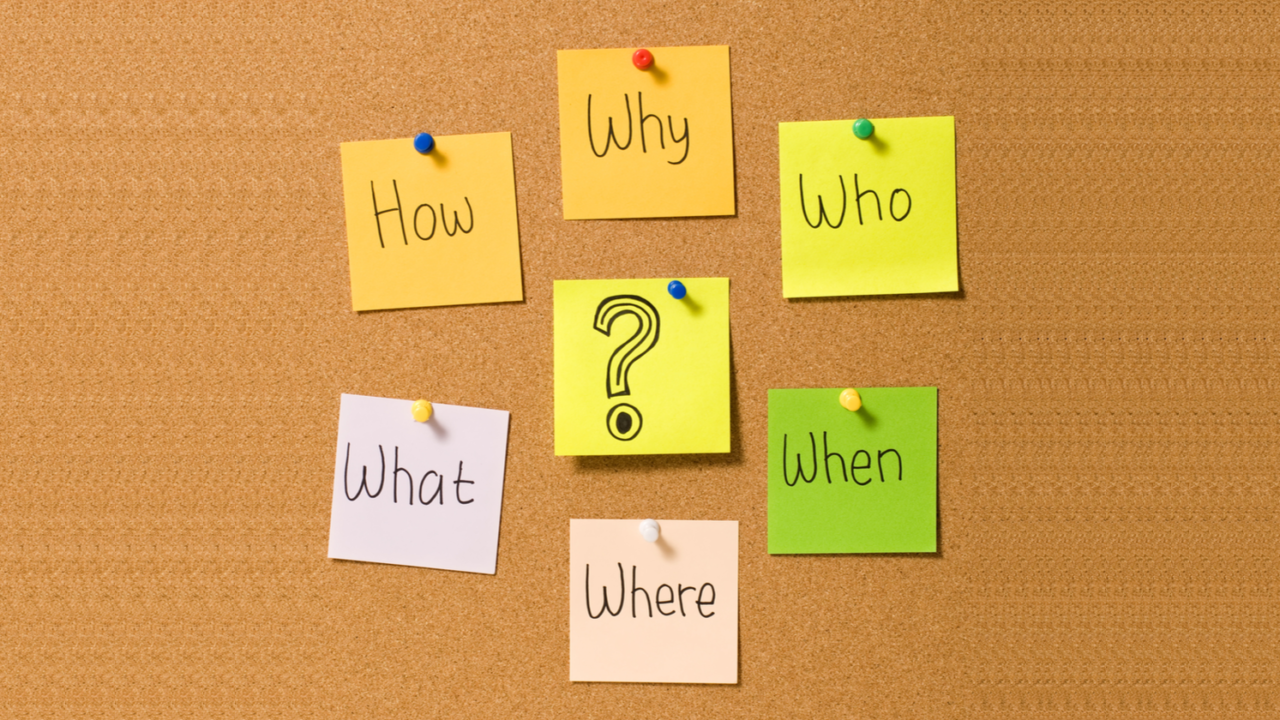
The best is the usage of 5Ws & 1H, i.e., What+When+Where+Why+Who+How. The right steps guide is, know the problem first, then find the context. Now once you’re aware of the context, make sure you know the precise purpose. Working without purpose would lead you nowhere. Take a note here, there is no need, absolutely none, to rush the finishing of the graphics software. And that is because not all problems can be solved with a sketch.

The 5 Ws (& 1 H) of Content Marketing

Designers create sketch solutions in the form of wireframes to solve the problems. Wireframe designs can be really wild, if you really get to thinking of the solutions. It’s a fact that beautiful sketches and hand-made drawings are not always capable of solving strong issues. Now when such a stage comes up, internal validation enters the picture. It is best to validate at the earliest stage possible, so that you get a definitive answer.

The method of analysing is not exclusive to UX/UI designs, rather it can be applied to the designing of illustrations, brand logos, etc. In principle, design is for knowing the problem, analysing it and then finding an appropriate solution. That’s the main function.


VISUALIZATIONS

The second mantra is visualizations. The design made at the initial stage, in the form of wireframes is processed in a way that is pleasing and looks absolutely beautiful. In this phase, designers can demonstrate their capabilities in the appearance department. You can tweak or completely subtract the placement of visual elements like shapes, lines, etc. Avoiding the clutter and instead leaving out acceptable white space for the perfect fit of the talking stage. 

Processing graphics is like the dominant part at this stage. The designer’s choices and skills are the difference makers. Creation of style and possibilities in the main graphics software happens essentially because of the sensitivity.

Later on, the resultant wireframe is transferred over on the UI, which is beautifully done. It has an appearance where the colours are popping, option buttons are making you want to click on them. What more to ask for as a designer? The success of your design and work is all that you need!

The 9 Best Analytics Tools For Data Visualization Available Today

Now, if you have both these mantras as characters in you, a problem solver and a visualizer, then there you go. You are a complete designer, a balanced one who can provide amazing solutions.


Furthermore, you should always be wanting to improve. So how would you improve your problem solving skills?

The thing is you will be solving problems, if there are problems. But the trick is, look for problems. Analyze every situation and try to improve it. So you question, “what if?”


There are multiple applications, products, websites out there and they all have scope to improve. There always is. You just have to work your way through the application/website and then figure out the issues that you probably face during the course. Not all of your queries down.

This process is a major part of running an analysis. An effective analysis gives a result wherein you find the best of best solutions. However, validation is of essence. You have to validate your resultant case study with the users through constant testing, this will tell you whether or not your solution is effective. 


Secret mantras aren’t exactly a secret. We shall grow and learn together, so share the secret so that you don’t have a secret to guard anymore!

APPLYING FOR A DESIGNING JOB

Finding the right choice for a designing job can be really challenging. There are several aspects that are to be covered for applying, but your initial presentation should be impactful. What happens in most of the cases is that the applicants don’t represent themselves and their work in the right way. Hence, we’re here to help you better understand the process and aspects of applying for a designing job.How to Get a Job as a Graphic Designer | Glassdoor

SET YOUR GOALS

You need to ask yourself, ‘what is your passion and what is it that you want to do?’. And if you are not sure, then you need to figure it out. It is best if you talk to someone who’s already in the same profession and industry. This will give you a much clearer vision and you would be able to figure out the direction you want to go in.

Answering the Interview question: Where Do you see yourself 5 Years from Now? - Naukrigulf.com

One question that you will be asked in every interview is – “Where do you see yourself in five years?” Now the important thing is you need to know the answer for that question for yourself. So make sure that you know what you want to do in your life and just focus on it, this would help you a lot and even make it easy for you to plan your future.

Be sure of building your career in an environment you can thrive in. Because the people around you can really affect your job and your career in the long run. So, you would want to find a job with an environment where people have passions similar to yours, connect with those people and you will go a long way in your choice of life.


WORK THAT PORTFOLIO

First impression is the long lasting impression if not the last impression. So, with your portfolio, you make the first impression. Your portfolio is the first thing your potential employer will look at. You have to work hard on your impression and present a few of your projects that you’re most proud of. Remember a portfolio is not just a bunch of sheets, it is how you present yourself and your way of thinking, so make sure every minute detail is perfect.

How to Organize Your Portfolio for Your Job Interview

Try to avoid portfolios in pdf forms and dropbox folders with screenshots of your designs, especially if you’re applying at a digital company. There are a bunch of great online services that can help you build your portfolio in the best way (like Readymag, semplice, etc)

As a designer, always try solving the problems at hand with your projects. Talk about the approach you went with and the process you had whilst working on the said projects. 

Here a few things that you should consider while sending your portfolio:

  1. What are the goals of your project?
  2. What is it that you want to solve?
  3. What is the background of your project?
  4. Who are your users?
  5. How do you plan on solving the problem with your project?


Design is not just about creating beautiful things, instead it’s about following the right process and employing creative storytelling to come up with a solution. Which implies, functional utility > aesthetics. 

A lot of times, people looking for a job say that they don’t have any work to show, since they didn’t get a real opportunity to work. You should know that you need not worry about not having any experience of working in an agency or with clients. There might be a website or a tool that you use in your daily life, one with which you would have had a bad experience.

Now, look into and find out what the problem/flaw is and try to come up with a solution for it, as to how you could improve it. There you go, you can present your work and approach by resolving the problem.


Be extremely careful with your portfolio, keep in mind all the current technologies and the latest designs for the same. Lastly, show what you are best at, and what you would want to work on.


INTERVIEW: PREPARE YOURSELF


First, research the company thoroughly before you go for the interview. Gain knowledge about the people who already work there and try to find them on social media. You will find a lot of useful information that may help you further. And, don;t forget to research the clients’ they are working for and the projects that they have done so far.

The 5 Best Interview Questions Candidates Ask During Job Interviews

Second, be ready to present yourself and your work. Critiques help you sharpen your communication skills as a designer, as there is always scope for learning how to articulate what you did, how you did and why. Basically, it will help you in explaining your idea to the reviewer in a much better way. 


The last and the most important key, BE HONEST. Nobody is perfect, so you remember to communicate them to your reviewer/potential employer.


CONCLUSION

Explore different companies, their profiles and websites, where you will find what they do and how they do it. And also about the people and the culture in their company. Attend design workshops and meetups, you have the best shot at meeting and getting to talk to people from the industry, you will find a lot of insightful information. And lastly, stay fresh with your portfolio work and keep yourself updated on the current trends in digital designs. Remember, this not just for applying to a job, but for all times. It’s good to stay updated all time. 


error: Content is protected !!