Where to look for Pro Design Inspo

FAIR STATE BREWING COOPERATIVE

The not- yet- open Fair State Brewing Cooperative is Minnesota’s first cooperative brewery. Their motto? “We love to brew good beer. We love the good people who love our beer.” Their website reflects this message. Scrolling through the clean design, you learn all about the new company and their commitment not only to stellar beer, but also to their community of beer lovers in the co-op. It’s an honest, simple site.

HOTELSTYLE

There’s not a lot to this website for the obscure Italian clothing store, HotelStyle, but we like the presentation of the full screen video that opens the site. The video features the kind of man your mother would not want you to talk to (when you studied abroad in Florence) modeling the company’s clothing. The angles are great.

YEP!

Yep! is an app that “creates instant meetings with fun people.” You choose an activity- a walk, a meal, a tennis match- and the app finds you a friend. In a couple short scrolls on their creative website, you not only understand Yep!’s mission but you become excited about it, too. Yep! is based in San Francisco, but we were impressed with the ability to view the website in Russian. Can’t wait to try it out.

NEOTOKIO!

The designers over at Italian design agency, Neotokio!, are currently on vacation and instead of directing you to their regular website, Neotokio! has designed a lovely scrolling popsicle that announces that they’re out of the office. Their website is not only super interactive, it’s exciting and brilliantly designed. Scrolling uncovers a site full of great content.

MEDIABOOM

MediaBOOM is a digital design agency in Guilford, CT. Their website features an impressive portfolio while animated full screen video plays in the background. Definitely check out the tour of “MediaBOOM: Interactive Capital of the World!” in 3D. Don’t skip the intro.

TCM’S SUMMER UNDER THE STARS

This website is interactive, beautiful, and educational. The movie lovers over at Turner Classic Movies has produced an awesome website for their “Summer Under the Stars.” All summer, TCM has devoted an entire day to one classic movie star. On TV, the day is filled with back to back movies featuring the actor. Online, the website provides information about the star and allows  you to reflect, via social media, on why that star was legendary. It’s all part of the network’s new marketing scheme. Today’s star? The American actress Jeanne Crain. Our favorite website this week!

Telling a story with motion graphics!

How to tell a story with motion graphics

Everyone is a storyteller at heart. Some of us develop an outlet to express our thoughts. Some of us don’t. It’s doesn’t matter if we express it or not but some stories just find their way out in the world. Every incident is a story. Every experience is a narrative. And we drive these conversations, effortlessly. Don’t we?

The incredible thing about stories is that they are not just confined to spoken or written words. They are independent of a requirement of a medium. The only components needed for a good story are- a storyteller and someone to hear that story.

I, for instance, chose to be a storyteller through motion graphics as my medium. I found the idea of breathing life into static experiences exhilarating. Everything in motion is a story in itself. The wind that blows leaves, the sound and movement that a pendulum clock makes, the chaos that rains cause in Delhi, all become my muse from time to time.

My job as a motion graphics designer is all about telling a story with pictures, sound, and videos to create an experience that is meaningful and impactful. But, like everything else in the world, it’s not an easy job. It requires a lot of thought much before I lay my hands on the tools and get into the process part.

I usually spend a lot of time in structuring a fluent storytelling flow, fretting over how to make it appear natural, and most importantly trying to not over-complicate the message. Sometimes it works, sometimes it doesn’t. But the good thing is I know when it works. Every time I follow a structured approach, the result comes out to be spot on. I am happy to share it with all of you, feel free to add yours to it-

Conceptualization

20 Brilliant Animated Motion Graphics Video Examples

I can’t stress enough this very basic step. Take my words, you are forbidden to skip it. This is THE MOST important step in creating motion graphics. No matter if you are creating a 30-second clip or a 30-minute piece, you can not afford to mess with the structure. Thanks to the internet, the attention span of our users is in seconds. You only have a little time to make an impact.

As a rule of thumb, I start by fleshing out a clearly structured story. I ask myself three questions-

  1. Who am I making this for?
  2. What action I want users to do with this?
  3. What emotion I want them to feel?

Once you have the answers to these questions, it will be relatively easy for you to make progress.

Storyboarding

Motion graphics design process: How to create a storyboard - YouTube

After conceptualization, I move to create a high-level story (or, storyboarding as I call it  )

On a paper, I draw stick figures to identify the core structure of the story- how they are entering/exiting/interacting, what are the transitions needed, what are the text/audio requirements, and things like that. The storyboard helps me stitch together every frame and it helps me visualize the entire story.

As I am the only motion designer on my team, I show my storyboard to my fellow designers and take their feedback. It’s always good to take other people’s inputs before you get started on the final script. I totally recommend that.

Design

Free Design Elements for Motion Graphics Artists - PremiumBeat

Voila! Finally. This is indeed the most exciting part. Here you get to give wings to your ideas and see them come to life, piece by piece. The design part is mostly technical. You might want to use your own style here, but I always stick to our brand guidelines. So the ball is entirely in your court.

Just remember that design is not just about adding popular animation styles or fading in/fading out various scenes. It’s about stitching a cohesive story together so that it flows in the blink of an eye. The timing, the voiceover, everything has to be in perfect sync with motion.

UX MESS-UPS THAT CAN RUIN YOUR PROJECT

Designing isn’t merely about following fancy trends. It is about creating stunning visuals, thoughtful user experience and mind-blowing content! There goes a lot of work in creating a fully competent and workable design.

Creating a great UX is all about learning, observing, analysing, interpreting and testing. It’s the process of making good experiences for the users. Although every designer is aware of the UX core principles, but, there are a few mess-ups that can be troublesome for their projects.

LOREM IPSUM < REAL CONTENT-

Anteelo design - LOREM IPSUM < REAL CONTENT-

Internet usage ultimately boils down to content consumption. What users consume on the internet is what affects them and their thoughts. In the majority of the cases, the consumed content manipulates the users’ decision, which may or not lead to the right conclusion. As designers, you can easily fall into the trap of using ‘lorem ipsum to wrap up your design as quickly as possible. Reality is that, using placeholder copy makes your design look like a half cooked product and so it becomes hard to relate to. Our aim is to create design experiences, not templates. And this is possible only if real content is used in your design. It helps you to create a finely tuned experience tailored specially for your target-audience (TA).

The way to solve this? Is research:

Research your domain thoroughly. From methodologies to terminologies, everything. Use real content that will catch your end-users attention. Start with writing a provisional copy to set a tone and strategy and then later it can be revised again if required. A content writers’ team can do that for you. They can separate the content that matters and the ones with flaws. This ultimately helps experience what the live page would feel like and in return discussions and reviews would be made much easier. 


NOT HAVING A DEFINED TA-

Anteelo design - NOT HAVING A DEFINED TA-

Generally what users find on the internet is universally generic content. They find that content, take time to process what they are looking for and then understand it. All of this creates a certain distastefulness in the users. A very common mistake is that designers writing content like it is for them and not for the users. Now, this can land as an issue.

Answer to this mistake? Create Personas:

Persona is the users’ voice. Research your users, their behavioural aspects, preferences and requirements. Now filter out your research and throw your focus on what needs to be done. Create various groups according to the condensed information and then create realistic personas, based on their experiences, needs and behaviours.


IGNORING DIFFERENT LAYOUTS-

You might easily love the ideas and designs that you come up with, but they might not always work. Sometimes they will fail and hence leave your goals incomplete. Even the good ideas fail. And this happens to the best of us.

Want your goals achieved? Answer is testing:

Merely creating designs is not enough. Conduct user experience tests with different variants, so that there’s something to compare your main design with. Such testing techniques will lead you to know, whether or not the intended effect on your users is working.


PLACING IRRELEVANT INFORMATION-

Anteelo design - PLACING IRRELEVANT INFORMATION

Every user is on a different user phase when they are at your product and hence they might be looking to seek different information. So if you bombard them with truck loads of data, they will get confused and their needs would remain unfulfilled. It is critical to provide your users with only relevant information. The users also might be using your product in a different context, according to their own needs.

Analyse your user(s) journeys to solve this:

The easier it gets for the users to find their required information, the more better acquired your product gets. Based on the realistic personas that you created, further create user journeys. Consider the scenarios your user might be in, the experiences they felt and so the information that would make sense to them. Think of, (a) the users geographical position; (b) what they did before and what they want to do now; (c) and what they want to do next.


UNORGANISED INFORMATION-

Anteelo design - UNORGANISED INFORMATION

When there is a massive amount of information available on the platform, the users might find it hard to find. Now in this situation, unstructured information is just like cherry on top. A user can find it hard to navigate through the product and will end up having a bad experience.

Solution? Become an architect for the information:

Prioritize the most significant features and then create the required navigation. The goal should be to make it easy for the users to navigate through the product. Consider, predict and make it clear as to what their possible actions and scenarios might be. Sort through the information and structure it the right way. remember , it is not for you. It’s for the users. Information hierarchy is very significant for the product to be successful.

Ask yourself the relevant questions and then you will be able to find the answers to solve the said problems. Research, analyse and imply the refined ideas.


WONDERS OF WORKING AT A DEDICATED DESIGN STUDIO

Working in the field of communications and PR, we have come across and have had the chance to look closely at how designers work. Designs have always had something about them which is extremely fascinating. Whilst observing various design departments, we found out why designers are the happiest and at their utmost satisfied state in a dedicated design studio.


INEVITABLE GROWTH-

Although the industry is still in its early stage, but, it is growing at a sheerly high pace. Professionally designed digital experiences are now considered the base layer for a business’ success and hence they are becoming even more crucial. The better part of it is that, designing is not limited to a specific field rather it is required by all kinds of domains that are entering and exploring the digital world. And in today’s world, there is no business without an online profile, so ultimately, every business needs the designing service. And so, UX/UI designer’s job is one of the highest requirements in demand now.

TRADITIONS OF A START-UP-

Majority of the design studios have just started out, in their early stages. And so they have cool new traditions. Generally they have small close-knit groups and they work crazy hours accompanied by frequent parties and celebrations. The bonus about working in the renowned design studios is that you get to work with different industries in the design department, therefore, you gain lots of experience.

E²: EXPOSURE AND EXPERIENCE-

Design studios make you learn and help you grow simultaneously and you indeed would do so as well, that’s a ‘for sure’. If you are working in an IT company or for a product, you would be adding value to one or two parts of the designing process. While on the other hand, if you work in a dedicated design studio, then you get to work in various projects from several industries. This way you’d keep on adding value to your profile, whilst learning and growing. What more to ask for than a priceless portfolio, that leaves companies with no choice but to work with you and get you on board.

SHAPING PERSONALITY-

Working in dedicated design studios requires for you to come face-to-face with clients. Where you converse with them, understand their needs and justify your design to them with a clear perspective. This does nothing but shape your personality and develop your communications. Having a great personality does leave an indistinctive mark on the client.

LEARN AS A TRAINEE TO WORK AS A BOSS-

As it is said, “with great power comes great responsibility”. It is really important for you to realise that when you choose to learn and work, you must also learn to work towards ownership. When you work on a project that is under your responsibility, you automatically learn to meet deadlines, expectations and to put up a great show. In all of this, you significantly learn discipline. Now because you are trying to produce substantial and efficient results, you will keep learning and updating your skills, because time doesn’t wait for anyone

ACKNOWLEDGMENT AND APPRECIATION-

Appreciation makes innovation easier. Designers get acknowledgement for their work, thus, leading them into creating new styles and setting new benchmarks. Being appreciated only fuels your brain to imagine and create. Now what more to ask for than a versatile pace in innovation. It’s definitely a plus, innit!

Before wrapping this up with the final thoughts, let’s answer one last question, that is likely to pop in your head while you read this piece. Money. To be fair, such studios do pay you really well. Although it does not pay an insanely high amount, like an IT company or a product would do. But the designing field needs passion and innovation the most and dedicated design studios present that with grace.

Now all you need to do is, reflect, think and decide.


MUST-LEARN THINGS IN DESIGN SCHOOL

Getting fresh out of grad school, with a degree in design, it’s almost natural to feel like you’ve finally conquered the design degree. You might think, now that you’ve mastered designing, you can go ahead to soon become a star designer, working with magnificent clients and world-famous brands. It’s good to dream but it’s wrong to assume it’d come this easy. All of this is far from the truth. Reality hits hard when you join a designing company and begin working. You will come to realize that before considering yourself a complete designer, you need to understand the fundamentals and know the crucialities of designing. However it may sound, portfolios won’t help in your successful career, merely your skill and knowledge will lead to your success.

The things you learn at your first job and even in your further jobs will always be as crucial as your educational degree. Designing alone won’t suffice, teamwork, communications, client-skills, social aptitude, professional relations, all of these things play a significant role in your dream of becoming a successful designer.

Here are a few things you’d wish to have learnt in design school!

SOFT SKILLS

If you’re an artist, then why are soft skills required? Well, being a designer, having knowledge about design only is not quite enough. In order to do designing, you will first have to think, observe and articulate your ideas. You will be required to have justifiable ideas and designs. If you won’t be able to answer and explain the why’s of your choices to your clients, then you’d have to say goodbye to client-satisfaction. If you don’t have answers, then you won’t be able persuade your clients, leading to the crashing of your plans and ideas. Furthermore, you have to manage your time, communicate with your seniors and interact with your teammates, maintaining a cordial relation with everyone. Hence, you need to make sure of acquiring soft skills before you jump onto your plans further. 

MANAGING CLIENTS

Managing multiple clients is not at all an easy job, it gets harder as you grow along the way. It’s not to scare you, rather, it’s here to prepare you. You must follow one rule of thumb- LISTEN. Remember, hearing and listening are two different things and to manage clients effectively, you need to listen. If you listen properly, only then you’d be able to clearly understand clients’ views, needs and feedback. This also enables you to understand whether your idea has been bought or whether it turned out like a slam-dunk, straight up dead. Being capable of responding positively to your clients and being welcoming of their feedback, helps you in managing the clients better and get your work done in an efficient way.

FUNCTIONALITY >  DESIGN LOOKS

Real world websites are for providing better results and not just for pleasing aesthetics. Designing pretty looks is not effective, if it’s not functional and dynamic. Hence, we aim at designing good-looking, yet functional websites that appeal to the target audience effectively. This helps you beat competition and let’s you stay on top. At the end of the day, we create and design websites to build a brand, take lead and drive audiences.

NEW IDEAS, ALWAYS WELCOMED

Designers are constantly required to come up with fresh ideas for brands and sometimes even are asked to bring multiple ideas to the plate, for the same project. It can be quite intense! And it’s a possibility that you might get designer’s block, so to break it you will have to sit down with your team members. Then you brainstorm various ideas, discuss and sift through those ideas. That’s how you quickly come up with fresh ideas and interesting design angles. It makes things a lot smoother.

THINK BIG, LOOK AT THE WHOLE PICTURE

Working a job requires completing tasks within tight deadlines, where you have to make close calls. It can be really consuming. The deadline pressure makes designers forget the essence of time and hence leaves designers caught in the web of little details and nuances. Therefore, it is important to be able to take a pause and have a good look at the whole picture, every design, detail and variation. To help create focus and effectiveness, ask yourself this- what is the purpose of my design? Where is the user and what do they require? How will my design provide sense to the user’s decisions? What are the technicalities?

Once you find the answers to these, you will be able to calmly get your work done.

OWN YOUR STYLE

Design school often asks you to design for a specific set of products and hence you end up with similar designs. Although, you learnt a lot but you weren’t challenged enough. You need to have that kind of challenge every now and then to jog your sense of style. You owe it yourself to find your own style and way of conducting your work. Your unique approach is what will get you up that success ladder, it will make you stand out in the crowd.

Here’s the path to your dreams, become that star designer! It might feel lousy at times, having to go through a long process, but trust me, it is worth every second. 


Anteelo’s Development Process

Can great products be built without having any solid development processes? I don’t know but I can confidently say that it’s a definitive topic for a thesis. Well, we decided to do away with all the development processes for one of the coolest products that we are building.

Anteelo : Mobile App Development & Digital Transformation

You did what!?

Yeah, Unbelievable but true.

It must be burning in flames, isn’t it?

As a matter of fact, to the contrary, we not only got done sooner but it works great.

You kiddin’ me, right? It ain’t even 1st of April today?

Nope. It’s sad that we have been conditioned to believe the processes are a panacea to all our software problems and helps build product the right way. Come to think of it, it is probably true to a large extent for certain kind of software projects but you can still make magic without it.  It is always about the people.

So, what was the darn process? Or, whatever you are calling it?

Actually, we decided to build the software in an extremely simple yet agile way. Really, it was darn simple. We call it “V1P” – Version 1.0 Process.

Anteelo landing page design inspiration - Lapa Ninja

Ideate

Sudesh and I spent lot of time envisioning how the product would look like. We did lots of wireframes/HTML prototypes before even laying the single line of code or thinking about design. Once we were comfortable with our idea, we decided to put the features in an excel file.

Plan

We created an extremely simple spreadsheet with all the features and task and divided them in 2 week iterations.

White boarding

We did an extensive white boarding of the design and how different components/layers would interact with each other. And, that was our design.

Communicate

As we were working very closely(ahem..I meant we sit next to each other), we used to have informal stand ups. Well, technically, we were always sitting down while having these meetings. So, more like sit-down stand ups – Huh! Oh well. We used to discuss for 15 minutes regarding the progress and any impediments.

Build Trust

We never went back and updated our status. Doh! The source code was the barometer of our progress. It’s funny what all can be communicated to each other when you trust your team mates and build on each other’s code.

Deploy

Sudesh deployed the code every other day so that we could see if anything was broken. Yup, no nightly build process for us. Come to think of it, I missed this the most. I think going forward, we would have some sort of Continuous Integration like we do in our other products.

Fix and Move Forward

We used to fix bugs before moving to any new functionality.

Rinse. Lather. Repeat.

Well, that was our process. You would be really surprised that we got done with the alpha version of the product in straight 3 months. It’s a fairly complex product and I’m sure it would have taken more time if we were to follow everything by the book. I think the thing that led to our success was lot of brainstorming early on and having immense level of trust.

It’s a different thing if the product becomes successful or not. Well, it’s coming soon. Wish us luck!

PS – I’m sure you must be really thinking that it is really applicable for products which are being built in a garage by couple of hackers. Well, may be. It’s not something that we follow everyday but has produced great results for us. Also, I don’t intend to follow it in our products of fairly large size which need lot of interactions but something I’m ready to stick with for smaller teams.

DESIGN THAT DREAM DASHBOARD

Our world is driven by big-data and in this world, dashboards are of utmost significance for providing users with information in just one glance.

Like the dashboard in a car, businesses also employ and utilize dashboards to summarize large chunks of real-time data in a limited space. The information is broken down in a way such that it doesn’t become visually pressurising. This representation of information allows you to measure your data and pick out the areas with scope for improvement. If done right, dashboard designs can bring about a visible difference in the business’ performance. 

Although designing is fun, but, designing a dashboard is not a piece of cake. Rather, it is a quite challenging task. Despite having those inner-creative desires, it is best not to unleash all of your creative streak whilst designing a dashboard. It’s better to keep it in control before it goes out of hands.

KNOW YOUR AUDIENCE

Dashboard is assumed to be allabout data, but that’s not true. It is about information and enabling the users to make smart business decisions. The sole aim of designers is to create a dashboard that makes the users feel powerful. That is how hearts and minds are won.

And in order to do so, you have to know your users. Take a seat, find out what information do they need, what is their field of interest and what is their objective. Once you research and gather all of the required information, you can move forward to begin your work on the dashboard.

Furthermore, you should design dashboards keeping in mind only ONE user. Your dashboard should be providing information according to that single user. In case of multiple users, different dashboards should be designed for the users.

HIERARCHY

While designing a dashboard, it is best to have informational hierarchy, i.e., organising information in a way such that it makes sense to the users. Remember, information placement is not about filling up empty spaces or about aesthetic reasons. Key information should be placed such that it shines different and is easily caught by the users. 

The most significant piece of information related to the user’s primary goal should always appear first. Followed by that should be supportive material which creates context for the forthcoming main content. For the users to make right decisions, it is important that you showcase the relationships between data. This instills a lot more sense into the data than when it was placed randomly. For example, if it is a dashboard for fashion, then you should see the graphs for the hot trends along with the outgoing fashion sales.

LOGICAL DATA GROUPING

This is one obvious point. You should group the required pieces of data in a way that it is clear to the users, that it makes sense. For instance, if you’re designing a dashboard for a cosmetic brand, don’t place the allergy complaints next to the sales data. It just ruins things even further. 

It is best not to follow the usual best designing approach when it comes to dashboard designing. Generally in a website, we place the brand logo on the top-left and navigation options right below that or on the top-right. But as a fact, we humans read from left to right, top to bottom. So it is best advised to place the most crucial piece of information on the top-left corner. Decide wisely.

BE MINIMALIST

Using extra information to please your user will only turn out to be a headache for the user followed by a headache for you. It is always better to keep it minimal, crisp and to the point.

Whilst you’re planning on how to present the information to your user, ask yourself this- what will the user get out of this piece of information? It really works.

Now that you know the placing, try not to clutter too much content on the dashboard. It will only make a mess, which will be for you to clean up. Use minimal text. You would definitely want to avoid unnecessary images and graphics, especially to prevent visual noise. Even if it makes you wonder, simpler, user-friendly design can carry high functionality. And that is, only if the right approach is followed.

DATA VISUALIZATION, THE RIGHT WAY

Data visualization is not merely for the eyes, rather it is a significant part of the dashboard design. Raw data can be hard to process and can have a monotonous tone. The purpose of visualization is to refine the raw data and present the relevant information in a short span of time and at the same, allows users to gain more information, if they wish to do so. Pie-charts, graphs, plots assist users to interpret and better understand the data. However, don’t go overboard with it, you might end up terrorizing your users.

BE WISE, COLOUR-WISE

Colours are great, they make everything better. Likewise, they make data interpretation and analysis much easier for the users. You must choose your alert and button colours wisely, so that your users get notified of tasks, activities, events and features in your interface. Best way is to create a style guide on which you can base your data state.

Dashboards are there for informing righteously, not for experimenting with a colour palette. 

WHEN TO REFRESH YOUR DATA

Data refreshing is important, as it helps in prioritising and placing the elements. For instance, if a data is refreshed often, it implies that the data holds a crucial role. Hence, it is best to place that information in the beginning, at a place where the user can catch it at the earliest possible.

Simultaneously, it is important that you notify your users when the data is/was refreshed. And whether they need to refresh the data manually.

Planning data presentation, especially deciding what to exclude, is truly a SCIENCE. Data alone lacks context and meaning, that is where the designers come in. They take the responsibility of making the data understandable and representable. Dashboards are so crucial for a business, they can make or break your product/application. 

Thus, along with being creative towards the work you love, make the right choices as well.    


Designing with Code

It is an old saying- “A picture speaks a thousand words”. But not everyone can understand that language. So to make a design understandable we use code for designing.Code takes the design more near to the real product functionally/behaviorally. As in terms of professional language for a customer-“Interface is the product”. So the interface need to be interactive. And for a better interactivity a designer should design a functional layout. And to make those functional layouts functioning we use code, combination of -Markup language(HTML, XML etc.), Styling language(CSS, LESS, SASS), Scripting language(Javascript, jQuery, AJAX etc.).Should designers code or developers design? | by Anna Arteeva | The Startup | Medium

There are lots of experiments, inventions that are done to give more life to designs, the mockups are now no longer used or are not enough to satisfy the customer to sell a product. No matter how much strength you put to design a beautiful template, unless it is interactive, even a group of static layouts can’t tell the whole product story. I am saying this because our interface now became more device independent, transitional and alive like a real product.

If we think of a human body, then design is skin and interface are bones, which gives shape to skin and gives it a meaningful body structure.

Let’s stop talking shit and let me show how code do magical designing…

Suppose we have a layout for which our client wants that, it should be viewed properly on all browser supportive devices. So, here comes the magic of code and we will code it once and it will work on all devices automatically. Let’s see how:

Just copy all the code and paste in a text editor and save it as, lets say test.html. And test it on browsers (advanced browsers).

There is a lot more stuff, like a new term which has evolved now a days is “RAPID PROTOTYPING“. It is something we do after design and before we start working on interface designing. The need of this is to demonstrate 20% of the actual product which users use 80% in the product most of the time.

Fluid spaces in design organisations

Back in 2010, when we were a handful of designers working in an apartment, there was just one spare wall where we had mounted a huge whiteboard and named it “The divine wall of ideas”. Whenever we were stuck, we thronged to that wall and drained all our shitty thoughts. And after hours of brainstorming, it would bless us with some great ideas.As our team grew, more designers joined our team. With more people in our tribe, our hearts grew but our rooms shrank. Our “divine wall of ideas” was no more divine. When all of us were together, we felt like chickens in a coop. Everyone blocked each other’s view and we heard frequent elbow-knocks and sounds of ouch and oops when someone tried to reach the wall.Why it's important to have fluid spaces in a design organization | by Quovantis | UX Planet

We began to realize that limited space was causing hindrance to our creativity and lowering our productivity. We wanted everyone to participate in our design thinking sessions, wanted them to see user personas, snapshots of the existing UI, and sketches of proposed solutions so that they could critique it. But we realized that our paraphernalia needs physical space. One can’t just do all of this effectively without any board to draw/sketch and without any space for people to sit/stand.

And this isn’t some fancy thought that we made up ourselves. It’s backed by research and many design leaders agree that fluid design spaces improve creativity. Scott Witthoft, author of Make Space: How to Set the Stage for Creative Collaboration shared in an interview with HBR–

“When you’re generating ideas, it becomes really important to be very fluid and have the ability to move in and out of different concepts and different people’s voices as an idea’s coming to fruition. So creating a space that allows movement, allows active posture to really help collaboration move more smoothly, and can forward creativity by allowing people to participate when they want, step out when they don’t, and allow leadership to move throughout the group.”

So, we did something big. We moved our entire office to a bigger, better place. Well, there were other reasons too which aided our decision. But, you could say that it was mainly because we realized that we can’t trade our happiness with anything. If people aren’t happy with their workplace, then they’re probably dragging their feet to work. We couldn’t bear that thought!

It’s been almost a year now that we’re in our ‘new’ office. We used this opportunity to rethink how we wanted to make the best use of the available space. We have made conscious choices in making design thinking sessions more productive and interactive. Most of it was inspired by companies like Apple who have made commendable efforts in popularizing the idea of such fluid spaces to espouse creativity. We owe it to them.

So, let me take you around our office then-

Elevated tables and chairs

Collaborative & Social Space Design After COVID-19 | Steelcase

This is my favorite spot. It especially works during mid-day design sessions when people are caught up with deadlines and it’s hard to get their attention. The high-tables, as we call them, allow them to take a break and stand together close in the upright position. It’s a space where people can get comfortable, but not too much.

You can spread your ideas, sketches or prototypes on the table and open the discussion for everyone. When you have this setting, it makes people aware that you are open to critique and they feel more inclined to share their honest feedback.

Also, these tables are located at places where people have high chances to bump into each other while walking around. So, imagine you’re sitting at the high table, working on some design and a fellow designer walks past you carrying her coffee mug. She stops by and appreciates the color gradient you’ve used, asks you to teach her how good gradients are made and also tips you on two new Sketch shortcuts to speed up your execution. Isn’t that a great conversation?

Whiteboards and Glassboards

Glass Whiteboards and Glass Dry Erase Boards by Clarus | Whiteboard wall, Glass dry erase, Glass dry erase board

At Quovantis, we value simplicity in the processes that can help us get our ideas out quickly. So despite all the digital tools that are out there, we still are a huge fan of whiteboards and glass boards where we can draw, doodle, write and paste Post-its quickly- a fast and efficient way to communicate.

So when an idea bubble appears, we quickly gather on the nearest wall and put it up for people to see and critique. And then we let it stay there so that everyone can see it, reference it, and can go back and share their thoughts on the pile. The visibility and accessibility are very important in every design session.

Meeting rooms

Our meeting rooms are a manifestation of the fantasy world we admire. They were named after voting democratically within the organization. One wall of each meeting room has the famous quote of that fictional hero/place. For instance, Diagon Alley and Shire have quotes about Hogwarts and the mystical land of Narnia.

From the design point of view, we’ve kept the visibility of meeting rooms neither too protective nor too revealing. It’s such that people who are inside the room don’t get distracted by what’s going outside. And, people who are outside can steal a glance and get to know if the meeting room is available or occupied. Such visual cues help people in overcoming mental blocks to rush into a room and start a discussion.

Abundant open space

We all have this natural tendency to crumble to negativity when things don’t go as we plan. And that’s why we have tried to keep the office interior spacious, happy and uplifting. The empty space allows us to make use of what Scott refers to as “impromptu pop-up team spaces”

There is one corner near the bookshelf and plenty of space near the couch to sit and have a discussion if one is bored with their sitting space. One can even walk around with some hilarious quotes and illustrations around. I remember, one of our teammates, told me about how he found creative inspiration in the office cafeteria.

Design Thinking in Healthcare

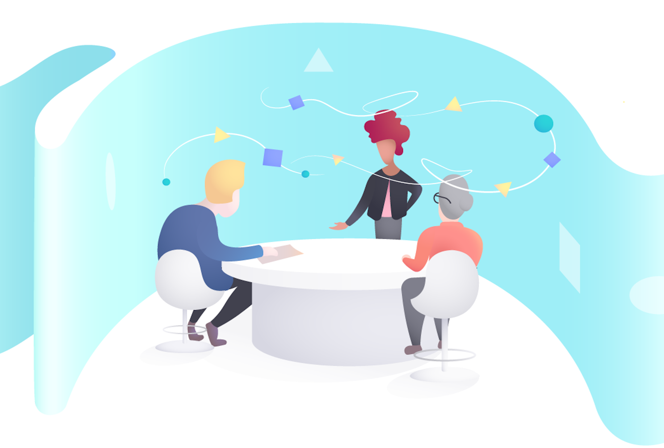
Design Thinking, at its core, is a creative process to solve everyday problems with a human-centered approach. While the word ‘creative’ may sound like something do only with designers/artists, the good news is- it’s not. Anyone can implement design thinking. The only thing that you really need is- listen to your customers as people who need your help. Once you understand their needs, their hopes, their fears and the friction they face while dealing with a particular problem- Bang! You are halfway through it.

Let’s hear a story. The story is about a woman named Elisa (yeah! I made that pseudonym). Elisa is an eighty-one-year-old woman suffering from age-related macular degeneration (AMD). When she was told she needs to take an injection in the eye for treatment, she was petrified. And why wouldn’t she? It’s not just any injection on the skin, it’s a needle in the eye. At the age when you are struggling with survival, it’s terrifying to think of ways in which you can go blind.

Why Design Thinking in Healthcare Matters

Apart from this particular case, it’s a fact that many of us dread getting an injection. Diabetic patients go through this painful experience, every day. Sometimes they have to administer these injections themselves, and sometimes they have to deal with a less skilled, less empathetic nurse.

Don’t you think we need a better solution to this? Can’t we develop something which makes this experience less scary? Can we go that extra mile and feel the pain of these patients? Can we somehow make them suffer less than they are already suffering?

An organization called Portal Instruments has now challenged this 160-year-old needle & syringe technology with design thinking. They have created a needle-free computerized injection system which fires a jet of liquid into the human skin. The handheld, low-cost unit is highly precise and accurate. The device is easy to use and its digital health features empower the patients to holistically manage their chronic condition interactively.

Design, particularly in healthcare, is about efficiency, usability, and a better user experience for patients as well as medical practitioners. And Design Thinking is a very powerful approach to solve customer’s problems. So where can you apply design thinking in healthcare?

Design Thinking in Patient Care

How Healthcare Organizations Can Start to Use Design Thinking | PreCheck

Patient care is not just about exchanging pleasantries and moving ahead with the treatment. When you apply Design thinking to this process, you will uncover ways in which care goes beyond the treatment.
A customer empathy map will help you understand your patient’s pain, concerns, fears and go beyond the clinical treatment. For instance, simply by listening to the concerns of expectant mothers, you can help them ease their anxiety. After quality research & brainstorming viable solutions, you can arrive at a proposed solution to help them be better informed about the labor process.

Design Thinking in Clinical Experience

Memorize the last time you were sitting in the emergency-room and recollect your waiting experience. Wait times are difficult to pass. You are in a troubled state of mind. Patients and their families spend a considerable amount of time in waiting rooms, sometimes waiting to be treated and other times waiting to see the doctor.

Design thinking may bring forth innovative ways of helping patients feel comfortable and make their experience bearable. You can start by asking questions and understanding their mindset. Must the patient be left alone while they wait for care? Is there a better way in which family wait time can be utilized? If you can not reduce the wait time, think of ways to utilize it. Once you answer these questions, you’ll be able to elevate the user experience of your users.

Design Thinking in Websites

If you are building a healthcare app/website, then you have to take care of the reliability and accuracy of the information that you provide. A person’s medical records can be critical information while monitoring health patterns or detecting disease symptoms.
Prioritize the most important information & fields for your users. Boil down to basics. Take all age groups into account and design keeping in mind their ailments.
They (might) want more information with less number of clicks, they (might) wish for larger and readable fonts. And while you may get away with frequent ‘small’ updates on social media apps, here it (might) frustrate them.

How to design a great Healthcare Experience

You know why every superhero is veiled behind a mask? Because creators of comic heroes want you to believe that even superheroes are like any other human. Their only superpower is endurance and resilience. They understand people; they want to solve their problems. They put people before anything else.
Much like Spidey! Or Batman.

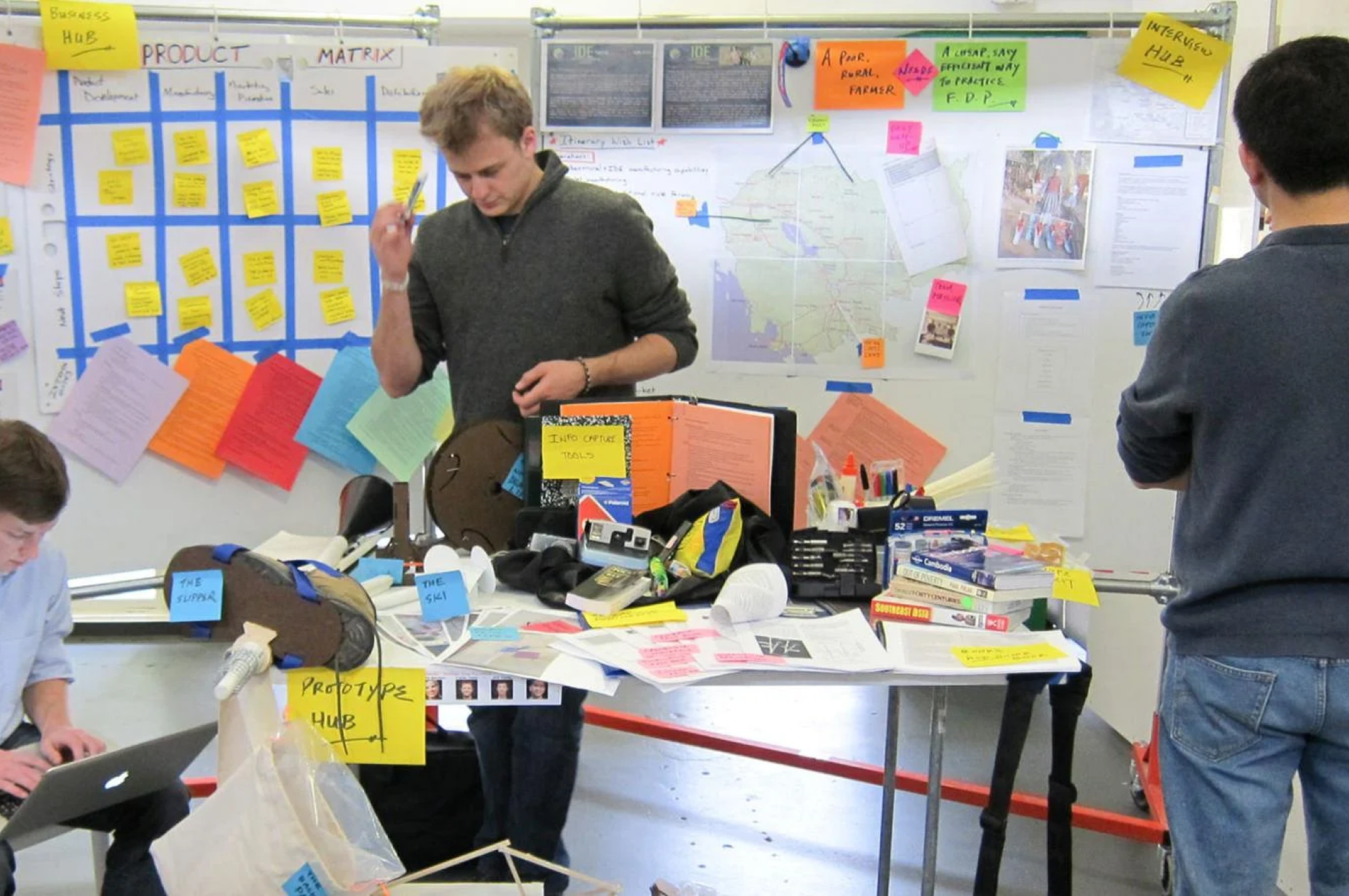
Design thinking is same. It’s about organizing those mindful scattered ideas that everybody forgot to care about. Design thinking is about subtle differences which make you outshine from the ordinary. Yet it’s not so easy to put yourself in some else’s shoes. It takes a lot of efforts in brainstorming and generating ideas. Then, you should quickly pivot on a prototype and gather user feedback for continuous improvements.

Design thinking has already made it to healthcare. But, as we all are aware of the sad state of product design and innovation in Healthcare, there are still areas where it remains underused, such as patient transportation, the communication gap between doctors and patients, to name just a few. Here’s one approach that might be useful to you-

Research and define the problem statement

If you are dealing in the food business, wouldn’t you start talking to the farmers? So, start with conversations. Talk to patients/families about their problems.
Build customer personas. A persona is an imaginary character that embodies your real customer. Learn about your user’s lifestyle, their goals, their values, the challenges they face. Empathize with your users & their problems.
If you are designing an online appointment experience, you need to involve every single person associated. Right from the doctor to the patient. Even the receptionist. You need to understand their roles and most importantly, where they fit in together. Once you understand their pain points, then you’ll be able to create the experience for patients who need care.

Ideate

Design Thinking in Healthcare – IDEO U

Enough talking! Time for some action. Gather all that you have talked and use the outcome of Research phase to generate interesting ideas. Not all ideas will be usable; so try and stay close to ‘potential solutions’. Use techniques like high-level drawings, user-mapping and plot a user’s experience map to arrive at innovative solutions.
For instance, while building a SaaS-based mobile engagement platform for one of our client, our design team took conscious efforts to understand the whole journey- health plan benefits, treatment requirements, appointment details, communication medium, medication instructions etc.

Putting down our ideas on paper helped us a lot in working on user workflows. We were able to visualize a smarter workflow which connects with patients through mobile messaging for more effective communication.

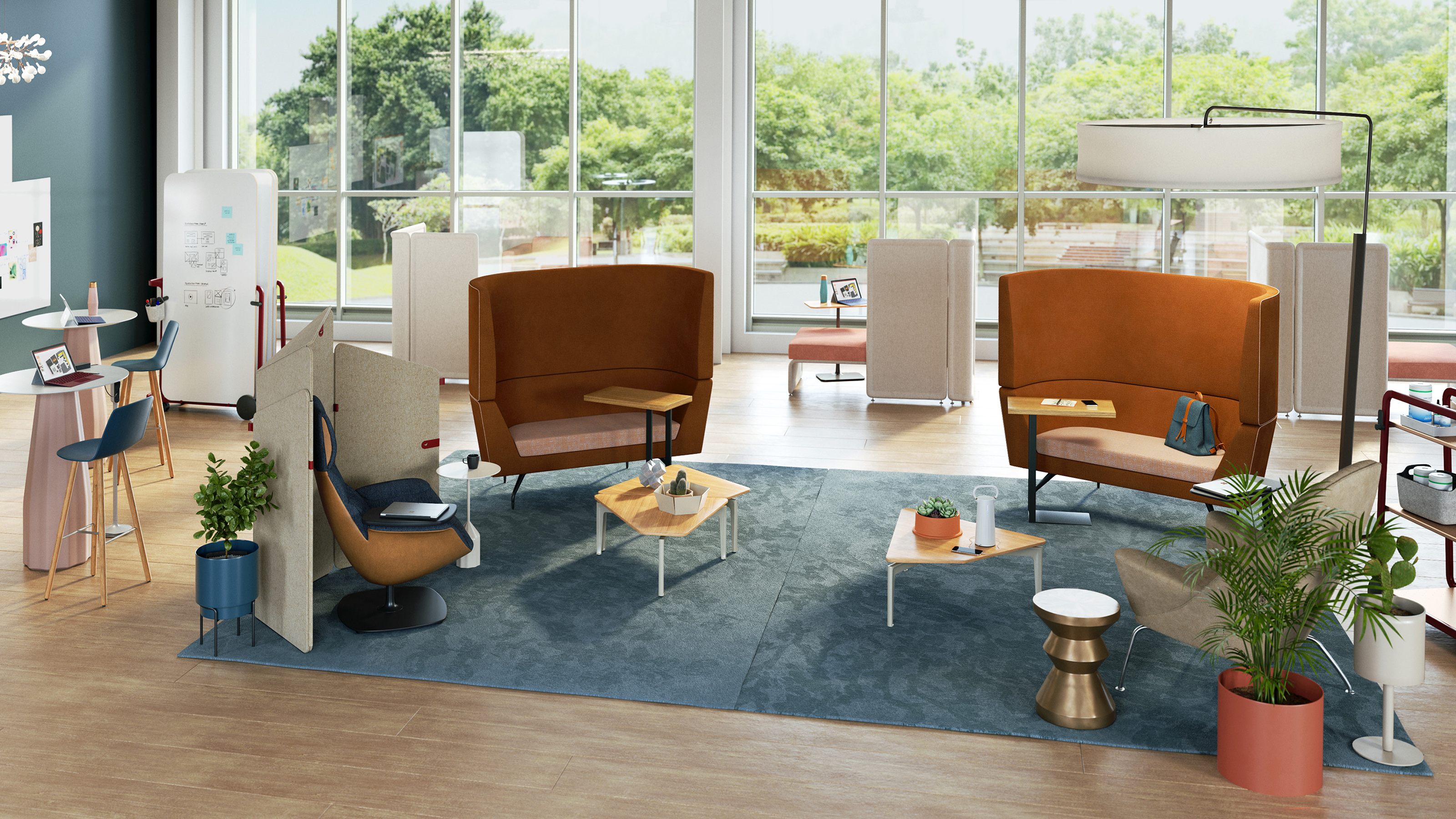
Prototype and iterate

Giving your ideas a shape is crucial to the design thinking process. Otherwise, it will just be castles in the air. Prototyping is something that pushes you into making things tangible so that you keep moving forward.
Prototypes will be a proof of concept of your ‘ideation exercises’. They will help you in demonstrating and validating your concepts and understanding. Moreover, they are important because you would want to test your functionalities in a real environment with real users.

Prototypes need not be beautiful. It can be a black and white template of your colorful understanding. It must answer a simple question- as simple as “How would you like to reach out to your members?”

Depending on your application (web/mobile), prototypes can be interactive or static. What really matters is that they must convey the user experience flow.

The advantage of building a prototype is that it’s something substantial and not just some thought process going on in our mind. Once you have pushed that into a real environment, you can take feedback from users and iterate to simplify functionalities.

Designing for healthcare won’t be a joyride. Unlike social media apps like Snapchat, your healthcare platform will grow slowly. And that’s not your mistake. The user base that you are catering to, is not looking for socializing or entertainment. So the only solution lies in applying design thinking to approach problems.

Before aiming for success, first, offer a service that’s valuable. Offer a service that solves a real problem. Offer a service which makes them forget that they are interacting with a machine.
Let’s build a better healthcare experience. Let’s be more human.

error: Content is protected !!