DESIGN THAT DREAM DASHBOARD

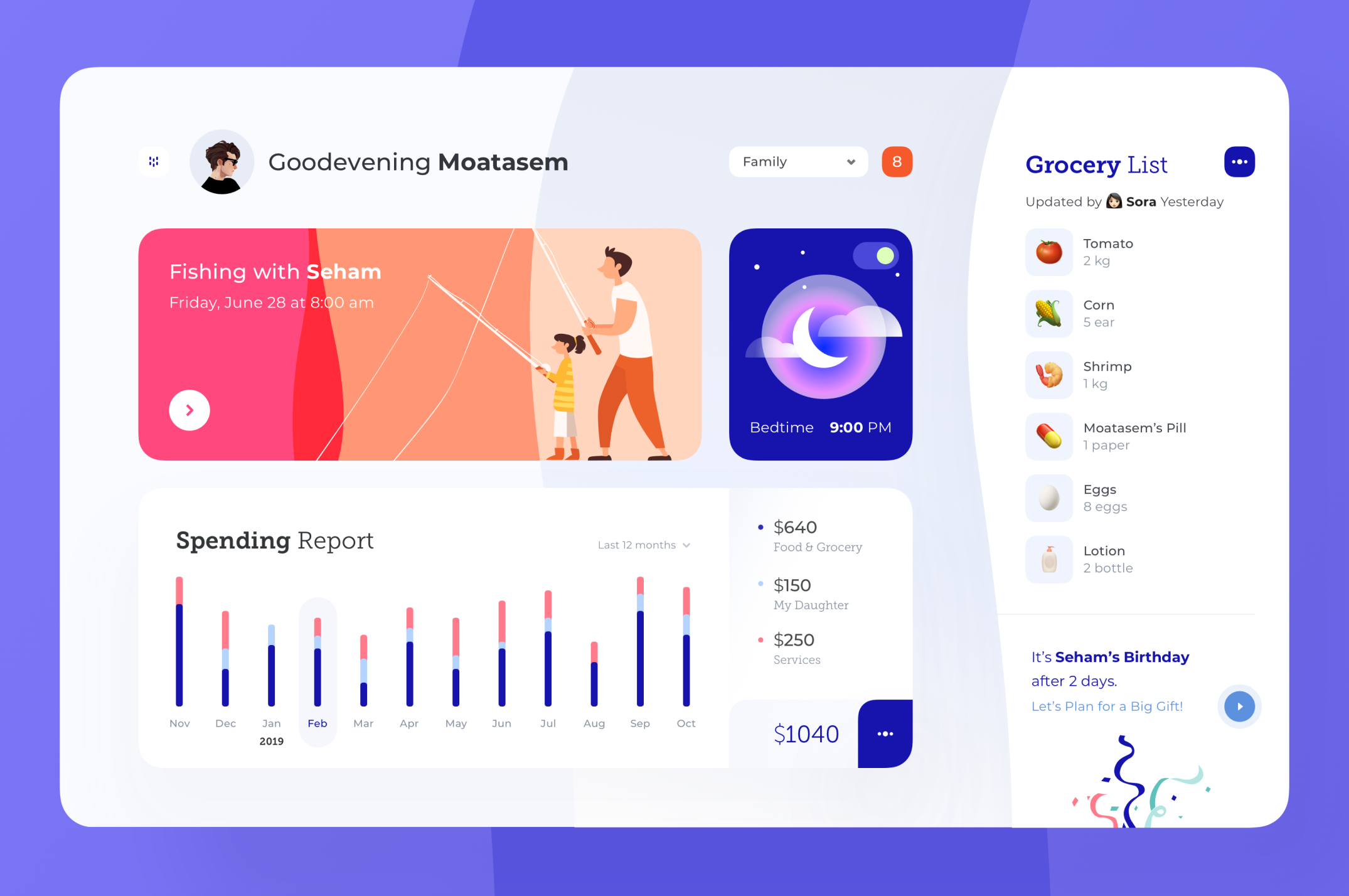
Our world is driven by big-data and in this world, dashboards are of utmost significance for providing users with information in just one glance.

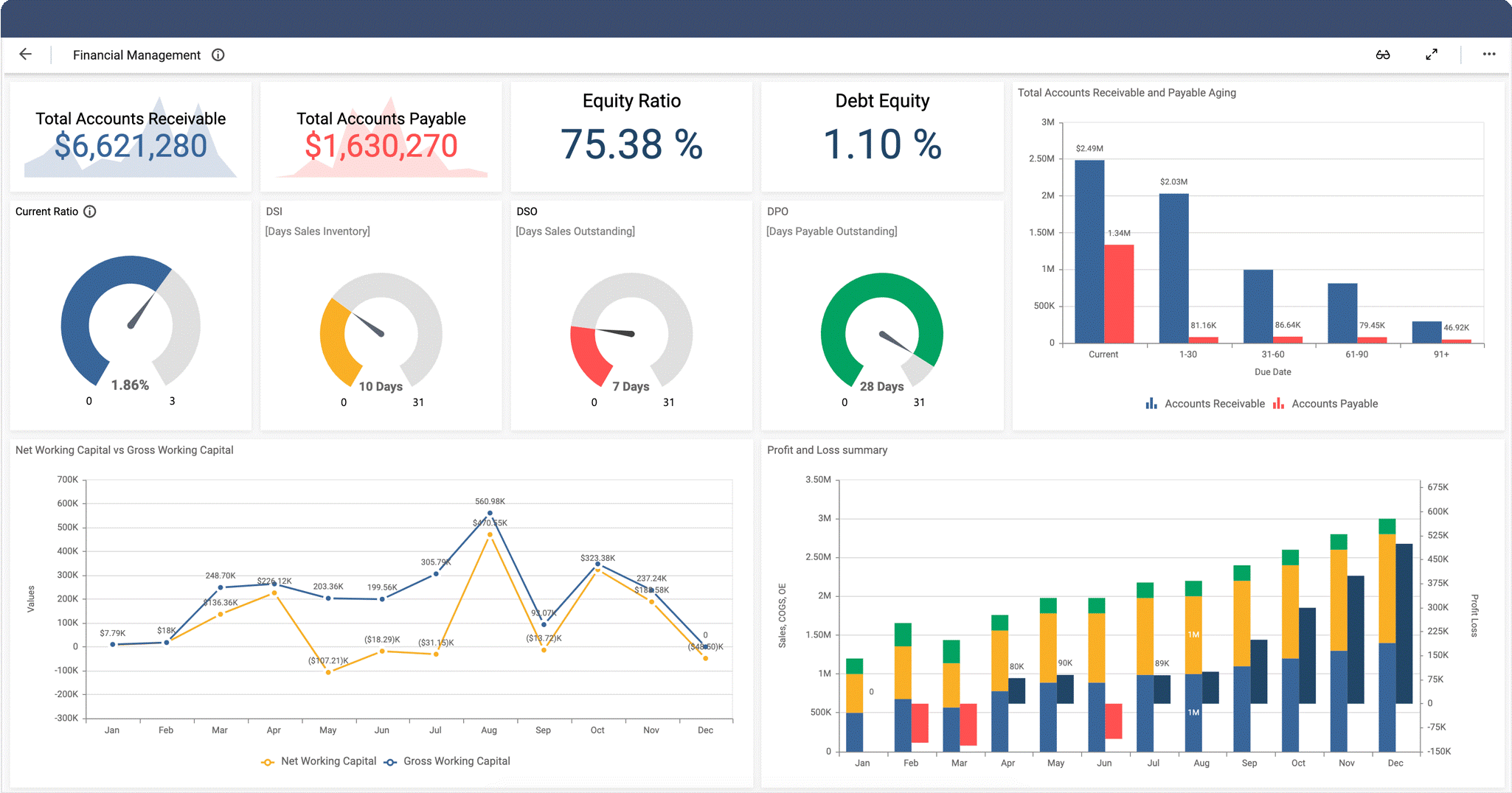
Like the dashboard in a car, businesses also employ and utilize dashboards to summarize large chunks of real-time data in a limited space. The information is broken down in a way such that it doesn’t become visually pressurising. This representation of information allows you to measure your data and pick out the areas with scope for improvement. If done right, dashboard designs can bring about a visible difference in the business’ performance. 

Although designing is fun, but, designing a dashboard is not a piece of cake. Rather, it is a quite challenging task. Despite having those inner-creative desires, it is best not to unleash all of your creative streak whilst designing a dashboard. It’s better to keep it in control before it goes out of hands.

KNOW YOUR AUDIENCE

Dashboard is assumed to be allabout data, but that’s not true. It is about information and enabling the users to make smart business decisions. The sole aim of designers is to create a dashboard that makes the users feel powerful. That is how hearts and minds are won.

And in order to do so, you have to know your users. Take a seat, find out what information do they need, what is their field of interest and what is their objective. Once you research and gather all of the required information, you can move forward to begin your work on the dashboard.

Furthermore, you should design dashboards keeping in mind only ONE user. Your dashboard should be providing information according to that single user. In case of multiple users, different dashboards should be designed for the users.

HIERARCHY

While designing a dashboard, it is best to have informational hierarchy, i.e., organising information in a way such that it makes sense to the users. Remember, information placement is not about filling up empty spaces or about aesthetic reasons. Key information should be placed such that it shines different and is easily caught by the users. 

The most significant piece of information related to the user’s primary goal should always appear first. Followed by that should be supportive material which creates context for the forthcoming main content. For the users to make right decisions, it is important that you showcase the relationships between data. This instills a lot more sense into the data than when it was placed randomly. For example, if it is a dashboard for fashion, then you should see the graphs for the hot trends along with the outgoing fashion sales.

LOGICAL DATA GROUPING

This is one obvious point. You should group the required pieces of data in a way that it is clear to the users, that it makes sense. For instance, if you’re designing a dashboard for a cosmetic brand, don’t place the allergy complaints next to the sales data. It just ruins things even further. 

It is best not to follow the usual best designing approach when it comes to dashboard designing. Generally in a website, we place the brand logo on the top-left and navigation options right below that or on the top-right. But as a fact, we humans read from left to right, top to bottom. So it is best advised to place the most crucial piece of information on the top-left corner. Decide wisely.

BE MINIMALIST

Using extra information to please your user will only turn out to be a headache for the user followed by a headache for you. It is always better to keep it minimal, crisp and to the point.

Whilst you’re planning on how to present the information to your user, ask yourself this- what will the user get out of this piece of information? It really works.

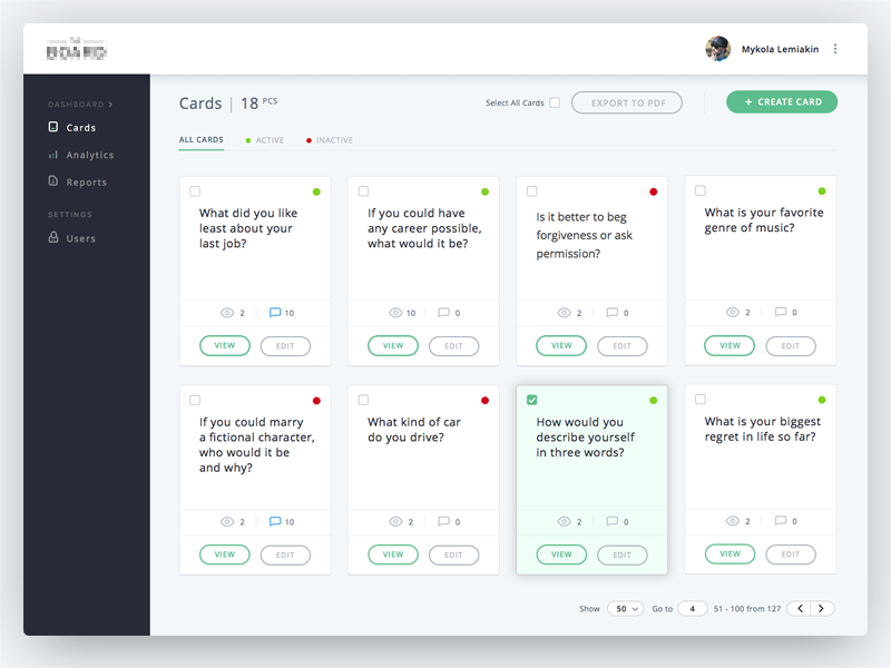
Now that you know the placing, try not to clutter too much content on the dashboard. It will only make a mess, which will be for you to clean up. Use minimal text. You would definitely want to avoid unnecessary images and graphics, especially to prevent visual noise. Even if it makes you wonder, simpler, user-friendly design can carry high functionality. And that is, only if the right approach is followed.

DATA VISUALIZATION, THE RIGHT WAY

Data visualization is not merely for the eyes, rather it is a significant part of the dashboard design. Raw data can be hard to process and can have a monotonous tone. The purpose of visualization is to refine the raw data and present the relevant information in a short span of time and at the same, allows users to gain more information, if they wish to do so. Pie-charts, graphs, plots assist users to interpret and better understand the data. However, don’t go overboard with it, you might end up terrorizing your users.

BE WISE, COLOUR-WISE

Colours are great, they make everything better. Likewise, they make data interpretation and analysis much easier for the users. You must choose your alert and button colours wisely, so that your users get notified of tasks, activities, events and features in your interface. Best way is to create a style guide on which you can base your data state.

Dashboards are there for informing righteously, not for experimenting with a colour palette. 

WHEN TO REFRESH YOUR DATA

Data refreshing is important, as it helps in prioritising and placing the elements. For instance, if a data is refreshed often, it implies that the data holds a crucial role. Hence, it is best to place that information in the beginning, at a place where the user can catch it at the earliest possible.

Simultaneously, it is important that you notify your users when the data is/was refreshed. And whether they need to refresh the data manually.

Planning data presentation, especially deciding what to exclude, is truly a SCIENCE. Data alone lacks context and meaning, that is where the designers come in. They take the responsibility of making the data understandable and representable. Dashboards are so crucial for a business, they can make or break your product/application. 

Thus, along with being creative towards the work you love, make the right choices as well.    


CREATE WONDERS IN A DASHBOARD UI? HERE’S HOW!

The world that we’re living in today, is almost entirely technological. And it is evolving every day with the wonders of Artificial Intelligence (AI), Business Intelligence, BlockChains (like NFT), etc. In order to make people’s lives easier, these smart technologies use complex algorithms and theories to quickly compute and summarize data. This data is then provided to users in the name of ‘useful information’. But a question that needs to be asked here is that what is the point of this data if the users can’t understand it? And if so, they might not even find it beneficial for themselves or their purpose. Hence, this is one of the most important reasons as to why dashboard design has grown significant over the last few years. 

One of the first things to understand is that as much as UX of the dashboard is important, so is the UI of the dashboard. They are both equally essential. Before jumping into our main motive, let’s take a quick sneak peak into the most prominent features of a great dashboard:

  1. A good dashboard allows its users to interpret, analyse and present the key pointers, or say insights.
  2. What an efficient dashboard do is present the user with useful information that can be put to use. As well as compile a visual representation of the otherwise complex set of data.
  3. The desired dashboard will always be customizable and it generally is quite intuitive. 
  4. As an additional point, they are always organized when it comes to use of space. There might be a lot of data on the dashboard but it won’t seem like a mess that is cluttered all in one little space. Rather it looks neat.

NOW WE’RE AT THE HERE’S HOW SECTION

CONSISTENCY MAKES IT EASY

The dashboard should always be consistent. Considering that the users access the dashboard through different devices that also vary in screen size. It is important that the design looks consistent, whether it’s with respect to the colours, font, style of charts or navigation. The user should not get distracted because of the inconsistency in the dashboard design and so sheer attention should be paid to how the design dashboard looks on multiple screen sizes. The key is to start with smallest screen size and then move up along the way. This way of approaching the design is a golden rule, this helps in creating a visually appealing dashboard, which gives both a great UX and a great UI.

SIGNIFICANT INFORMATION APPEARS FIRST

Let’s talk about the heart of designing a dashboard, ‘content hierarchy’. Although this goal is achieved at the UX stage of designing, but is essentially through visual design that conveys the most important information in the most efficient way. This not only guides the layout but also the design guidelines. A couple of things to note here is that; (a) Centre alignment is the most recommended as found out from the users’ behaviour pattern on the dashboard. They acquire that part of the information in the first place ; (b) Another thing is that 18 pixel font is the maximum to be employed and information should be highlighted through the use of distinctive colours.

COMFORTABLE CUSTOMIZATION

Never use the ‘one size fits all’ approach. There are different users with varying business needs and requirements. Designs should be scalable, so that the user experiences customized dashboard. Now this in turn will empower the users, which is the designers’ ultimate goal. Users should feel that they can adjust their fit in consideration to their individual business requirements. This can be as simple as adding or deleting a column, or even adding a whole new table or sheet. The things to remember here are: (a) Always allow for easy modifications like addition/deletion of modules; (b) Give different yet comfortably usable options for viewing and deleting data separately; (c) And lastly, try using easy drag and drop interaction for the users to experience customizable dashboard design.

CHARTS? LESS IS MORE!

When it comes to presenting data visually, i.e., via pie charts, bar graphs etc., they should always be put in simpler form. Cluttering the charts with heavy tools and representation techniques only hinders the user from understanding and using the said data. Instead of using 3D graphs and animation, using flat-laid charts and graphs makes it a lot more comfortable for the users. Colour differentiation although, is sheerly appreciated, since it allows the users to understand the separate sets of data clearly. 

ICONS CATCH THE EYES

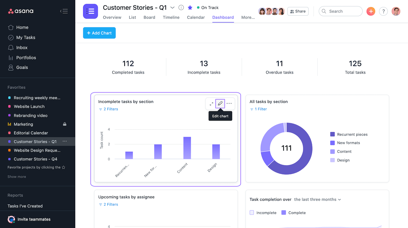
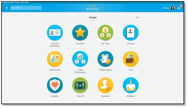
What is generally ignored in the process of designing a dashboard UI is the ‘icons’. The best dashboard designs always include icons that are familiar to the users. For example, the pen/pencil icon is usually the edit tool. Likewise, the trash icon is for the option of deleting anything. This way, the user would have less time wasted in processing what the icon means and would have more utilized time in wrapping up their work. Thus, familiar icons help create great UX and UI.

RIGHT FONT REMAINS IMPORTANT

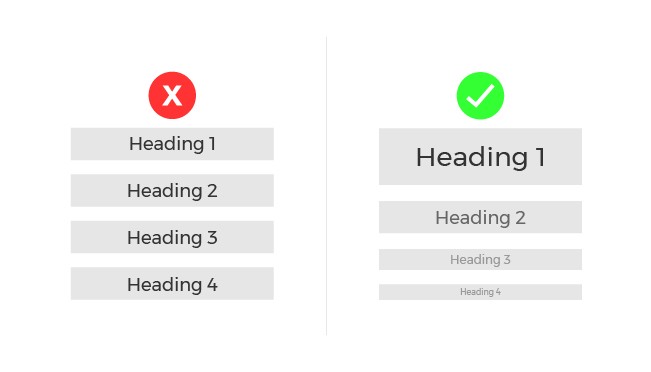
Employing the right style of the font and its size is equally important in both the UX and UI designs. It is advisable that while designing, not more than two fonts shall be employed. This is done in order to maintain a clean dashboard design. Creating a visual hierarchy by employing the inverted pyramid style in all the written content is quite significant. This can be done by putting the most important sets of information in the largest and the not-so-important sets of information in the smaller font, along with a hint of colour differentiation.

FILL COLOURS IN DESIGN AS MUCH AS IN LIVE

The concept of colours is such that, it might seem simple, but it also has a complex side. Different colours signify different things. Just like red colour is usually employed to denote danger and green colour is used to denote ease and agreement. Now, imagine if their use is reversed, won’t it be confusing? Therefore, designers are required to be really mindful whilst working on the colour palette of their designs. Besides, it is best not to go overboard with the colours, even if you’re tempted to do so. A good start would be picking two colours in the initial stage, that too something like contrasting contemporary colours. 

MAKING THE FINAL POINTS

All of this would be worthless if you don’t know your users’ preferences. Whatever the studying concept maybe, if you don’t have the emotional connection with your users and if you don’t know their choices and requirements, then the whole work would just remain pointless. Therefore, besides knowing the tips and right ways of employing the tools to create a great dashboard, you should also know your users. Research, understand, analyse and imply your methodologies and tools. 

Taking your leave with, 

“Graphic design will save the world right after rock and roll does.”

– David Carson

Workday Payroll dashboards: How to Get the Most Out of Them

Como construir e manter uma boa reputação on-line no ambiente escolar

The future of work is bringing new challenges for Human Capital Management (HCM) practitioners, especially as the skills shortage becomes a day-to-day reality. In the near future, the people responsible for people in your organization — from CHROs to payroll specialists, will need more time to strategize, analyze, and innovate. With truly innovative HCM technology, not only will employees have more time, employee productivity and engagement will increase.

Workday Payroll is designed to help employees increase efficiencies, eliminate errors, and anticipate changes, particularly around compliance or tax related items—a competitive advantage in a fast-changing regulatory environment. Plus, Workday Payroll not only saves employees time, but perhaps most critically, reduces questions to the payroll department and increases insight around the complex process of compensation.

Workday Payroll best practices

Our Workday experts at Anteelo recommend starting with the following simple steps to drive user engagement and adoption to get the most out of Workday Payroll dashboards:

Share—and share often.

Basic Earnings per Share vs. Diluted Earnings

For employees involved in the day-to-day work of payroll (or any HCM work), new technology requires that management does their due diligence in communicating the change. But we’re all bombarded with hundreds of messages every day; so this requires creating messaging that has meaning:

  • Empathize with the difficulties of change (even positive change is stressful!).
  • Make it personal: Share how Workday Payroll dashboards will benefit both employees and administrators in day-to-day work. For example, teach employees how to easily compare pay periods and make updates, such as tax elections, from one place.
  • Show payroll partners and administrators how the dashboard gives them instant visibility into the status of each payroll, retro differences to be paid, and employees affected by regulatory changes (such as tax rates).

Follow-up with non-users.

? How to Take Meeting Notes People Will Actually Use [Templates & Examples]

It’s simple: Ask employees who aren’t using Workday Payroll dashboards why they aren’t. Engage employees by providing more training, enabling one-on-ones with power users, giving employees extra time to learn about the dashboards, and/or scheduling frequent check-ins to answer questions and provide encouragement.

Invite existing users to share why they love Workday Payroll dashboards.

Workday@Yale

Ask employees who are using Workday Payroll dashboards what they love about it. And then ask them to share this with their peers. Happy users are the best advocates for new technology. Product evangelists—your employees who love payroll dashboards—can greatly influence others to get on board.

Make sure updates go smoothly.

Top tips and tricks to keep Windows 10 running smoothly | Computerworld

Build a repeatable test plan for updates and always communicate any upcoming changes to Workday Payroll dashboards far in advance. If you need help, our experts can help you develop a solid testing plan that is both repeatable and not overly taxing on resources.

Plan ahead—and communicate frequently—about big events, such as audits.

Behavioural auditing | Ethical Boardroom

One of the advantages of Workday Payroll dashboards is that they enable users to start the audit process early. Help employees understand that auditing early and often, using the tools in payroll dashboards, can make the end of the year far less stressful—and even reduce the need for overtime around the holidays.

Creating a positive, engaging user experience is the first step to getting the most out of Workday Payroll.

It’s imperative that employees doing the day-to-day payroll work need to know how Workday Payroll dashboards help them personally do their jobs better. Organizations can drive greater adoption and engagement by actively sharing the employee-centric benefits of payroll dashboards, encouraging existing users to advocate for the technology, and making it easier for non-users to become engaged users.

error: Content is protected !!