UX Designer vs UI Designer vs Web Designer

What Does a UI/UX Designer Do?

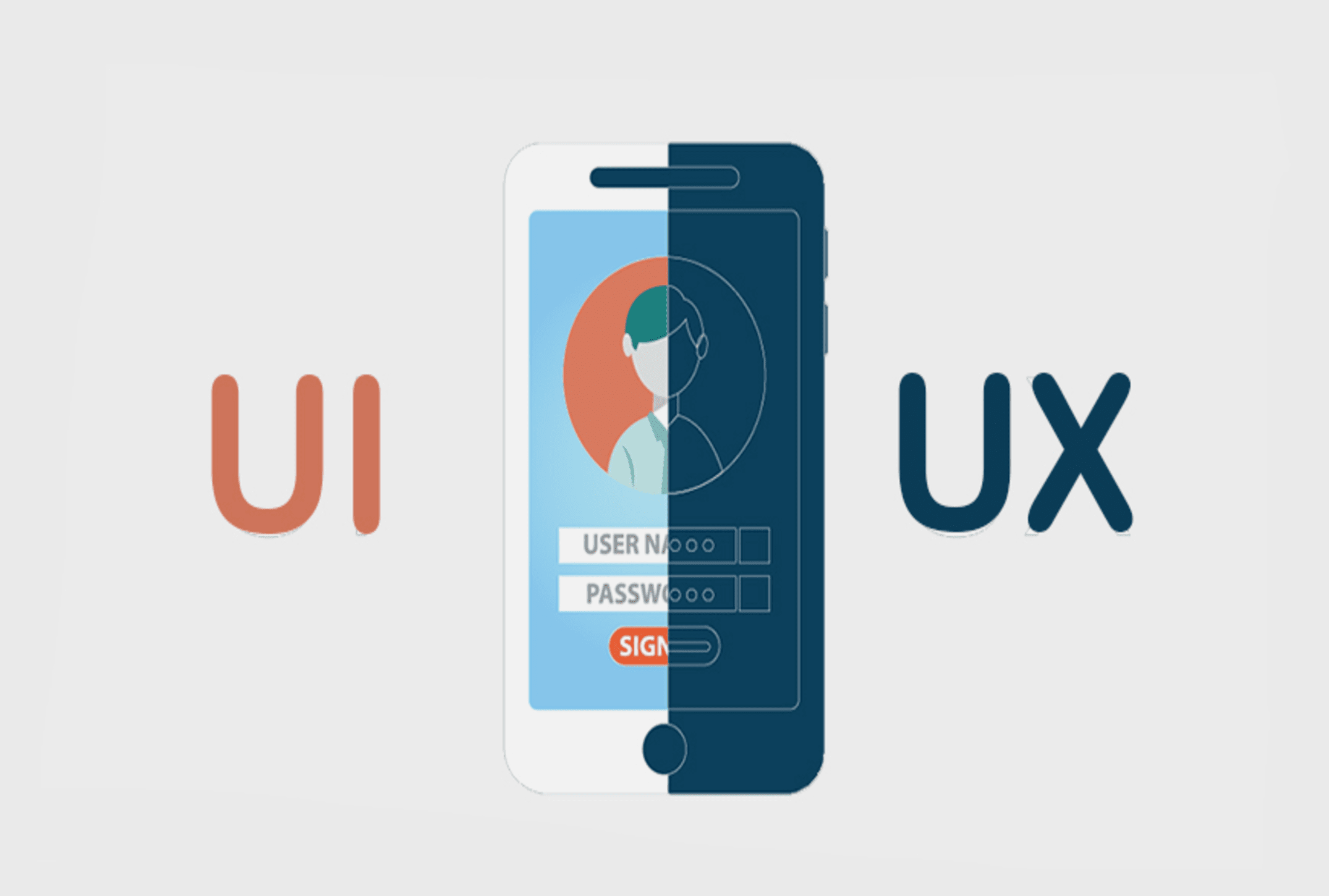
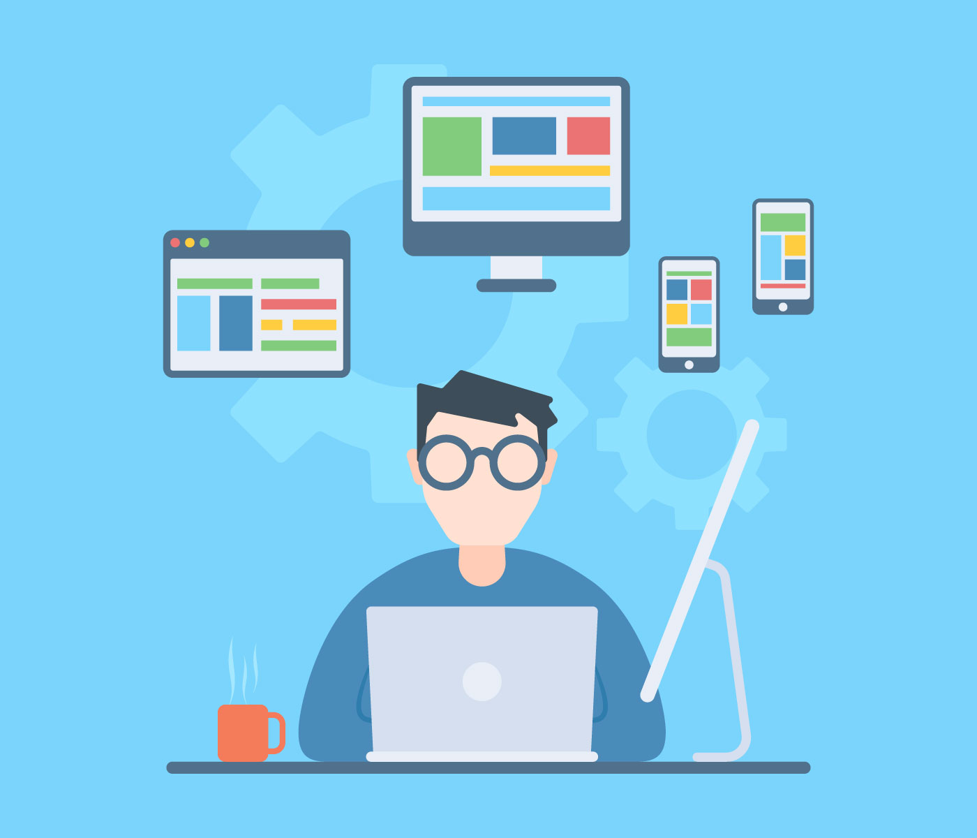
To the laymen, digital design can be a puzzling world of systems, acronyms, and programs. Web creation is not just about making a landing page and adding content anymore but a complex world of coding for site function and protection. It is also a fun and artistic adventure to create something visually alluring. If you combine this with the psychology behind all the systems of a webpage, and you have the basics of web development. Sounds simple enough, right? Not for everyone. The software industry has skyrocketed, and many people are still trying to understand key differences in standard terms. Terms like UI design, web design, and UX design are often thrown around and are incorrectly interchanged. However, following the aim of each tool is as simple as knowing the various parts of a house. Web design is the base or the foundation, UI design is the architecture, and the UX design is the electric, plumbing, and other wiring needed.  Before we get into defining these terms, we can say there can be a lot of overlap between them. UX, UI, and Web Designer difference is nothing but a fine line but can have great impacts on your project. However, to excel in any of them, you must have a comprehensive knowledge of all three of them.

UX, UI, and Web Designer differences:

35,084 Ux Design Illustrations & Clip Art

Web Designer UX Designer UI Designer
A web designer is a professional who generates content for a website following the latest trends. They are responsible for designing the layout of the website, along with its aesthetics, utility, and functionality. UX is the abbreviation for User Experience. It brings in creativity. A UX designer handles the whole procedure of obtaining and coordinating a product, including parts of marking, development, convenience, and utility. It is a process that starts before the product reaches the customer. UI stands for User Experience. A UI Designer is responsible for creating the interfaces between the user and the product and ensure that the interaction between the customer and the product is a seamless one.
The role of the web designer is to compile everything, including the UI and UX, and turn it into a highly-functional and efficient website that people can easily interact with using their smartphones or computers. A web designer might emphasize more of the aesthetics of the site rather than how a user might deal with it. UX design is all about having a deep understanding of the customer, which includes their preferences, behaviors, habits, requirements, and feelings. UX designers must comprehensively understand the issue along with the client whom they are working for so as to design an optimal and streamlined solution. The UI design is the complement of UX Design. UI designers work on the point of interaction between the user and the service/device and try to improvise the product in a way that is user-friendly and adds value to the users. UI designers work on the look, design, and especially the feel of the product.
A web designer must have in-depth knowledge of programming languages like HTML and CSS, Scripting languages like JavaScript and PHP, web designing packages like Flash, Photoshop, etc. A good UX designer is expected to have fluent communication, agile and lean development skills, rapid prototyping, revising skills, crowdsourced designing, and relevant soft skills. In contrary to UX designers, UI designers are in charge of making UX designers’ dreams a reality. Numerous UI designers have a decent comprehension of front-end development along with some coding abilities.
Contemporary Web designers are usually modern era graphic designers trained in visual design to be experts in:

  • Color theory
  • Creative conceptualization
  • Diagrams
  • Interactivity, rollovers, drop-down menus, digital slideshows, call-to-action-buttons, and forms.
  • Icon development
  • Info-graphics
  • Typography
A UX Designer plays a very crucial role in an organization. They have to make sure that a customer is having a good time with the brand. They primarily focus on:

  • Understanding user psychology
  • Comprehending product specification
  • Finalizing the right interaction model
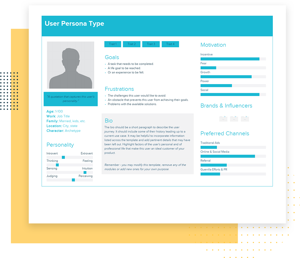
  • Create personas through user surveys
  • Collaborate with UI designers to create attractive and useful designs
A UI designer primarily focuses on:

• Color and typeface choices.

• Designing the monotonous but necessary stuff: buttons, icons, sliders, and scrollbars.

• Forming a style guide for the app or website to ensure consistency for the user.

• Responsive designing

• The interactive parts

•  The layout of each screen

Website designers might be visual designers or engineers who have built enough aptitudes to make beautiful and aesthetic websites or applications. Website designers do not tend to adopt the human-focused strategy of UX design. Most website designers don’t dive as deep to consider every element that a UX designer remembers. A website designer will, in general, be less iterative, while UX design is tied in with coordinating persistent enhancements by interacting with users. UX applies to whatever that can be experienced—be it a site, a cup of tea, or a visit to the supermarket. The “client experience” part alludes to the connection between the client and service or product. UX structure, at that point, considers all the various components that shape this experience. A UX designer considers how the experience makes the client feel and how simple it is for the client to achieve their ideal errands. UI design is simply a digital approach. It considers all the visual, intuitive components of a product interface—including buttons, symbols, checkboxes, typography, color scheme, and responsive design. The objective of UI design is to outwardly guide the client through an item’s interface. It’s tied in with making an intuitive encounter that doesn’t require the user to think excessively! UI design delivers the brand’s qualities and visual resources for a product’s interface, ensuring the design is predictable, intelligible, and tastefully satisfying.

CONCLUSION

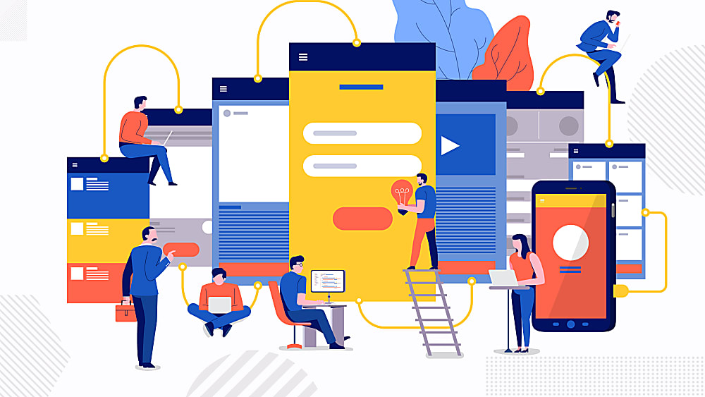
So a UX designer chooses how the UI functions while the UI designer chooses how the UI looks, and the web designer puts it all together into a cutting-edge website. This is a community-oriented procedure, and these three domains will, in general, work intently together. While the UX group is working on the flow of the application, how buttons guide you through your website, and how the interface effectively presents the data that the client’s need, the UI group is chipping away at how these interface components will show up on the screen and the web designers are integrating it all.

If Web Design is the umbrella, then UX and UI design are specialties and focuses on it. Anyone who regards themselves as a web designer should be well-versed in UX and UI. These terms are also industry-specific. Startups and tech companies mostly hire specifically for UI/UX roles. Every so often, a UX role will focus more on research and information architecture. Occasionally, a UI role will include UX. Sometimes, companies are looking for a web designer who can do it all. It’s all a bit of a mess unless the aim is precise. Whichever direction you take, it’s vital to remember that design is not just about making things look pretty, but it’s about problem-solving communication and people.

Mobile App Interface: With UX-UI Strategies

When was the last time you bought a movie ticket from the multiplex counter? When was the last time you went out to Crosswords to buy a new release from your favorite author? Or when was the last time you went out for dinner without reading its reviews on Zomato? And oh! When was the last time you went to bank for checking your monthly statement?Take your time!Ages ago, no?

Life is sorted. Everything is available on mobile apps now. We’re living in revolutionary times. The power that web has given to us is enormous. It has made our life, both, easy and difficult. Every one of us has now access to a plethora of information. A swarm of mobile applications is available on the store to make your life easy. For things as small as which baby stroller to buy, we have become dependent on our mobile devices.

UI/UX Strategies to develop Mobile App Interfaces | Humble Bits

Our eyes and ears are always open to that new cool app which is making waves in the market. And every mobile app which becomes a craze among its users has one reason behind it- excellent User Experience. A lot of people believe that design is about making applications look pretty. Ofcourse, a part of it is true. Anything which looks good improves the user experience. But what if it doesn’t satisfy customer needs?

A good design includes creating each and every interaction to delight users. Remember what Steve Jobs said?

“It’s not just what it looks like and feels like. Design is how it works.”

A bad user experience will give you a thousand thumbs down within minutes. The application must delight its users, both with functionality and experience. The mobile app interface should appeal to the users. I am sure you can relate to the experience when the mobile application works perfectly but doesn’t excite user to use it? What if the application looks pretty but its functionalities are broken? In these cases, you need to look at what works for users and what doesn’t.

Well, there is no one-size-fits-all solution. But here are some strategies that you can implement which have always worked wonders-

Design long-lasting products

7 Winning Design Tips and Strategies For App UI/UX Developers - iqonic

The argument to stay up-to-date with all the latest trends might clash with this but when we say design long-lasting products, we mean that the products should not age prematurely. The product should not become out of style with time. Design something neutral, which can live longer and is not just a passing design fad.

Dieter Rams, a very famed industrial designer, says-

You cannot understand good design if you do not understand people; design is made for people.

He conceived these 10 design principles fifty years ago. He says he didn’t intend these principles to be set in stone forever. If you read them, you will understand why these didn’t mutate with time. They are still accepted and implemented till date. So your design should follow the latest design trends, but do it while keeping in mind your end user.

Keep It Simple, Stupid!

Less is More– this famous proverbial phrase emphasizes on why you should keep things simple and clear. The idea is that simplicity and clarity in thoughts lead to good design. When you are designing, take instances from your real life. How do you like to keep your stuff at home? Clean and organized? Use that thought in your design. Move away from clutter.

Every element in your design should serve a purpose. It shouldn’t just sit there as a pretty object. Minimalism is a tricky thing. Offer your user space where they can find action buttons easily. Reduce the load of information, keep navigation flow easy and let the user win. So, even if you are designing a web page to sell potato or onions, don’t make the user think!

The large clear fonts set the message straight- loud and clear. The background color places the user’s mind into the right frame of mind. The CTA buttons allow users to move directly to the action. Minimalism does not mean you start removing elements from the design, it’s about removing the unnecessary and keeping just enough which can depict your story.

Make an impressive user-onboarding flow

Follow these 7 steps for creating a bulletproof UI/ UX strategy

A lot many people uninstall apps they just downloaded when their onboarding experience is ruined. If you ask for too many permissions (camera, Gallery, contacts, location) then the user might become irritated. Collect only relevant information which is usable for you. Give your user flexibility to log in from different platforms- Facebook, Twitter, being two very popular options.

After you have made the user signup successfully, offer him a quick tour of what is the app about- where are the profile settings, where is the action button, which features are available and where. Even here, provide an option to ‘Skip’.

Use appropriate colors to make a connection

According to the color theory, if we apply logic to the selection of colors, it can greatly enhance our user experience. In visual experiences, colors should be pleasing to the eye. Anything which is pleasing increases engagement of the viewer and encourages him/her to get involved. On the other hand, when something is not pleasing to the eye, it is either dull or chaotic.

If the visual experience is boring and dull, then the monotonic appearance will keep user disengaged. The human mind will not perceive that information effectively. On other extremes, if the use of colors is overdone, it becomes chaotic. So much so that the user cannot comprehend the motive.

So color harmony which delivers visual interest to the user and a sense of structure is essential. And that is why it is important to create emotions with colors in UX Design.

Make Navigation Simple

Gps Navigation designs, themes, templates and downloadable graphic elements on Dribbble

You can have a pretty website with colorful and stylish design and astonishing images, but it pains my heart to say that it will be an utter failure if users don’t make any purchase from it. Simple and intuitive navigation helps them take an action. Every step should guide them to a result and help them understand trivial things, like:-What brand they are looking at
-What is the particular page about
-Where can they find the menu
-How can they get back to the previous page or next page
-Is there a way they can apply filters or search a particular product
-How can they make a purchase
-From where can they contact a concerned person
-How can they give feedback or suggestions

All this is vital and needs to be designed with utmost care because if user is made to waste time on these crucial things then they will immediately switch to a better option.
The digital era is here to make our experience faster & more convenient as compared to real life experiences. Make it worthwhile!

Conclusion

Just as a well dressed and a well-mannered person will always attract attention; similarly a mobile app interface with good design which solves users’ problems will always attract user’s attention. The most important thing which you need to keep in mind is to make sure that your design is both useful and intuitive. The world of app development is bursting and it will continue to grow by leaps and bounds. You, my friend, must learn to create an outstanding user interface that makes your mobile application amazing.

UX Design of data-intensive applications

We’re living in an age where data is the most precious thing. Data has the power to distort or empower people’s perception and individual decision making capabilities. As a UX designer, it’s on us to design applications that convey the right kind of data in the right way to help make correct decisions.The Visual Display of Quantitative Information by Edward Tufte is a book that talks about the same thing. Jeff Hale shared an interesting story in his book review.“A good chart can inspire action. Early epidemiologist John Snow’s 1854 map with data appears to have saved many lives. Snow showed the location of London’s 13 public wells and 578 cholera deaths by stacked bars perpendicular to their location. His graphic, in part, appears to have helped convince the city to shut down the infected well.”

UX Design of data-intensive applications | Humble Bits

We’re in the 21st century now and I feel we still have a long way to go when it comes to designing data-intensive applications. A data-intensive application is driven by the huge amount of data it consumes. Working with this overwhelmingly huge amount of data has just one problem. It creates various problems for the application because now one has to take care of various aspects such as consistency/standards, usability, scalability and maintainability of the application.

Scalability and maintainability are something that require good application architecture and quality code. But for the scope of this blog, let’s skip that part and talk only about the design.

As designers, we first need to understand that data visualization plays an important role in defining the user experience. The way data is represented on the UI defines how the users are going to interpret and use it. Only when we understand the ‘why’, we’ll be in a position to empower the end users of the application in making informed decisions.

How to design compelling data-intensive applications?

Designing Data-Intensive Applications: The Big Ideas Behind Reliable, Scalable, and Maintainable Systems: Kleppmann, Martin: 9781449373320: Amazon.com: Books

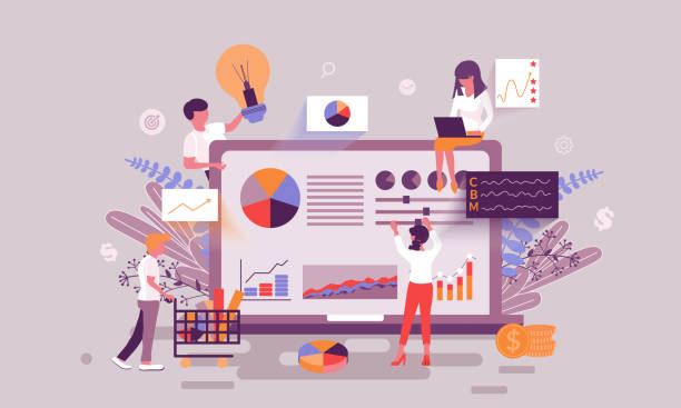
The first step in designing data-intensive applications is determining the mode of representation of data. One can represent data through charts, tables, maps or a combination of these. One of the most common ways to represent data is through dashboards which give a bird’s eye overview of data and share insights that allow users to quickly make decisions or iterate on their current implementation.

For now, let’s talk just about these dashboards and how designers can pay attention to the little details of designing dashboards. Although, different products demand different approach to designing dashboards, but I feel that one can keep a check on the below points to make sure that whatever you design is useful and reliable.

Choose the right visualization method

Future according to Designing Data-Intensive Applications | nexocode

One of my friends recently recommended me an app for managing my finances. She raved about the mobile app so much that I had to download it. I realized it later why she was all praises. The app gave me so much information just at one glance. I could look at my monthly expenditure as well the breakdown of money spent on food, movies, travel etc.

Looking at it from a designer’s perspective, I now know why it clicked for me. For different data sets, they have used an appropriate visualization method.

For example, the monthly report used the line graph so that user can easily identify spikes in expenditure at one glance. Similarly, expense categories are shown in a pie-chart and color coded, so that it’s easier to identify in which category the person spent the most.

So, just before you begin the design of the dashboard, start with an initial understanding of what kind of data you have and what’s the most suitable data visualization method that you can use.

Here are a few data visualizations methods that you can frequently use in dashboards of digital apps-

Line Chart– Line chart is great for showing data trends.

Bar Chart– Bar chart helps in comparing data values of related categories quickly.

Pie Chart– It divides a circle into proportional segments to show percentages between categories.

Gauge Diagram– It’s not a very popular choice, but it can be used in situations where you want to take a different spin on data visualization. For example, in showing the voter’s opinion during the elections, or a client’s opinion on product’s feedback.

UX Design of data-intensive applications | Humble Bits

Plan your layout keeping in mind your end users

A good layout keeps things in place and makes navigation easier for users. Think in terms of the physical space in your house. How do you know which utensils are kept where in the kitchen? How do you wade through the pile of clothes in your closet? It’s because of the layout and the place you’ve fixed for everything.

In the same way, for websites and mobile apps, layout plays an important role. It takes a greater precedence if the application is data-intensive. This is because when you have lots of data, understanding and deriving insights from it is time-consuming.

Therefore, it’s a good practice to keep below practices in mind-

Cut down on extra options

The more choices you give people, the more confused they’ll be. And the more time they’ll take in picking their choice. By the way, that’s not my personal opinion, it’s what the Hick’s law states.

No wonder, why do we take so much time in shopping malls.

But, as a designer, you can be the change you wish to see in the world. All we have to do is resist the temptation to show everything in one single interaction. Not every piece of information can be useful as well as critical. Even if it is, show only that information which is urgent and important for them and which motivates them to take action.

Use progressive disclosure technique to reveal the rest of the information. This way, the users can digest the information quicker and accomplish tasks faster.

An example could be from a news reading website. Showing the entire news could be a little straining for readers. On the other hand, if you just show them the snippets, the readers feel far less cognitively strained.

Do more with less

Some people think that simplicity ruins creativity. But it’s the other way round. Simplicity empowers you to do more with less. It reduces the cognitive load on the users and helps attract attention on the most relevant details.

Be consistent

Consistency is important to help users retain and understand information. We see consistency in almost every aspect of our life.

Consider this as an example- Imagine the chaos in your life if you discovered that the state/country you are visiting has different signals at traffic intersections. In that fictional state, Red no more means stop, Green no more means GO, and yellow is replaced by purple. Now, you have to learn these conventions all over again. Wouldn’t that be messy?

Similarly, in web and mobile applications, it becomes difficult for the user if you keep changing icons, colors, layout, CTAs, etc. An ideal approach that you can take is to make users learn once, use anywhere. 

Select an appropriate color palette


Every color tells a story and that’s why finding the right color palette for data visualization is probably the most crucial step. Choosing appropriate colors also impacts the accessibility of your applications as people who are visually impaired can benefit from your color selection.

There are a few things that you need to remember while choosing your color palette-

Be consistent with colors

If you are using two color variables in a chart, don’t confuse your users with different representation of colors for the same variable.


The Do's And Don'ts of Infographic Color Selection - Venngage

Use desaturated colors for visualization

Desaturated colors like white, black and shades of grey work the best as they do not attract unnecessary attention from the user, rather they convey the information subtly. The more colors you use in your visual representation, the more difficult it becomes for the user to decode the information.

UX Design of data-intensive applications | Humble Bits

Use saturated colors only to draw attention to changes (state) 

If you want to highlight the most important aspects of your chart, use a saturated color instead of throwing all colors together. Make grey your best friend and use it as a base to make sure you neither miss showing the important data points, nor do you overdo with too many colors.

The reason why data-intensive applications deserve more attention while designing is because these applications are complex. Moreover, there are multiple touch-points in such applications which need a touch of innovation so that users interactions become smooth and useful.


The UX Deliverables Timeless List

A Complete List Of UX Deliverables | by Nick Babich | UX Planet

The efforts of the UI/UX team can be translated and measured into a whole list of UX deliverables. The deliverables which are then passed on to the stakeholders, both internal and external to get an idea of what the app’s users would experience.

Being the leading mobile app design agency that has helped brands like Dominos redesign their offering, we often get asked questions in the line of –

  • What are the deliverables that you provide at the end of the project?
  • Will the development team be able to convert the design in code and then a functioning app, with the help of the deliverable?

To address all these questions, we have prepared a brief description of the different UX deliverables to help you understand what to expect as an outcome when you partner with a mobile app design agency.

The end result of our UX Design process which is what is shown in the illustration below, are all the deliverables that we are going to read in the section that follows

An Entire List of UX Deliverables

The deliverables that present themselves as an outcome of the Mobile app UX effort is a family that can be divided into four subsets –

User Research

Market Research

Design-Centric

Testing Deliverables

User Research Deliverables

This part of the UX deliverables is concerned with looking into the users’ side of the story – who they are, what they prefer in an application, etc.

User Persona

User Persona Template and Examples | Xtensio

The first deliverable that app UX designers work towards is the creation of a user persona. It is about drawing out an image of your probable user – who are they, where do they live, what do they like, what irritates them, what is their pain point, how do you prefer solving it, etc.

The study gives designers and the business as a whole the idea of whom their software design process is intended for – above all, whom they are not developing the app for.

The next part of user research specific UX deliverable is knowing how the user would move inside the application, something that helps draw out a customer journey map.

It is a visual representation to show the actions that a user would take to reach the end goal in an app.

Being in a visual form, the deliverable makes it easy to identify the steps needed to redesign or improve the app, thus setting the ground for understanding what counts as the UX for perfect user flow.

Experience Map

When & How to Use an Experience Map in UX Design | Adobe XD Ideas

This deliverable here is basically a diagram that looks into the many steps that are taken by the users when they engage with the application. It enables the designers to frame users’ needs and motivation in every step of the journey and create a design solution which is appropriate for every step in the customer journey map.

Use Cases

It is the written description of how the software design process would be and how your users would perform tasks inside the application. It showcases the users’ point of view and how the app would behave when their request is responded. Every use case inside the app is shown as the sequence of easy steps, starting with users’ goal and finishing when their goal is achieved.

Storyboard

A Comprehensive Guide To Product Design — Smashing Magazine | Storyboard design, Ux design, Storyboard

Inspired from movie industry, this part of the list of UX deliverables deal with creating an outline of users’ action and the motive behind them. The idea behind this stage is to not just show what is the environment that makes users behave the way they do inside the application.

Market Research

This part of the UX deliverable deals with the market part of the elements that are known to help businesses get an idea of how their app market is moving.

Competitive UX Analysis

EMD Website Flowcharts by Eric Miller, via Behance | Flow chart, Web design, Flow chart template

Designers while researching for the app design will be able to analyze your competitors’ apps – helping you understand the industry standard and find out an opportunity for innovating in a specific segment.

The next part in the list of UX deliverables is specific to the core designing part of the application.

Design Centered UX Deliverable

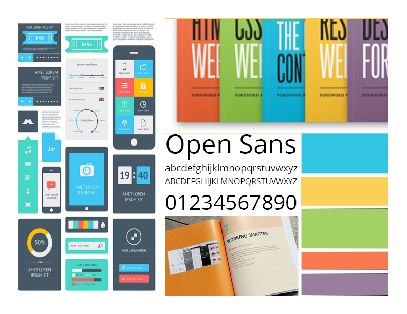
Moodboards

Mood board, a wise tool — DAY 23. Mood board is an useful tool to be… | by Roberto Pesce | Product Coalition

It is that UX design method where a collection of references and images are found which evolve as the product’s visual guide. It allows the designers to showcase the proposed look for the app to the stakeholders before they put any time, efforts, and money behind it.

Sketches

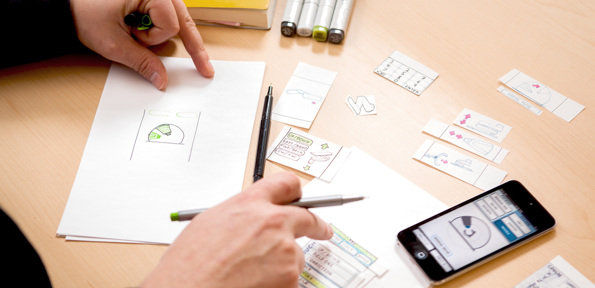
One of the quickest ways to visualize an idea – Sketching is what is next in the list of design deliverable. Made using nothing but a pen and paper, it is used to validate the concept of products and the approach related to design taken by both users and the team members.

Wireframe

It is the UX design method cum visual guide which showcases the structure of the page along with its key elements and hierarchy. They have proven to be very useful when the designers have to discuss ideas with stakeholders and team members.

Prototype

UX design deliverables - Best practises of how to use different UX deliverables - Marvel Blog

This part of the UX design process is the simulated version of a semi-final app which is also used for testing purposes before the software is launched. The aim of the prototyping process and answer to What is the role of prototyping in user experience design? is to test the products before developers are involved to move on to the MVP stage.

When it comes to creating them, there are multiple prototyping tools that you can make use of to share a clickable version of your design with the stakeholders, all of which can turn out to be pretty useful when it comes to conducting an A/B test for UX designing.

Once all the market, user, and design related UX deliverables are worked upon, the time comes to look at the deliverables which would help test the design in the market.

Testing Deliverables

Quantitative Survey

The need to prepare questionnaires and surveys that help measure user satisfaction and collect app feedback is what comes under the KRA of app UX designers

Usability Report

These reports rightly summarize the findings related to usability in a descriptive and precise way helping teams identify issues and then work for its solution.

Analysis Report

There is a huge number of insights that analytics tools like Google Analytics fetch and show how users are interacting with the application.

Sitemap

Website Flowchart & Sitemap for Illustrator, OmniGraffle or Sketch – UX Kits

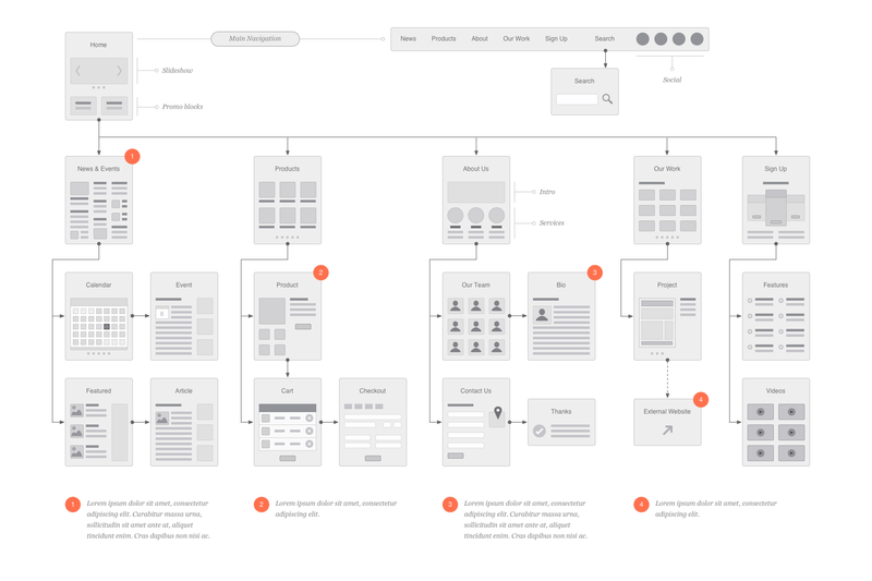
The last UX deliverable, which is also an important part of the UI design methodology that acts as the outcome of the designing efforts is Sitemap. It mainly shows the navigation and hierarchy structure of the application – which helps in giving out the information on how content will get organized in sections or screens.

Which UX Deliverable is For Which Audience?

The stakeholders of your design are not just your users but also your teammates and the company’s board and the clients. So assuming that all the UX deliverables you just read would be intended to explain the concept to any one stakeholder category would be a grave misassumption. Your chosen deliverable will have to vary from your audience to audience.

Let us look at all the different combinations that you should work around.

A. In-house management

When it comes to communicating with the managers or internal stakeholders, the UX deliverables which are mostly deemed ideal is the prototype model and the analytics report.

The prototypes give the stakeholders an experience which is a very close reflection of the final app and thus prove to be a solid tool for showcasing what the users would experience.

On the other hand, usability and analytics reports are also found to be very useful when sharing information with the management, for they present clear evidence of the UX recommendation made.

B. Clients and External Stakeholders

When you have to share the UX designs with the external stakeholders like your client, interactive prototypes and mockups are usually the most opted for deliverables.

The idea behind this is when you work with people who have limited knowledge of UX design and ux review, it is always better to give them deliverables that would place the entire focus on visual design. Doing this will help them see the app’s functionality, its information architecture, and the interaction design which is integrated inside the realistic mockups.

C. Engineers and Mobile App Developers

Outstanding Set of Software Engineers Vectors 180258 Vector Art at Vecteezy

When we talk about communication the UX idea with the developers, interactive prototypes are once again chosen as the right option. But there are other deliverables as well which come across as ideal – site map, style guide, and flowchart.

Because of their detailed focus on interaction specifics and structural details, these deliverables prove to be very useful when it comes to the actual implementation process.

With this, we have seen everything there is to know about not just the types of UX deliverables to expect as an outcome from the UX/UI designing agency but also which deliverable is best for which stakeholder.

Now that you have the necessary deliverable related information, it is time to get started with working on your own app’s deliverables.

error: Content is protected !!