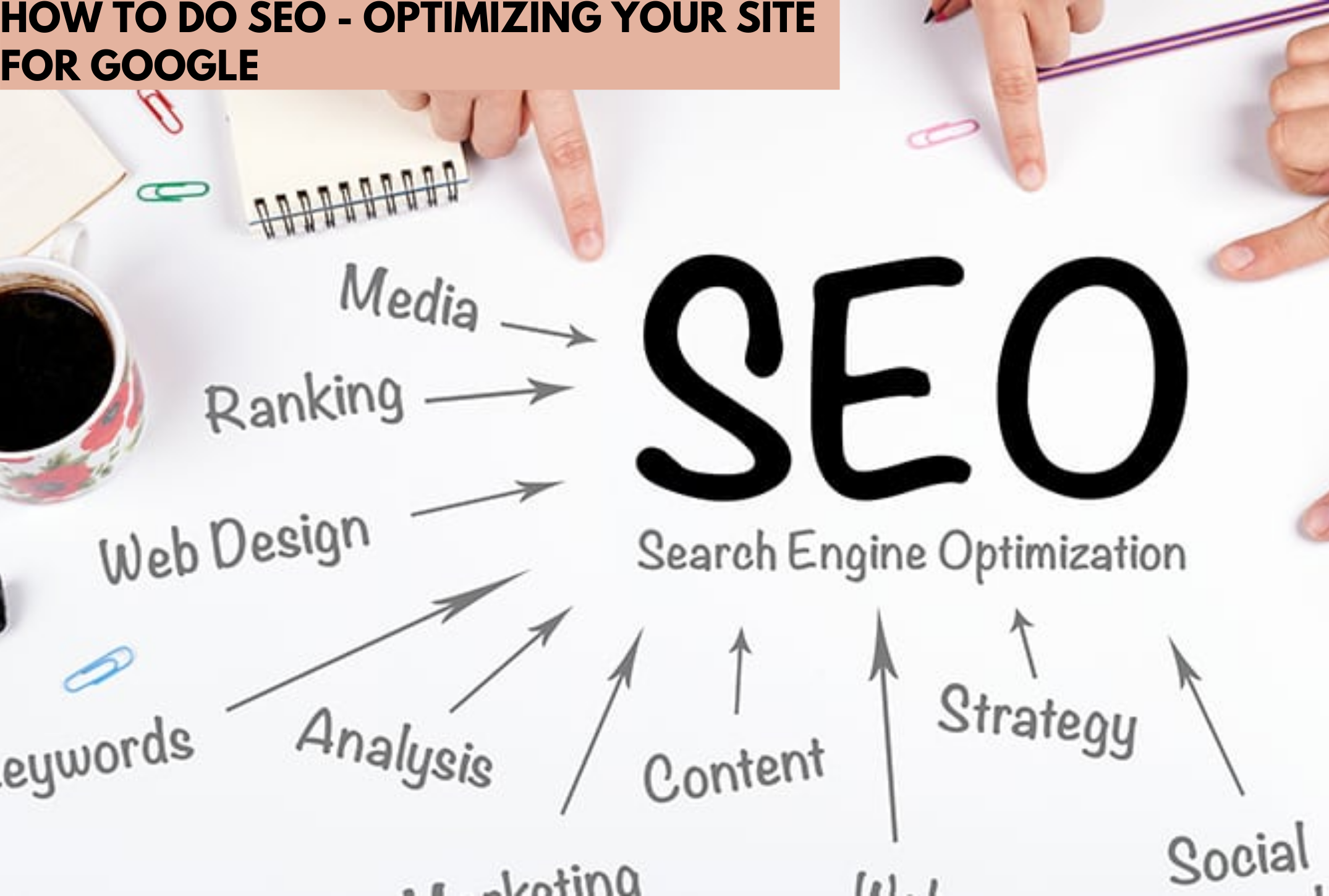
SEO lets start by understanding what is actually meant by Search engine optimization. Well it can be understood as the art or technique of optimization of a website to make it search engine friendly.
My SEO experience well to be fair I use to have three websites and lots of free time so I tried every bit of techniques on them from on page optimization to link building. So what I will share here will be my own empiricism.
Search engines determine whatever to rank your site for a particular keyword is by the number of inbound links to your site .That is the number of others sites that linked to you and the quality of senders for that particular keyword.
Think for a moment. Why would someone make a link to your website? The only logical reason is because you have created something of value. This is the logic of Google, anyway.
Another way to think about a popular website and a poor performing website, some sites are like old cities in the middle of nowhere with a road in and one road out that is poor linking . Some sites are on the trade route with high-speed multi-lane running in and out that is perfect linking .What we want a lively exchange, not a single road.
Again it just not all about link building it is also about the quality of content and at the end of the day, the quality of your content is the only thing that will convince other Web sites to link to you.
SEO can be divided into two separate categories: on-page SEO and off-page SEO.
Here I will try to list down the techniques of on-page SEO, although the on-page SEO is only 25% of the score on the search engines and the ranking of your website, it is worth addressing it, as it can improve in very less time.
On-page SEO checklist
Page title
Your page title should include keywords that are less than 70 characters in length if you make the page title too long, it will dilute the importance of the words mentioned.
The Meta description is not something that is visible on your website. Meta Description is a brief summary of the website, which is usually included in the top of the source code of the pages on a label, Meta description is not used by the search engines for SEO purposes. What the Meta description is used to provide the researcher a brief description of the page (150 characters) under each result. In fact, if a Meta description is not included in the source code, the search engine will show you some of the content of the page instead.
Titles h1, h2, h3..
The text of the titles is more likely to be read by the search engines as keywords of text in the rest of the page. For this reason, it is good to include keywords in your titles whenever possible. Labels h1 text give more weight to the keywords, tags h2 carry more weight than the label h3 .
Images
Do not use excessive images. More images mean that your page takes longer to load. This has a negative impact on the user experience as the optimization of search engines. The text associated with the images. Search engines do not read images, just read the text. The ALT text is an HTML attribute that can be added to the image so that the search engines replace the image with associated text.
Domain Information
The search engines also favor sites that are registered for a period of time longer. Since domain registrations indicate a commitment to the site and what they say the site is less likely to be considered spam. Extend your website registration for 10 or more you will definitely see better result for your site.
URL structure
Avoid nesting pages with URLs . Nested pages receive less SEO credit .
Include keywords in the URL.
Create static URLs, not dynamic. This means that the URL of one of your pages must be the same.
Web should be accessible to a vast majority of people including those with different kind of disabilities. It is not only about those who can’t see or can’t hear or any other specific category of disability. We can make positive impact on the lives of people by making web accessible to them.
Primarily there are 4 main types of disabilities that highly affect the use of web.
1. Vision
People with low vision or those who are completely blind mostly rely on using the screen readers and keyboard. Specially designed keyboards are available in the market which blind users can easily use. In earlier days people with vision impairment had to use external bulky screen readers attached to their computers but these days browser extension like Chromevox and Fangs are available.
Websites should be designed and coded in a way that these should be easily recognizable for the screen readers. For example: putting appropriate alt tags in images help screen readers to read the image loud to blind users so that they get to know what that image is all about.
Also, there are huge number of people in the world who are color blind. This term may be confusing for some people. It doesn’t mean that the person is blind or can not see anything. Color blind people can see the colors but they see them differently. Green and red are the highly affected colors.
As per the survey results, 8% of men and 0.5% of women are color blind. You may wonder why this huge gender based difference. The reason why men are highly affected than woman by color blindness is: X-Chromosomes. These X-Chromosomes are responsible for sending color signals to the human brain. Men are born with one X-Chromosome whereas women are privileged to be born with two X-chromosomes and in case one is defective then the other one comes handy for women. Nature has offered extra privileges to women. :D.
Some of the famous celebrities to name with color blindness are- Mark Zuckerberg, Bill Clinton, Keanu Reeves, Prince William Windsor.
There are many ways in which we can make web accessible for color blind people. For example: include color names and show example, please see the image “Color Names”
Don’t rely on color coding only, instead try to use a combination of color texture or pattern. Please see the image “Colors and Patterns”.
You can also proof to color blindness in Photoshop and Illustrator while designing. Please see the image “Color Proof”.
2. Hearing
Making web accessible for deaf and hearing impaired people is relatively easy. The best solution at the moment is the use of closed captioning whenever a sound appears. This technique is widely used in television where a text is displayed whenever a sound appears.
Use of signs and symbols is also a very useful technique for this category of people. Captioning the videos on web pages also ensures that search engine will more accurately index them leading to more people finding your content. There are certain tools that can help create captioning to our videos like Overstream.net that allows to caption videos hosted on other sites like YouTube.
3. Motor
The requirement for motor impaired web users is generally overlooked or poorly implemented. The main reason for motor impairment is stroke, Parkinson’s Disease, a broken arm/wrist/palm. To help this category of people we should always ensure to increase the width and height of the clickable area. This can greatly help the motor impaired people who can use the mouse but with limited mobility.
Some of the other easier ways are to include images for text links. Clicking images is far more easier than to click text links. Assign CSS command display:block to each link in the vertical list. This way full width is clickable instead of just the link. Use of padding on left and right of the text links can also increase the clickable area. Assigning a background color to focused links is also a very useful technique we can do to help the keyboard-only user tabbing through the web.
4. Cognitive
This type covers the difficulty with understanding, inability to focus and distractibility. We should follow universal design principles to make websites accessible to individuals with cognitive disabilities therefore making it more accessible to everyone. Mainly there are 3 principles that come handy to design the web for cognitive disabled people as explained below:
Content of the website should be simple. We should refrain from using complicated language, technical terms, legal jargon, and professional buzzwords. If it is necessary to display complex information we must use a glossary of sections targeting different people.
Placement, styling and consistency of navigation links. We should make sure all the navigation links are at the same location and are not scattered on different places. It becomes very uneasy for cognitively impaired people to try to locate what they are looking for.
Using illustrations, icons and other visual cues to communicate the key idea. Images can be very effective in communicating the complex information otherwise this information may be lost in the middle of a long in-depth content.
There are also impairments that are directly not associated with the users. Environmental factors also have huge effect on how people use and interact with the web. Some of them are mentioned below:
Low bandwidth, intermittent internet connection
Bright light, rain or other weather conditions
Noisy environments
Only option to browse the web on mobile devices
There are different legal acts in effect in different countries to give equality right to disabled people and help them use the web without discrimination. Section 508 requires US federal agencies to ensure that employees and members of public with disabilities should have equal opportunity to access government information.
Target.com: In February 2006 a student of University of California-Berkley, Bruce Sexton in conjunction with “National Federation for Blind” sued Target.com because it’s website was inaccessible for the blind. This lawsuit was used as a spotlight to many corporate websites that don’t play well. Target.com had to settle the case with $6 million.
If you are a developer, you know the struggle of choosing the right tools for your projects. Opting for the right editor or IDE is a great hassle if you don’t have your facts right. In software development, Emacs and WebStorm are two very common names, both of them being tools that support Node.js Development. However, the question arises that which of these two tools should you consider while starting your Node.js project.
Emacs vs. WebStorm for Node.js Development
In this article, I shall guide you through all the details, from big to small, regarding Emacs and Webstorm to help you choose which of these two might be better for your project.
Similarities
There are a few features that are shared by both Emacs and WebStorm. Firstly, both of them are capable of connecting to external code quality tools such as ESLint. Both of them can connect to these tools and provide real-time code analysis and bug spotting. Secondly, either one of the tools can provide a deep analysis of JavaScript mode. WebStorm has its exclusive JavaScript analysis engine whereas Emacs has its own js2 mode. Both aid in finding the bugs and issues in the code like finding a function that does not return a value and can perform minor tasks such as extracting variables too. Lastly, both the tools greatly support smart auto-completion. Where Emacs does this through Tern, which is an open-source JS code analyzer that various editors can connect with. On the other hand, WebStorm does it using its own engine which, in addition, parses JSDoc comments and TypeScript descriptor documents.
Why WebStorm?
Although Emacs is great yet there are a few things that lie out of its scope and just cannot be done right with it. Disparagingly, few of the peskiest things that Emacs can not do, can be done by WebStorm, making it a great choice for developers. One of the major aspects of this domain is debugging. The basic debugger in the Node.js is terribly slow. WebStorm emerges as a great alternative in this case. It wouldn’t be wrong to say that this debugger in itself enough to make a developer opt for it over anything else for major JavaScript Development. Though Emacs does have an inbuilt editor for debugging, it fails to work with the default Node.js debugger. Even if it did work, it would’ve been taken back by the utterly sluggish performance of the default debugger.
Definition and Symbol lookup is another incredible component of WebStorm. While Emacs can discover definitions and symbols in a solitary document by means of Tern, WebStorm can really review your entire task and discover a definition, or if nothing else give you a very pruned rundown of contenders to look over. This makes exploring through code exponentially quicker, and it truly diminishes the strain of setting exchanging between documents.
Testing integration is the last enormous success for WebStorm. When utilizing the most well-known JavaScript testing systems, Jasmine and Mocha, WebStorm removes the need for running individual tests, entire test files, and entire test suites with only a couple of keyboard shortcuts.
If we join this last component with debugging and code navigation between documents, WebStorm turns into an astounding TDD tool. Emacs can be inconsequentially set up to run an entire test suite, however not to run individual tests for any of the regular JavaScript testing frameworks. While this is possible in Emacs too, (such integration exists for Ruby’s RSpec tools), nobody has contributed to the opportunity to make it work.
Why Emacs?
Regardless of the considerable number of pros WebStorm has, there are still various things Emacs is better at. One of the most significant of those is auto-completion. I have already mentioned above that both Emacs and WebStorm can do some degree of smart, context-aware completion. The truth of a dynamic scripting language like JavaScrip is that on multiple occasions, there is no relevant completion accessible as there is an excessive vagueness or the code has improper structure.
In these cases, WebStorm simply doesn’t offer any completion, compelling you to type everything physically. Emacs accomplishes something amazing in this case. It basically tokenizes the majority of the words in each buffer of a similar kind, for example, each JavaScript buffer, and takes a gander at the characters you have begun to type and attempts to discover a match. It is nothing but a fact that often in the event that you type around three characters of a word, it will offer you around 3-5 choices of words starting from those three characters. This radically improves the speed as you don’t need to type the whole words to get going.
Something else Emacs is commendable at is Vim emulation. While WebStorm’s Vim copying is good too, but it does encounter bugs frequently. These incorporate bugs like keys not enlisting, getting into abnormal states where you seem to be somewhere between the normal and insert mode, and a peculiarly delicate mouse choice that consistently appears to place you in visual when you didn’t ask it to. Also, some propelled highlights like macros once in a while work directly for rarely work. It also fails to copy things on the system clipboard, which Emacs does as a matter of course. Also, large file editing or micro-driven refactoring is also better done in Emacs.
Summary
Like every other app development tool, Emacs and Webstorm too, have their own advantages and disadvantages. A significant disadvantage is automated refactoring. Automated refactoring is an incredibly tricky problem in a dynamic language. Neither Emacs or WebStorm is capable of going beyond extractions or simple variable renames. It can make refactoring across files a wearisome, error-prone process. Similarly, both tools lack at generating code for JavaScript. Either of the tools supports expanding developer-defined templates, but nothing else. WebStorm appears to be at least trying a bit in this regard. Presently, it can generate a method that you call in code, but only into the same file you are in, and it will often call the method wrong. A developer must consider all the points before choosing the right tool and beginning the development so as to utilize the features to their utmost capacity.
A website is the destination of your online business, and you should make sure your website is well-designed and compliant with the existing SEO guidelines. Year after year, new technologies, software, and ranking algorithms are introduced, which force website owners to make the necessary design changes.
Website Redesigning
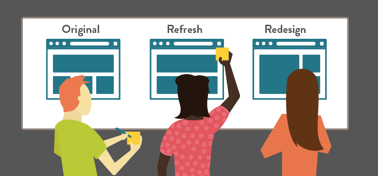
If you are a website owner who is contemplating a website redesign, this article discusses five vital factors that you should consider for redesigning a website.
A Responsive Website Redesigning
A clunky, laggy, and unresponsive design can turn off the visitors in the blink of an eye. On the other hand, a beautiful looking website that responds to the touches and actions immediately hook in the visitors. Moreover, Google has made it clear that a responsive design that increases session time would be one of the significant ranking factors.
Good website redesigning includes a clutter-free interface with plenty of white spaces and small but visible navigation buttons. A website with symmetric and well-organized pages catch the eye of all users and make an excellent first impression. A responsive design Also includes different landing pages optimized according to various devices that can give your website a significant boost in traffic, average session time, and rankings.
Summarizing, your website needs to satisfy these parameters for attaining an excellent, responsive design that impresses your visitors and improves your Google rankings.
Beautiful design
A lot of white spaces with small navigation icons
Diverse landing pages
Mobile Optimization
Apart from responsive design, a website should be compatible with all small screen and large screen devices. Around 50 percent of the total internet traffic is mobile traffic, and Google, in one of its recent algorithm updates, has mentioned that mobile compatibility is going to be one of the significant ranking factors for websites.
Therefore, your website should be well-optimized for mobile, tablet, and other small-screen devices. A website can be optimized for mobile devices by several methods like:
Suppose you typed a search query on Google and clicked on one of the displayed search results. You’ve been waiting for ten seconds, but the page does not load. What will you do? Unless you are not a regular visitor to that website, you leave it in a flash. This behavior is standard and applied to all the users; therefore, a website must load fast.
The design of the website plays a vital role in determining its speed and performance. If a website has a dense, clumsy design with a lot of content, pictures, and videos on every page, it takes more time to load. On the other hand, if a website has a sleek and responsive design with minimal content and compressed images, it loads faster.
Luckily, you can access a lot of free tools like GTmetrix and PageSpeed Insights that allow you to determine a website’s load speed and tips to improve it.
Some tips to improve your website’s load speed and performance are:
Design plays a vital role in determining your website’s load speed. Your website design should be minimal, with only necessary items and pieces of information on the page.
The presence of excessive multi-media elements like high-quality images and videos can significantly reduce the load speed of a website. Try reducing videos and pictures on your website, and compress the photos if they are relevant and provide the necessary information.
If your website does not have appropriate storage, bandwidth limit, or a right hosting provider, it affects its loading speed. Make sure to check these factors if your website takes time to load.
Check your website’s speed and performance regularly and act upon the recommended fixes and suggestions.
Accounts and Social Media Integration
Social media integration enables you to multiply the number of visitors visiting your website without putting in any extra effort. Adding share buttons on your website allows your visitors to instantly share your content with their friends and family, which improves your reach, traffic, and rankings.
Adding your social media handles on the website can help you connect better with your audience and allows you to share content on different platforms and in various forms. Providing an option to register and login on your website enables you to provide your users with personalized user experience, which is essential for building trust and improving brand reputation. You can further simplify the login process by providing the feature of logging in directly from social media accounts.
Social media and account integration can help you in the following ways.
It allows your visitors to share your content over different platforms.
It enables you to connect your visitors with your social media handles.
It enables you to provide your users with personalized user experience.
Analytics
Analytics tools allow you to analyze the performance of your website and make necessary improvements. Different websites have different visitors of varying age, gender, country, device, and more. Analytics tools like Google Analytics and Monster Insights allow you to access all the information about your visitors, enabling you to understand their behavior and requirements.
Analytics tools also allow you to track conversions, funnel performance, session time, bounce back rate, back off rate, and other necessary information that can be vital for improving your website’s performance.
Some advantages of using analytics tools are:
It provides in-depth information (demographics) about the visitors.
It identifies the underperforming areas of your website, helping you take targeted actions.
It enables you to analyze your conversions, backoffs, bounce back rate, and average session time.
It helps you optimize your campaigns and strategies according to the visitors.
Conclusion
Website design is a significant ranking factor for websites as a responsive website design that provides visitors with a better experience. Although a good website design includes other elements like logo design & positioning and widget optimization as well, the aspects discussed above play a key role in determining the overall design and performance of your website.
SEO lets start by understanding what is actually meant by Search engine optimization. Well it can be understood as the art or technique of optimization of a website to make it search engine friendly. My SEO experience well to be fair I use to have three websites and lots of free time so I tried every bit of techniques on them from on page optimization to link building. So what I will share here will be my own empiricism.
Search engines determine whatever to rank your site for a particular keyword is by the number of inbound links to your site .That is the number of others sites that linked to you and the quality of senders for that particular keyword.
Think for a moment. Why would someone make a link to your website? The only logical reason is because you have created something of value. This is the logic of Google, anyway.
Another way to think about a popular website and a poor performing website, some sites are like old cities in the middle of nowhere with a road in and one road out that is poor linking . Some sites are on the trade route with high-speed multi-lane running in and out that is perfect linking .What we want a lively exchange, not a single road.
Again it just not all about link building it is also about the quality of content and at the end of the day, the quality of your content is the only thing that will convince other Web sites to link to you.
SEO can be divided into two separate categories: on-page SEO and off-page SEO.
Here I will try to list down the techniques of on-page SEO, although the on-page SEO is only 25% of the score on the search engines and the ranking of your website, it is worth addressing it, as it can improve in very less time.
On-page SEO checklist
Page title
Your page title should include keywords that are less than 70 characters in length if you make the page title too long, it will dilute the importance of the words mentioned.
Meta Description
The Meta description is not something that is visible on your website. Meta Description is a brief summary of the website, which is usually included in the top of the source code of the pages on a label, Meta description is not used by the search engines for SEO purposes. What the Meta description is used to provide the researcher a brief description of the page (150 characters) under each result. In fact, if a Meta description is not included in the source code, the search engine will show you some of the content of the page instead.
Titles h1, h2, h3..
The text of the titles is more likely to be read by the search engines as keywords of text in the rest of the page. For this reason, it is good to include keywords in your titles whenever possible. Labels h1 text give more weight to the keywords, tags h2 carry more weight than the label h3 .
Images
Do not use excessive images. More images mean that your page takes longer to load. This has a negative impact on the user experience as the optimization of search engines. The text associated with the images. Search engines do not read images, just read the text. The ALT text is an HTML attribute that can be added to the image so that the search engines replace the image with associated text.
Domain Information
The search engines also favor sites that are registered for a period of time longer. Since domain registrations indicate a commitment to the site and what they say the site is less likely to be considered spam. Extend your website registration for 10 or more you will definitely see better result for your site.
URL structure
Avoid nesting pages with URLs . Nested pages receive less SEO credit .
Include keywords in the URL.
Create static URLs, not dynamic. This means that the URL of one of your pages must be the same.
Opting for an appropriate web development framework is quite a hefty task. There are a lot of frameworks present in the market designed specifically according to the needs of the project. Every developer looks for three things while choosing a framework which is: the language used, tools present in the framework and the reputation that it has in the market. Django passes all the parameters with flying colors as it is the best in the class. For many businesses and organizations, Django is an easy choice. Django boasts the label of one of the most popular web-development tools today.
Django is a free, python-based, open-source web development framework that facilitates clean and rational designing of websites driven by databases. It reduces a lot of hassles that a developer has to face during the development of a website. It is used to develop minimal yet smart web applications. Simultaneously, Django enables developers to create web applications as required by fluctuating business prerequisites. Since it is developed by professional developers, it takes care of all the hassle involved in web development so that you can focus on making the application rather than digging the basics.
Pros of Using Django Framework for Web Development
Here are a few reasons why Django is the first choice when it comes to web development.
1. Backward compatible
Django offers the provision of working with its older versions and makes use of its older formats and features. Additionally, it has a comprehensible guide that walks you through all the information that you might need to know about the changes and trends of the Django framework, especially when the new changes become incompatible with the former ones.
2. Community Support
Django enjoys the support of a huge and very professional community of developers who have inside out knowledge of Django and are always ready to help. Having a large community has benefits of its own. It makes finding answers to problems much easier as there’s a great probability that the problem faced by you now has occurred to someone else too and now probably has an answer to it on one or the other forums. The community is very quick in answering the issues and fixing the bugs of fellow developers.
3. DevOps Compatible
DevOps is the blend of cultural philosophies, tools, and practices that increases an organization’s ability to deliver services and applications at high speed: evolving and upgrading products at a faster rate than organizations using conventional software development and infrastructure management processes. Incorporating DevOps in Django is great as it fixes issues faster with enhanced operational support. It uses continuous delivery methodology to increase the efficiency of the system.
4. DRY and KISS compliant
Django religiously follows the ‘KISS’ principle which is “Keep It Short and Simple”. In Django, it simply means that the code must be brief, easily understandable, and methods should not exceed more than 50-60 lines. Similarly, ’DRY’ stands for “Don’t Repeat Yourself”, which means that the software patterns that occur quite often can be replaced with abstractions. In this manner, issues related to the code as well as repetition can be avoided. Additionally, reusing the code simplifies the development process thereby decreasing the overall production time.
5. Infrastructure
Django is independent and a complete set in itself. It means that it does not require any other external solution. It is everything, from an ORM to a web server. This enables it to use various databases and switch them accordingly.
6. REST framework
REST stands for Representational State Transfer framework which is a renowned toolkit for creating web APIs. This is an added benefit with Django as it is powerful enough to build a full-fledged API in just two or three lines of code. An additional benefit to it is that REST is immensely flexible. Therefore, data is not bound to any protocol and can return various data formats and manage several types of calls.
7. Secure & up-to-date
Django is constantly kept up to an elevated standard, following the most recent patterns in site development and security. That certainly addresses the inquiry “Is Django useful for web development?” — As security is a ‘number one’ in any to-do list. Django is customarily updated with security fixes, and regardless of whether you’re utilizing an older rendition of the system, its security is as intact as the new one. It’s no big surprise as Django has an LTS (Long-term Support) variant.
8. Simple
Django’s documentation is excellent. It was introduced with excellent documentation, and they are as yet kept intact in the same way, which makes it simple to utilize. Also, one of Django’s principal reasons for existing is to disentangle the development procedure: it covers the fundamentals, so you can concentrate on the details of your project.
9. Suits any kind of project
Unlike C# or Java, Django is no business solution. Still, it is appropriate for all kinds of projects regardless of their size. A Django application can be a social media application with enormous traffic and heavy volumes of data or it could be a simple web application for handling logbooks. It can build anything as it has everything required to build every type of application. Additionally, Django is cross-platform also compatible with the majority of databases making it highly versatile.
10. Time effective
Django is ridiculously fast. It was built to slide the applications from imagination to reality in a blink. Django applications are both economical and efficient. Thus it is the right choice for developers who have major stakes placed on the due dates.
11. Time tested
Django has been in the picture for years and in that tenure, it has emerged as the choice of a lot of businesses for their web applications. This confirms the fact that Django has already made an impression in the market and is here to stay for long. A few examples of applications built on Django are Disqus, Spotify, Instagram, and NASA.
12. Useful additional features
Django comes with everything inbuilt. It has all the features which are required to build a web application from scratch. There’s no need to spend hours on forming a frame since everything is already present in the framework. It also has tools packages to help in going hands-on with pioneering technologies such as Artificial Intelligence, Data Analysis, and Machine Learning.
13. Versatile
Django is the master of all trades. It is capable of doing everything, from content management to managing scientific computing platforms; everything falls under the umbrella of Django.
14. Works on Python
As mentioned earlier, Django is a web framework which is written in Python. As a result, it brings with itself the simplicity of utilizing the syntax structure of Python and enables developers to build meaningful and viable web applications effortlessly. In this way, developers can easily reduce the development time required for building these web applications.
Summary
To summarize, Django aids developers to compose custom web applications in Python by offering several features, modules, and features. Contemporarily, Django is being rehearsed by various high-traffic websites like Google, YouTube, Pinterest, Spotify, and Instagram. However, Django, like other web systems, has its very own pros and cons. Therefore, the developers must recollect the precise requirements of each venture while evaluating the advantages and disadvantages of Django to choose the best Python framework.
Robotic process automation (RPA) has the potential to save companies significant amounts of money by shifting mundane, repetitive tasks, such as data extraction or data translation, from humans to robotic software agents. In fact, the McKinsey Global Institute estimates that half of the activities that workers are currently paid $15 trillion in wages to perform globally could be automated with current technologies. An example of RPA would be a robotic agent that automatically opens and reads word documents or spreadsheets, identifies and extracts the necessary data, and transfers the data quickly and accurately to the appropriate business processing system. When it works right, RPA can speed up business processes, reduce manual data entry errors and free up employees to be more productive. RPA is also the first step on the road to higher value activities like machine learning and AI.
Unfortunately, many companies that have launched RPA projects have been disappointed when the savings have failed to meet lofty expectations. Other organizations have achieved early successes with proofs of concept, but have been unable to scale beyond the “low hanging fruit” processes.
In order to avoid the pitfalls that have prevented companies from realizing the full benefits of RPA, there are several key points to keep in mind, particularly when it comes to deciding whether to deploy assisted or unassisted RPA.
The first mistake companies make is jumping ahead and trying to grab quick and easy wins before doing the necessary strategic planning required to support a scalable, long-term and sustainable RPA deployment.
For example, companies need to make sure they don’t try to automate processes that are inherently inefficient because simply doing the wrong things faster doesn’t help the company achieve lasting business process improvement. Companies also need to analyze business processes in a holistic, end-to-end way, otherwise speeding up one part of the process might just create a bottleneck somewhere else.
For many companies, it’s tempting to implement unassisted RPA in which the software agent operates without human intervention. That can lead to early wins, but it can also lead the company into a dead end where they run out of projects that lend themselves to unassisted RPA.
Unassisted RPA requires processes that can be completed with simple decisioning, but it turns out that these processes are few and far between in the real world.
The real value of Robotic Process Automation will only be realized when companies adopt assisted along with unassisted RPA, combining the speed and accuracy of robots with the complex decision-making and creative abilities of humans. By working in tandem, humans and robots can achieve the efficiency goals that companies are seeking. And RPA, if done with the requisite strategic planning, can serve as the foundation for the organization’s business process automation journey to more complex, higher-value technologies like cognitive computing, machine learning and AI.
Starting up with a website designing business is relatively easier, but keeping the game up for security becomes the major concern. The primary motive of your web design business should be to get those clients who are willing to pay for the services you are going to provide them. Security is one such aspect of this business that gets generally neglected and is not given that due attendance, which it deserves. Many startups offering web design services think that their business is too small to practice any serious security measure, or they find it useless to invest in cybersecurity plans at such a small level. By the time their business starts rising to the mid-level, they realize that it is now too late to implement security measures.
One breach in the security policies of your company can harm it to the level you might not have imagined. If we look into the survey reports from the National Cyber Security Alliance, we get to know that more than 70 percent of hacking attempts are done on small businesses. On average, a data breach of a small web designing company can cost Rs 35000 to Rs 50 lacs. Approx 60 percent of small businesses shut down in less than 6 months after a security breach as it becomes difficult for them to recover from the loss in business both financially and emotionally.
Security Mistakes to avoid with your web design business
To protect your web design business, and to maintain its security, ensure that you are not committing any of these mistakes.
1. Making use of personal devices for business purposes
When starting with any new business, there are many challenges that come in your way. The first one is the budget constraint, which often tempts people to use the technology or devices which they already have without spending more money on these products. It is all fine if you are using that device dedicatedly to meet your business goals and have stopped using them completely for your personal use after deleting all the personal data from that device.
It is of utmost necessity to set up a line between your personal and professional data, especially when there is an involvement of customer information. Mixing up these data can pose a real threat to the security policies of your organization. It is a tendency to ignore security measures when it comes to personal devices as compared to professional ones. Employees should also be refrained from using their devices for business purposes as it is really difficult for you to control your business then and can breach your security policies by exposing customer’s data. When an employee resigns from a company, the information on their devices also goes with them, that is why it is always better not to use personal devices for business purposes.
2. Overlooking the importance of data backup
Everything related to your business should be backed up, even the things that you think don’t contribute to the growth of your web design business. The data should be protected with a multi-tiered backup system involving data available both online as well as offline. A significant amount of time goes in to recover the lost data, and being a part of the web designing business; you cannot afford to lose significant data or spend time recreating data because of poor backup systems.
3. Overlooking basic security protocols
A very simple but often overlooked element in web designing business is cybersecurity. By adhering to the basic protocols related to security, one can safeguard their business from being hacked. According to a survey, approx 75 percent of employees do not secure their computer, approx 73 percent of employees use weak passwords in both their professional as well as a personal account. To safeguard the data, a web designing company should create internal mechanisms asking employees to change their passwords often and to disable logins of the employees who leave the company immediately. Passwords should be handled carefully and should reach only to authorize personals. Setting up security protocols like firewalls, anti-virus software, and malware protection is equally important to protect the company’s data.
4. Not using a virtual private network (VPN)
Being a web designing company, you need to develop websites for multiple clients, which means you are given an ample amount of sensitive information. To safeguard the data which your clients have entrusted to you, you should use a virtual private network to reduce the potential of any breach. A VPN encrypts all the data that is being sent over a network, making it virtually invisible to potential hackers.
5. Designing it all by my mindset
While setting up a company, it is viable to get involved in multiple roles to learn things and to save some extra bucks. As web design is an internet-based occupation, you might think that there is no need to hire a network designer, and you can do this task all by yourself. But hiring a network professional not only saves time but also you get to know things from a professional perspective, which guides you towards the best security protocols to safeguard the company’s significant data and hence save you from expensive problems in the future.
6. Not creating a proactive shield
When clients trust you with the development of their websites that forms an important part of their business, they expect you to include all possible security elements in that project. In many cases, website developers or web designing companies are held responsible for the security breach on a client website because of the irresponsible attitude of the developer in creating appropriate security protocols on the website.
Conclusion
Cybersecurity may not seem important at first, especially for small businesses, but it plays a very important role in determining the success of any company. By avoiding some security mistakes, you can ensure the safety of your company’s data as well as the client’s data. By following simple security protocols, you can grow your business exponentially without worrying about the theft of significant data.
As the world is going digital, all start-ups and businesses are indulged in developing their website and mobile applications. However, the question that arises is which amongst the two makes your business thrive and skyrocket its profit? The broad idea is that everyone in the coming times would have a mobile phone rather than laptops or any other. Besides, mobile apps are the latest things due to the popularity of mobile phones.
So far, the mobile apps get developed after the website has been launched, but is this the best decision for your business? However, should it be the only thing you start with? Especially if one’s budget doesn’t allow to launch both? Does that mean the web is dead?
Furthermore, having a mobile phone does not merely translate into downloading mobile applications. So, how to surpass your competitors on the web? Through a web vs app? There are many advantages and disadvantages involved in both. You must opt for the right platform for your start-up. The answer is, of course, selected according to your needs and the kind of customers you want to attract.
Should I start with an App or Website?
Therefore, before you choose, you must consider the importance of a mobile-friendly website as well as a mobile app. Going through this guide answers the most frequently asked question – What should I begin with – Mobile App or Website?
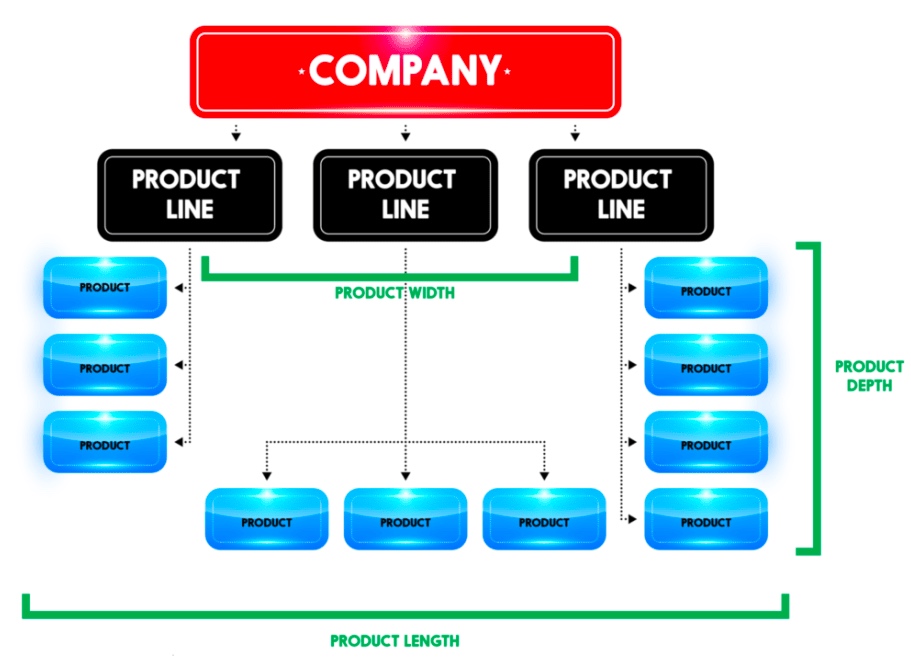
1. Product Line
Does your product include GPS, navigation, or location-based elements? An instance of it would be Ola or Uber. Such start-ups must have a mobile app rather than having a website. Their business links the passengers with cab drivers willing to drop them to their desired destination. Similarly, if you plan to build an application for people to track their route or an application facilitating the runners map the distance covered and the number of steps taken, then you can provide your clients with the best possible experience only through a mobile app since GPS is the lifeline for a business.
Similarly, a flight or train booking business needs an app to make it accessible from everywhere. If you are into developing Android applications or even online games, to-do lists, notes, alarm clock, reminders, social media, or email, then mobile apps involve more users and interact with them in the best way possible. The business can only be successful by comprehending the requirements of its audience and target market first.
On the contrary, if you are an event management company who needs people to go through your catalogs and know about your business, or if you are a photographer or a hairstylist who needs people to checkout pictures or samples of your work, you can very well go with a website as it serves your purpose better.
2. Budget
The first thing that you need to think about after getting your Company Registration completed is the budget you have for going over the internet. Furthermore, you need to set aside at least some amount to keep your platform, weather website, or mobile application, updated. Most Web Designing and Development Companies suggest that you develop a website first and then a mobile app since it is an economical option. You get the advantage of showcasing all the content on a single interface on a website. Besides, updating the content takes fewer efforts in case of a mobile app as compared to a website.
Furthermore, the UI of an App must be adjusted for every platform like Android, iOS, and Windows. An app-only business model might face issues reaching out to consumers across all the platforms. It is said that you are required to spend more on developing different apps for different platforms. It reduces your cost per OS. If you have started your business with a limited amount, it won’t make sense to start developing a mobile application.
3. Marketing Plan
In the beginning, all the businesses only have restricted resources. As the business scales up, you can go for additional platforms. Still, if a company is opting to go app-only, it risks missing out on a broad market of potential customers. Mainly, if their app does not happen to feature amongst the top few apps of choice for a consumer.
A famous example is Myntra, the leading fashion e-commerce marketplace in India. A few years back, it announced that it is going app-only. The company claimed that this step was taken to improve personalization. Without a doubt, the loyal users of Myntra were compelled to download the mobile app. This approach was adopted to push out the competition. As consumers would be more captive in a particular environment and shopping around for discounts would decrease. But the move only backfired. Within a year, Myntra was compelled to relaunch its mobile website.
4. Tools Required
Are you launching something complicated? Would you require to show data analysis or reports and more? Will your users need sophisticated numbers, reporting, or calculations? It is almost impossible to utilize these tools on a website. So in this parameter of the website vs app, the mobile app is a clear winner due to its optimized UI, which displays all the data. For instance, if you will be needing complex calculations, numbers, reporting, then you should acknowledge that it will be next to impossible to use these tools without a dedicated app.
5. Frequency of Usage
Do your targeted customers need to access your services on a daily or hourly basis? If you want your users to check into your platform a few times a day, then it makes more sense to start with an app. It is far more convenient, faster to access, and it has the option of notifications for the users to keep updated. But you must make sure that your app is not slow to launch or perform the desired actions. It will become a barrier that stops people from using your app.
6. User-Friendly
Most of the websites have a navigational UI. However, mobile apps need to have an interactive UI to be successful. Again the example of games comes to mind. A mobile app will be a better choice for a game development company as compared to a website. A responsive web design approach acknowledges as well as resolves many of the usability problems for a mobile-friendly website. So, you must consider the needs of your business and the choice as well as the comfort of your users.
7. Accessibility
Even today, accessibility to the internet is a major problem in many parts of the world. So, do in-depth research on how long would a customer need your services. For offline accessibility, you must build location-dependent, parallel apps. Therefore, mobile apps will be more appropriate for offline mode of navigation rather than a website. If you think that your business would serve mostly to offline users, then it is much better to develop a mobile app where the user can access your services whenever they need it. For instance, dictionaries facilitate accessibility to know words, even without an internet connection. Users can use it whenever they need, wherever they need.
8. Speed
Those who’ll use your app or website pretty often during the day would want to have their interaction to be smooth and lag-free. Nobody would want to wait even for a minute to play games during their 15-minute metro ride or while waiting for a cab. Nobody has the time to bear with a slow platform for their needs. Imagine if you always had to access your favorite Social Media like Facebook, Instagram, or LinkedIn through your browser first and then having to sign in. Only after doing all that every time would you be able to read that message or know of the newly vacant position. Wouldn’t it be much better to get an immediate notification as soon as you receive the message? However, if you are targeting customers who would not be accessing your platform frequently, then installing a mobile app will be more time consuming as compared to visiting a website.
Conclusion
Many companies and businesses may want to go for a mobile app first. It is a much more advanced and trending way to connect with consumers. But it can be a huge mistake too. Unless you have a mobile-based start-up, developing a website first, is the way to go, rather than spending some significant part of your budget in making a mobile app. Instead, you can try to make your website more user-friendly or even pay extra to make it rank up on the Search Engines. The final verdict is that there are many points that you must carefully consider before you make a choice should I start with an App or Website?. Amidst the Website vs. Mobile App, it’s challenging to pick an absolute winner. It all depends on you and your business requirements. With this article, we have all the advantages and disadvantages served before you, which you will have to weigh for yourself.
With every second person using their mobile device to access information over the Internet, there’s no option left for business houses than to build websites customized for smaller screens; because if they don’t, they risk losing out on a substantial share of potential customers.
But building a website that fits on a smaller screen is a challenge in itself since with the variety of mobile devices currently available, there are a plethora of screen sizes for which websites need to be customized.
So do organizations need to build a different website for every different screen sizes?
Well, of course not!
That’s where an approach called Responsive Web Design comes into the picture. Using this approach, an organization can suffice with creating one website that can fit onto any screen size. There are some code changes to be done to the programming of the website to make it mobile “responsive,” and that’s it!
So what is this Responsive Web Design approach, and what are its key benefits? Let’s find out.
What is Responsive Web Design?
Ethan Marcotte was the first person who came up with the term “Responsive Web Design,” and he also contributed significantly to developing the first mobile responsive websites. The man has deeply explained the basics of the design approach in a book called Responsive Web Design and also in this article on A List Apart.
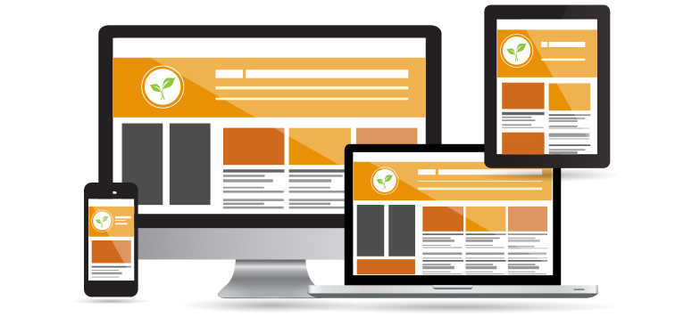
According to Marcotte, a truly responsive website is one that “responds” or adapts its layout according to the screen size on which it is being viewed. The layout of a website changes based on the size and capabilities of the device being used. For instance, suppose a website has content and images laid out in three columns on a desktop. Now for that website to become responsive, it needs to automatically show the same content in a layout with two columns on a tablet and one-column on a Smartphone.
For any website to deliver optimum user experience, it must be responsive. Imagine what impression a potential customer would carry of your organization if, on his first visit of your website on his Smartphone, all the images you carefully handpicked appear at haphazard positions with content broken up and displayed at non-matching locations.
We’re guessing it wouldn’t be that appealing!
Is a responsive website and a mobile website the same?
Not really. A responsive website is one that changes continually and fluidly based on several factors and device capabilities. In such a case, the same website is equipped with code which enables it to transform its layout at run time to fit any screen size.
Alternatively, a mobile website is one that is explicitly built on a new domain for mobile users. Such websites have their code, which is usually pretty lightweight, but often barred by constraints like obtaining two separate domains (one for desktop and one for mobile), browser sniffing, and more.
While several organizations opt for having two separate websites to serve two different sets of customers, it is not a great idea to have a different mobile site for your business. Having the same site adapt to smaller screen sizes is better since it maintains standardization and upholds your brand’s unique identity through a common portal.
How to make a webpage responsive?
We need to program HTML and CSS to automatically resize, hide, shrink, or enlarge the webpages to make them look good on all the devices so that the website becomes responsive. To start, you need to include a meta viewport tag in the document’s “head” section, which acts as an indication to the browser instructions as to how to control the displayed page’s dimensions.
To make a webpage responsive, add the following <meta> element in it:
The “viewport” tag tells the browser that an instruction to control its width and scaling follows
“width=device-width” matches the screen’s width in device-independent pixels
“initial-scale=1.0” works to form a 1:1 relation between device-independent pixels and CSS pixels
Attempt to deliver the best user experience, mobile browsers render non-responsive pages at desktop screen width first and then attempt at making the content look better fit by increasing the font size and scaling it as per the screen size. Thus for such pages, the font-size may appear to be inconsistent, and users may have to double-tap or pinch-and-zoom to read clearly.
However, if you include the code mentioned above in your webpages, mobile browsers match the screen’s width in device-independent pixels. It enables the page to reflow content such that it matches varying screen sizes, whether displayed on a Smartphone or a desktop.
While this is just the first step towards making a website responsive, there are several other aspects involved, like auto-scaling images, text, and CSS, to become truly responsive. Here’s an excellent resource where you can read some more about this.
The Basic Principles behind Responsive Web Design
The three critical principles detailed below are what makes responsive web design services possible:
1. Flexible Images
How many times have you visited a webpage where an image is so large you have to scroll horizontally to view it completely? While it is possible to view the image in this way, doesn’t it ruin the whole UX? Thus, resizing images such that they fit entirely into the screen on which they are being viewed is a necessity for making websites responsive.
A great way to make images responsive is to use CSS’s max-width property. Using this property ensures that images load in their original size unless the viewport is narrower than their width. If you set the width to a maximum value of 100 percent of the viewing area, images shrink proportionally as the screen or browser becomes narrow.
2. Fluid Grids
Fluid grids stand for grid systems, which scale based on a user’s screen size as opposed to fixed-width layouts that always appear the same. Although the term is frequently used interchangeably with “liquid layouts,” fluid grids ensure that all elements on a page resize concerning one another.
3. Media Queries
A majority of the modern browsers support CSS3 media queries that enable websites to collect data from individual visitors and apply CSS styles conditionally. The media feature “min-width” lets designers implement particular CSS styles once the browser window falls below a specified width.
Say hello to a few Responsive Web Design Frameworks
A great way to introduce responsive within your websites is by using existing CSS Frameworks that offer responsive design. Such frameworks are usually free and easy to use. Here’s a quick look at some great responsive web design frameworks:
1. W3.CSS
W3.CSS is a responsive stylesheet which makes it easy to develop sites that look nice at any size; desktop, laptop, tablet, or phone.
2. Bootstrap
Another popular framework is Bootstrap. It uses CSS, jQuery, and HTML for making responsive web pages.
Key Benefits of Responsive Web Design
Responsive Web Design brings many benefits to the table. Some of the most important ones are:
If your websites don’t distort at the change of screen size, there are more chances of users sticking around
Making a website responsive takes less time and resources than building a separate mobile website. It is also easier to maintain
A responsive website usually loads faster than a non-responsive one since it is optimized for smaller screen sizes
Responsive websites offer improved online as well as offline browsing experience
Along with the above mentioned vital benefits, having a single responsive website helps a business achieve better SEO rankings, analyze traffic reports better, convert more customers, and reduce bounce rates.
Summary
Responsive web design means making websites that automatically adapt to the size of the visitor’s viewport. Modern businesses need to make websites responsive so that content can render them appropriately on the screen, depending on their size. The activity aims to ensure that visitors have an optimal experience no matter how they access a website. The key advantage of this strategy is that websites load quickly, and they do so without any distortions, such that users don’t need to resize anything to view content manually.