We’re in the 21st century now and I feel we still have a long way to go when it comes to designing data-intensive applications. A data-intensive application is driven by the huge amount of data it consumes. Working with this overwhelmingly huge amount of data has just one problem. It creates various problems for the application because now one has to take care of various aspects such as consistency/standards, usability, scalability and maintainability of the application.
Scalability and maintainability are something that require good application architecture and quality code. But for the scope of this blog, let’s skip that part and talk only about the design.
As designers, we first need to understand that data visualization plays an important role in defining the user experience. The way data is represented on the UI defines how the users are going to interpret and use it. Only when we understand the ‘why’, we’ll be in a position to empower the end users of the application in making informed decisions.
How to design compelling data-intensive applications?
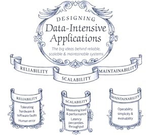
The first step in designing data-intensive applications is determining the mode of representation of data. One can represent data through charts, tables, maps or a combination of these. One of the most common ways to represent data is through dashboards which give a bird’s eye overview of data and share insights that allow users to quickly make decisions or iterate on their current implementation.
For now, let’s talk just about these dashboards and how designers can pay attention to the little details of designing dashboards. Although, different products demand different approach to designing dashboards, but I feel that one can keep a check on the below points to make sure that whatever you design is useful and reliable.
Choose the right visualization method

One of my friends recently recommended me an app for managing my finances. She raved about the mobile app so much that I had to download it. I realized it later why she was all praises. The app gave me so much information just at one glance. I could look at my monthly expenditure as well the breakdown of money spent on food, movies, travel etc.
Looking at it from a designer’s perspective, I now know why it clicked for me. For different data sets, they have used an appropriate visualization method.
For example, the monthly report used the line graph so that user can easily identify spikes in expenditure at one glance. Similarly, expense categories are shown in a pie-chart and color coded, so that it’s easier to identify in which category the person spent the most.
So, just before you begin the design of the dashboard, start with an initial understanding of what kind of data you have and what’s the most suitable data visualization method that you can use.
Here are a few data visualizations methods that you can frequently use in dashboards of digital apps-
Line Chart– Line chart is great for showing data trends.
Bar Chart– Bar chart helps in comparing data values of related categories quickly.
Pie Chart– It divides a circle into proportional segments to show percentages between categories.
Gauge Diagram– It’s not a very popular choice, but it can be used in situations where you want to take a different spin on data visualization. For example, in showing the voter’s opinion during the elections, or a client’s opinion on product’s feedback.
Plan your layout keeping in mind your end users
A good layout keeps things in place and makes navigation easier for users. Think in terms of the physical space in your house. How do you know which utensils are kept where in the kitchen? How do you wade through the pile of clothes in your closet? It’s because of the layout and the place you’ve fixed for everything.
In the same way, for websites and mobile apps, layout plays an important role. It takes a greater precedence if the application is data-intensive. This is because when you have lots of data, understanding and deriving insights from it is time-consuming.
Therefore, it’s a good practice to keep below practices in mind-
Cut down on extra options
The more choices you give people, the more confused they’ll be. And the more time they’ll take in picking their choice. By the way, that’s not my personal opinion, it’s what the Hick’s law states.
No wonder, why do we take so much time in shopping malls.
But, as a designer, you can be the change you wish to see in the world. All we have to do is resist the temptation to show everything in one single interaction. Not every piece of information can be useful as well as critical. Even if it is, show only that information which is urgent and important for them and which motivates them to take action.
Use progressive disclosure technique to reveal the rest of the information. This way, the users can digest the information quicker and accomplish tasks faster.
An example could be from a news reading website. Showing the entire news could be a little straining for readers. On the other hand, if you just show them the snippets, the readers feel far less cognitively strained.
Do more with less
Some people think that simplicity ruins creativity. But it’s the other way round. Simplicity empowers you to do more with less. It reduces the cognitive load on the users and helps attract attention on the most relevant details.
Be consistent
Consistency is important to help users retain and understand information. We see consistency in almost every aspect of our life.
Consider this as an example- Imagine the chaos in your life if you discovered that the state/country you are visiting has different signals at traffic intersections. In that fictional state, Red no more means stop, Green no more means GO, and yellow is replaced by purple. Now, you have to learn these conventions all over again. Wouldn’t that be messy?
Similarly, in web and mobile applications, it becomes difficult for the user if you keep changing icons, colors, layout, CTAs, etc. An ideal approach that you can take is to make users learn once, use anywhere.
Select an appropriate color palette
Every color tells a story and that’s why finding the right color palette for data visualization is probably the most crucial step. Choosing appropriate colors also impacts the accessibility of your applications as people who are visually impaired can benefit from your color selection.
There are a few things that you need to remember while choosing your color palette-
Be consistent with colors
If you are using two color variables in a chart, don’t confuse your users with different representation of colors for the same variable.

Use desaturated colors for visualization
Desaturated colors like white, black and shades of grey work the best as they do not attract unnecessary attention from the user, rather they convey the information subtly. The more colors you use in your visual representation, the more difficult it becomes for the user to decode the information.
Use saturated colors only to draw attention to changes (state)
If you want to highlight the most important aspects of your chart, use a saturated color instead of throwing all colors together. Make grey your best friend and use it as a base to make sure you neither miss showing the important data points, nor do you overdo with too many colors.
The reason why data-intensive applications deserve more attention while designing is because these applications are complex. Moreover, there are multiple touch-points in such applications which need a touch of innovation so that users interactions become smooth and useful.











:max_bytes(150000):strip_icc()/GettyImages-625727674-5a6d3a236b974564a4e39795bfcbd827.jpg)
