The Mantra to Mobile App Development Success

Mobile is now everywhere. In today’s reality, we can hardly imagine spending a day without our mobile left at home, so much that it turned into an addiction for many of us: feeling the „phantom vibration“ in our pocket or being anxious when the phone is not with us are just two of the obvious aspects reflecting our relationship to the mobile. From an object that we often forgot at home barely fifteen years ago, it turned into a pocket computer that has replaced many of the daily life objects (photo and video cameras, music player, recorder, calculator, agenda, and everything that a powerful, internet-enabled computer provides). From the moment it became „smart“ with the first iPhone release in 2007, everything has changed and more and more of our lives and daily actions are going through that object. Smartphones and tablets have completely changed the way we live, buy, research, communicate – mobile has basically put the digital world at our fingertips 24/7, wherever we are, freeing us from the desktop-sitting and immobile position. This has also drastically changed our approach to common tasks: we expect to perform them at our convenience, according to our needs: what Forrester calls „the mobile mind-shift“ : it replaced the computer as the first and main interaction for daily tasks. Such mind-shift forced every business to adapt their offers and service, as mobile becomes the front door of their organization. All this led to the development of „mobile-first“ design website in a first time, but more and more businesses decide to develop their own branded app. The mobile market is an incredible opportunity for businesses to interact with their customers and know them better thanks to the app analytics, provided they handle these analytics correctly. Let’s go over the key factors to consider when developing a successful mobile app, and how to manage your analytics with reporting tools.

APP ANALYTICS: A GOLD MINE
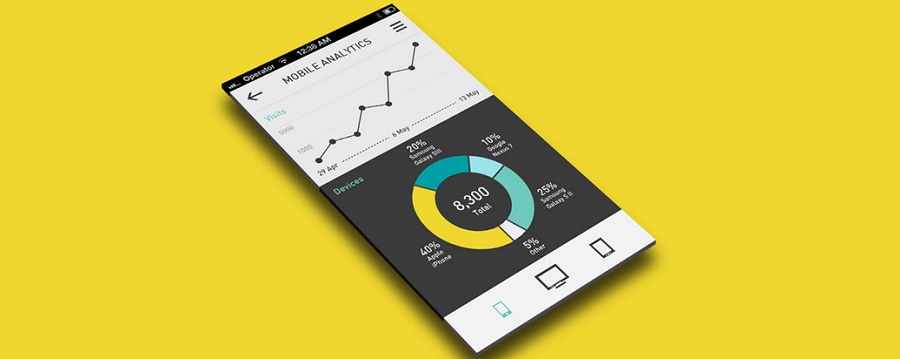
Mobile app analytics are multiple: they can be used for analyzing the app performance on various app stores, but also bring a lot of insights about the way the users are interacting with it.

Thanks to app analytics, you know how many people have downloaded your app, on which app store, and if they found it directly browsing the store or via another website or app as referrer. It gives you already basic information to shape and adapt your mobile strategy over time.

You also find usual marketing analytics you would use for your branded website or blog: – the number of impressions (how many times your app icon appeared in the store)
– how effective are your different in-store marketing campaigns
– how effective your app product page is, comparing the number of people reading it to the number of people downloading it
– the average visit time and screen views per visit, evaluating the average session duration and how many “app screens” a user read on your app.
– the app retention, measuring how many users come back to your app after their first visit.

Just like in Google Analytics, you can also learn about the demographics of your users:
– who they are
– their age
– their gender
– where they live
– which language they speak.

That will help you define more specifically your target audience and adjust your product and content to their interests and needs.

With mobile app analytics, you also learn a lot about the users’ behavior and habits within your application: these are referred to as in-app analytics. They gather data on:
– how often the users are opening your app,
– how long they engage with it
– on which device they are doing so (the type -mobile or tablet-, the manufacturer, the operating system)
– event tracking (which buttons or ads are clicked for instance)

If you decided to have a free version with specific in-app purchases, or premium version, you can also compare how many paying users to how many free users are using it. You can also learn on a user’s journey through your app: do they always go back to the homepage, or follow deep links and exit? In-app and user behavior are essential to analytics to optimize their experience and see what leads to conversions.

Mobile app analytics will tell you a great deal about the application itself and its performance:
– which pages lead to an app crash
– which device is more likely to make it run slow or crash
– the carrier latency
– the app uptime and downtime,
– the number of errors

A Compuware study showed that 79% of users will retry an app once or twice it fails the first time, a figure that drops to 16% if the app fails more than twice. Same study found out that a poor mobile app experience led to 48% of users less likely to use the app and 34% switching to the competitor’s app! All these figures show how important it is to analyze your performance app analytics in order to diagnose potential problems, troubleshoot what needs to be and identify root causes of issues.  This is key to improve the operational aspect of your app, which can frustrate users and drive them away.

Finally, you can look at rating and review analytics. Today, 88% of users look at reviews before engaging with any business – this is why you are app review are critical to the success of your business. Now, we also know that the overwhelming majority of users don’t leave reviews, and those who take the action to do it is usually to report a bad experience. It is thus important that you communicate your users how important it is to leave a feedback and that such feedback is taken into account to improve the app to their expectations.

You can find a great list of various app KPIs to track in order to perform the best analysis and enhance your application performance. Just like for any analytics, equipping yourself with a reliable business intelligence software will greatly help you in the management and data analysis of your metrics.


Mistakes of Unsuccessful Developers

What are the common mistakes of unsuccessful developers

5 years ago when I started my career as a mobile developer, I had one thing in my mind. I wanted to be good at my job. I wanted to learn the art of programming and I wanted to explore new avenues. In the last 5 years, I have worked on a lot of interesting projects that have helped me become good at what I do.

On this journey, I have seen some of my colleagues who started with me but have now changed their career track. I talked to a few of them to understand why they changed their career path. Our conversations revolved around things that didn’t work out and things that did. I understood from our conversations that they had a fixed mindset rather than a growth mindset.

Stanford psychologist Carol Dweck, in her book titled Mindset: The New Psychology of Success has talked about these two mindsets in detail. In a fixed mindset, the person assumes that their intelligence and creative ability are static givens. So, if they fail at some task, they assume it’s because they are not made for it. On the other hand, a growth mindset thrives on challenges and looks at failure as another chance for growth and developing new skills.

You’ve probably read articles that talk about the mindset of successful people. In my opinion, such articles paint a dreamy picture of success. They make it look like– “do these steps to be a successful developer.” However, success is an elusive subject and one can’t achieve it only by following what others did.

Therefore, I decided to take a different approach and write about what kind of mindset makes you unsuccessful. So here are some common traits or thought-trains of unsuccessful developers. Be aware of them and try to avoid them–

They want to learn a new language overnight

Famous Programming Languages – Authors and History – MYCPLUS - C and C++ Programming Resources

It’s true that a developer should be a quick learner. One should be fast in picking up new languages, frameworks in order to implement them in projects.

But learning quickly doesn’t mean learning overnight. One can’t learn everything in a day.

For example – If you want to learn Java/Android, you have to spend time on it. You can’t learn all the concepts in a day.

Generally, people with this mindset don’t spend much time on a single concept and after spending a few days on it, they move to another one. And repeat the same behavior elsewhere. With this approach, you will definitely learn something about everything and you will be able to write a basic level program but you will never be able to solve complex problems.

So go an inch deep, rather than going a mile wide. Learn one thing at a time, but learn it well.

They wait to learn until they have a job/project

100 Computer Science Careers to Consider | Chegg CareerMatch

It’s a common misconception that one can only learn when they actually start working on a project. But that’s not true. You don’t need a job or a project to learn a new skill.

If you really need to learn something, start today. Explore ideas and opportunities where you can implement your learning. Make things functional, even if they don’t turn out to be as great as you imagined them to be. You will gain confidence and learn a lot more about your shortcomings simply by doing.

They keep repeating the same mistakes

MISTAKES, A Valuable Life Lesson

George Bernard Shaw said, “A life spent making mistakes is not only more honorable but also more useful than a life spent doing nothing”. And I couldn’t agree more.

But there’s no merit in repeating the same mistake again and again.

Developers with a fixed mindset keep trying the same thing with a similar approach. They feel that somehow, magically, things will fall into place. However, they don’t understand that repeating the same mistakes doesn’t result in successful outcomes.

If you’re tired of not getting outcomes, sleep over it. Sometimes you have to quit something to start in a better way, with a fresh mindset. Don’t stick to one approach. If things don’t work as they did earlier be flexible and change your ways of doing things.

They say yes to everything

A 2017 article in the New York Times talked about why you should learn to say NO more often. The article hits the right spot because it tells why being assertive is important in life. If you can’t do some work because you’re already swamped with earlier deadlines, learn to say No. It’s okay if someone is hurt because you said no. What’s more important is that you come out of the ‘yes’ culture and understand that it’s difficult to do everything that everyone wants. Be realistic and hold yourself accountable for whatever you commit.

Saying YES to everything just because you feel that saying NO will make you appear bad is a slippery slope. When you say YES, the other person believes you to get the work done. For you, it might just be one word, but for the other person, it’s a commitment. When you fail to deliver, the trust vanishes, and blame-game takes its place. The other person might feel cheated as they trusted you to get work done.

This is the mindset of unsuccessful developers. They think that by saying yes to everything they will please everyone in the team. On the other hand, they fail to understand that saying yes has to be followed up with great commitment and dedication.

They ignore documentation

What is Technical Documentation? Examples and Tips | CleverTap

Documentation plays an important role in developer life. It is common to talk that if you are working on a complex project, you should document everything. It will not only increase your understanding of the code but will also help you add more features in the future. Your documentation should be simple that takes less time and effort but explains everything beautifully.

Unfortunately, some developers feel that it’s a waste of time and don’t pay attention to it. As a result, when the code base increases in volume, they face difficulty in managing it.

Mobile App Interface: With UX-UI Strategies

When was the last time you bought a movie ticket from the multiplex counter? When was the last time you went out to Crosswords to buy a new release from your favorite author? Or when was the last time you went out for dinner without reading its reviews on Zomato? And oh! When was the last time you went to bank for checking your monthly statement?Take your time!Ages ago, no?

Life is sorted. Everything is available on mobile apps now. We’re living in revolutionary times. The power that web has given to us is enormous. It has made our life, both, easy and difficult. Every one of us has now access to a plethora of information. A swarm of mobile applications is available on the store to make your life easy. For things as small as which baby stroller to buy, we have become dependent on our mobile devices.

UI/UX Strategies to develop Mobile App Interfaces | Humble Bits

Our eyes and ears are always open to that new cool app which is making waves in the market. And every mobile app which becomes a craze among its users has one reason behind it- excellent User Experience. A lot of people believe that design is about making applications look pretty. Ofcourse, a part of it is true. Anything which looks good improves the user experience. But what if it doesn’t satisfy customer needs?

A good design includes creating each and every interaction to delight users. Remember what Steve Jobs said?

“It’s not just what it looks like and feels like. Design is how it works.”

A bad user experience will give you a thousand thumbs down within minutes. The application must delight its users, both with functionality and experience. The mobile app interface should appeal to the users. I am sure you can relate to the experience when the mobile application works perfectly but doesn’t excite user to use it? What if the application looks pretty but its functionalities are broken? In these cases, you need to look at what works for users and what doesn’t.

Well, there is no one-size-fits-all solution. But here are some strategies that you can implement which have always worked wonders-

Design long-lasting products

7 Winning Design Tips and Strategies For App UI/UX Developers - iqonic

The argument to stay up-to-date with all the latest trends might clash with this but when we say design long-lasting products, we mean that the products should not age prematurely. The product should not become out of style with time. Design something neutral, which can live longer and is not just a passing design fad.

Dieter Rams, a very famed industrial designer, says-

You cannot understand good design if you do not understand people; design is made for people.

He conceived these 10 design principles fifty years ago. He says he didn’t intend these principles to be set in stone forever. If you read them, you will understand why these didn’t mutate with time. They are still accepted and implemented till date. So your design should follow the latest design trends, but do it while keeping in mind your end user.

Keep It Simple, Stupid!

Less is More– this famous proverbial phrase emphasizes on why you should keep things simple and clear. The idea is that simplicity and clarity in thoughts lead to good design. When you are designing, take instances from your real life. How do you like to keep your stuff at home? Clean and organized? Use that thought in your design. Move away from clutter.

Every element in your design should serve a purpose. It shouldn’t just sit there as a pretty object. Minimalism is a tricky thing. Offer your user space where they can find action buttons easily. Reduce the load of information, keep navigation flow easy and let the user win. So, even if you are designing a web page to sell potato or onions, don’t make the user think!

The large clear fonts set the message straight- loud and clear. The background color places the user’s mind into the right frame of mind. The CTA buttons allow users to move directly to the action. Minimalism does not mean you start removing elements from the design, it’s about removing the unnecessary and keeping just enough which can depict your story.

Make an impressive user-onboarding flow

Follow these 7 steps for creating a bulletproof UI/ UX strategy

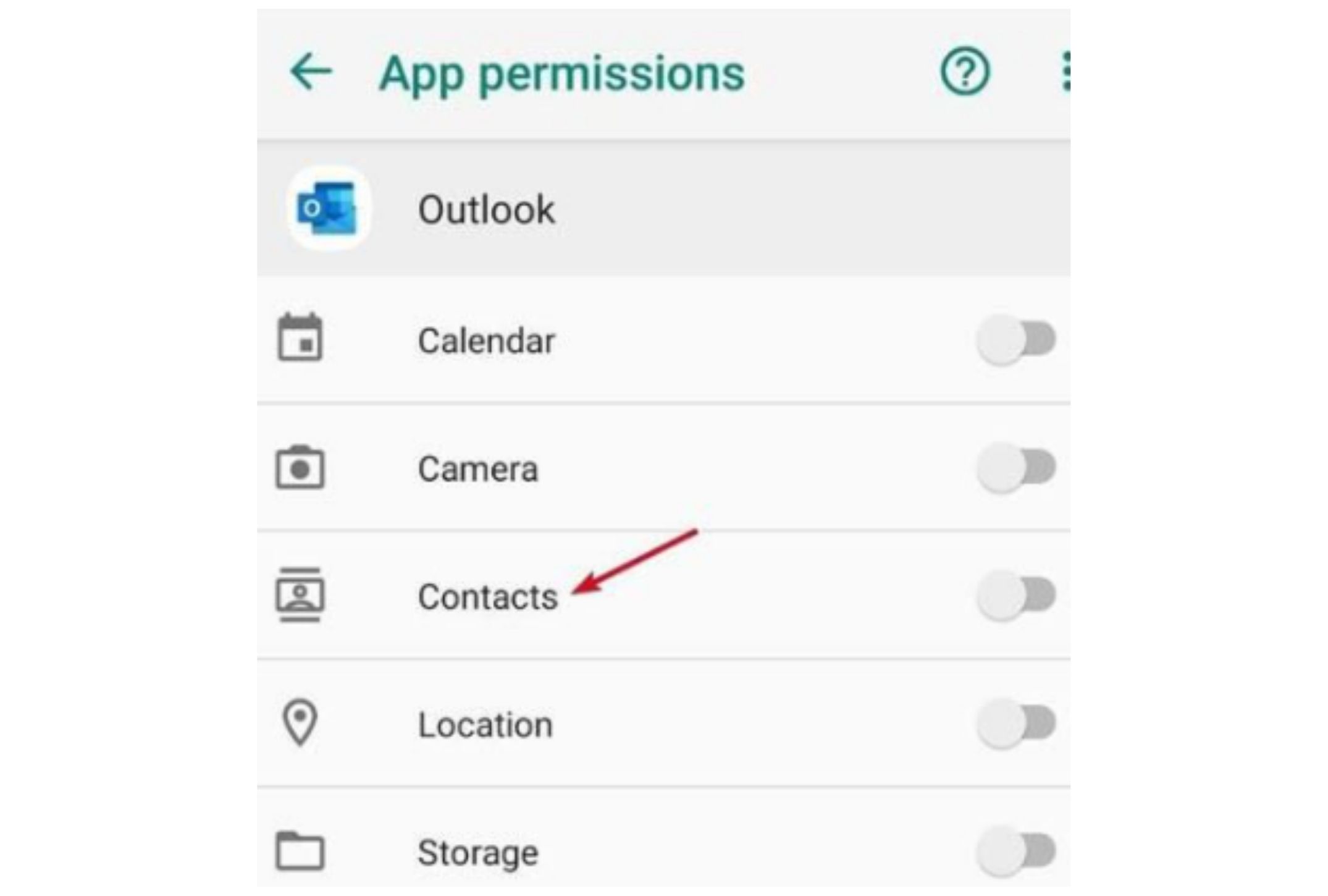
A lot many people uninstall apps they just downloaded when their onboarding experience is ruined. If you ask for too many permissions (camera, Gallery, contacts, location) then the user might become irritated. Collect only relevant information which is usable for you. Give your user flexibility to log in from different platforms- Facebook, Twitter, being two very popular options.

After you have made the user signup successfully, offer him a quick tour of what is the app about- where are the profile settings, where is the action button, which features are available and where. Even here, provide an option to ‘Skip’.

Use appropriate colors to make a connection

According to the color theory, if we apply logic to the selection of colors, it can greatly enhance our user experience. In visual experiences, colors should be pleasing to the eye. Anything which is pleasing increases engagement of the viewer and encourages him/her to get involved. On the other hand, when something is not pleasing to the eye, it is either dull or chaotic.

If the visual experience is boring and dull, then the monotonic appearance will keep user disengaged. The human mind will not perceive that information effectively. On other extremes, if the use of colors is overdone, it becomes chaotic. So much so that the user cannot comprehend the motive.

So color harmony which delivers visual interest to the user and a sense of structure is essential. And that is why it is important to create emotions with colors in UX Design.

Make Navigation Simple

Gps Navigation designs, themes, templates and downloadable graphic elements on Dribbble

You can have a pretty website with colorful and stylish design and astonishing images, but it pains my heart to say that it will be an utter failure if users don’t make any purchase from it. Simple and intuitive navigation helps them take an action. Every step should guide them to a result and help them understand trivial things, like:-What brand they are looking at
-What is the particular page about
-Where can they find the menu
-How can they get back to the previous page or next page
-Is there a way they can apply filters or search a particular product
-How can they make a purchase
-From where can they contact a concerned person
-How can they give feedback or suggestions

All this is vital and needs to be designed with utmost care because if user is made to waste time on these crucial things then they will immediately switch to a better option.
The digital era is here to make our experience faster & more convenient as compared to real life experiences. Make it worthwhile!

Conclusion

Just as a well dressed and a well-mannered person will always attract attention; similarly a mobile app interface with good design which solves users’ problems will always attract user’s attention. The most important thing which you need to keep in mind is to make sure that your design is both useful and intuitive. The world of app development is bursting and it will continue to grow by leaps and bounds. You, my friend, must learn to create an outstanding user interface that makes your mobile application amazing.

MeteorJS

What is MeteorJS?

What is MeteorJS? | Guide to What is MeteorJS with Career Scope

MeteorJS is a javascript framework to create web applications. It is built on the top of NodeJS and uses MongoDB as a storage layer.

Components of Meteor

There are 5 major components on which MeteorJS is built upon.

How does ddp work in meteor? - Quora

BlazeUI

Blaze UI | Tracxn

This library of MeteorJS is helpful to give live updates to users. This library is responsible for updating DOM. It is just like AngularJS where in DOM you have to just tell what you want and if there is any update, it will take care of that.

MongoDB

Thousands of MongoDB databases compromised and held to ransom – Naked Security

Meteor project comes with MongoDB, without writing any configuration file. It can be accessed from the remote by adding 2 in the Meteor server port. For instance, if Meteor is running at 3000 then MongoDB will run at 3002 port. The MongoDB files are in the .meteor directory of the Meteor project.

DDP

Distributed Data Protocol(DDP), is a communication layer between client and server. It is based on web sockets. Everything that happens between client and server is only through DDP. The client and server do not know each other. Client and server both don’t need to be of Meteor. Meteor clients can talk to other servers who understand DDP and Meteor servers can talk to other clients who understand DDP.

Live Query

It is a communication layer between and server and database. It continuously listens to the database and sends updates to the server if anything happens in the database. So if anything happens in the database, you will get updated results on the screen without hitting the refresh button. In general, it requires a separate implementation for each database.

Benefits of Meteor

1. You can get real-time updates without writing an extra code for it.
2. Packaging system – You can save lots of time by using MeteorJS packages. Many built-in packages can be used as it is. Using packages and writing your package for others is also very easy. Rails developers can think of a gem as a package.
3. Learning curve is low. You need to have command over javascript because MeteorJS uses javascript on both the client and server-side.
4. Meteor itself minified the javascript and CSS in production mode.
5. Meteor automatically syncs the state between client and server.
6. The community of Meteor is very active and supportive.

An Example

Below are the few commands that will install MeteorJS and then it will create the project for authentication.

Installation

$ curl https://install.meteor.com/ | sh

To create an application with name authentication

meteor create authentication

The output of the above command will be-

Run Application

Go to authentication directory – cd authentication

Type command – meteor
Open the browser and go to http://localhost:3000
By executing the above commands you will see something

Add package

meteor add accounts-base
meteor add accounts-password
meteor add accounts-ui

The above 3 commands will add authentication packages

Display buttons on UI
Add below line in authentication.html and comment {{> hello}} line

{{> loginButtons}}

The above line will give you the ‘Sign in’ link on your browser and when you click on that link you will get ‘Sign in Form’ and other links that are required for authentication


Use JMeter for Mobile Performance Testing

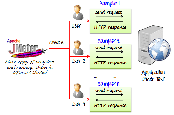
What comes to our mind for the very first time when we hear about JMeter? Is it Performance Testing? Or Web App Load Testing? Well, most of us are unaware that JMeter can also be used for performance testing of Android/iOS apps. It’s quite similar to recording scripts like in case of web apps, all we have to do is to configure a proper proxy on mobile devices. So here in this blog post, we would be listing down the process to record a performance test script in JMeter for Android and iOS platforms.

Best Performance Testing Practices For Mobile Apps In 2021

Prerequisites: JMeter version 3.0, Android phone (versions above Jellybean) or iPhone (version 8.0 onwards)

JMeter Configurations

How to Make Use of JMeter tool for API Testing in Mobile App Development?

1.  Launch JMeter -> Navigate to File option ->  Templates -> Select Recording -> Click on Create (So now we have added all the necessary parameters for Recording scripts)

2. Go to HTTPS Test Script Recorder -> Set port to 8080

Now find your IP Address by ifconfig for Linux and ipconfig for Windows. We will load up this IP address on our phone Android/iOS phone to setup proxy.

Mobile side Configurations

iOS proxy configuration:

  • Go to Settings–>Wi-Fi option.
  • Click on your connected network.
  • Select ‘Manual’ option from the HTTP Proxy section.
  • Set ‘Server’ value as your computer’s IP address and ‘Port’ value to 8080 as JMeter configuration. Refer above image to get an idea about this setup.
  • We need appropriate JMeter Certificate and save it to our phone.
  • Install this certificate on your iPhone.

Android proxy configuration:

  • We need appropriate JMeter Certificate and save it to our phone.
  • Download the zip file for the certificate and send the certificate on mail. And install through the mail. Once the certificate is installed phone will ask to apply a lock. And a notification appears showing Network may be monitored.
  • Now click on Wi-fi Settings -> Long press on the Network you are connected to -> Click on Modify Network -> Advanced Settings -> Change Proxy to Manual -> In Proxy Host name enter the IP of your computer -> Set Proxy to 8080 -> click save
  • Now we are set to start recording and running the scripts.
  • Go to Jmeter -> HTTP(S) Test Script Recorder click Start (this would start the recording). Remember that the port  in JMeter Global Settings and Mobile must be the same.
  • Add a Listener -> Add Result Tree to HTTP(S) Test Script Recorder
  • Perform any actions on mobile devices and the user can see the actions getting recorded on JMeter.

How to Use JMeter for Performance & Load Testing

Replay the actions by increasing the load and monitor the performance

In JMeter go to thread groups and alter the number of threads, Ramp up period and Loop count.

  • Thread means the number of active users.
  • Ramp-Up is the amount of time JMeter must take to send threads for execution.
  • Loop Count is used to specify the number of times to execute the Performance Test.

Adding Appropriate Listeners and analyzing the performance on different loads. Listener that we have used here is Response time over time Listener.

These Listeners don’t come by default with JMeter we need to download the jar and put it into JMeter’s lib/ext directory.  Now restarting JMeter shows these Listeners in JMeter’s list of Listeners.

Advantages of using JMeter for mobile performance testing

  • First of all, JMeter is an open source software. So zero investment.
  • It’s very user friendly with a interactive UI
  • It’s easy to learn
  • Every test script results can be best monitored using different Listeners in JMeter
  • By far the easiest though effective way to check the mobile performance


Syncing Contacts with an Android Application

How to Sync Google Contacts With Android: 4 Steps (with Pictures)

Syncing the phone book contacts in an android device with your application is being used by various android applications today. These applications include Whatsapp, Google+, Skype and various email applications. In this way, contacts syncing allows the user to access contacts from various social applications from the phone book itself.Now I will explain with an example Android application how the syncing process happens. This Android application runs in the background as soon as its launched and synchronizes itself with the device’s phone book contacts. Following is a screenshot of a contact synced with the app.

Clicking on MyData will take us to the desired screen on the application.


Contacts syncing requires three components to work in order which is:-

  1. Contacts provider
  2. Authenticator service
  3. Sync service

Contacts provider

Contacts provider is the standard access provider to the device’s data about people. All the contacts in the phone are managed by the contacts provider through tables that can be queried to get data. There are basically three tables that store data for a person.

These tables are-

Figure 1- Contacts provider table structure (Source)

  1. ContactsContract.Contacts is the table that contains the aggregated data from raw contacts rows that represents different people in the contacts list.
  2. ContactsContract.RawContacts table contains the person’s accounts and type data summary.
  3. ContactsContract.Data table contains other details corresponding to each raw contact like email address, phone number, etc.

I made use of the ContentProviderOperation to handle the table insertion operations on the table to add a raw contact and the data corresponding to my app and finally to apply the changes to the database as a batch operation.

Here is the sample code for the class that handles this functionality:

Authenticator Service

Tutorial: Build an Android Application with Secure User Authentication

The authenticator service is used to create an account for our app on the device. It plugs into the Android accounts and authentication framework through which an account type is created on the device corresponding to our app. Accounts for standard social applications like Whatsapp, Skype, Facebook, etc. can be found if you visit the accounts screen in settings on your device.

Sync Service

The sync service is made up of two parts the sync adapter and the sync service itself. The sync adapter is used to synchronize data between the server and the local database. My app doesn’t fetch any data from the server but still, it is required to implement the sync adapter. The sync service is what binds the sync adapter to the android sync framework.

The authenticator service runs in the background when the app is launched to create an account for the app on the device. The sync service is called in a periodic cycle to constantly sync the data.

When you tap on the Whatsapp icon on the contacts screen, it will take you to the chat screen of that contact. Similarly, in the phonebook contacts, your app icon can be seen which is clickable to access the app screens that correspond to that contact’s information on the app. The contact data can be sent through the intent extras to the activity that launches.

Locks on Web Redesign: 5 Keys to Unlock

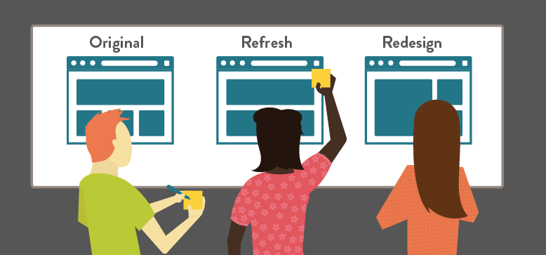
Locks on Website Redesigning: 5 Keys to Unlock

A website is the destination of your online business, and you should make sure your website is well-designed and compliant with the existing SEO guidelines. Year after year, new technologies, software, and ranking algorithms are introduced, which force website owners to make the necessary design changes.

Website Redesigning

When to Consider a Website Redesign | Mightybytes

If you are a website owner who is contemplating a website redesign, this article discusses five vital factors that you should consider for redesigning a website.

A Responsive Website Redesigning

Responsive Website Redesigning Services, With 24*7 Support, | ID: 6654188497

A clunky, laggy, and unresponsive design can turn off the visitors in the blink of an eye. On the other hand, a beautiful looking website that responds to the touches and actions immediately hook in the visitors. Moreover, Google has made it clear that a responsive design that increases session time would be one of the significant ranking factors.

Good website redesigning includes a clutter-free interface with plenty of white spaces and small but visible navigation buttons. A website with symmetric and well-organized pages catch the eye of all users and make an excellent first impression. A responsive design Also includes different landing pages optimized according to various devices that can give your website a significant boost in traffic, average session time, and rankings.

Summarizing, your website needs to satisfy these parameters for attaining an excellent, responsive design that impresses your visitors and improves your Google rankings.

  • Beautiful design
  • A lot of white spaces with small navigation icons
  • Diverse landing pages

Mobile Optimization

Mobile Optimization: Principles From Smart Marketers - Lander Blog

Apart from responsive design, a website should be compatible with all small screen and large screen devices. Around 50 percent of the total internet traffic is mobile traffic, and Google, in one of its recent algorithm updates, has mentioned that mobile compatibility is going to be one of the significant ranking factors for websites.

Therefore, your website should be well-optimized for mobile, tablet, and other small-screen devices. A website can be optimized for mobile devices by several methods like:

  • Updating robot.txt file
  • Updating the CSS code
  • Using mobile-optimization plugins
  • Creating a mobile version for your website

Speed and Performance

Good Performance is Good Design. It's time for designers to own… | by Mitch Lenton | UX Planet

Suppose you typed a search query on Google and clicked on one of the displayed search results. You’ve been waiting for ten seconds, but the page does not load. What will you do? Unless you are not a regular visitor to that website, you leave it in a flash. This behavior is standard and applied to all the users; therefore, a website must load fast.

The design of the website plays a vital role in determining its speed and performance. If a website has a dense, clumsy design with a lot of content, pictures, and videos on every page, it takes more time to load. On the other hand, if a website has a sleek and responsive design with minimal content and compressed images, it loads faster.

Luckily, you can access a lot of free tools like GTmetrix and PageSpeed Insights that allow you to determine a website’s load speed and tips to improve it.

Some tips to improve your website’s load speed and performance are:

  • Design plays a vital role in determining your website’s load speed. Your website design should be minimal, with only necessary items and pieces of information on the page.
  • The presence of excessive multi-media elements like high-quality images and videos can significantly reduce the load speed of a website. Try reducing videos and pictures on your website, and compress the photos if they are relevant and provide the necessary information.
  • If your website does not have appropriate storage, bandwidth limit, or a right hosting provider, it affects its loading speed. Make sure to check these factors if your website takes time to load.
  • Check your website’s speed and performance regularly and act upon the recommended fixes and suggestions.

Accounts and Social Media Integration

Top Benefits of Social Media Integration in Online Marketing - Lander Blog

Social media integration enables you to multiply the number of visitors visiting your website without putting in any extra effort. Adding share buttons on your website allows your visitors to instantly share your content with their friends and family, which improves your reach, traffic, and rankings.

Adding your social media handles on the website can help you connect better with your audience and allows you to share content on different platforms and in various forms. Providing an option to register and login on your website enables you to provide your users with personalized user experience, which is essential for building trust and improving brand reputation. You can further simplify the login process by providing the feature of logging in directly from social media accounts.

Social media and account integration can help you in the following ways.

  • It allows your visitors to share your content over different platforms.
  • It enables you to connect your visitors with your social media handles.
  • It enables you to provide your users with personalized user experience.

Analytics

How to Utilize Google Analytics to Improve Your Restaurant's Website

Analytics tools allow you to analyze the performance of your website and make necessary improvements. Different websites have different visitors of varying age, gender, country, device, and more. Analytics tools like Google Analytics and Monster Insights allow you to access all the information about your visitors, enabling you to understand their behavior and requirements.

Analytics tools also allow you to track conversions, funnel performance, session time, bounce back rate, back off rate, and other necessary information that can be vital for improving your website’s performance.

Some advantages of using analytics tools are:

  • It provides in-depth information (demographics) about the visitors.
  • It identifies the underperforming areas of your website, helping you take targeted actions.
  • It enables you to analyze your conversions, backoffs, bounce back rate, and average session time.
  • It helps you optimize your campaigns and strategies according to the visitors.

Conclusion

Website design is a significant ranking factor for websites as a responsive website design that provides visitors with a better experience. Although a good website design includes other elements like logo design & positioning and widget optimization as well, the aspects discussed above play a key role in determining the overall design and performance of your website.

React Native: 5 Roads of iOS vs Android

In this digital age, one can’t survive without technology. Mobile apps have become an obsession for people, a proven fact that in 2017, users around the world downloaded almost 197 billion Android apps and over 25 billion iOS apps. The app development business has reached its peak in the past few years and has been growing higher since.

But with the craze for mobile apps rising high, there’s one massive problem that has arisen for app development companies. Finding enough talented developers who can develop the same thing for Android and iOS is a bit of a challenge.

So is there a more natural solution?

Of course, there is! If you want to develop an app from scratch, for both iOS and Android platforms, React Native is the best option.

React Native is a framework that can be used to develop cross-platform apps. It is a JavaScript-based framework created by Facebook to develop apps supported by both Android and iOS platforms. While it offers benefits such as reduced development time and reusable code and app components, there are some differences between the usages of React Native for both platforms.

In this article, we are going to highlight five significant differences between React Native app development methods across Android and iOS. But before that, let’s have a look at the features of React Native that have made it so popular.

Why is React Native gaining impetus? 

React vs Vue in 2021: Head to Head Comparison [Updated]

React Native is a widely used platform that allows you to alter the user interface of an app for both iOS and Android development. Following are some primary reasons that React Native is such a hit among app developers:

  • Open-source Framework – This framework is open-source. Its structure is all set to become completely compatible with both Windows and macOS. It also supports reusing already written code instead of rewriting it from scratch.
  • Quick Development – Application development is not an easy task. Writing code from scratch and learning to code in Swift and Java is tough and time-consuming. React Native resolves this issue in a way that instead of having expertise in these two, you are only required to know JavaScript; this makes app development very easy and quick. That said, basic knowledge of Swift and Java is also necessary.
  • Focus on the User Interface – React Native allows you to develop smooth and easy-to-navigate User Interface in both operating systems at the same time. UI is one of the main reasons behind its popularity. Before this, developers were required to prioritize one type of operating system. React Native resolved this issue and made development more comfortable and balanced for both platforms.

Coming to the focal point now –The differences when used for Android and iOS no platform is perfect when it comes to technology. There are some boundaries and restrictions for every one of them. The same is the case with React Native. App development for Android and iOS vastly differs, and it is because of the following factors:

While you develop a cross-platform app using React Native, you need to access a few specific iOS simulator tools for app testing. But these tools are not considered reliable as Apple does not officially recognize them. In the case of Windows, Android studio is a reliable source to test the Android version of apps. So it is effortless to conduct official testing for the android version, and there is no authorized testing module available for iOS. That does not mean that iOS apps are not tested; we can say that the results are not authentic.

A suggested solution to overcome this problem is to test the iOS app within Android Studio since it is compatible with macOS. It is better to use Apple MacBook as the testing device to test both, Android and iOS versions of the React Native apps.

  • Linking Libraries

If you need to link third-party libraries in your app, you cannot merely use the React Native link called “library name” to link libraries. You are required to link those third-party libraries manually. This manual linking is considered to be a hurdle because it is time-consuming, and it requires developers to have distinct knowledge about Android and iOS development.

We can avoid manual linking if complete documentation of the required libraries are available, which is rare. The manual linking requires the developer to have a grip on Java and Swift or Objective C language.

  • Platform-Specific Styles Elements

While working on a cross-platform app, it is essential to consider the style differences. The styles added using React Native look different in iOS and Android because both operating systems might not support that styling. For example, if you add shadow style in your app, it won’t be visible in the Android version, as Android does not support this styling.

So, developers require keeping the style differences in mind and use the styles which are supported by both operating systems.

  • Native Elements

The display differences of different native app elements might not be considered at the initial stage, but once development proceeds, developers start regarding such differences as hurdles. React Native has several elements to be used, but the results differ according to the platform they are implemented on. For example, the picker component would display a different outcome on an iOS simulator and a different one on the Android emulator.

  • Platform-Specific Design Elements

React Native provides a cross-development platform because of shared code, and developers expect to build both versions of applications with minimal efforts. But unfortunately, no platform is perfect. iOS apps usually are quite minimalist in design, while Android is more drawn towards the material design principle. While developing through shared code, you need to make sure that the app is suitable according to its natural look and feel for both platforms. Right now, multitask panels in iOS have small tabs in contrast, while the interchangeable tabs of Android’s multitasking panel are almost of screen size. So, developers need to keep track of these differences while developing on a shared platform.

Similarly, the icons of iOS apps are round-cornered squares, while Android has a range of useful options that include icons with transparent background and shadows. iOS has simplicity and lower cognitive load on icons. There is also a difference in navigation patterns for both operating systems. Android’s native navigation-bar has back and refresh buttons, while in iOS, the back button on the top is screen-specific and also works with a right swipe gesture.

All these differences are necessary to consider for developers while working on application development through React Native. These issues are essential to tackle but don’t come in the way of making it a popular and reliable platform. Many big brands have utilized React Native to develop popular applications for both operating systems.

To Sum It Up

From in-app features to design elements to testing tools, the development of iOS and Android mobile app development using React Native differs on various levels. Developers need to take care of these differences to avoid bugs during implementation. Many big brands like Instagram, Uber Eats, Airbnb, and Gyroscope use React Native’s shared platform technique, which goes a long way to indicate that the framework is reliable and generates up to the mark results.

Mobile Application Testing- A Step by Step Guide

Tutorial 2: Introduction to Mobile Application Testing

As mobile applications are emerging as the biggest trend in the market today, it is carrying with it plenty of opportunities for everyone- may it be the developers, the app owners or the users. Mobile apps have created a stir in the market, and therefore, the competition in its market is cutthroat. Therefore, just building a functional and aesthetically pleasing app in no longer enough.  Developers must ensure that their app is free from any sort of errors, bugs or glitches which might hinder the UX and avert customers from using it. That’s when TESTING comes into the scene.

Quality Assurance is an indispensable piece of the mobile app development lifespan. Unfortunately, many disregard the basic step of this progression. To guarantee the fruitful development of any application, QA must be engaged with all phases of development, from the ideation stage to breaking down prerequisites, drafting test particulars and deploying the completed item. QA is even the way to post-development audits.

Be that as it may, it can regularly be overwhelming to realise where to begin while making your testing procedure. Mainly follow the below-given steps for a consistent methodology of mobile application testing:

1. Strategizing and Preparation

How to Prepare for An Effective 2021 Strategic Planning Session [Video]

This is the first and foremost step after you are done with your development process. This phase requires you to set up a strategy and draft a work plan to define what success means for your app and what constraints it might face. This is a crucial phase as it sets the trajectory for the rest of the steps. The activities that are carried out in this stage are as follows:

  • Affinity for different systems
  • Check and rundown the necessities:
  • Check Frequency of data-usage
  • Check Frequency of space-usage
  • Dissect practical prerequisites
  • Does the application interface with different applications?
  • Identify the targeted devices
  • Is the application testing constrained to front-end? Does it incorporate back-end testing also?
  • Load Handling
  • The utility of each feature
  • Will the app be Native, PWA, or Hybrid?

2. Categorise the type of testing required

Is there value in segmenting (categorising) your client base? - Planet Consulting

It is a compulsory necessity that the application needs to work in all iOS and Android gadgets as the end-users can have a variety of gadgets. To guarantee that the application works in every one of the gadgets, we chose a mix of manual testing, automated testing and testing in cloud simulator. This comprises of practical, ease of use, similarity, execution, or security testing on the objective gadgets. Likewise, figure out what sort of practical prerequisites ought to be tried.

3. Test Case and Script Design

Test Script Template - With Example - QA world

The test case is a succession of steps that assist us in executing a specific test on the application. The test script, too, is something very similar. The only difference between these two is that the term test case is used during manual testing, whereas the term test script is used during automated testing. It is very crucial to draft a test case for each and every feature and functionality that you have provided in your mobile application. In addition to that, some extra test cases must also be included.

4. Setup Appropriate Environment for Testing

Setup Right Equipment For You - Web Design Clipart (#1794146) - PinClipart

A testing environment refers to an arrangement of code as well as devices for the testers or automated scripts to perform test cases. In short, it assists in testing with hardware, software, and system designed. Testbed or test environment is arranged according to the need of the App-Under-Test. On a couple of events, testbed could be the mix of the test environment and the test information it works on. Setting up the correct test environment guarantees successful mobile app testing. Any imperfections in this process can lead to additional expense and time of the customer.

5. Manual and Automated Testing

Manual Testing vs Automation Testing

This progression includes executing manual test cases and mechanised test contents on different gadgets, emulators or test systems. Presently these manual test cases and computerised test contents are run on the key functionalities of the application to guarantee that there are no glitches. Record the flaws recognised in the error management system and follow the work plan as devised in the first step.

6. Beta Testing

What Is Beta Testing? | Instabug Blog

Beta testing is a significant piece of the application dispatch process. After engineers test their application (that is a thorough testing process called alpha testing), they push it forward to genuine clients to test it. Now, they have the chance to get large blemishes settled before making the application accessible for the more extensive audience. What will the beta testers do? They reliably utilize the application over a particular timeframe. They report back any bugs or issues, and they give their reviews about the application. This aides application distributors to choose whether or not their application is prepared for their target users. On the off chance that it’s not, they’ll have the opportunity to continue improving before it hits the application stores.

7. Performance Testing

Manage, Improve and Upgrade Yourself For Self Improvement – Makhani Nainish

Performance testing is the act of assessing how a framework acts as far as responsiveness and soundness under a specific task are concerned. Performance tests are ordinarily executed to analyse speed, power, unwavering quality, and application size. Performance testing assembles each one of the tests that check an application’s speed, strength, unwavering quality, and right estimating. It looks at a few pointers, for example, a program, page and system reaction times, server inquiry handling time, number of acceptable concurrent clients architected, CPU memory utilization, and number/kind of mistakes which might be experienced when utilizing an application.

8. Security Testing

Challenges with Do-It-Yourself Security Testing - Nitel

Make sure that the application is secure by approving SQL injection, information dumps, session seizing, bundle sniffing, SSL, and gate crashers. Typically, mobile apps have generally less gadget memory and power so it is fundamental that applications must deal with it appropriately. Along these lines, the application performance can be tried by modifying the system from 2G, 3G, 4G to broadband and WIFI. Therefore, the responsiveness, adaptability, and strength are tried in performance testing of an application.

9. Device Testing

Mobile Application Testing Service and Tools Company

Device testing includes a lot of exercises from analysing and rectifying errors, content and administrations on genuine handsets. Testing incorporates confirmation and approval of equipment gadgets and programming applications. During this step, the mobile application is tested on various operating systems as well as a variety of devices so as to ensure that the apps work well when it is launched in the market among the end-users identified with the cloud. The primary motive of this phase is to attain decent test coverage relating to various devices, operating systems or versions of OS.

10. Reporting

Get Actionable Insight from Your Contact Center Reporting

At last, the QA administrator produces the test synopsis report. This is an administration report which gives subtleties of any significant data revealed by the tests led, incorporates evaluations of the nature of the testing exertion, the nature of the product framework under test and measurements got from occurrence reports. The report additionally records various kinds of testing performed and the completion of the testing. This assists in improving any future test arranging. This final report shows whether the product framework under test is fit for use and has met acceptance criteria characterized by venture partners.

In a mobile app development venture, mistakes can show up in any of the phases of the development cycle, some of them even stay hidden. Mobile application Testing empowers undertakings to assemble applications that are adaptable and accessible over various stages. It’s a procedure to fabricate a mobile application by testing it for its usefulness, ease of use, and consistency. This is possible via both automation as well as manual testing. Mobile applications are getting more and more complicated with time and there is a requirement for a start-to-end testing. Right from whether the app is downloadable easily, works smoothly, and gives the same kind of experience across various devices. Therefore, we hope that this article has given you enough insights into the mobile application testing process and may come handy when you need it.

MOBILE APP: TOP MOCKUP TOOLS

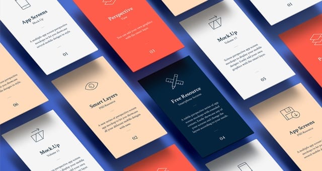
As we’ve said before that now the crossover realm of functionality and aesthetic is truer than ever. Which is why a mobile app mockup is crucial in the early stages of development. People have become accustomed to having apps that make them feel comfortable and are usable with an ease. Mobile mockups help in defining how the user experience and the aesthetics are functioning. Basically, it helps to make your app better, and the better it gets the more user traffic it will drive.When you are in the process of designing a software, a mobile app prototype testing gives your users, investors and the management a visual sense of how the app “feels like”. There are a lot of such apps in the market, but here we’d give you the top ten apps.


Let’s understand: A mobile mockup tool

There are many ways to mock up an app or a website. You can even use MS Paint, if you are not reluctant about using an antiquated tool. Today, there are several such solutions that function as simpler mockup tools and app prototyping.

There are two different kinds of mockup tools; One that mimics the intended functions of your app; And the other that just gives a visual layout of your designed app.


Prototyping Tools for Mobile App

Every prototyping tool available in the market also has mobile mockup features. And there consists features in the prototyping parts where the designer is enabled to add-in features that would let the app ‘flow’ like it originally should. This implies that when you click on a website/link, the app is supposed to work the same way as to how the actual app would work. A lot of mobile mockup tools along with prototyping features also include analytic features. The analytic features take note of how the test group is using the app, this helps the design team to better develop the app taking into consideration the user’s functionality preference.


Let’s look at the top mobile mockup tools;


InVision

InVision | Digital product design, workflow & collaboration

InVision is one of the most immaculate options available in the market. They provide app developers dynamic proficiencies, and that too needs-specific. The tools that are power packed in InVision present you with mobile app- prototyping tools, wireframe tools and mockup solutions. Design teams can create anything from a simple basic layout to an absolutely full-fledged prototype that represents the intended design.


Marvel

Marvel - The design platform for digital products. Get started for free.

Obviously you won’t be able to create the whole Avengers gang with this tool, but, you can create wireframes, design and prototyping with sheer ease. The Marvel system prevents the designers from getting uninhibited by any actual coding and works as WYSIWYG so that designers can create at peace. Marvel automatically takes note of the design’s parameters which makes it easier to pass off the entire properties to speed up the development process. This also relieves you of the guesswork that you would generally do to figure the way to replicate the mobile app mockup. This prototype also shows how users interact with the ensign and further inculcates a more centralized feedback framework.


Principle

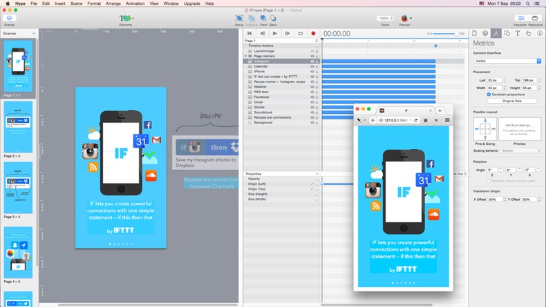
Eight Prototyping Tools Compared: Proto.io, Pixate, Framer, Origami, Form, Principle, Flinto for Mac, and Hype - Sketch App Sources Blog

This is another fully packed system that enables creating mobile mockups and prototyping the same. Principle presents designers with animation tools that are created on iOS and macOS engine, Core Animation. This makes it easier to illustrate and to apply the same on a working prototype. Designers can either select transitions from stock features or can simply create custom responses for UI. Users are allowed to import designs from the major tools and then further export animations that could be used by the developing team.


Framer X

This enables designers to quickly prototype their idea in a responsive layout. This is free, and it has one of the most developed digital stores for the purpose of third-party integrations via multi-platform plugins. It’s features and tools are curated by the Framer development community. Since the Framer system is a little advanced, it is not desirable for designers with no coding knowledge. Creating and coding prototypes at a decent level would be only possible for those with at least a little web coding knowledge.


After Effects


From the highest positioned design company Adobe, comes their animation app, After Effects. This app isn’t a prototyping tool in itself, rather it’s key point is that it offers a lot of control for creating motions and animations for media-intensive apps. Users can engage with other files from Adobe and can export their animation for using it in a mockup or prototyping.


Mockup Tools

A mockup tool allows a designer to build synthesised images for a mobile app or website in a short span of time. While mobile app prototyping enables receiving quick feedback, mobile app mockup and wireframe tools allow designers to create visuals for a project much quicker.

Let’s take a look at some top mockup tools;


Sketch

Although Sketch can also be employed for prototyping mobile apps, it’s main ability rests in creating consistent mockups. Like Framer X, this also has a large store for plugins maintained by a developing community. This mobile app mockup tool has a collaborative feature that makes it easy for designers to link with others working with them on the project and to receive feedback.


Figma

The Power of Figma as a Design Tool | Toptal

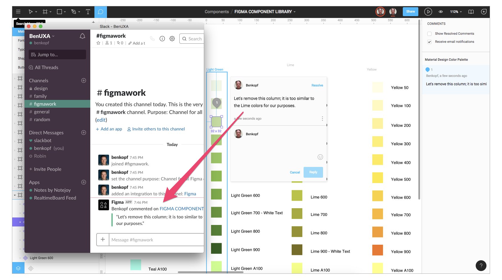
Figma is a cloud-based system, made for the purpose of collaboration between design teams for creating mobile app mockups. This comes with two bonuses, first that it also includes prototyping tools and second, the mobile app wireframing tools are free to use! The collaboration element in Figma is considered one of the best as it allows feedback to be left in the context without any interruptions. It’s almost like working in Google Docs but the difference is that this better accommodates feedback on design keys.


Adobe XD

Adobe XD does collaborative editing now, just like Figma - The Verge

We all know Adobe is the most famous when it comes to creating, designing apps/websites. Adobe XD also has a great collaboration feature that lets you work with other designers and teams on the platform. Since it integrates with other creative cloud softwares, hence, one gets a fine experience when using files from other apps like After Effects or Photoshop.


Proto.io

Proto.io Pricing, Alternatives & More 2021 - Capterra

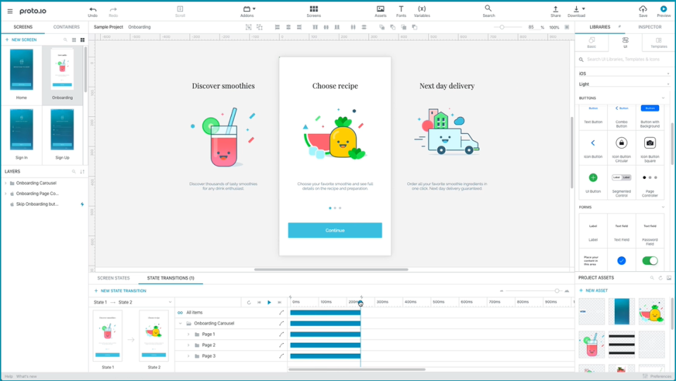
Proto.io is also a web-based mockup software and contains mobile app prototyping tools as well as mobile app wireframing tools. The best part is, it is a no-code solution, so designers that have zero to little knowledge about coding find it easier to work on this platform. This also works well with Sketch and Photoshop.


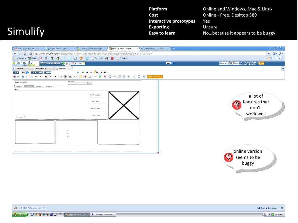
Simulify

Simulify Platform Online and Windows,

This is designed to assist with visual mockups for sites via JAMstack. For messed and decoupled architectures, where you are constantly pulling data in and out from multiple apps/websites, Simulify is the ideal option. The Simulify system amalgamates with Gatsby which is ideal for using modern development frameworks.


We’ve provided you the top choices and now the ball is in your court. Choose wisely!

error: Content is protected !!