Importance of Usability Testing

When Lyla was asked if she could interview an author on her colleague’s behalf, she jumped at the opportunity. Lyla was interning with an uptown magazine for a role that deemed her ‘unfit’ for any important tasks such as interviewing a popular author. Getting an opportunity to talk to her favorite author was like a jackpot. She thought she is finally gripping onto a childhood dream. She thought she finally can brag about meeting Paula Hawkins. She wanted to be careful about not screwing this golden opportunity, so she double-checked everything on her list.
Notepad, check. Pen, check. Camera, check. Questions, check. Recorder, check! Oh wait! I have to check for a new update, just in case I am outdated.
Which Usability Testing Method Should I Use in 2021? | PlaybookUX

She updated her app quickly and reached the coffee shop before time. She was excited, she was anxious. It’s an easy-peasy task, you just have to ask questions, record them and pour it out later– she kept repeating this in her mind.
But the moment Paula Hawkins walked in, she started feeling the breathlessness. Part excited, part nervous, she could feel her palms sweating. After exchanging some pleasantries they kicked off with the interview.

“Shall we start?”
“Yes, of course. Let me just..umm… Start this thing”
*she clicked on the record button and started talking, simultaneously taking notes.*

Unaware of what was happening after she clicked on that little red button, she went on with the interview, taking down notes as per her whims. Ignorant of the new updated feature — which now needed ‘long press and hold to start recording’, she finished the interview, smiling and pleased with herself. But as she looked down, in order to ‘STOP’ the recorder, she lost the fanatic feel of doing a good job!

A little hover over the button said “long press and hold to start recording” which was an obvious slip.
Game over. She probably lost her mind or her job. Or both. But that’s none of our concern. Right? She should have been more attentive.

Lyla is a fake person. She did not meet Paula Hawkins ever. But the incident is real. Only, it happened with an acquaintance and I figured out it wouldn’t be fair to name her. This incident forced me to shine some light on the importance of usability testing and why it’s more important to pay attention to user’s behavior while they interact with the product.

They say, never talk to your users, they hardly know what they want. But they missed out on the summary-

“To design the best UX, pay attention to what users do, not what they say. Self-reported claims are unreliable, as are user speculations about future behavior. Users do not know what they want.”

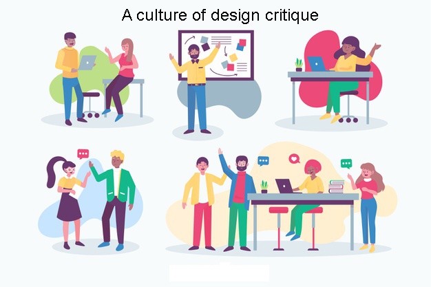
Usability testing- What is it?

What is usability testing? - Quora

Usability testing is like black-box testing of an application to ascertain if the product built is convenient to use and easy to learn.

These are methods of testing and observing the behavior of the users to find out what works and what doesn’t work. Users are given specific tasks to complete and when they are at work, observers watch their body language, facial expressions, emotions and encourage them to “think aloud” i.e. speak up whatever comes to their mind while using the product. Doing this exercise we can get qualitative and quantitative data and figure out usability issues with a product.

So, why usability testing is important?

Website Usability Testing: How To Get Started Today | Hotjar Blog

Doing usability testing the right way, at right time with the right set of people reduces the risk of building the wrong product; thereby saving time, money and other precious resources. In other words, if done at an early stage when the product is at paper prototyping stage, it finds the problems when they are easy and cheap to fix. And when done on a product which has attained maturity it helps to understand user’s success rate and time spent to complete a task. There are hundreds and thousands of cases when usability testing proved to be a good exercise in terms of ROI.

For example, a slight tweak in design suggested by usability testing for Mac’s UI, the company got 90% fewer support calls.

Need more clarity about why usability testing is a good idea? Here you go-
#1. To check if product meet user’s expectations
#2. Matches business decisions to real-world use
#3. Removes flaws in the product
#4. Allows you to see how successful users are with their tasks
#5. Useful for getting user reactions and feedback about the product

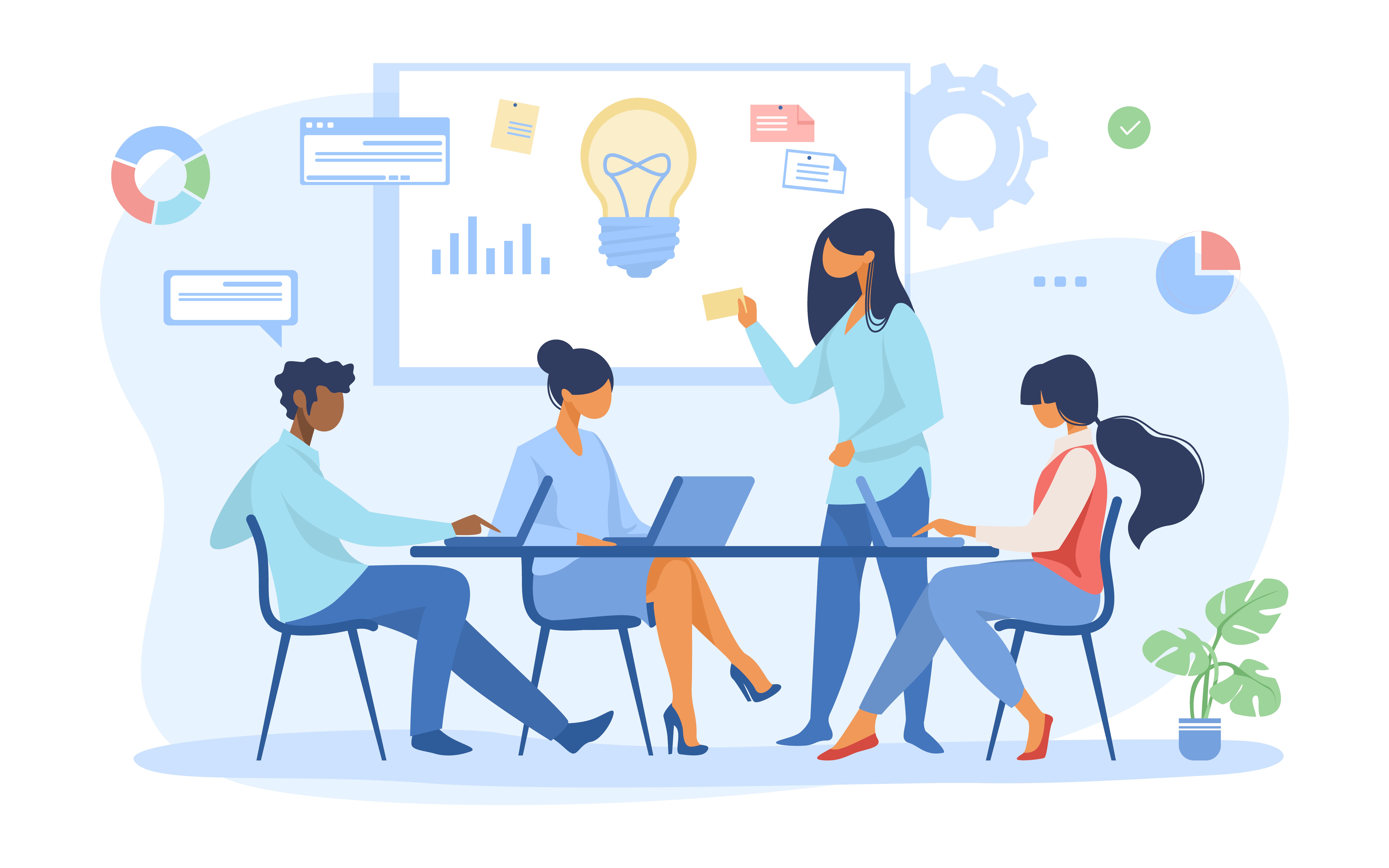
What are the types of data that we can get as a result of our analysis?

Two types of data results received are — quantitative and qualitative. Usability testing is largely a qualitative research technique and is not driven by statistics like surveys where lots of people participate. Usability testing is done using a small set of people, usually five to seven.

Qualitative methods are very useful to test the stress response of the users like their body language, movement of hands, expressions on the face and squinting eyes especially doing a test on a mobile device.

The metrics we get after usability testing can be quantitative as well. For example, time spent on doing a task, success and failure rates and also the efforts, like how many clicks a user needs in order to complete a task.

Is there a need to record all the metrics obtained from a usability testing?

Yes, keeping a record of the metrics is very important. Why? Because usability testing is not just for designers to understand how to make better designs but it is also an important tool to influence the rest of the stakeholders like clients, their sales/support team, project managers, developers, other designers etc.

Every stakeholder involved may have a different point of view for a design decision. Being subjective by nature, design decision often leads to long debates among stakeholders. Most often design decisions are influenced by a person who holds the highest position among fellow stakeholder or has superior oratory skills.

In short, metrics help us in iterating and validating design concepts. It gives objectivity to design debates and it helps in taking fact-based design decisions.

At what phase of the design process usability testing is recommended?

When it comes to usability testing there are two terms often referred by big names of the UX industry (like Jacob Nielsen) and these terms are Summative Test and Formative Test.

These tests are done at different stages of the design process. They are as explained below:
Formative tests are low-fidelity tests (to gain quick insights)-
#1. During the very initial development phase using paper prototypes
#2. It can be done anywhere and a formal lab is not required
#3. It can be done just between a moderator and a participant

The results from a formative test may include-
#a. Users’ comments in the form of “Thinking Aloud” narrative i.e. their emotions, confusion sources and their reasons for actions.

Summative tests are high fidelity tests (to capture metrics)-
#1. These are carried out at the end of the development stage
#2. At this stage usability of a product is validated
#3. This gives an answer to the question “How usable the product is?”
#4. This gives a comparison against competitor products
#5. Conducted in usability labs or remotely using many tools available where users can do the test using their computers or mobile phones

The results from summative tests may include-
#a. User’s success rate to achieve a goal
#b. The time spent on completing a task

How many users are required to conduct the testing?

“Elaborate usability tests are a waste of resources. The best results come from testing no more than 5 users and running as many small tests you can afford”
Jacob Nielsen

“It is widely assumed that 5 participants suffice for usability testing. In this study, 60 users were tested and random sets of 5 or more were sampled from the whole, to demonstrate the risks of using only 5 participants and the benefits of using more. Some of the randomly selected sets of 5 participants found 99% of the problems; other sets found only 55%. With 10 users, the lowest percentage of problems revealed by any one set was increased to 80%, and with 20 users, to 95%.”
Laura Faulkner

Who among them is right?

It depends on what type of test we are doing and where we are doing it. For example, if we are doing a low-fidelity formative testing we can do away with a small sample size. But if we are doing a summative testing we need a bigger sample size. In the type of testing where we are comparing our site to competitor’s website by using an online tool which is cheap and fast, we can use a large sample size. But we should keep in mind that these online tools like UserTesting or Loop11, they don’t capture metrics. It’s us who has to be aware of how all the participants did it.

So how to prepare a test plan?

That is certainly a good question. You have an inquisitive mind, I must say. But don’t you think that will be too much to digest in one bite?
Still, if you are really into it, give these things a thought-
-Decide what areas to concentrate on
-Determine potential usability issues
-Determine what tasks you want to test

Designing a kick-ass checkout experience

They confessed that they dreaded checkout as if some unknown calamity would fall upon them and they’d be forced to leave their cart. Sometimes they indeed had to abandon their cart because they didn’t get upfront information about shipping or tax charges. Other times, the steps were too hard to follow and they had a hard time placing the order.You think I am making this up? Below is an image which shows the results of a survey done with people in the US who gave reasons for abandoning their e-commerce cart-Among all the reasons, Extra costs (60%) and Create an account (37%) are the two topmost areas where users feel dejected.

Think of it this way- you go to a brick-and-mortar store, you put everything you need in your cart and stand in the long queue to wait for your turn. But just when you reach there, the person at the counter says that you need to pay 13% convenience tax as a first time customer. And, in case you want to waive it off, you need to register at the store. Isn’t that abominable?

Moving ahead, the third most cited reason for abandonment is- “too long/complicated process”. This is the area where, I feel, that designers can greatly help improve the user experience.

How?

By designing with the utmost care and keeping your end users in mind. You need to understand how people accomplish tasks and the role human psychology plays when people are browsing on the internet. It will help you design better interfaces.

For the checkout page, I have figured out five ways that can help you design a better experience.

How to design a user-centered online checkout experience | by Tanya Nativ | Prototypr

Design a checkout flow that customers can see

You know how trekkers gather the strength to climb to the top? They look at the summit and it gives them the adrenaline rush to conquer the mountain. A bit overboard of an example because the checkout process is nothing like mountain hiking. But you get the drift, don’t you?

In short- If you can see it, you can achieve it!

For example- once a user has added all the items in the bag and wants to go ahead and purchase, display the entire checkout flow up front. Show it with a progress bar so that the user knows what information s(he) has to fill at each stage. This also breaks down the process into chunks and the user is not burdened with everything on one page.

The above example of the checkout page of Myntra shows that there are three steps- BAG, ADDRESS, and PAYMENT. Each stage is highlighted so that as the users proceed in the flow, they know which stage they’ve reached and can review their order.

Display the right visual hierarchy

Visual hierarchy helps the users in two ways- it gives them the clarity on the items they are buying and it gives them control over their actions. When done right, visual hierarchy helps users understand what needs their attention.

For example- if they need to review their order or if they need to proceed to the payment page.

Visual hierarchy can also be used to attract the user’s attention to some promotional offer (eg- free shipping on orders over $X) or to motivate them to check out an interesting offer which can be clubbed with their existing one.

For example- in the screenshot below, the “bank offer” is highlighted so that users who are eligible (and interested) can look at it and decide whether they want to use it or not.

Keep the form fields minimal and clear

Designing forms that result in better conversations is an art. The number one principle that you need to keep in mind while designing forms is- don’t ask for unnecessary information.

For example, in the screen below, the payment form is precise and it helps users fill out the card details in the same sequence as they appear on the card. All payment options are listed in the left navigation menu and in case the user is unable to remember the card details, (s)he can use the other options.

The labels are correctly placed and they help the user enter the right information in the right input field. Apart from that, the security marks on the right-hand side (‘verified by VISA”) leave a positive impact on the user and they are assured of their money going in the right hands.

However, there is one more aspect which can be taken care of in this particular interaction. When I enter the card number (I entered an incorrect one), it didn’t show me any error.

Instead, it allowed me to move ahead in the journey. It was only after clicking on “make payment” that it showed me the error message on the top of the form. That too, incorrect. The error message is misleading and I can’t spot a “red” field anywhere.

A better approach is to handle errors on the go. It’s possible to validate the card number as soon as users enter it. So, why not make them aware of their mistake right when they make it?

How to Design an E-commerce Checkout Flow - 23 Tactics to Boost Sales

Make customer sign up optional

It happens to most of us. We look at something and we instantly want to buy it. But then we change our mind the moment the merchant portal asks us to sign up. Even in the survey conducted by Baymard Institute, “the site wanted me to create an account” is the reason given by 37% of people for cart abandonment. As customers, it’s natural to feel uncomfortable sharing our personal information (name, address, phone number) during the first interaction with a new store. Moreover, it’s tedious to create a new account on every site we browse.

A better option to fix this problem is to offer them guest checkout. By giving them the freedom to choose their way, you enhance their user experience. If they are already flattered by your service, they’ll make an account. If they are yet to discover that you’re awesome, you’ve given them a reason to love your page by giving them the “guest checkout” option.

Here’s an example from Nike’s website. When you “proceed to checkout”, it asks for your shipping details directly (no login required). However, it also gives you an option to sign-up in case you want faster sign up in the future.

Offer them all good things, including your help

Not all users sail smooth. Some hit a dead end, some get confused and some become frustrated. Even after taking care of everything (forms inputs, error messages, etc), it’s fair to assume that some users will still face problems.

In such situations, it’s crucial to provide users with assistance instead of sending them to help pages (that are not always helpful) or FAQ-pages that are hardly specific to their problems.

Nike’s website takes care of this aspect of user experience.

Knowing that someone is there to help you out brings more credibility and confidence in users and they can peacefully shop to their heart’s delight. It may not be a grand feature in the bigger scheme of things, but it’s the small things that matter the most.

The design of the checkout page is crucial in the consumer journey. If the design is good, it can help convert a customer into a returning user. However, if the design is bad, it not only causes loss of business but also gives people a chance to badmouth your website’s experience.

Therefore, it’s important to design a well-thought-out checkout page. There are many other methods that can guide you to create easy and creative checkout pages which delight users and make their shopping experience fun. But I believe that if the ways listed above are followed it can drastically increase the conversion rate through the checkout process.

UX Design of data-intensive applications

We’re living in an age where data is the most precious thing. Data has the power to distort or empower people’s perception and individual decision making capabilities. As a UX designer, it’s on us to design applications that convey the right kind of data in the right way to help make correct decisions.The Visual Display of Quantitative Information by Edward Tufte is a book that talks about the same thing. Jeff Hale shared an interesting story in his book review.“A good chart can inspire action. Early epidemiologist John Snow’s 1854 map with data appears to have saved many lives. Snow showed the location of London’s 13 public wells and 578 cholera deaths by stacked bars perpendicular to their location. His graphic, in part, appears to have helped convince the city to shut down the infected well.”

UX Design of data-intensive applications | Humble Bits

We’re in the 21st century now and I feel we still have a long way to go when it comes to designing data-intensive applications. A data-intensive application is driven by the huge amount of data it consumes. Working with this overwhelmingly huge amount of data has just one problem. It creates various problems for the application because now one has to take care of various aspects such as consistency/standards, usability, scalability and maintainability of the application.

Scalability and maintainability are something that require good application architecture and quality code. But for the scope of this blog, let’s skip that part and talk only about the design.

As designers, we first need to understand that data visualization plays an important role in defining the user experience. The way data is represented on the UI defines how the users are going to interpret and use it. Only when we understand the ‘why’, we’ll be in a position to empower the end users of the application in making informed decisions.

How to design compelling data-intensive applications?

Designing Data-Intensive Applications: The Big Ideas Behind Reliable, Scalable, and Maintainable Systems: Kleppmann, Martin: 9781449373320: Amazon.com: Books

The first step in designing data-intensive applications is determining the mode of representation of data. One can represent data through charts, tables, maps or a combination of these. One of the most common ways to represent data is through dashboards which give a bird’s eye overview of data and share insights that allow users to quickly make decisions or iterate on their current implementation.

For now, let’s talk just about these dashboards and how designers can pay attention to the little details of designing dashboards. Although, different products demand different approach to designing dashboards, but I feel that one can keep a check on the below points to make sure that whatever you design is useful and reliable.

Choose the right visualization method

Future according to Designing Data-Intensive Applications | nexocode

One of my friends recently recommended me an app for managing my finances. She raved about the mobile app so much that I had to download it. I realized it later why she was all praises. The app gave me so much information just at one glance. I could look at my monthly expenditure as well the breakdown of money spent on food, movies, travel etc.

Looking at it from a designer’s perspective, I now know why it clicked for me. For different data sets, they have used an appropriate visualization method.

For example, the monthly report used the line graph so that user can easily identify spikes in expenditure at one glance. Similarly, expense categories are shown in a pie-chart and color coded, so that it’s easier to identify in which category the person spent the most.

So, just before you begin the design of the dashboard, start with an initial understanding of what kind of data you have and what’s the most suitable data visualization method that you can use.

Here are a few data visualizations methods that you can frequently use in dashboards of digital apps-

Line Chart– Line chart is great for showing data trends.

Bar Chart– Bar chart helps in comparing data values of related categories quickly.

Pie Chart– It divides a circle into proportional segments to show percentages between categories.

Gauge Diagram– It’s not a very popular choice, but it can be used in situations where you want to take a different spin on data visualization. For example, in showing the voter’s opinion during the elections, or a client’s opinion on product’s feedback.

UX Design of data-intensive applications | Humble Bits

Plan your layout keeping in mind your end users

A good layout keeps things in place and makes navigation easier for users. Think in terms of the physical space in your house. How do you know which utensils are kept where in the kitchen? How do you wade through the pile of clothes in your closet? It’s because of the layout and the place you’ve fixed for everything.

In the same way, for websites and mobile apps, layout plays an important role. It takes a greater precedence if the application is data-intensive. This is because when you have lots of data, understanding and deriving insights from it is time-consuming.

Therefore, it’s a good practice to keep below practices in mind-

Cut down on extra options

The more choices you give people, the more confused they’ll be. And the more time they’ll take in picking their choice. By the way, that’s not my personal opinion, it’s what the Hick’s law states.

No wonder, why do we take so much time in shopping malls.

But, as a designer, you can be the change you wish to see in the world. All we have to do is resist the temptation to show everything in one single interaction. Not every piece of information can be useful as well as critical. Even if it is, show only that information which is urgent and important for them and which motivates them to take action.

Use progressive disclosure technique to reveal the rest of the information. This way, the users can digest the information quicker and accomplish tasks faster.

An example could be from a news reading website. Showing the entire news could be a little straining for readers. On the other hand, if you just show them the snippets, the readers feel far less cognitively strained.

Do more with less

Some people think that simplicity ruins creativity. But it’s the other way round. Simplicity empowers you to do more with less. It reduces the cognitive load on the users and helps attract attention on the most relevant details.

Be consistent

Consistency is important to help users retain and understand information. We see consistency in almost every aspect of our life.

Consider this as an example- Imagine the chaos in your life if you discovered that the state/country you are visiting has different signals at traffic intersections. In that fictional state, Red no more means stop, Green no more means GO, and yellow is replaced by purple. Now, you have to learn these conventions all over again. Wouldn’t that be messy?

Similarly, in web and mobile applications, it becomes difficult for the user if you keep changing icons, colors, layout, CTAs, etc. An ideal approach that you can take is to make users learn once, use anywhere. 

Select an appropriate color palette


Every color tells a story and that’s why finding the right color palette for data visualization is probably the most crucial step. Choosing appropriate colors also impacts the accessibility of your applications as people who are visually impaired can benefit from your color selection.

There are a few things that you need to remember while choosing your color palette-

Be consistent with colors

If you are using two color variables in a chart, don’t confuse your users with different representation of colors for the same variable.


The Do's And Don'ts of Infographic Color Selection - Venngage

Use desaturated colors for visualization

Desaturated colors like white, black and shades of grey work the best as they do not attract unnecessary attention from the user, rather they convey the information subtly. The more colors you use in your visual representation, the more difficult it becomes for the user to decode the information.

UX Design of data-intensive applications | Humble Bits

Use saturated colors only to draw attention to changes (state) 

If you want to highlight the most important aspects of your chart, use a saturated color instead of throwing all colors together. Make grey your best friend and use it as a base to make sure you neither miss showing the important data points, nor do you overdo with too many colors.

The reason why data-intensive applications deserve more attention while designing is because these applications are complex. Moreover, there are multiple touch-points in such applications which need a touch of innovation so that users interactions become smooth and useful.


Design ‘THE’ Patient Engagement

If you ask patients what is their biggest gripe with healthcare services, you’ll hear a lot of common responses– doctors’ indifference to patient’s problems, privacy during illness and treatment, more waiting times during hospital visits, and so on. But if you turn the tables on doctors and ask their biggest gripe with patients, you’ll get answers like lack of adherence to medication, failure to understand the implications of not following medical advice, missing regular checkups, and so on.

Digital healthcare applications that try to solve these problems (and fail) fall behind in understanding that they’re missing an important link- effective patient engagement.

When patients lack an understanding of ‘why’ of the treatment, they are less likely to follow it. They underestimate their own role in the recovery process which ultimately jeopardizes their health. For instance– if a person is on his weight-loss journey, then lack of information around how long will the program run, when would he start seeing results, how often he has to measure his vital stats, what would he achieve after 3-months of rigorous diet, prove to be demotivating.

Engaging actively with the patients is the only way to keep them motivated through the journey– whether it’s healing from a chronic illness or transformation into a new lifestyle. This is where we need to take action and design a holistic patient engagement solution.

So, what is patient engagement and how can we make it better?

Patient engagement is the communication that happens between the patients/users and healthcare services providers (doctors, insurance providers, pharmacy). To make patient engagement better, we need to design the app in a way that there is an active indulgence from patients’ side. We need to transform their experience in a manner so that they can take the leap from a passive care recipient to an active participant. We need to engage them with defined roles and responsibilities.

Don’t get me wrong. I don’t intend to say that we should offload all the responsibilities from the provider. My point is that we need to hold patients accountable for the outcomes and empower them to have the best health outcomes possible. To make patients adhere to the treatment and keep them engaged during the interactions certain aspects need to be kept in mind while designing the UI.

Invest time in user research


10 Signs It's Time to Invest in UX Research in 2021 | PlaybookUX

Healthcare is a vast and complex domain. There are many diseases and multiple ways to treat those diseases. The challenges are a mix of known unknowns and unknown unknowns. So, it is important to understand the market and the users.

To design a great patient experience, start at the beginning. Invest time in the discovery phase. Research various aspects of the problem statement. Understand the user demographics, what problems they face, and what solutions they imagine. After you have a first version ready, roll it out in the market to a limited target audience. Observe how the innovators and the early adopters receive it and gradually start including the rest of the audience.

Go beyond the happy scenarios

8 Best Customer Service Practices Every Company Should Adopt | CommBox

Healthcare organizations/service providers collect feedback from patients in the form of surveys and interviews and use them to form opinions– how was their experience with the doctor, how satisfied they feel with the treatment, and so on.

But often they miss out on collecting feedback on other aspects, such as– how much time did they spend in the waiting room, how easy/difficult it was for them to book an appointment, did they receive the right information on appointment rescheduling and so on.

To design a better patient engagement, think holistically and include all the touchpoints where the patients can get stuck or feel helpless. We need to design an experience that holds patients’ hands throughout their user journey.

The earlier example I shared is for an appointment booking system, but you can apply it to any healthcare product– be it pharmacy management or insurance management. Look for areas where your users face resistance in sharing their problems.

For instance- consider an insurance management application that allows people to purchase and renew their insurance. The happy scenario would be users buying the insurance as per their requirement. But we can think beyond that. What if we can inform and motivate users to fill in as much details about their health to book an insurance that suits their requirements.

 Make data security a priority

Data protection priorities differ, only 46% of leaders review cybersecurity: Study - The Economic Times


Technology is changing the way people perceive healthcare. But one thing hasn’t changed– concern over data protection and privacy. Healthcare products and digital apps carry lots of sensitive and confidential information that is prone to theft and misuse. This is why designing healthcare products is more complex than other digital applications.

But designing with an extra layer of security and privacy regulations makes products difficult to use and complex to understand. To design better patient engagement, think about the concerns of your users. Design your solutions while following safety protocols and compliance standards.

In addition to that, convey the security measures you’ve implemented to the users. When users understand that the application is safe and trustworthy, their engagement levels improve.

Empower patients to play an active role

i-PROGNOSIS: Intelligent Parkinson's early detection guiding novel supportive interventions - YouTube

Most patients lack understanding of their ailments which reduces their involvement in the treatment and decision-making process. The solution is effective patient education through multiple mediums so that they can select the medium as per their convenience and get a better understanding about their disease and the ongoing treatment.

Whether it’s patients or caregivers, empower them to play a key role in helping themselves/their family members, by teaching them how a given treatment is relevant. Patient engagement improves when users are educated, informed and onboarded in the process. This helps patients to be at the driver seat of their treatment.

Another way to empower patients is to provide them coordinated, accessible and customized information that suits their requirements. An example of this could  be- if they receive a push notification of reminder about renewal of their insurance policy, integrate it with the system that allows them to renew it right at that moment.

Practice empathy

How to Be More Empathetic - A Year of Living Better Guides - The New York Times

Every patient is different. Some are happy with new advancements in healthcare and are ready to try emerging technologies like AI, robotics to take charge of their health. Whereas, others are still hesitant in adopting new ways of treatment. Especially elderly and people with disabilities.

To offer better patient engagement to them, indulge with them in the traditional way. For example- an elderly having early signs of Parkinson’s disease might not feel comfortable in interacting with a virtual nurse assistant. There are two ways to help them- either you find a way to help them come out of their comfort zone or you offer help the traditional way, i.e. setting up an in-house visit.

Practice empathy to experience what they feel and go through every day. Support them in their journeys to enable better long-term treatment outcomes.

Enable communication

Using Shared Decision-Making to Improve Patient Engagement

Communication is a very important aspect to keep the patient adhere to the treatment. When patients go through a treatment, they have numerous questions in their mind. A good patient experience is when every question is answered. So, there should be a way where users can ask their questions and get answers.

To enable unhindered communication, an application must have a community where everyone keeps posting their queries and gets motivated by each other. In urgency, the patient should be able to connect with the support staff too for any assistance.

Make information accessible

The Technology of Making Your Business More Accessible - InfiniGEEK

It is very challenging for the patient and doctors to manage and remember every detail of the patient. So the system should be designed in such a way that it makes managing the clinical history of the patient easier. The doctor should be easily able to access the information from different patient care-related venues.

Deep dive into analytics

Adopting AI: Telecom industry takes a deep dive into data analytics -

Launching an application is never enough. One must look at the data and understand what’s working, what can be improved and what has failed. Patient engagement can be greatly improved if we care enough for the data and take action on improving the shortcomings. For example- analytics shows that most users drop at the payment CTA for booking an online appointment. This information can help us improve the payment flow. We can ask questions like- can we reduce the number of steps for payment, what security measures can we add in the payment gateway so that users can trust it, and so on.

Google’s HEART framework can also be used to measure task success in healthcare products.

H defines happiness which indicates if the patients and physicians are finding the app useful and easy to use.

defines engagement which shows if the patients and doctors are using the application to its fullest and are adhering to the treatment.

A defines adoption which shows how many users are signing-up for it and adopting the new features.

R defines retention which indicates if users are coming back to manage their appointments, refills, reminders, schedule.

T defines task completion which shows if patients and doctors are able to complete their tasks easily.

Using all these parameters, one can extract valuable information and use it to improve patient engagement.


Improving patient engagement is not a quick fix that one can do merely by desiring it. You have to do the hard work to understand the patient, interact with them and have an empathetic approach to understand their world view. A good patient experience improves engagement levels and is directly linked to the success of the application.

creating-a-culture-of-design-critique-within-the-team

One of my friends and mentor once shared the secret behind his success- I’ll always be grateful for my struggles and the criticism I received because if not for them, I would have never been where I am today.When I asked him what kind of criticism– positive or negative– was most helpful, he replied – “This is where all problems begin. We weigh feedback as positive or negative criticism. Instead, we must think of feedback as one of the ways to accelerate learning and do better next time.”This made me remember a quote from Norman Vincent Peale- “The trouble with most of us is that we would rather be ruined by praise than saved by criticism.” 

We all have done that at some point in our life. We want to hear more praises to validate our talent. But we associate criticism with negativity. The moment we hear criticism, we let our guards up.

What we need is a mindset shift that allows us to look at criticism as a tool to improve our work.

Why is critique culture so important?

How to run a productive design critique | by Nilroy Packiyarajah | UX Collective


Short answer– to create better ideas, build better products and become a better designer/developer/leader.

Long answer– The answer lies in C. S. Lewis’s quote that says “Two heads are better than one, not because either is infallible, but because they are unlikely to go wrong in the same direction.”

Consider this example- while designing a healthcare application, a designer oversees the usage of colors and letter casing in designs. Another designer, who has past experience in working on healthcare apps shares why letter casing is important to consider during design decisions.

This is just one of the many examples. I’m sure you can think of one from your own experience where, upon receiving feedback, you were happily surprised- “Wow! That’s a great suggestion. Why didn’t I think of that?”

What should critique givers keep in mind?

Critique-givers have a defining role in the success of a product.

Pixar co-founder Ed Catmull credits the success of Toy Story to the honest and candid feedback that everyone in the team shared when they saw the first screening of the movie. He admits that “Early on, all of our movies suck.” and goes on to say that it’s the critique that brings out the best in their movies.

What should critique-seekers keep in mind?

Theodore Roosevelt once said- “It is not the critic who counts; not the man who points out how the strong man stumbles, or where the doer of deeds could have done them better. The credit belongs to the man who is actually in the arena, whose face is marred by dust and sweat and blood; who strives valiantly; who errs, who comes short again and again, because there is no effort without error and shortcoming.”

If you’re a critique receiver, one thing to keep in mind is that criticism is not for you, but for your work. So, even if there are any harsh words, take them in your stride.

How to run critique sessions?

For critique seekers

Before beginning the critique sessions, set the context for everyone who is going to share their feedback. Send an email to your team with the time and location details of the session. Mention the subject of the critique and include a short summary of the design you will be presenting.

For example- always tell your team about the user personas for whom you’ve designed the application. It helps them understand the rationale behind your decisions.

During the session, listen to everyone’s feedback with an intent to improve your designs. Explain everything that must be explained. Remember, you’re the only person in the room who has the entire picture in your mind. Everyone else is seeing the project for the first time, so it’s okay if they question your choices (By the way, they won’t if you share the context beforehand.)

Be present in the discussion. Listen with utmost attention. Capture everything; even the harsh feedback. You can always decide later which ones you wish to implement. And when the session ends, thank everyone for their time and feedback. You really must do that.

Most importantly, avoid contradicting the critique by getting into an argument with critique-giver. Getting defensive or angry or taking criticism personally (even if it’s hurled at you in your face) means that you are not ready to hear the truth about your work.

After the session, take time to reflect upon every feedback. Not everything would be worthy of action. So don’t fret over implementing every single feedback. In case you need any clarification, reach out to the person who gave you feedback. Don’t stop before you implement, showcase, iterate on the feedback and present a better solution than before.

For critique givers

Before the critique sessions, understand every detail about the project you’re going to see. If it’s not already provided, ask for related information about the project’s goals, the user personas, their pain points, so that you’re in a better position to suggest improvements.

During the critique session, make sure that you are criticizing the work, not the person. Put aside all biases and prejudices and focus on solving the problem. Empathize with the end user (not the designer), and keep your target audience in mind. Ask genuine and thoughtful questions that help you uncover the intent and rationale of the designs. The designer has worked hard to design the project, they deserve your patience and respect.

If you like something, praise lavishly. If you don’t like something, be critical. But avoid being harsh or rude. Offer constructive feedback, something that can inspire the designer to think in a different way. Listen attentively to what others have to say and provide inputs in case you want to add something to it.

After the critique session, follow-up with the designer to check if he/she needs further help. If the person comes back to you with iterations, share your candid feedback (once again!) without shit-sandwiching it.


When two people discuss and take feedback from each other, they build on each others’ suggestions and make the product twice better. When more people get involved, it takes an exponential form where each member builds on others’ opinion, or suggestion. This is why critique sessions, as a cultural practice, are far more effective than peer-to-peer feedback.

Another reason to create a culture of design critique is that it creates an atmosphere of psychological safety in the team where everyone knows they’ll get honest, candid feedback from their peers and leaders. In such teams, learning and growth happens organically, not forcefully. Passion to do more, be more, drives people, rather than appreciation or promotions. And when that happens, people don’t feel an iota of hesitation in sharing their thoughts. They  openly talk about what’s on their minds. They share ideas, opinions, and criticize when things don’t go right.

Isn’t that enough reason to create a culture of criticism?

Wonders of CSS3

Wonders of CSS3

How your site feels and looks to its visitors is a huge determinant of the user experience (UX) offered on it. Site developers and designers leave no stones unturned to make their website’s style and design line up with its utility and functionality to give it a comprehensive look and make it practical. The most crucial decision amongst this is the successful utilization of CSS and its features.

Since its previous version, CSS3 has taken a giant leap and emerged as one of the most brilliant technological advances in the web design industry.  With CSS3, internet browsers locally produce plenty of styling effects that were once just feasible through inventive HTML hacks and editing software like Photoshop. What’s extraordinary about CSS3 is that it’s exceptionally amazing at lessening the requirement of pictures and code that you previously had to put on your site as a significant aspect of your structure. This implies decreased server requests and loading time for your website. This article talks about some of the most striking CSS3 features, which will help you to augment the feel and aesthetics of your project effortlessly

Features of CSS3

1. Advanced Animations

Facing Advanced Animations

We can utilize both Transition and Animation when it is required to change a component starting with one state moving/transitioning onto the next. The thing that matters is that animation can be comprised of numerous states, giving command over its animation. These animations are now available and compatible with all browsers.  There are two different ways to make CSS animations. The first is simple; it is done through animating the progressions of CSS properties with the transition assertion. With transitions, you can make float or mouse down effects, or you can trigger the animation by changing the style of a component with JavaScript.

The second route for characterizing animations is more complex- it includes the portrayal of specific moments of the animation along with the code. This enables you to have recurring animations that don’t rely upon user activities or JavaScript to get activated.

2. Multiple Backgrounds & Gradient

Advanced effects with CSS background blend modes - LogRocket Blog

With multiple backgrounds, creators can accomplish extremely intriguing impacts. They can stack various pictures as backgrounds of a component. Each picture (or layer) can be moved and animated effortlessly. CSS3 features also include the provision of having gradients in the background. Gradients enable website specialists to make smooth advances between hues without turning to pictures. CSS gradients likewise look extraordinary on retina displays, since they are created the moment the page loads. They can be straight or outspread and can be set to repeat.

3. Multiple Column layout

Multi-column layout with bootstrap - Stack Overflow

This CSS3 feature incorporates properties to enable web designers to display their content in multiple sections with alternatives like column-width, column-gap, and column-count. Column-based formats were previously hard to pull off in CSS. It normally included utilizing JavaScript or server-side processing that parts the content into various components. This is superfluously convoluted and wastes valuable development time. Luckily, presently there is a route around this by utilizing the CSS columns rule.

4. Opacity

CSS | Opacity / Transparency - GeeksforGeeks

This property can make components more transparent. You could approach setting the opacity of a picture in a picture manager or photo editing software, and afterward, save it as a .png or .gif document with opacity enabled. Or on the other hand, you could simply get this done with a single line of code in CSS. It’s up to you. The opacity ranges from 0 (totally transparent) to 1 (totally opaque).

5. Rounded Corner:

Sketch Quick Tip — Different Rounded Corners for a rectangle | by Kumar Saurav ? | Screens | Medium

Greatly utilized by the social media giant Twitter, this CSS3 feature is already very renowned on the web. Rounded corner components can tidy up a site, however, making a rounded corner requires a web designer to compose a great deal of code. Modifying the stature, width, and location of these components is an endless task in light of the fact that any adjustment in content can break them.  CSS 3 tends to simplify this issue by presenting the rounded corner property, which gives you the equivalent rounded corner impact, and you don’t need to compose all the code. Truly, rounded corners simply look more appealing and easy to use than square boxes. The best part currently is, you can apply this effect to HTML components with CSS3. That is the reason why you’ll discover rounded corners all over the web.

 6. Selectors

CSS Selectors 101

Selectors enable the web designer to choose on increasingly precise degrees of the website page. They are basic pseudo-classes that perform halfway-matches to assist in coordinating with crediting and trait esteems. New selectors focus on a pseudo-class to style the components focused on the URL. Selectors likewise incorporate a checked pseudo-class to style checked components, for example, checkboxes and radio buttons.

CONCLUSION

Cascading Style Sheets Level 3 (CSS3) is a version of the CSS standard utilized in the styling and designing of Web pages. CSS3 features fuse the CSS2 standard with certain progressions and upgrades. CSS3 is a fantastic asset for Web creators. From the time CSS3 has been presented, there has been a superior control over the exhibition of content on a site. Regardless of where we choose to utilize our programming capacities, it will be seen that web advances are really basic and important to take advantage of on each stage. Give CSS3 a try and utilize it in case you’re making a site. Mess around with it. You’ll find it very intriguing to work with its cutting edge features while also sparing yourself a great deal of time that you would have otherwise spent to make precisely the same thing in a photo editing software.

With a new feature of CSS3’s modularized specification, it has further eased out the process for browser developers as it permits them to support incremental modules without doing any heavy modifications or refactoring of the browsers’ codebases. This concept of modularization makes it much simpler and faster to implement individual CSS3 modules.

Hiring Challenges in Design Studio and How to Solve them

Hiring Challenges in Design Studio

Being an HR is one thing but being an HR in a design studio is a different ball game altogether. And, if you are hiring for the stream of UX and UI in India, the most sought-after skill today, well buckle up, it is not going to be an easy ride. But, after reading this article, I am sure you would be well prepared.

Fairly disrupted industry w.r.t. Quality vs. Cost

The first step for every HR is understanding the market space and expectations to chalk out an in-house budget for each role. But, like every other industry, this would not be an easy task. Since the industry is fairly new, you would come across many expectations that are exuberantly high as compared to experience. The best way to go about this is defining budgets based on your company’s standards and later it would just be a matter of finding a suitable candidate.

A readily available portal for hiring designers

We all are extremely used to various hiring portals that provide us with a varied number of services, but, in this industry, you must create your own channel. Use your networks, be more responsive and visible, visit design colleges and make ample use of references. This would definitely save a lot of your time and energy. Basically, keep your antennas switched on always!

Outstanding communication skills

This would come as a surprise but there will be instances where you would fall in love with designer’s creativity & skills but would be in two minds because communication would not be their strength. It’s advisable to chalk out the level of communication required for each role and your new team will be joining in no time because not every role calls for exceptionally good communication.

Designers are always BUSY

This is an amusing trait, you would find thousands of applicants but the ones who are willing to prove it out to the world and ready to go that extra mile is comparatively less. If your selection criteria demand’s some time off their current lifestyle don’t be disappointed if you do not receive a lot of responses. In fact, this would serve as an amazing yardstick in filtering out candidates.

Start-up Culture & Design Studio Culture – It’s Lethal

Most of the dedicated design studio in India are in Start-up phase and we all know that the culture is already laid back with a lot of flexibility. But, design studio goes an extra mile here because designer’s function differently and they are disciplined in their own way. But, sadly rest of the world does not function like this. So, hiring the right attitude and character becomes absolutely critical; next time when you are out on a look for some designer make sure this is always ticked off.

Significance of “design for operations” approach for service-based IT

Service based IT companies

To deliver on digital transformation and improve business performance, enterprises are adopting a “design for operations” approach to software development and delivery. By “design for operations” we mean that software is designed to run continuously, with frequent incremental updates that can be made at scale. The approach takes into consideration the end-to-end costs of delivering and servicing the software, not just the initial development costs. It is based on applying intelligent automation at scale and connecting ever-changing customer needs to automated IT infrastructure. DevOps is the set of practices that do this, enabled by software pipelines that support Continuous Delivery.

 Design Operations

The challenge: Design for operations

Products and services pass through various stages of design evolution:

  • design for purpose (the product performs a specific function)
  • design for manufacture (the product can be mass produced)
  • design for operations (the product encompasses ongoing use and the full product life cycle)

Automobiles are a good example: from Daimler’s horseless carriage, to Ford’s Model T and finally to Toyota’s Prius (or anything else that’s sold with a service plan). Including the service plan means the auto maker incurs the costs of servicing the car after it’s purchased, so the auto maker is now responsible for the end-to-end life cycle of the car. Information technology is no different — from early code-breaking computers like Colossus, to packaged software such as Oracle, and then to software-based services like Netflix.

The key point is that software-based services companies like Netflix have figured out that they own the end-to-end cost of delivering their software, and have optimized accordingly, using practices we now call DevOps.

There are efficiencies that can be achieved only with software designed for operations. This means that companies running bespoke software (designed for purpose) and packaged software (designed for manufacture) have a maturity gap, where the liability is greater than the value. If that gap can be closed, delivery can be better, faster and cheaper (no need to pick just two).

It’s essential to close that gap, because if competitors can deliver better, faster and cheaper, that puts them at an advantage. This even includes the public sector, since government departments, agencies and local authorities are all under pressure to deliver higher quality services to citizens with lower impact on taxation.

The reason we “shift left”

A typical outcome of the design-for-purpose approach is that functional requirements (what the software should do) are pursued over nonfunctional requirements (security, compliance, usability, maintainability). As a result, things like security get bolted on later. In many cases, this lack of functionality starts to accrue as technical debt — that is, decisions that may seem expedient in the short term become costly in the longer term.

The concept of “shifting left” is about ensuring that all requirements are included in the design process from the beginning. Think of a project timeline and “shifting left” the items in the timeline, such as security and testing, so they happen sooner. In practice, that doesn’t have to mean lots of extra development work, as careful choices of platforms and frameworks can ensure that aspects such as security are baked in from the beginning.

A good example of contemporary development practices that support this is manifested when we ask, “How do we know that this application is performing to expectations in the production environment?” This moves way past “Does it work?” and starts asking “How might it not work, and how will we know?”

Enterprises need to adopt a “design for operations” model that includes a comprehensive approach to intelligent automation that combines analytics, lean techniques and automation capabilities. This approach produces greater insights, speed and efficiency and enables service-based solutions that are operational on Day 1.

How to Pitch Design Ideas to Clients like a Pro!

How to Pitch Your Design Work | Made by Sidecar | By designers. For designers.

Effective design is the best sales pitch! Design is good when it serves a purpose and turns a few heads, but it becomes phenomenal when it can twirl your client by the pixel. And this is where most designers face a roadblock. The only problem is, they somehow fail to associate “selling” with designing. And for those who don’t fall into that category, are most probably doing it wrong.We, designers come across a wide variety of clients to appease. Some of them turn out to be quite friendly and supportive, who hands over the liberty to the project in a barrel with other important stuff you might need to know. But some are more specific about their requirements and prefer to keep the freedom under a leash. Whoever we work with, the bottom-line remains the same: ideas don’t sell themselves. The key is to adapt to the ‘sales strategy’ to suit the customer. These are soft skills every designer must have!

Playing the role of an effective virtual tour guide isn’t a cakewalk, but I have for you, a few valuable and time-tested skills to help you add muscle to your selling.

Here are some pointers that you can mobilize to sell the design to your clients.

1. Know your Client : Get Talking

The Freelancer's 9-Step Guide to Convincing Clients to Hire You - Skillcrush

The number one rule of sales is getting to know your customer. This is where all the magic happens. It always starts with a string of conversations. The trick is to not let the thread go cold. At the start of a project, gather as much information about the client as possible. This will serve you well in the future in navigating through what actually matters to your client.  You can ask about their city, (a classic conversation starter), the weather may be, or about their likes and so on. And if you hit the right buttons, you would be amazed at what a simple conversation can uncork about your client’s design preferences, unless of course, you are Sherlock Holmes. Here’s what happens when you get talking:

  • You would get a clearer picture of what your client would prefer in your design.
  • A friendly conversation establishes trust. And once your client begins to trust you, the restrictions fall apart giving way for a fair amount of liberty on the projects you’re handling.
  • Once clients feel comfortable working with you, 80% of your pitching is done. They would start taking your designs more seriously and who knows, their next string of projects might have your name on them.
  • Establishing a relationship with the client is a fundamental precursor to pitching design ideas to them. It always gets them listening and responding more positively to your ideas.

2. DO YOUR HOMEWORK: GAIN CREDIBILITY

How to Pitch Creative Ideas to your Clients | Honchō

Decision making in design can be a bit challenging. It is not like throwing in variables in a formula to get to the right answer. Therefore, there’s always room for error. And this is why you need to have an answer for everything you do because rest assured there will be questions!

The business of design dictates that there exists logical reasoning for every UI/ UX move you make. There needs to be a reason for your chosen palette of colors or, your one-page layout preference. Backing your ideas up with concrete statistics is the way to go. A little bit of research goes a long way. It is always advisable to have complete knowledge of the amazing solution you are about to present since this dramatically reduces the chances of skewing up the thought process. This way, you can let the data talk for itself. And clients seldom argue with data.

However, where data falls short, big players come in handy. Another way to gain credibility is by making examples out of well-recognized names in the market. Think of this as a simple hack to the path of least resistance. If your idea coincides with Google’s, to some extent, then that should definitely be a part of your pitching strategy. This little information can open up doors you never thought existed. The bottom line is, clients will have a lot of queries, and you need to have all the answers ready to make for a smooth design selling work-day!

3. KNOW THE TRENDS: DESIGN FOR THE FUTURE

Future Trends in Graphic Design for Your Website

Don’t just be a great designer, be a smart one. We happen to live in a world where nothing is constant, except change. And when it comes to design, change is what pulls the wagon.

The next time you have a design intervention, do quick trend research. Make yourself aware of the big trends in the market and find out the ones that will stick. You can incorporate those in your designs and make it work. Thinking out of the box is a gift, but thinking smart is an acquired taste. Whatever you do, keep in mind that there’s a difference between an unprecedented risk and well-thought-out-and-researched one. You would definitely need to avoid the former.

If you look closely, you would find that there exist two broad kinds of designers, the trend-setters and the trend-followers. Who do you want to be?

4. PRESENTATION, PRESENTATION, PRESENTATION

51 Best Presentation Slides for Engaging Presentations (2021)

Even the best, path-breaking, award-winning ideas need a good presentation to get them out of the shed. Which is why, in order to sell your design ideas effectively, you will need more than a few sketches or words.

Consider making a pitch desk that communicates your ideas in a way that catches the client’s imagination. Make sure that they get the bigger picture. While addressing the client, make sure that you put everything in context. Use mockup templates, distribute design samples, go the extra mile. This will help the client visualize what the final design will emulate. The closer your working prototype comes to the real-life design functionality, the closer you will be to sealing the deal.

5. DON’T UNDERESTIMATE YOUR CLIENT: ACCEPT CRITICISM

Customer feedback analysis 101: What's the best way to analyze vast amounts of feedback?

In a profession without absolutes, criticism comes in bountiful. Your work might be your territory, but you need to keep in mind that you have been hired to solve a problem. And how effectively you do it, measures the conversion rate. Your clients may not have all the design know-hows, but they know exactly what they want and how they want it. So it’s best to always stay on top of your game and pitch your design ideas without getting too defensive.

Your clients need to know that you are distilling their design ideas and steering them to the best possible fruition and not taking it as a challenge. So treading with a touch of finesse would be a great idea. Instead of responding “I don’t think this change is required”, you could tone it down to a “While the changes you have suggested are completely do-able, you might find that it already satisfies these requirements, if you re-examine the one I have submitted.”

The manner of accepting the feedback on the design is critical to its final acceptance. You will find yourself in situations, where a positive attitude, attention to detail and an inane ability to address all the pain-points will ensure that the client is more receptive to your version of the final design that otherwise.

Quick Tip: You are on the same side as your client, stop taking it as a challenge.

Summary

With design, you need to keep two things in mind:

  • Less is more
  • It is always better to show than to tell

Even though the thought of “selling” might make you cringe, it is a milestone to achieve to make your designs see the light of the day. Having said that, you need to believe in your pixels and your instincts to see you through the worst because at the end of the day, you are what you present. Figuring out the art of presenting your design ideas, pitching them articulating them proficiently and ‘closing’ the design sale are important skills that will come in handy rather regularly over the course of your career.

THE UNKNOWN MANTRAS OF DESIGNERS

“ABCD”, AnyBody Can Design. That’s right, anyone can become a designer. Attaining a specialised certification or having an expertising degree iis not necessary. If you’ve mastered the graphics software, you can simply become a designer. Learning softwares usage online and mastering does not make it illegal. It’s perfectly legal.The 7 Success Mantras to be a Great Designer | by Abhinav Agrawal | Muzli - Design InspirationSo, is design a science or an in-born skill? How do designers work?

The thing to remember here is design has two sides, one is creative and fun and the other is challenging and even daunting. And so, designers should also be problem solvers towards business troubles as well as aesthetic matters. Both of these are like bicycle tyres, like a human’s feet. It’d work only if both sides are balanced, else you’d find yourself limping. You must be very careful in maintaining the balance.


PROBLEM SOLVER

Being a designer, this is your first and foremost requirement. You should first know the problem and then conduct a deep-rooted analysis. The aim is to come up with such a solution that leads you to the path of achieving your goals. Now how do these analysis processes take place? What is the tool?

The best is the usage of 5Ws & 1H, i.e., What+When+Where+Why+Who+How. The right steps guide is, know the problem first, then find the context. Now once you’re aware of the context, make sure you know the precise purpose. Working without purpose would lead you nowhere. Take a note here, there is no need, absolutely none, to rush the finishing of the graphics software. And that is because not all problems can be solved with a sketch.

The 5 Ws (& 1 H) of Content Marketing

Designers create sketch solutions in the form of wireframes to solve the problems. Wireframe designs can be really wild, if you really get to thinking of the solutions. It’s a fact that beautiful sketches and hand-made drawings are not always capable of solving strong issues. Now when such a stage comes up, internal validation enters the picture. It is best to validate at the earliest stage possible, so that you get a definitive answer.

The method of analysing is not exclusive to UX/UI designs, rather it can be applied to the designing of illustrations, brand logos, etc. In principle, design is for knowing the problem, analysing it and then finding an appropriate solution. That’s the main function.


VISUALIZATIONS

The second mantra is visualizations. The design made at the initial stage, in the form of wireframes is processed in a way that is pleasing and looks absolutely beautiful. In this phase, designers can demonstrate their capabilities in the appearance department. You can tweak or completely subtract the placement of visual elements like shapes, lines, etc. Avoiding the clutter and instead leaving out acceptable white space for the perfect fit of the talking stage. 

Processing graphics is like the dominant part at this stage. The designer’s choices and skills are the difference makers. Creation of style and possibilities in the main graphics software happens essentially because of the sensitivity.

Later on, the resultant wireframe is transferred over on the UI, which is beautifully done. It has an appearance where the colours are popping, option buttons are making you want to click on them. What more to ask for as a designer? The success of your design and work is all that you need!

The 9 Best Analytics Tools For Data Visualization Available Today

Now, if you have both these mantras as characters in you, a problem solver and a visualizer, then there you go. You are a complete designer, a balanced one who can provide amazing solutions.


Furthermore, you should always be wanting to improve. So how would you improve your problem solving skills?

The thing is you will be solving problems, if there are problems. But the trick is, look for problems. Analyze every situation and try to improve it. So you question, “what if?”


There are multiple applications, products, websites out there and they all have scope to improve. There always is. You just have to work your way through the application/website and then figure out the issues that you probably face during the course. Not all of your queries down.

This process is a major part of running an analysis. An effective analysis gives a result wherein you find the best of best solutions. However, validation is of essence. You have to validate your resultant case study with the users through constant testing, this will tell you whether or not your solution is effective. 


Secret mantras aren’t exactly a secret. We shall grow and learn together, so share the secret so that you don’t have a secret to guard anymore!

error: Content is protected !!