Why is CX important for websites, and how can it be improved?

What is Customer Experience: Strategy, Examples, Tips | Hotjar

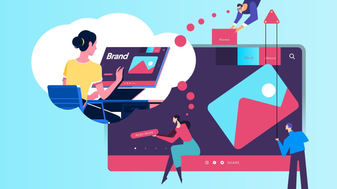
According to a recent survey from SuperOffice, customer experience (CX) is the biggest priority of businesses over the next five years, more important than finding better products or selling them at the right price. Why? Because customers are flocking to brands that provide them with better CX and 86% of consumers said they would pay more for it. Whether you just sell online or have both a website and a bricks and mortar store, improving CX could transform your business. Here are some of the things that customers are looking for from brands today.

Personalisation

How to get started on your web content personalization strategy

What makes Amazon the world’s most successful online retailer? The key ingredient in its success is personalisation. Its collection of user data ensures it knows its customers exceptionally well and this means that whenever they sign into the website, use its app or open an email, every product or offer provided for them is tailored around their wants and needs. It knows their shopping and browsing histories, the things on their wish lists, when they shop, what they shop for and how much they are likely to spend.

This level of insight means that Amazon’s product recommendations are much more likely to be a match for what the customer wants. This not only results in higher sales for Amazon; it also makes it highly attractive to customers who want to find the right products quickly and simply. This is why Amazon has become, for millions of shoppers, the default search engine for products.

The success of Amazon has led personalisation to become commonplace on the internet. Businesses everywhere are collecting user data to provide similar customer experiences (CX). For small businesses to remain attractive to modern shoppers, they too will need to start collecting user data to make personalised recommendations to customers. Today, it is easier than ever to implement. There are numerous specialist companies offering recommendation engines as a service and if that is out of your budget, try the AI-enabled, PRZ Recommendation Engine plugin for WordPress and WooCommerce.

Simple shopping

Double eleven shopping girl png image_picture free download 401645711_lovepik.com

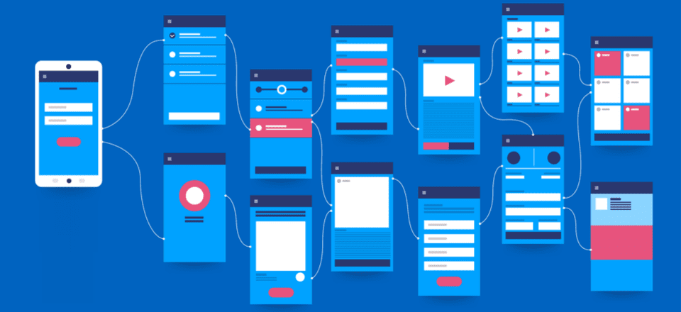
While product recommendation engines are beneficial, they can’t predict everything that a shopper wants to buy and they are not much use at all for new visitors for whom you have no historical data. Customers in these situations seek websites that offer simpler ways to shop. They want to be able to find products quickly, have all the essential product data given clearly (description, images, price, specifications, etc.) without ‘information overload’ and they want to be able to pay and leave without a fuss.

This starts with simple site navigation and the ability to search for products. Product search has evolved and customers expect to be able to easily narrow down searches by applying numerous filters: price, customer ratings, size, shape, colour, brand, etc. This can easily be implemented using plugins, indeed many store building platforms come with the functionality built-in.

Providing the right information can be a balancing act. Customers will want to know everything essential about a product, including other purchasers’ ratings, but without being overloaded. They may want to compare products side by side before making a decision, save the product in a wish list if they can’t make up their minds and be shown similar products that they might not yet have come across.

Once a decision is made, they’ll want to buy and go as quickly as possible. This means providing a streamlined checkout process, including guest checkouts for non-members and one-click checkouts for those who have saved payment details with you.

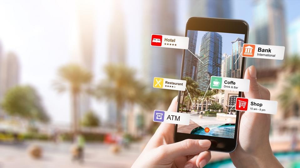
Omnichannel shopping

Omnichannel Retail Made Simple: A Complete Guide For Brands

Though the growth in online shopping has led most bricks and mortar stores to build an online store, many retailers keep those two elements of their business distinct. Technology, however, has blurred the lines between online and on-premises shopping and this has provided yet another experience that customers want – omnichannel shopping.

The modern customer likes the flexibility of click and collect. They want to be able to purchase online and pick the product up from the store. Indeed, this business model stopped many bricks and mortar stores going bust during the pandemic as it enabled them to offer drive-through shopping. While shops were compulsorily closed, customers could order items from their phones in the car park and staff would take them to the car.

For single store businesses that have all their inventory under one roof, putting this system into place is easy to do on your website as it just means linking your store software to your inventory data, a feature available in plugins like WooCommerce. It is more complicated for businesses with multiple stores and separate warehouses as they will need to unify inventory data from across all their stores and warehouses. However, once in place, a customer can remotely buy from a physical store using the website or app.

Omnichannel communications

How to Develop an Omnichannel Marketing Campaign | AdRoll Blog

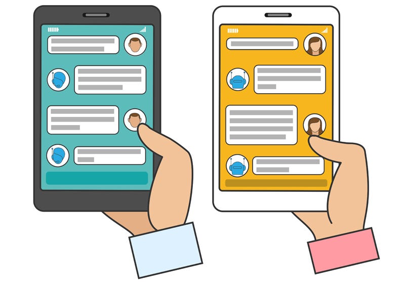
Modern technology has hugely expanded the number of ways that customers and companies communicate. The difficulty for brands is that consumers have their own preferences for how they like to stay in touch. Indeed, they have different preferences for different purposes. If communication is important, they may want the company to send a printed letter or email, if it’s a special offer they may prefer an SMS or WhatsApp message. When consumers want to get in touch, they usually want a quick response and may use phone, chatbot or, increasingly, a voice assistant or smart speaker.

Providing a great customer experience (CX) means communicating via the channels that consumers prefer. The advantage for businesses is that it enables them to send the right messages at the right time with a greater chance that they will be seen and acted upon.

The challenge here is, again, one of data. Not only does the company need to know which channel each customer prefers but it also needs to unify data to provide a complete overview of the customer journey. This way, whoever is communicating with the customer (human or AI) will have access to all the information needed to send out the right correspondence or deal with enquiries seamlessly when customers move from one channel to another.

This is the level of sophistication that many businesses have managed to achieve and which customers now expect from retailers. If they send a message on social media and phone up later, they’ll expect whoever is answering the call to have access to the social media message. Just as importantly, if they have used a smartphone app to add a product to their shopping cart, they’ll expect to see it still there if they visit your website on a laptop or try to order it using a voice assistant. Everything has to link up.

Conclusion

As you can see, customer experience (CX) is essential to staying relevant in an ever more competitive market and this is forcing brands to adopt new business models and the advanced technologies needed to implement them. For websites, the collection of data needed for personalisation, omnichannel shopping and omnichannel communications often require much more disk space and processing power than shared hosting packages provide. Upgrading to VPS or the cloud provides far more capacity to deploy the new technologies that CX relies on and is your first step to transforming your site.

Typography Comprehensive Guide For App UI Design

10 Rules of Good UI Design to Follow On Every Web Design Project | Elegant Themes Blog

“The text is too big.” “The words are placed too distantly.” “The words are not going with the image” Such comments have been passed continuously ever since the day user experience established itself as a crucial element of the mobile app design industry. With users spending a major portion of their day on applications, consuming information, and interacting with words, the importance of carefully crafted typography has come to the forefront.

Let’s walk you through the concept that holds the power to lower app abandonment and play a crucial role in increasing the app revenue – Typography.

A Basic Introduction to Typography

Typography, in simple words, is an art of organizing written text, point sizes, line-spacing, and other elements in a way that offer a pleasant and readable user experience. It is a craft that enables designers to transform human interactions into durable visual form.

Now, when talking about what is typography, it is good to have a familiarity with elements it comprises of – something we will discuss in the next section of this article.

6 Typography Elements You Must Know About

Beginning Graphic Design: Typography - YouTube

1. Typeface

Typeface refers to a set of symbols, numbers, letters, and characters that share similar features. For example, Garamond, Helvetica, and Baskerville is a typeface.

2. Font

Often used as a synonym of typeface, Font is basically a typeface that is set in a particular style, size, and height.

3. Line Length

Another typography design element you should be familiar with is line length. It refers to the area covered by a block of text positioned between the left and right margins.

It is usually calculated as the total number of words or characters in a particular line.

4. Line Spacing

Also termed as Leading, line spacing is the distance between two baselines, i.e, imaginary lines where the text resides.

5. Kerning

Kerning is defined as the spacing between two particular characters or letters.

6. Tracking

Tracking is another typography element used by UI designers for crafting a better experience. It is termed as the spacing between two individual blocks of texts and is also known as letter spacing.

Now as you know the definition and typography elements to consider for user interface design, it’s good to look into why is it necessary to focus on this UI design method.

So, let’s go through the advantages of focusing on Typography in UI design.

Reasons Why It Is Important to Consider Typography

1. It Sets a Mood/Tone

369 Mood Tone Stock Illustrations, Cliparts and Royalty Free Mood Tone Vectors

The foremost reason why typography is important in UI design is that it helps in setting the tone of the message. While plain and simple typography shows that content needs to be considered with seriousness, innovative typography adds fun and excitement to the screen.

2. It Helps Deliver Better Visual Experience’

7 DMO Websites that Deliver Beautiful Visual Experiences | by Elizabeth Ching | The Viewfinder | Medium

Typography also boosts the visual appearance of a mobile app. When chosen wisely, it infuses positive vibes and helps to deliver a delightful experience to your target audience. Whereas, wrong typography ruins the user experience and compels them to exit the platform soon.

So, it is profitable to consider typography as a key element of your mobile app design process.

3. It Enhances Readability

8 Tips for Better Readability - The latest Voice of Customer and CX trends | Usabilla Blog

Another reason why focusing on typography is one of the proven tips to enhance mobile app UI design is that it eases the process of reading content. It simplifies how users comprehend every single detail you mentioned in your app while helping in building better connections.

4. It Shows Professionalism

Core Values Icons - Professionalism & Integrity - Compass Associates

Typography also adds a tint of professionalism in your mobile app UI design. When you pick a typography which goes with your brand vision, customer behavior, and market standards, it brings a positive impression on the audience. It encourages them to trust in your brand and thus, support you in achieving expected goals in stipulated time and effort.

5. It Boosts Sales Conversion

18 Proven Ways to Increase Your Sales Funnel Conversion Rate

Typography encourages users to spend more time on your application and understand the context more effectively. This increases the chances of motivating them to perform the desired actions and ultimately, boosts sales.

6. It Creates Brand Recognition

Brand Awareness Definition

When you use a particular set of typography and use the same pattern throughout your content, users start relating it to your brand. They begin to remember your work via the typography you have used.

With this attended to, it is likely that you would be interested to know how to use typography in UI design, next.

While hiring a reputed mobile application design and development services provider is a good idea, having information about popular apps to get inspiration from can be really significant.

So, let’s look at the list of apps that have over time, amazed users through their mobile design system typography.

5 Mobile Apps to Take Inspiration From

1. Hotel Tonight

Make Tonight Unforgettable with HotelTonight - Technology and Operations Management

Hotel Tonight has used different fonts and styles on both platforms. While the brand implemented various weights of Google’s Roboto for its Android application, it used Gothan for its iOS platform.

2. FIFA

FIFA - Wikipedia

FIFA mobile application has used Miso for typography in UI design, though in different font sizes and weights to bring better emphasis on particular content elements.

3. Fancred

Fancred

Fancred has also focused on using different typography elements in their app UI design. Besides, they have also experimented with the idea of adding text to pictures and did UX reviews to give a seamless user experience.

4. Citroen Lifestyle

Citroen Lifestyle is another impressive iOS application that has worked with the idea of using font pairing, text-in-picture, and other ways of implementing typography in their app design.

5. UltraVisual

Flipboard buys photo and video creation app Ultravisual

Another mobile application that has inspired users with its typography is UltraVisual. The application, in its iOS version, has used different fonts and added content on photos to deliver better information with minimal space.

Now, as we have seen what Android and iOS applications you can consider for getting an understanding of the rightful implementation of typography UI design, let’s take a look at what UI typography style guide to follow while creating a design strategy for your app.

8 Typography Principles to Focus Upon While Creating Your App

1. Complement Mood to the Message

How Typography Aid Consumer Moods | DesignMantic: The Design Shop

As per the best mobile design experts, every typeface comes with a unique vibe. While some are fancy and friendly, others are simple and yet professional. In such a scenario, picking the one that goes with your brand message is a must.

So, do not overlook this fact while pondering upon how to improve your UI design through better typography.

2. Pick the Font’s Point Size as per Design Context

A Comprehensive Guide on Typography in App UI Design

Choosing too small or too bigger fonts altogether makes it difficult for users to continue reading with the same flow. It affects the readability of the app content.

In such a scenario, it is important for mobile app designers to select the right font point size for their app’s  UI design.

Now when talking about picking the right font point size, it is profitable to invest your time and effort in the general thumb rule-keeping body text between 10 and 12 points for print projects and 15 to 20 pixels for the web.

3. Stick to a Limited Number of Fonts

Typography in Design Systems. Choose Fonts, Set a Hierarchy, and… | by Nathan Curtis | EightShapes | Medium

Adding too many fonts on the same page can be a barrier to readability. So, it is again vital to keep yourself limited to a certain number of fonts – usually those who are not drastically different in look and feel.

4. Build a Hierarchy

Another rule to follow when talking about typography in UI design is to create a good hierarchy. This will help in easier navigation, better organization of every element as well as simplifying the process of finding information.

Now, when focusing on creating a hierarchy, the basic things a UI designer must know are:-

  • Employing text size to prioritize information by importance.
  • Adding appropriate spacing to make content scannable.
  • Arranging related items together.
  • Introducing headings, subheadings, etc. in the content.

5. Focus on Grammar

English Grammar Pill: How to use the present perfect tenses correctly | English with a Twist

Since a wrong spelling can break the flow and make it difficult for the audience to comprehend the whole meaning, it is again imperative to focus on the grammar aspect as well.

6. Don’t Overlook Spacing and Alignment

Spacing and alignment also make a huge difference in the overall app UI experience. When you introduce the right amount of spacing and alignment in your app content, users find it easier and faster to grasp the information and respond effectively.

For example, when you use center or justified alignment, users have to struggle with maintaining a continuous communication flow. Whereas, this is not so in the case of left-aligned content.

Likewise, when the letters in your app content are too tightly hugged or at significant distance, users fail to continue reading with the same pace and often exit the platform. But, this does not happen when you pay attention to proper spacing between all the words and letters.

So, do not forget to focus on this principle when considering how to use typography in UI design.

7. Prevent using Design Fads

Another thing you should focus upon is to prevent employing design fads. This is because the fads do not prevail in the market for longer. They have a shorter time span, implying you might have to change your app’s UI design with some other typography later.

So, do not prefer going with any such design fad.

8. Observe and Practice

Practice Method Observe Operation Perform Utilize Concept Stock Photo, Picture And Royalty Free Image. Image 61729774.

Last but not the least, invest your time and effort into practicing different typography and evaluate their success rate. This will help you in receiving better user experience outcomes.

Now while these principles of typography will help you with crafting a perfect UI design plan, it is incredibly important to keep a watch on the typography trends as they were one of the crucial mobile app UI design trends for 2018.

So, taking the same thought into consideration, let’s end this article with a focus upon top typography trends to watch out for in 2019.

Typography Trends You Should Stick to in 2019

1. Hand-Drawn Fonts are Popular

awesome font | Lettering, Cool fonts, Lettering fonts

The foremost typography trend to follow in 2019 is using hand-drawn fonts, i.e, the fonts resembling with our handwriting.

Such fonts are highly preferred by brands like Etsy and Fiverr because of the fact that they add a human touch to the app design and encourages users to connect more easily.

2. Glyphs are Gaining a Huge Momentum

Mysterious Ancient Maya 'Star War' Glyph And Its Possible Connection To Venus | Ancient Pages

Not only text fonts, but designers are also focusing on a varied set of symbols and non-alphanumeric characters like dividers and icons in their app UI design to enhance the user experience.

3. Font Pairing Will Go Trendy

10 Beautiful Font Combinations For Your Design In 2021

Another answer to what are the typography trends to focus upon in 2019 is font pairing.

As the name depicts, it’s the practice of using a combination of two or more different font types in a particular design in order to add a surprising element in the content.

4. Variable is the New Responsive

Another typography UI design trend for designers to focus upon this year is to introduce variable fonts.

Unlike the traditional fonts that are static, these fonts showcase content in different smooth yet non-discrete transitions. This makes content more appealing and engaging.

5. Variant Sizes Will Create a Perfect Match

UI designers will also experiment with contrasting fonts this year and for some time to come. They will use the same font in varying sizes to create a ‘hierarchy like impression.

And in this way, direct users to focus more on particular texts instead of giving equal attention to all.

6. Photos Will Go Expressive

Art Therapy for Children

In 2019, UI designers are taking another route to deliver visual storytelling experience to their audience. They are adding text and other elements to photos. And in this way, delivering more information in minimal space and that too without making it unpleasant to eyes.

7. Geometric Typefaces Will Take a Lead

Top 5 geometric fonts for 2019. Need some geometric fonts for your next… | by Florian Gaefke | UX Collective

Last but not the least, Geometric typefaces will also take a lead in the marketplace this year. The typeface, created with the help of straight lines and round forms, will add a futuristic vibe to your content and make it easy to scan and readable.

It will be highly used in the process of creating branding and logo designs, especially in the field of Science, Technology, and Engineering.

Frequently Asked Questions About Typography in UI Design

1. What is good typography?

Good typography is defined as the one that complements the tone of the design while helping spread the desired message. When talking about picking good typography for any design, there can be more than one option available.

2. What are the principles of typography?

While there are various principles related to typography, the prime ones are:-

  1. Pick typography that enhances the tone of the message.
  2. Pick the Font’s point size according to the design’s perspective.
  3. Set up a Hierarchy.
  4. Pay attention to Spacing and Alignment.
  5. Observe, Get Inspired, and Practice.

3. Is typography an element of design?

Yes, typography is a part of the design. The technique enables designers to present their app content in an engaging and knowledgeable manner – resulting in a better user experience.

4. Why is typography important in graphic design?

Typography is important in graphic design because it:-

  • Sets a tone/mood to the message,
  • Encourages visual experience,
  • Shows professionalism,
  • Enhances readability,
  • Boosts sales conversion,
  • Creates brand recognition.

Here are Tips to Enhance Mobile App Design by Improving Its UI

5 Minutes with a UX/UI Designer | Contentsquare

Often, we hear the terms ‘UI’ and ‘UX’ being used in context of websites and mobile applications. Haven’t we all heard or made statements such as ‘I just couldn’t understand the UI of the application so I didn’t install it’ or ‘the UX of the website is so great I keep going back to it.’ What are UI and UX actually and how do they impact a mobile application’s performance? And more importantly, how can mobile application design be enhanced using UI and UX?

This blog will talk about the vital UI and UX aspects of a mobile application and also provide handy tips that are proven to improve an application’s UI and UX.

User Interface (UI) and User Experience (UX)

Cert Trainers

User Experience (UX) and User Interface (UI) are commonly used interchangeably, but the fact is that UI and UX are quite different from each other. “Design is not what a thing looks like or feels like; design is all about how anything works.” Steve Jobs’ legendary words sum up the co-dependence between UI and UX. A great product design strategy for your mobile app will keep end users’ needs in mind and meet the bottom line of conversion, every time.

Both UI and UX work hand in hand to make interaction with a mobile application as painless and smooth as possible.

User experience refers to the interactive side of a website or application. It governs the kind of experience a user has while interacting with a product. An application having a great UX will put new users to ease and actually encourage them to explore the application. So, UX developers have to actually anticipate how a user will think when they use a product and then design it in such a way that the interaction becomes seamless and intuitive. When talking about a website’s UX, site map, page load, responsiveness, and content are relevant aspects and for apps, navigation and layout are relevant UX aspects.

User Interface on the other hand refers to the visual elements in a website or app. The typography, color schemes, and layout of various design elements are usually a part of UI design. So, if a call-to-action button has to be placed on a webpage, its color and fonts will be decided by the UI developers but its placement, resolution, and functionality will be determined by a UX expert.

So, while UX professionals make designs centered on user’s needs and research, UI professionals create visual designs based on a client’s needs and requirements.  But the end objective of both UI and UX is to please website visitors and app users and encourage them to return to the app or website again and again.

Tips to Improve Your Mobile App’s UI

Designing the perfect UX and UI is an art and a science. Your mobile application’s design can make or break its fate. While style certainly can’t beat substance, it’s a definite deal breaker for app users. All users love apps with familiar layouts, quick load times, and seamless experience across devices and screens, cohesive visual elements and strong branding. So, for your app to be a hit, it needs to be appealing inside and out.

Have a Unique app icon

Adidas Fitness App Icons by TRÜF | App icon design, Workout apps, Icon design

A killer app icon will make your app stand out among the dozens crowding a user’s screen. Facebook, Google and WhatsApp icons are recognizable by people across the globe. Ensure that your app icon reflects your brand’s colors and style. Use the icon consistently across screens and pages and on all marketing collateral. The aim is to forge a strong bond between your brand’s message and its icons so that people make the connection instantly.

Keep in mind the following when designing your app logo:

  • Either use a unique image or your brand name’s initials in the icon. Your company’s logo is also a good choice as it might already have established repute and visibility in the market.
  • Avoid incorporating long words in the icon as it affects readability adversely and crowds the screen.
  • Submit several iterations of the icon while publishing your app.

Prioritize interaction design

Interaction design is an essential aspect of mobile app design. Apps with great interaction design are simple to use and seem like second nature. Users are able to figure out how to use these apps without reading lengthy tutorials or seeing complex demos. Each element of the app just fits together perfectly such that design becomes secondary and functionality gains priority.

5 Fundamentals of UX Design That Impact SEO - Usability Geek

The three pillars of interaction design that can enhance your app’s UI are:

  • Goal-driven design: User research and use case scenarios should be made for numerous situations so that you understand how a user will behave in a particular situation. Your app should not lose users at any point. Since it’s relatively easy to acquire an app from play stores, users don’t hesitate to abandon an app that isn’t meeting their needs instantly and opt for a competitor app. So your UI developers have to only attract visitors but also retain and convert them efficiently through brilliant design and interactivity. Customized workflows have to be designed for different use cases.  Familiar navigation and simple layouts are best to guide users to the next steps. Uncluttered typography and contextual content are absolutely essential to maintain attention.
  • Usability: Usability testing is arguable the most important phase of app development. It allows real users to interact with an app under construction. Careful observation should be made to identify breakpoints and incoherence in the app’s UI. Usability testing should be repeated a number of times with different users and in different environments. This will probably give the most authentic feedback to your developers even before the app hits the market.
  • Feedback: Users need to be validated after they complete an action, especially new users unfamiliar with an app’s functioning. So, provide timely feedback in the form of visual cues, sounds or prompts as a user performs an action. It’s also a great strategy to include a prompt about the next step they should perform to guide them towards conversion stage.

Reduce, Reduce, Reduce

7 Ways To Be More Responsive To Your Customers

While mobile applications are becoming the go-to source for every kind of transaction, it’s a harsh truth that people’s attention spans are reducing by the second. Web users have no patience to read walls of text or go through lengthy how-to guides.

  • Keep your app copy clean and engaging. Also adhere to the context of the content. The aim is not to wow audiences with long, technical terms but to endear them with simple easy to understand content.
  • Use pictures and icons lavishly. They not only make your app attractive but also occupy less space and are more effective that textual cues. Keep in mind that pictures used should not be generic stock images. They should be customized to platform and screen size and have a comfortable resolution.
  • Mobile apps have trouble with multitasking. So focus on limited features. Don’t try to accomplish everything with a single app. Remove all extraneous elements and features and make your app screen uncluttered. This will appeal to users and also up your app’s performance.

Concentrate on Responsiveness

Customer Responsiveness: What It Is & Why My Business Needs It!

  • Finger-friendly design is a must for mobile applications. Your app should run flawlessly in different devices and screen sizes. Whether this requires tweaking media queries or JavaScript, no stone should be left unturned to keep users engaged when they switch between laptops, smartphones and tablets.
  • Use images in suitable format that fit the platform on which your app runs. Stretchable graphics are a great choice for Android app design.
  • Follow platform rules and design for best utilization of the particular platform. Don’t try to reinvent the wheel and create unfamiliar screen controls an interface elements. Take cues from the platform about the look and feel of your app. This will not only reduce redundancy of efforts but also delight users.
  • Adhere to the UI guidelines prescribed for mobile applications. There are norms for buttons, menus, widgets and every mobile element. All applications are scrutinized for these guidelines by play stores before they are published there.

Know Your Visual Elements

Visual elements such as fonts and colors although a part of UI, contribute substantially to the holistic user experience with an application.

  • When choosing typography for your app copy, focus on readability rather than attractiveness. The aim is not to distract users from your app’s features by using large, whacky fonts. Too small fonts become miniscule on smaller screen sizes. So, keep font size above 12 pt. at least.
  • Understand colors thoroughly and use them smartly to enhance visuals and show screen transitions. Fade out between screens will soften screen transitions. Highlighting a button can prompt a user to perform an action. Changing a button’s color after it’s been clicked will show a goal-driven action has been completed.
  • Use popular icons to show typical actions. For instance, a heart can be used to signify favorites and a tick mark to show completed action. Replacing text with representative icons will help your app’s international users who may not understand your app’s copy.
  • Keep an eye on app design trends as they keep changing rapidly. Material design, flat design, minimalistic design- choose wisely to give your mobile app a contemporary look.

Designing a mobile app with a great UI is a tough task. It requires years of patience and an in-depth understanding of user psychology. But practice makes perfect. So, keep iterating and testing to get the perfect mobile app design. Anteelo’s skilled UI and UX team has created more than 350 Android apps and iOS apps. We even provide comprehensive design consultancy to audit your app’s design elements and enhance its performance and usability.

Mobile Apps UI Design Trends for 2018-Top 15

App designs, themes, templates and downloadable graphic elements on Dribbble

Mobile Apps Designs continue to change with the changing demand of the industry’s million users. In the race of catching and keeping the attention of the crowd of impatient users, the UI design market keeps coming with new ideas and keeps revolutionizing the old ways to make the experience innovative and value offering.

2017 bid adieu to a number of UI elements that were making the product design old and boring – hamburger menu, content with less to no images, safe colors. While 2018 will be all about on the face, no nonsense designs.

There has been a new found demand for mobile app design agencies that can understand and help keep the brands in trend, when it comes to offering uniquely innovative experience to the users.

There are a number of UI elements that have together made a list of Mobile App Design Trends 2018.

Let’s get on them to keep you on trend this year.

1.Vibrant Colors

Bright Colors in UI Design: Benefits and Drawbacks | by tubik | UX Planet

In 2016, UI designers reinvented flat designs in mobile apps and shifted their focus to offering greater personalization with their design elements.

Instagram was one of the first apps to modify their logo, move on from the flat, dull-muted tones to multi-colors. The trend was then trailed by a range of famous companies. Moving in the same direction, 2018 is going to be the time of vibrant colors, shooting up warmth, energy, and subtleties to your home screen.

It’s time for designers to be valiant and try out newer colors, but select and apply them wisely. Make sure the colors allow you to create unique, powerful, and eye-friendly experience.

2.Borderless Display

Future of UX Design: Trends That Really Deserve Your Attention

When Apple declared the launch of iPhone X with a borderless display, the major buzz was made around the effect of the design on UI design. They introduced the trend of transforming the usage of strict flat design ideas in mobile apps, boosting fluent storytelling. While it was still a lot restricted in 2017, Borderless Display specific designs have found themselves in the list of UI Design Trends of 2018. We will soon start seeing designs that cover the whole mobile from edge to edge.

3.Videos

50 Awesome Music & Video Player UI Designs – Bashooka

2017 witnessed a rise in the fame of video content format. Hubspot stated that 78% of people watch online videos per week, and over 55% see online videos every single day.

In the context of the mobile apps, designers will be adapting the video formats in their apps in 2018.

The human attention period has reduced from 12 to eight seconds. Video-based UI is a result of this change in span.

2018 will see more of video-based content and more platforms coming up with live video options to convey information and feelings.

4.Cards

Card UI design: fundamentals and examples - Justinmind

It was in 2015 that mobile devices overtook PCs as most used tools for surfing the web and doing the regular online activities. To cover the gap between desktop and mobile app usage, there had to be an element that would work well on both.

One of them is cards.

Although not an innovative addition in Mobile App UI Trends 2018, they play a crucial role in curating an effective UI design. Having all – video, photo, text, and link to a specific subject, cards are one of the most brilliant ways to display and organize large amounts of content on screen. Above all, they are aesthetic, easy to digestible, and properly-optimized for clicks and taps. This is why they have found themselves as the prime UI design mode on Pinterest, Netflix, and Newsfeed.

5. Sounds

PureMind | Sounds | Interactive design, App design, Sound

The newest element in 2018 UI Design Trends is sound layers. This trend are with respect to the sounds which users listen when they open a website, send comments, select emojis, etc. The sound element of UI design adds features like enjoyment and pleasure in user experience. 2018 has come with an expansion to this trend and is set to take user experience to new levels.

6.Big Typography

Big Typography designs, themes, templates and downloadable graphic elements on Dribbble

Typography is another feature for the UI designers to experiment when designing uber personalized app designs. When added with images, colors, video, animations, and innovative layouts, the element brings about exceptional user experience.

Solely because of the reason, Typography has become crucial piece of UI design world in 2018, helping designers transform from the traditional font styles to a more experimental, creative space. What you should expect this year, is fancy and bold fonts in place of done till death system fonts, which have been applied since forever.

7.Overlapping

Pattern 10: Create Overlapping & Collaged Elements - UI & Visual Design Patterns - Proximity School of Design

Overlapping of graphics, fonts, and colors not only makes UI design distinctive and eye-catching, but also add a false sense of white space. Creating an illusion of open space in the crowded real estate of a device, is the number one reason why designers are adding overlapping feature in their mobile apps.

Furthermore, in most cases, the overlapping of the same elements, combined with shadows, makes the mobile app interface designs impressive and fantasy like. All these reasons combined, make overlapping an important part of Mobile Application User Interface Design Trends 2018.

8.Gradients

Gradient designs, themes, templates and downloadable graphic elements on Dribbble

In 2018, one can expect to see bright vivid colors and much greater use of the gradients.

In the last some years, we have been seeing a rise in the number of app designers who are adopting color gradients in design when designing buttons, logos, and backgrounds.

The reason behind this adoption is when you chose a specific color, you can show a hierarchy while drawing a picture and combining it with different graphics and color gradients.

This sense of hierarchy will continue to make Gradients famous in 2018 as they did in 2017.

9.Opacity

30 Clearly Cool Transparent UI Designs – Bashooka

Same components tend to have diverse effects once you adjust or play around with their transparency level. When designing mobile app interfaces, adding opacity in components can be an excellent design work. Furthermore, the opacity settings for various graphics or colors can also help create colorful glass like texture to the app elements.

Overall, irrespective of how you add opacity to your UI design in mobile apps, they will see a concrete rise in demand in 2018.

10.Animation

5 phenomenal examples of motion design in UI | Inside Design Blog

Introducing motion design or animations in fonts, icons, buttons, and photos always have an optimistic impact on app users giving them more enjoyable experiences. The trend will continue in 2018.

11.Responsive Logos

Joe Harrison - Design & Interaction

The idea of modifying logos to fit in with the n number of devices, has been a very recent doing of the app design world. Brands have now started refreshing the logos in simplified, modern versions since last some years and making them responsive is the only logical next phase when it comes to meeting the today’s demands.

12.Real Life Photography

40 Best Photography Web UI Design Examples 2019 – Bashooka

It’s very energizing to see authentic, real-life images return to the mainstream again.

The demand for real photos rose greatly in 2017 and is set to grow massively in 2018, with brands seeking to bond with users, and designers looking to get rid of tawdry stock photos.

13.Highly-Detailed Vintage

Pin on APP UI

Vintage is nothing new, but its usage will grow stronger in 2018. Although it contradicts the mainstream need for minimalism, finely crafted images are timeless. This year, brands will be looking to attain top-shelf expression that shouts sophistication and distinction.

While not everyone’s cup of tea, food and beverage domain—specifically those involved with organic food and wine—will be leveraging the style in 2018.

14.Voice Enabled

How to Design Voice User Interface? (VUI Design Guide)

Voice-activated elements of apps helps simplify users’ operations. In 2017, apps with voice dependent services finally found their fair share of demand from the industry. The popularity of voice-activated mobile apps will only grow in 2018.Other than the voice-activated elements, fingerprint-activated ones will also play a very crucial part in defining mobile app interface designs for 2018.

15.Emoticons

Popup design - Daily Ui 16 by Ashley Saleem-West on Dribbble

In 2018 we can expect to see emotional intelligence getting integrated in mobile experience to a much greater level. It is no more about animated effects that are shown when users complete any specific action. EI has now become a mainstream way to make users experience delightful and engaging.

In the year of mobile apps, we will see more emoticons in the list. They will see an integration with Face recognition elements that will be used for providing an array of reactions. One such technology that have been doing this perfectly is Animoji — the animated emoji that responds to iPhone X camera’s facial expressions.

Tips & Trends to Follow For Mobile App UI Design in 2021

Third year students UI Design Systems Project—Designing a Finance App for Teens — IDEA School of Design Blog | Capilano University Illustration and Design School

UI design has proven to play a crucial role in mobile app success. It has positioned itself as a ladder to reach the hearts and minds of the users and customers by displaying engaging visual content and more.

But, is everyone able to relish its benefits? Do all the designers and entrepreneurs know about the best mobile app UI design tips that work in the customer-centric world?

Sadly, no.

So, with the intention to simplify their journey of figuring out what the UI of future apps look like, we have prepared a list of tips and trends that will be popular in the mobile world in 2021.

But first, let’s take a recap of the benefits of UI design.

Now that we have taken a visual walkthrough of the importance of good user interface design during app development, let’s peep into a few mobile apps that are giving serious UI designing goals to others in the industry.

Best Apps That You Can Get Inspiration From

1. Netflix

Netflix Has 45% Fewer Movies (and 400% More TV Shows) Than it Did in 2010 - TV[R]EV

Netflix app – the one that has changed the landscape of the movie streaming industry – tops the list with its breathtaking UI design.

The application introduced incredible layout and color options to the mobile domain. It has not just worked on simplifying the navigation process but also ensured that all the reported bugs are solved in real-time. In this way, it has increased the chances of offering a positive experience to their audience.

2. Splitwise

Financial Hacks: Splitwise makes it easy to go Dutch | The Edge Markets

The UI design of the application is simple, sophisticated, and pleasant. The color scheme is chosen in a way that it complements app elements as well as employs the center of the device effectively.

3. Spring

The Introduction: Spring Shopping App - The American Edit

Spring, the popular shopping app, is also a good option to consider while looking for design tips for mobile apps.

The mobile application offers a simple and interactive experience – using icons to give a hint of the functionality of each element. The app uses different font styles and sizes along with a card layout to deliver an enhanced UI experience.

4. Trello

Trello

Trello is yet another application you can consider for deciding the type of UI design to create.

This productivity app is easy to use and gives the facility of creating boards for managing their tasks. It comes with a clean and sophisticated look and feels along with its tactics of arranging all the pins in a ‘pipeline’ manner. Also, it offers tons of cool backgrounds and labels colors to amp users’ experience.

5. Shine

Another application that has enhanced its customer experience via the user interface is Shine.

The mobile app uses custom and abstract aesthetics to match the mood of users. It also relies on soft shapes and calm colors to make them experience some peaceful moments.

6. Coursera

Coursera | Build Skills with Online Courses from Top Institutions

Coursera is yet another mobile application whose User interface offers some real goals in the design world.

The app design is simple and smooth, offering the ease to navigate from a well-organized syllabus. It uses different font styles and colors to give users an idea of what they have covered, what they are interacting with, and what’s next.

Now that we have taken inspiration from different mobile applications, let’s turn towards the main part of the article, i.e, best mobile app UI design tips to follow in 2021.

Mobile app UI Design Tips To Follow While Designing Your App

Keep It Simple

The foremost tip for designing a better mobile app is to keep the UI simple.

When you restrict the number of app UI elements, users do not get drifted by unnecessary details. They find it easier to focus on the prime elements of the application, which eventually improves the user retention rate.

Make it Responsive

HTML Responsive Web Design

Concentrating on responsiveness is also one of the proven tips to enhance mobile app design by improving its UI.

This is because when you design elements that fit the screens, regardless of the device users are using, they find ease in performing actions. This, in turn, encourages them to spend more time on your platform and add higher value.

Use Popular Icons

Download Free Social Media Icons | Picons

Users, when interacting with various mobile apps on a daily basis, become familiar with certain icons. They can easily relate those icons to particular functionalities without even reading the label.

In such a scenario, using those icons can cut down the hassle of making users understand what an app element is for. This eventually enhances customer engagement and delivers higher ROI. So, introduce popular and similar icons in your UI designing strategy.

Maintain Consistency

Another best practice for app designing that  UI mobility experts follow is showing consistency. That implies using the same font style, color, design, and icons throughout the app screens – and that too in the same order.

This simplifies the user journey and helps them make an action without getting a feel of being on some other platform. So, keep it into consideration while planning the app UI design.

Follow Platform-Based Rules

Which Phone is Best? Android vs Apple iOS vs Windows 8

Both Apple and Google have set guidelines for mobile app design for iOS and Android platforms

. Following those guidelines improves the look and feel of your application on the respective platform.

So, do not overlook these Google and Apple UI design guidelines while crafting your app design.

Do not Forget about Loading Speed

Average Page Load Times for 2018 - How does yours compare? - MachMetrics Speed Blog

Focusing on speed is also one of the best design tips for enhancing user interaction. This is because when UI elements take too much time to load, users get frustrated. They decide to exit the platform soon, because of which all of your efforts could go in vain.

So, think about optimizing your app speed frequently.

Invest in Testing

Many times, the elements you introduce in your app UI design do not work effectively. In such cases, they ruin the user experience instead of adding value to it.

So, it is good to invest your efforts into mobile app UI testing. For when you test your app icons and other elements for different conditions, it ultimately helps bring a positive impact on the users.

When talking about app testing, one thing that UI/UX designers must consider is the depth to which they should test their UI screens.

While educational and commercial apps require thorough UI testing across all the devices and OS versions, business apps can skip investing in extensive testing. This is because their audience, in most cases, is trained to employ the application.

In a nutshell, the depth of UI testing depends on the app’s purpose and the market it will target. However, it is a must to test your app UI on at least three different OS versions.

Iterate Regularly

Since user behavior and market trends keep on changing with time, it is again effective to upgrade your app UI design timely. And eventually, gain higher conversions.

As previously mentioned when talking about the latest mobile UI design trends 2021, changing market trends also influence the success of the user interface you design. So, let’s uncover what are the future mobile design trends 2021 to pay attention to.

The State of UI in 2021: Technologies and Trends That Will Dominate the Industry

1. Conversational Interface

What is a Conversational UI and why does it matter? | by Maruti Techlabs | Chatbots Magazine

Conversational Interface is one of the leading UI design trends for the future.

Just like Apple, Amazon, Google, Facebook, and Microsoft, various startups, and established brands will invest in Chatbot development to deliver the next level of conversational experience to their user base.

2. The Overlapping Effect

In 2021, UI/UX designers for a mobile app will embrace the idea of overlapping different elements, like text, image, and colors in a single screen.

The concept will help in creating a well-organized interface and create an illusion of space. This will eventually enhance the user experience to a great extent.

3. Typography

Why you should invest in software test automation | by MentorMate | Medium

Just like last year, considering typography in-app UI design will be one of the best mobile app design trends in 2021.

While brands have been applying bold San-Serif fonts and strong typography for some time now, they will now focus more on typography that reflects motion-based and three-dimensional effects.

4. Voice-Powered Interfaces

How Voice User Interface is taking over the world, and why you should care | by Good Rebels | Medium

By 2021, 50% of the search engine queries will be performed via voice. Because of this, voice-governed interfaces will also become one of the popular mobile application design techniques which are poised to deliver higher output.

5. Simple Curves and Geometry

Another UI design trend that will transform our future is the use of simple curves and geometry.

These curves and geometry will lower down confusion that might arise when multiple illustrations, pictures, catches, and animations are present in the design

6. Custom Illustration Interfaces

Illustrations will also be one of the popular mobile application design techniques to follow in the future.

Both brands and designers will turn towards introducing custom illustrations into their application – just like how Uber did.

7. White space

White space will also continue to be one of the core elements of mobile app design strategies.

With white space, designers will be able to deliver an uncomplicated experience to their target user base. They will find ease in making them focus upon the main part of the application over others. And ultimately, add value to their business.

8. Artificial Intelligence (AI)

Information Ethics - Department of Philosophy and Religion

Another technology that will bring a major impact in the field of UI design is Artificial Intelligence.

AI will not just help designers with creating multiple versions of any particular landing page or screen, but would also introduce personalized elements backed by thousands of studies and visual analysis. This, as a whole, will encourage them to look into how to use AI for better user interface design.

9. Contrasting Font Color/Shapes

Using contrasting font colors/shapes for mobile UI design will increase its popularity in 2021.

Mobility experts will infuse contrasting colors and shapes into their design to break the regular flow and add a tint of surprise into user interactions.

10. Animation

Ways To Effectively Use Animation In Enterprise Learning - eLearning Industry

Animation, which was one of the key app UI design trends for 2018 and 2021, will also continue to enjoy the same momentum in the future.

Brands will embrace the technique to introduce micro-interactions in their design process. And, in this way, prompts users to spend more time on their platforms.

11. Opacity

Setting the opacity of different UI elements will be considered among the top key app design trends 2021. The technique will be used to bring more emphasis on certain elements while maintaining smoothness and seamlessness.

12. Augmented Reality (AR)

The Amazing Ways VR And AR Are Transforming The Travel Industry

In 2021, UI/UX design experts will turn towards Augmented Reality (AR) for creating real-world interactions. They will embrace the technology to add immersion effects to their apps and products and help users comprehend the information more efficiently.

Besides, the technology will also be considered for building 3D brand impressions in the coming years.

13. Storytelling

Storytelling, i.e. the art of engaging users by narrating a story, will also be seen as one of the best UI/UX mobile design trends in 2021.

Mobile app designers will put more effort into crafting a story that highlights the purpose of the app and make users feel like a part of it. They will turn towards the best visual storytelling guides, tools, and techniques to make a story that keeps their audience hooked to their platform.

14. 3D Graphics

Art of Volume: Inspiring Examples of 3D Illustrations and Animation

3D graphics will also land on the list of top UI/UX trends to consider in 2021.

Mobile app designers will incorporate sophisticated textures and 3D images into their designs to add a realistic feel. Also, users will demand more 3D designs and marketing content to enjoy a vivid, fresh, and engaging experience.

15. Placement of Navigational Elements

Top 100 Awesome Website Navigation Icon - Techfameplus

Another trend that will change the future of the mobile app design world is the placement of navigational elements.

As we have already seen in our blog upon the impact of Phone X’s new design on mobile apps, the absence of a home screen button will influence the navigation process. This will urge mobility UI experts to discover new ways to deliver a seamless navigational experience to their users.

16. Virtual Reality (VR)

What is VR? The devices and apps that turn the real world virtual

Last but not least, the incorporation of Virtual Reality (VR) in UI design will also be in trend in the coming years.

The technology, after redefining the healthcare, marketing, and gaming industry, is expected to boost interaction levels in-app UI design. It is expected to emerge out as the ‘Internet of experiences’ by spilling out the app elements in the real world and prompting users to feel them.

While these were some of the mobile app design tips and trends that are predicted to revolutionize user interface in 2021, many more are hoping

How to Pitch Design Ideas to Clients like a Pro!

How to Pitch Your Design Work | Made by Sidecar | By designers. For designers.

Effective design is the best sales pitch! Design is good when it serves a purpose and turns a few heads, but it becomes phenomenal when it can twirl your client by the pixel. And this is where most designers face a roadblock. The only problem is, they somehow fail to associate “selling” with designing. And for those who don’t fall into that category, are most probably doing it wrong.We, designers come across a wide variety of clients to appease. Some of them turn out to be quite friendly and supportive, who hands over the liberty to the project in a barrel with other important stuff you might need to know. But some are more specific about their requirements and prefer to keep the freedom under a leash. Whoever we work with, the bottom-line remains the same: ideas don’t sell themselves. The key is to adapt to the ‘sales strategy’ to suit the customer. These are soft skills every designer must have!

Playing the role of an effective virtual tour guide isn’t a cakewalk, but I have for you, a few valuable and time-tested skills to help you add muscle to your selling.

Here are some pointers that you can mobilize to sell the design to your clients.

1. Know your Client : Get Talking

The Freelancer's 9-Step Guide to Convincing Clients to Hire You - Skillcrush

The number one rule of sales is getting to know your customer. This is where all the magic happens. It always starts with a string of conversations. The trick is to not let the thread go cold. At the start of a project, gather as much information about the client as possible. This will serve you well in the future in navigating through what actually matters to your client.  You can ask about their city, (a classic conversation starter), the weather may be, or about their likes and so on. And if you hit the right buttons, you would be amazed at what a simple conversation can uncork about your client’s design preferences, unless of course, you are Sherlock Holmes. Here’s what happens when you get talking:

  • You would get a clearer picture of what your client would prefer in your design.
  • A friendly conversation establishes trust. And once your client begins to trust you, the restrictions fall apart giving way for a fair amount of liberty on the projects you’re handling.
  • Once clients feel comfortable working with you, 80% of your pitching is done. They would start taking your designs more seriously and who knows, their next string of projects might have your name on them.
  • Establishing a relationship with the client is a fundamental precursor to pitching design ideas to them. It always gets them listening and responding more positively to your ideas.

2. DO YOUR HOMEWORK: GAIN CREDIBILITY

How to Pitch Creative Ideas to your Clients | Honchō

Decision making in design can be a bit challenging. It is not like throwing in variables in a formula to get to the right answer. Therefore, there’s always room for error. And this is why you need to have an answer for everything you do because rest assured there will be questions!

The business of design dictates that there exists logical reasoning for every UI/ UX move you make. There needs to be a reason for your chosen palette of colors or, your one-page layout preference. Backing your ideas up with concrete statistics is the way to go. A little bit of research goes a long way. It is always advisable to have complete knowledge of the amazing solution you are about to present since this dramatically reduces the chances of skewing up the thought process. This way, you can let the data talk for itself. And clients seldom argue with data.

However, where data falls short, big players come in handy. Another way to gain credibility is by making examples out of well-recognized names in the market. Think of this as a simple hack to the path of least resistance. If your idea coincides with Google’s, to some extent, then that should definitely be a part of your pitching strategy. This little information can open up doors you never thought existed. The bottom line is, clients will have a lot of queries, and you need to have all the answers ready to make for a smooth design selling work-day!

3. KNOW THE TRENDS: DESIGN FOR THE FUTURE

Future Trends in Graphic Design for Your Website

Don’t just be a great designer, be a smart one. We happen to live in a world where nothing is constant, except change. And when it comes to design, change is what pulls the wagon.

The next time you have a design intervention, do quick trend research. Make yourself aware of the big trends in the market and find out the ones that will stick. You can incorporate those in your designs and make it work. Thinking out of the box is a gift, but thinking smart is an acquired taste. Whatever you do, keep in mind that there’s a difference between an unprecedented risk and well-thought-out-and-researched one. You would definitely need to avoid the former.

If you look closely, you would find that there exist two broad kinds of designers, the trend-setters and the trend-followers. Who do you want to be?

4. PRESENTATION, PRESENTATION, PRESENTATION

51 Best Presentation Slides for Engaging Presentations (2021)

Even the best, path-breaking, award-winning ideas need a good presentation to get them out of the shed. Which is why, in order to sell your design ideas effectively, you will need more than a few sketches or words.

Consider making a pitch desk that communicates your ideas in a way that catches the client’s imagination. Make sure that they get the bigger picture. While addressing the client, make sure that you put everything in context. Use mockup templates, distribute design samples, go the extra mile. This will help the client visualize what the final design will emulate. The closer your working prototype comes to the real-life design functionality, the closer you will be to sealing the deal.

5. DON’T UNDERESTIMATE YOUR CLIENT: ACCEPT CRITICISM

Customer feedback analysis 101: What's the best way to analyze vast amounts of feedback?

In a profession without absolutes, criticism comes in bountiful. Your work might be your territory, but you need to keep in mind that you have been hired to solve a problem. And how effectively you do it, measures the conversion rate. Your clients may not have all the design know-hows, but they know exactly what they want and how they want it. So it’s best to always stay on top of your game and pitch your design ideas without getting too defensive.

Your clients need to know that you are distilling their design ideas and steering them to the best possible fruition and not taking it as a challenge. So treading with a touch of finesse would be a great idea. Instead of responding “I don’t think this change is required”, you could tone it down to a “While the changes you have suggested are completely do-able, you might find that it already satisfies these requirements, if you re-examine the one I have submitted.”

The manner of accepting the feedback on the design is critical to its final acceptance. You will find yourself in situations, where a positive attitude, attention to detail and an inane ability to address all the pain-points will ensure that the client is more receptive to your version of the final design that otherwise.

Quick Tip: You are on the same side as your client, stop taking it as a challenge.

Summary

With design, you need to keep two things in mind:

  • Less is more
  • It is always better to show than to tell

Even though the thought of “selling” might make you cringe, it is a milestone to achieve to make your designs see the light of the day. Having said that, you need to believe in your pixels and your instincts to see you through the worst because at the end of the day, you are what you present. Figuring out the art of presenting your design ideas, pitching them articulating them proficiently and ‘closing’ the design sale are important skills that will come in handy rather regularly over the course of your career.

‘6 Mistakes of Web Design’: What to Avoid?

Starting up with a website designing business is relatively easier, but keeping the game up for security becomes the major concern. The primary motive of your web design business should be to get those clients who are willing to pay for the services you are going to provide them. Security is one such aspect of this business that gets generally neglected and is not given that due attendance, which it deserves. Many startups offering web design services think that their business is too small to practice any serious security measure, or they find it useless to invest in cybersecurity plans at such a small level. By the time their business starts rising to the mid-level, they realize that it is now too late to implement security measures.

One breach in the security policies of your company can harm it to the level you might not have imagined. If we look into the survey reports from the National Cyber Security Alliance, we get to know that more than 70 percent of hacking attempts are done on small businesses. On average, a data breach of a small web designing company can cost Rs 35000 to Rs 50 lacs. Approx 60 percent of small businesses shut down in less than 6 months after a security breach as it becomes difficult for them to recover from the loss in business both financially and emotionally.

Security Mistakes to avoid with your web design business

Most Common Web Design Mistakes That You Should Avoid

To protect your web design business, and to maintain its security, ensure that you are not committing any of these mistakes.

1. Making use of personal devices for business purposes

When starting with any new business, there are many challenges that come in your way. The first one is the budget constraint, which often tempts people to use the technology or devices which they already have without spending more money on these products. It is all fine if you are using that device dedicatedly to meet your business goals and have stopped using them completely for your personal use after deleting all the personal data from that device.

It is of utmost necessity to set up a line between your personal and professional data, especially when there is an involvement of customer information. Mixing up these data can pose a real threat to the security policies of your organization. It is a tendency to ignore security measures when it comes to personal devices as compared to professional ones. Employees should also be refrained from using their devices for business purposes as it is really difficult for you to control your business then and can breach your security policies by exposing customer’s data. When an employee resigns from a company, the information on their devices also goes with them, that is why it is always better not to use personal devices for business purposes.

2. Overlooking the importance of data backup

Everything related to your business should be backed up, even the things that you think don’t contribute to the growth of your web design business. The data should be protected with a multi-tiered backup system involving data available both online as well as offline. A significant amount of time goes in to recover the lost data, and being a part of the web designing business; you cannot afford to lose significant data or spend time recreating data because of poor backup systems.

3. Overlooking basic security protocols

A very simple but often overlooked element in web designing business is cybersecurity. By adhering to the basic protocols related to security, one can safeguard their business from being hacked. According to a survey, approx 75 percent of employees do not secure their computer, approx 73 percent of employees use weak passwords in both their professional as well as a personal account. To safeguard the data, a web designing company should create internal mechanisms asking employees to change their passwords often and to disable logins of the employees who leave the company immediately. Passwords should be handled carefully and should reach only to authorize personals. Setting up security protocols like firewalls, anti-virus software, and malware protection is equally important to protect the company’s data.

4. Not using a virtual private network (VPN)

Being a web designing company, you need to develop websites for multiple clients, which means you are given an ample amount of sensitive information. To safeguard the data which your clients have entrusted to you, you should use a virtual private network to reduce the potential of any breach. A VPN encrypts all the data that is being sent over a network, making it virtually invisible to potential hackers.

5. Designing it all by my mindset

While setting up a company, it is viable to get involved in multiple roles to learn things and to save some extra bucks. As web design is an internet-based occupation, you might think that there is no need to hire a network designer, and you can do this task all by yourself. But hiring a network professional not only saves time but also you get to know things from a professional perspective, which guides you towards the best security protocols to safeguard the company’s significant data and hence save you from expensive problems in the future.

6. Not creating a proactive shield

When clients trust you with the development of their websites that forms an important part of their business, they expect you to include all possible security elements in that project. In many cases, website developers or web designing companies are held responsible for the security breach on a client website because of the irresponsible attitude of the developer in creating appropriate security protocols on the website.

Conclusion

Cybersecurity may not seem important at first, especially for small businesses, but it plays a very important role in determining the success of any company. By avoiding some security mistakes, you can ensure the safety of your company’s data as well as the client’s data. By following simple security protocols, you can grow your business exponentially without worrying about the theft of significant data.

The UX Deliverables Timeless List

A Complete List Of UX Deliverables | by Nick Babich | UX Planet

The efforts of the UI/UX team can be translated and measured into a whole list of UX deliverables. The deliverables which are then passed on to the stakeholders, both internal and external to get an idea of what the app’s users would experience.

Being the leading mobile app design agency that has helped brands like Dominos redesign their offering, we often get asked questions in the line of –

  • What are the deliverables that you provide at the end of the project?
  • Will the development team be able to convert the design in code and then a functioning app, with the help of the deliverable?

To address all these questions, we have prepared a brief description of the different UX deliverables to help you understand what to expect as an outcome when you partner with a mobile app design agency.

The end result of our UX Design process which is what is shown in the illustration below, are all the deliverables that we are going to read in the section that follows

An Entire List of UX Deliverables

The deliverables that present themselves as an outcome of the Mobile app UX effort is a family that can be divided into four subsets –

User Research

Market Research

Design-Centric

Testing Deliverables

User Research Deliverables

This part of the UX deliverables is concerned with looking into the users’ side of the story – who they are, what they prefer in an application, etc.

User Persona

User Persona Template and Examples | Xtensio

The first deliverable that app UX designers work towards is the creation of a user persona. It is about drawing out an image of your probable user – who are they, where do they live, what do they like, what irritates them, what is their pain point, how do you prefer solving it, etc.

The study gives designers and the business as a whole the idea of whom their software design process is intended for – above all, whom they are not developing the app for.

The next part of user research specific UX deliverable is knowing how the user would move inside the application, something that helps draw out a customer journey map.

It is a visual representation to show the actions that a user would take to reach the end goal in an app.

Being in a visual form, the deliverable makes it easy to identify the steps needed to redesign or improve the app, thus setting the ground for understanding what counts as the UX for perfect user flow.

Experience Map

When & How to Use an Experience Map in UX Design | Adobe XD Ideas

This deliverable here is basically a diagram that looks into the many steps that are taken by the users when they engage with the application. It enables the designers to frame users’ needs and motivation in every step of the journey and create a design solution which is appropriate for every step in the customer journey map.

Use Cases

It is the written description of how the software design process would be and how your users would perform tasks inside the application. It showcases the users’ point of view and how the app would behave when their request is responded. Every use case inside the app is shown as the sequence of easy steps, starting with users’ goal and finishing when their goal is achieved.

Storyboard

A Comprehensive Guide To Product Design — Smashing Magazine | Storyboard design, Ux design, Storyboard

Inspired from movie industry, this part of the list of UX deliverables deal with creating an outline of users’ action and the motive behind them. The idea behind this stage is to not just show what is the environment that makes users behave the way they do inside the application.

Market Research

This part of the UX deliverable deals with the market part of the elements that are known to help businesses get an idea of how their app market is moving.

Competitive UX Analysis

EMD Website Flowcharts by Eric Miller, via Behance | Flow chart, Web design, Flow chart template

Designers while researching for the app design will be able to analyze your competitors’ apps – helping you understand the industry standard and find out an opportunity for innovating in a specific segment.

The next part in the list of UX deliverables is specific to the core designing part of the application.

Design Centered UX Deliverable

Moodboards

Mood board, a wise tool — DAY 23. Mood board is an useful tool to be… | by Roberto Pesce | Product Coalition

It is that UX design method where a collection of references and images are found which evolve as the product’s visual guide. It allows the designers to showcase the proposed look for the app to the stakeholders before they put any time, efforts, and money behind it.

Sketches

One of the quickest ways to visualize an idea – Sketching is what is next in the list of design deliverable. Made using nothing but a pen and paper, it is used to validate the concept of products and the approach related to design taken by both users and the team members.

Wireframe

It is the UX design method cum visual guide which showcases the structure of the page along with its key elements and hierarchy. They have proven to be very useful when the designers have to discuss ideas with stakeholders and team members.

Prototype

UX design deliverables - Best practises of how to use different UX deliverables - Marvel Blog

This part of the UX design process is the simulated version of a semi-final app which is also used for testing purposes before the software is launched. The aim of the prototyping process and answer to What is the role of prototyping in user experience design? is to test the products before developers are involved to move on to the MVP stage.

When it comes to creating them, there are multiple prototyping tools that you can make use of to share a clickable version of your design with the stakeholders, all of which can turn out to be pretty useful when it comes to conducting an A/B test for UX designing.

Once all the market, user, and design related UX deliverables are worked upon, the time comes to look at the deliverables which would help test the design in the market.

Testing Deliverables

Quantitative Survey

The need to prepare questionnaires and surveys that help measure user satisfaction and collect app feedback is what comes under the KRA of app UX designers

Usability Report

These reports rightly summarize the findings related to usability in a descriptive and precise way helping teams identify issues and then work for its solution.

Analysis Report

There is a huge number of insights that analytics tools like Google Analytics fetch and show how users are interacting with the application.

Sitemap

Website Flowchart & Sitemap for Illustrator, OmniGraffle or Sketch – UX Kits

The last UX deliverable, which is also an important part of the UI design methodology that acts as the outcome of the designing efforts is Sitemap. It mainly shows the navigation and hierarchy structure of the application – which helps in giving out the information on how content will get organized in sections or screens.

Which UX Deliverable is For Which Audience?

The stakeholders of your design are not just your users but also your teammates and the company’s board and the clients. So assuming that all the UX deliverables you just read would be intended to explain the concept to any one stakeholder category would be a grave misassumption. Your chosen deliverable will have to vary from your audience to audience.

Let us look at all the different combinations that you should work around.

A. In-house management

When it comes to communicating with the managers or internal stakeholders, the UX deliverables which are mostly deemed ideal is the prototype model and the analytics report.

The prototypes give the stakeholders an experience which is a very close reflection of the final app and thus prove to be a solid tool for showcasing what the users would experience.

On the other hand, usability and analytics reports are also found to be very useful when sharing information with the management, for they present clear evidence of the UX recommendation made.

B. Clients and External Stakeholders

When you have to share the UX designs with the external stakeholders like your client, interactive prototypes and mockups are usually the most opted for deliverables.

The idea behind this is when you work with people who have limited knowledge of UX design and ux review, it is always better to give them deliverables that would place the entire focus on visual design. Doing this will help them see the app’s functionality, its information architecture, and the interaction design which is integrated inside the realistic mockups.

C. Engineers and Mobile App Developers

Outstanding Set of Software Engineers Vectors 180258 Vector Art at Vecteezy

When we talk about communication the UX idea with the developers, interactive prototypes are once again chosen as the right option. But there are other deliverables as well which come across as ideal – site map, style guide, and flowchart.

Because of their detailed focus on interaction specifics and structural details, these deliverables prove to be very useful when it comes to the actual implementation process.

With this, we have seen everything there is to know about not just the types of UX deliverables to expect as an outcome from the UX/UI designing agency but also which deliverable is best for which stakeholder.

Now that you have the necessary deliverable related information, it is time to get started with working on your own app’s deliverables.

The laid out path to responsive web design

With every second person using their mobile device to access information over the Internet, there’s no option left for business houses than to build websites customized for smaller screens; because if they don’t, they risk losing out on a substantial share of potential customers.

But building a website that fits on a smaller screen is a challenge in itself since with the variety of mobile devices currently available, there are a plethora of screen sizes for which websites need to be customized.

So do organizations need to build a different website for every different screen sizes?

Well, of course not!

That’s where an approach called Responsive Web Design comes into the picture. Using this approach, an organization can suffice with creating one website that can fit onto any screen size. There are some code changes to be done to the programming of the website to make it mobile “responsive,” and that’s it!

So what is this Responsive Web Design approach, and what are its key benefits? Let’s find out.

What is Responsive Web Design?

Responsive website design - adapt, respond and overcome

Ethan Marcotte was the first person who came up with the term “Responsive Web Design,” and he also contributed significantly to developing the first mobile responsive websites. The man has deeply explained the basics of the design approach in a book called Responsive Web Design and also in this article on A List Apart.

According to Marcotte, a truly responsive website is one that “responds” or adapts its layout according to the screen size on which it is being viewed. The layout of a website changes based on the size and capabilities of the device being used. For instance, suppose a website has content and images laid out in three columns on a desktop. Now for that website to become responsive, it needs to automatically show the same content in a layout with two columns on a tablet and one-column on a Smartphone.

For any website to deliver optimum user experience, it must be responsive. Imagine what impression a potential customer would carry of your organization if, on his first visit of your website on his Smartphone, all the images you carefully handpicked appear at haphazard positions with content broken up and displayed at non-matching locations.

We’re guessing it wouldn’t be that appealing!

Is a responsive website and a mobile website the same?

What is a Mobile Friendly Responsive Website? - Digital Consulting

Not really. A responsive website is one that changes continually and fluidly based on several factors and device capabilities. In such a case, the same website is equipped with code which enables it to transform its layout at run time to fit any screen size.

Alternatively, a mobile website is one that is explicitly built on a new domain for mobile users. Such websites have their code, which is usually pretty lightweight, but often barred by constraints like obtaining two separate domains (one for desktop and one for mobile), browser sniffing, and more.

While several organizations opt for having two separate websites to serve two different sets of customers, it is not a great idea to have a different mobile site for your business. Having the same site adapt to smaller screen sizes is better since it maintains standardization and upholds your brand’s unique identity through a common portal.

How to make a webpage responsive?

Responsive websites: 30 examples and 5 best practices - Justinmind

We need to program HTML and CSS to automatically resize, hide, shrink, or enlarge the webpages to make them look good on all the devices so that the website becomes responsive. To start, you need to include a meta viewport tag in the document’s “head” section, which acts as an indication to the browser instructions as to how to control the displayed page’s dimensions.

To make a webpage responsive, add the following <meta> element in it:

<meta name="viewport" content="width=device-width, initial-scale=1.0">

What this command does is this:

  • The “viewport” tag tells the browser that an instruction to control its width and scaling follows
  • “width=device-width” matches the screen’s width in device-independent pixels
  • “initial-scale=1.0” works to form a 1:1 relation between device-independent pixels and CSS pixels

Attempt to deliver the best user experience, mobile browsers render non-responsive pages at desktop screen width first and then attempt at making the content look better fit by increasing the font size and scaling it as per the screen size. Thus for such pages, the font-size may appear to be inconsistent, and users may have to double-tap or pinch-and-zoom to read clearly.

However, if you include the code mentioned above in your webpages, mobile browsers match the screen’s width in device-independent pixels. It enables the page to reflow content such that it matches varying screen sizes, whether displayed on a Smartphone or a desktop.

While this is just the first step towards making a website responsive, there are several other aspects involved, like auto-scaling images, text, and CSS, to become truly responsive. Here’s an excellent resource where you can read some more about this.

The Basic Principles behind Responsive Web Design

Key Principles of Effective Responsive Web Design | Web Design | Graphic Design Junction

The three critical principles detailed below are what makes responsive web design services possible:

1. Flexible Images

How many times have you visited a webpage where an image is so large you have to scroll horizontally to view it completely? While it is possible to view the image in this way, doesn’t it ruin the whole UX? Thus, resizing images such that they fit entirely into the screen on which they are being viewed is a necessity for making websites responsive.

A great way to make images responsive is to use CSS’s max-width property. Using this property ensures that images load in their original size unless the viewport is narrower than their width. If you set the width to a maximum value of 100 percent of the viewing area, images shrink proportionally as the screen or browser becomes narrow.

2. Fluid Grids

Fluid grids stand for grid systems, which scale based on a user’s screen size as opposed to fixed-width layouts that always appear the same. Although the term is frequently used interchangeably with “liquid layouts,” fluid grids ensure that all elements on a page resize concerning one another.

3. Media Queries

A majority of the modern browsers support CSS3 media queries that enable websites to collect data from individual visitors and apply CSS styles conditionally. The media feature “min-width” lets designers implement particular CSS styles once the browser window falls below a specified width.

Say hello to a few Responsive Web Design Frameworks

Best Framework for Responsive Website Designing

A great way to introduce responsive within your websites is by using existing CSS Frameworks that offer responsive design. Such frameworks are usually free and easy to use. Here’s a quick look at some great responsive web design frameworks:

1. W3.CSS

W3.CSS is a responsive stylesheet which makes it easy to develop sites that look nice at any size; desktop, laptop, tablet, or phone.

2. Bootstrap

Another popular framework is Bootstrap. It uses CSS, jQuery, and HTML for making responsive web pages.

Key Benefits of Responsive Web Design

10 Essential Benefits of Responsive Web Design - KeyCDN

Responsive Web Design brings many benefits to the table. Some of the most important ones are:

  • If your websites don’t distort at the change of screen size, there are more chances of users sticking around
  • Making a website responsive takes less time and resources than building a separate mobile website. It is also easier to maintain
  • A responsive website usually loads faster than a non-responsive one since it is optimized for smaller screen sizes
  • Responsive websites offer improved online as well as offline browsing experience

Along with the above mentioned vital benefits, having a single responsive website helps a business achieve better SEO rankings, analyze traffic reports better, convert more customers, and reduce bounce rates.

Summary 

Responsive web design means making websites that automatically adapt to the size of the visitor’s viewport. Modern businesses need to make websites responsive so that content can render them appropriately on the screen, depending on their size. The activity aims to ensure that visitors have an optimal experience no matter how they access a website. The key advantage of this strategy is that websites load quickly, and they do so without any distortions, such that users don’t need to resize anything to view content manually.

Basics of Integrated Information Architecture in UX design

The 7 principles of UX design—and how to use them - 99designs

Your website may have a lot to convey but if the content is not structured properly on your website it could mean people leaving your website soon after landing on it. It is no secret that websites that do well have been designed well and the information on them is easily accessible. However, it needs to be acknowledged that such websites cannot be created overnight and requires a lot of planning.

Well- planned Information Architecture is the secret sauce here that can be the difference between a website that is high on bounce rates and a website that has visitors staying on it for a long time.

By now you’re are probably thinking – But isn’t Information Architecture just another fancy word for UX and UI design?

The answer is No. Information Architecture is the scientific process of structuring the content that needs to be displayed on a website. IA helps to create a blueprint that will outline the hierarchy of information on your website and also tell you about what to highlight or how much to display.

IA helps to organize a website’s content in such a way that it helps a user to easily find it and use it.

UX on the other hand has a much broader umbrella under which IA is also included.Â

Thus to sum up, Information Architecture is responsible for ensuring that there a good user interface in place and it is the starting point for UX design.

Here are five innovative tips that will help you integrate Information Architecture into UX design.

Keep the goals of your products in mind

How to Achieve Your Company Goals in 6 Steps

Before you start constructing your information architecture you need to be clear about the expectations of your users from your website or app. This means that you should be able to see the bigger picture of what is the end goal of whatever is being offered on the website. There should be a clearly outlined product objective and product strategy that is understood by all the members of the creative team. Understanding of objectives means that there is a clear understanding of what to do and where to begin. When goals are clearly outlined, it helps to get all the teams on the same page and designers can get started without the possibility of wasted man hours due to clarity of targets to achieve.

Consider Gestalt principles of Psychology

The Gestalt principles of design: how psychology shapes perception - 99designs

Cognitive Psychology involves the study of the mind and mental processes which help people to acquire, process and store information in the brain.

Familiarity with psychological principles can help designers create designs that will facilitate users performing those actions that are desired of them. For example – making a purchase.

There are psychological principles known as the Gestalt principles that can help designers come up with effective designs.

These principles are

Similarity: Objects that look somewhat similar are going to be perceived as part of the same group. This similarity could on the basis of shape, colour, size, texture or value. This similarity helps users to see unity between the design features. The different circular tabs on the website which talk about the different areas that the WWF works on is are examples of the principle of similarity.

Similarity (geometry) - Wikipedia

Continuation: This principle talks about the flow of the human eye from one object to another. Elements that are arranged in a continuous line are considered by the brain as grouped together. In UI design, the continuity principle helps draw attention to grouped information that will create smoothness on a page and help a reader to move from one content slice to another. Amazon uses the principle of continuity to communicate that each of the products below are similar and related to each other.

Related products, Upsells, Cross-sells in Magento

Closure:  The principle of closure works on the human eye’s ability to close a shape or perceive a shape as complete even though the image or shape might not be complete by mentally filling in the missing pieces of the shape. Artists have long recognized the ability of the human mind to complete an incomplete image and used this in their art. The logo of the World Wildlife Fund www.worldwildlife.org  is   an example of the closure principle.

The Panda Behind the World Wildlife Fund&#39;s Logo | PopIcon.life

Proximity:  The principle of proximity says that when objects are placed next to each other, the human eye sees them together as a group even though the elements might not be related to each other. Lines or shapes can be used in UI to surround elements and create proximity. For e.g. putting words and a picture in a box can give the message to the brain that both are in proximity to each other and hence related. Pinterest uses the principle of proximity to great effect to group images together and create the impression that all the images are related to each other although they are not.

Get Pinterest - Microsoft Store

Figure/Ground: This principle concludes that the human eye will separate an object from its background and thus highlight the correlation between an object and the space surrounding it.  AngelList does a very good job with the figure-ground principle and tells us that the focus should be on the white on top of the black background.

AngelList - Wikipedia

Using the principles above designers have created powerful content that draws in visitors from the word go.

Plot the navigation system

A Step-By-Step Guide to Marine Chart Plotting

Navigation can be defined as a number of steps and procedures that guides users through an app or website to explore the various parts of the website or app and complete a successful interaction on the site where their goals are fulfilled.  When it comes to Information Architecture, users should be able to move seamlessly through content on the website or app.

So, navigation is inherently dependent on good IA.

Create Personas

How to Create a User Persona (with Examples) | CleverTap

Different people with different personalities will visit your website or app. Creating personalities or personas’ which are hypothetical representations of the people who will visit your website or app is also a good way to find out how to best position the content on the site.

Based on your research you can create these personas of different users who will visit your website or app for their different needs. These personas will help you understand the needs, aspirations, behaviour and targets of your real customers. The personas will help broaden your horizons about the different kinds of consumers that are out there and help you relate to them. Using personas will ease the process of designing and also help create a good UX for your target users.

Integrate Principles of Visual Hierarchy

12 Visual Hierarchy Principles Every Designer Should Know

The main agenda of visual hierarchy is to ensure that content on a website or an app is designed in such a way that the user on the site understands the amount of   importance that needs to be assigned to each block of content on their own.

This technique takes advantage of the fact that the brain differentiates between objects based on things such as size, colour, alignment and contrast.

Visual hierarchy is of utmost importance in interpreting the content on a website or app and also enhancing the visual performance on the site.

One of the core aspects of  visual hierarchy that designers should keep in mind  while working on the web pages is the scanning patterns of people  as studies have shown that people first scan a web page before reading it.

Designers who familiarize themselves with the principles of visual hierarchy can create an information architecture that will integrate vital elements of content on the areas that are most scanned and thus drive users towards taking the desired actions.

Conclusion

It is important for you to understand the people don’t want to wade through a maze of ambiguous content to finally reach what they need and this means that they should easily get access to whatever it is that they have come for in the first place. Here, information architecture is key to building an interface that will give your users exactly the kind of value that they are looking for. Remember, good information architecture and good UX design are mutually inclusive.

error: Content is protected !!