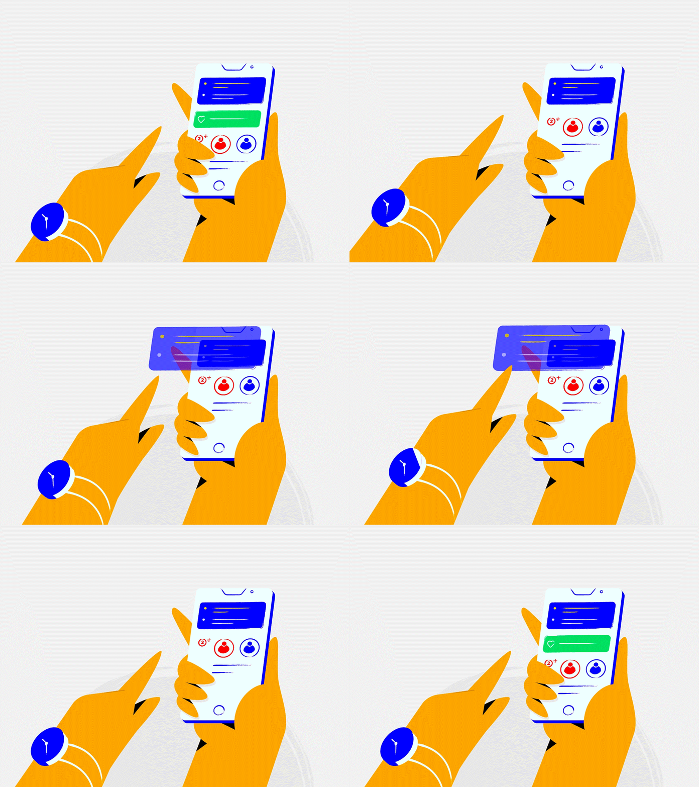
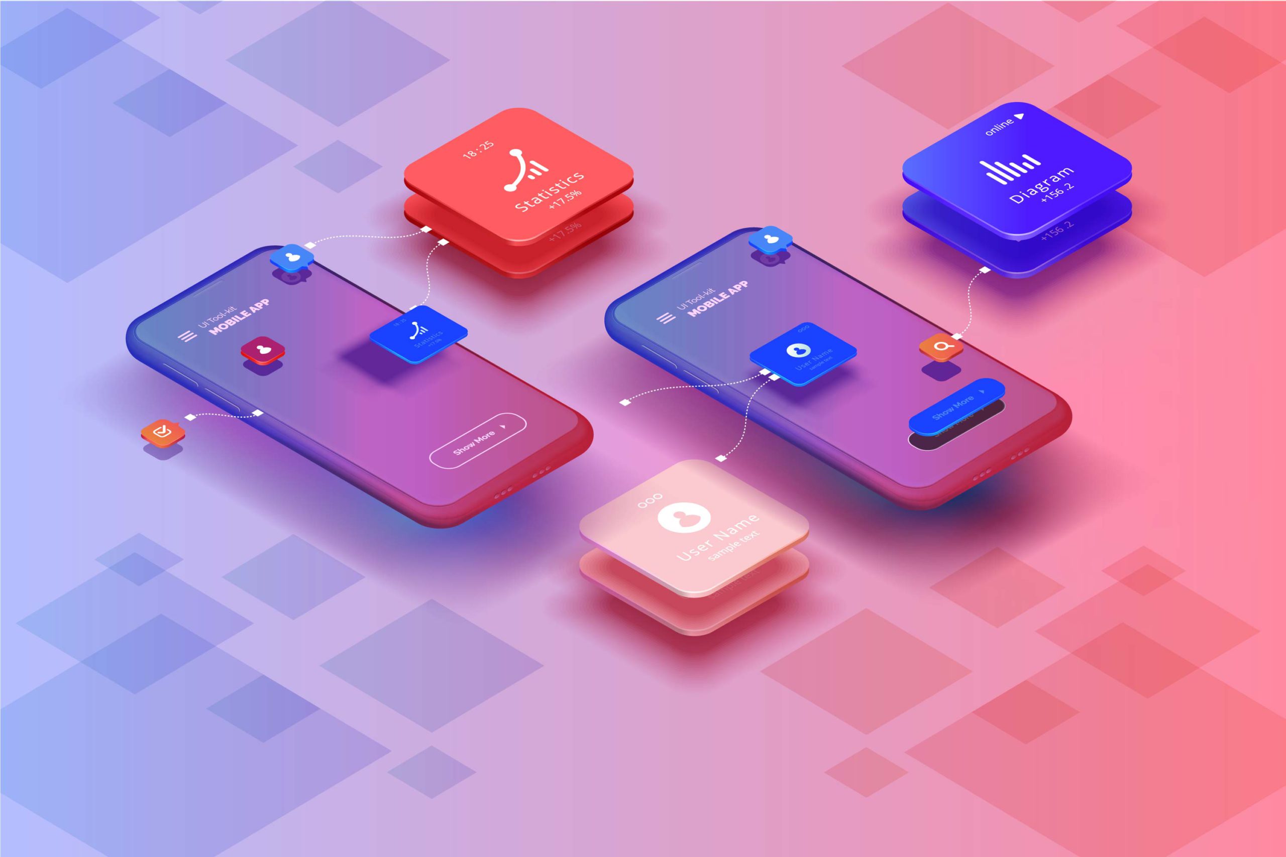
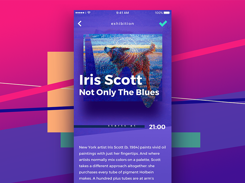
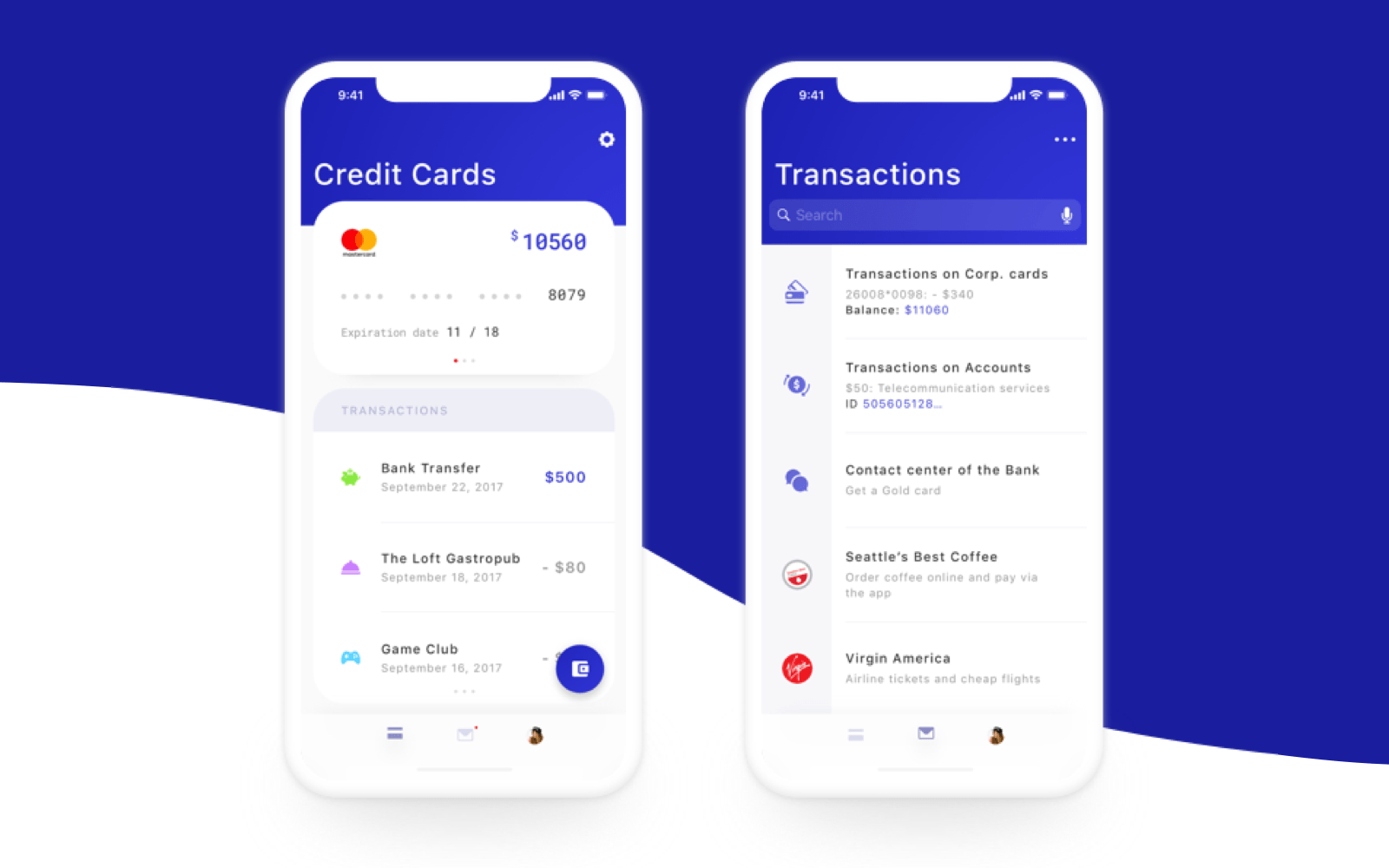
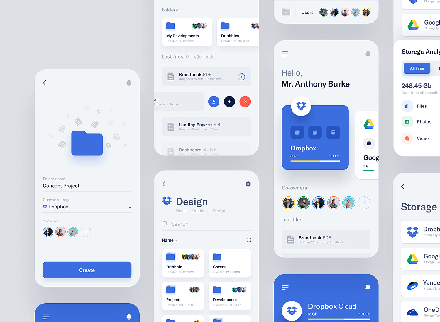
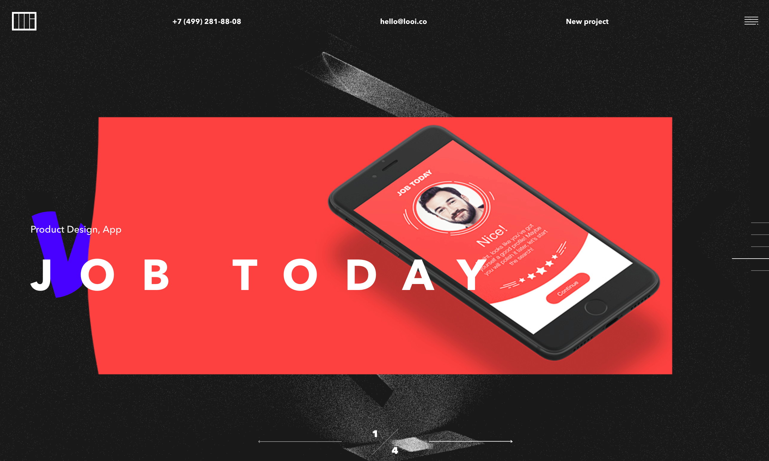
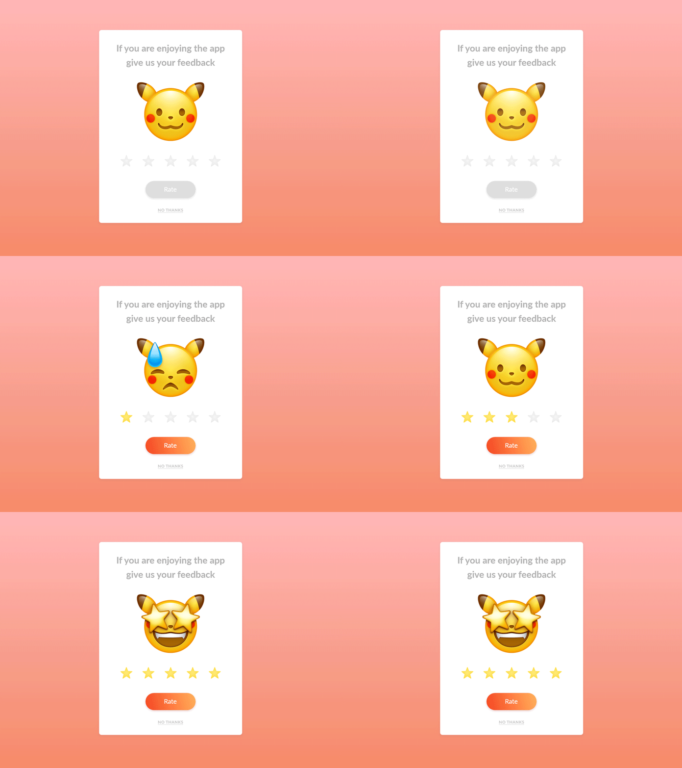
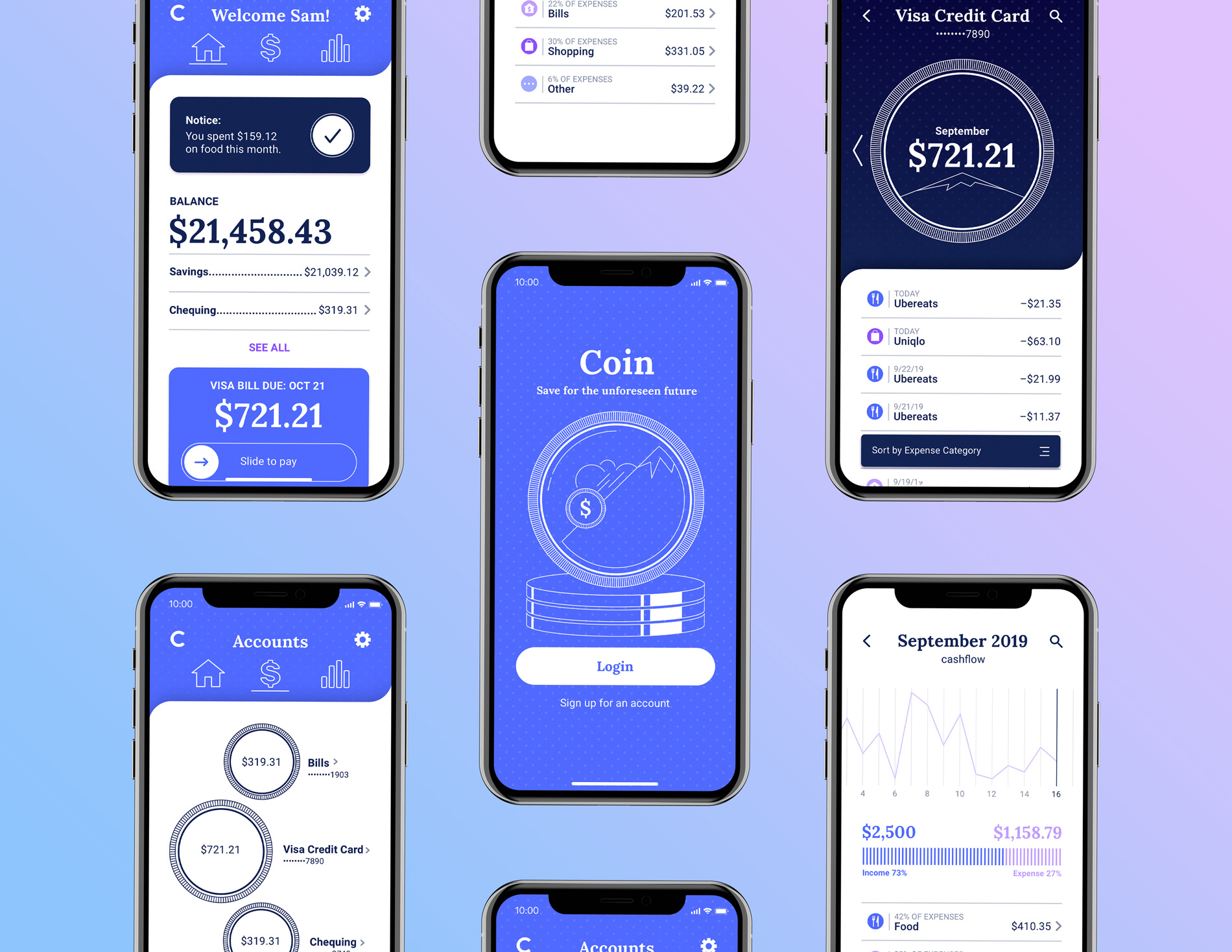
New UX/UI mobile application design trends come every year. There is a reason behind that. When most of the players begin to follow a specific trend, it becomes inefficient due to oversaturation. So, the designers should keep a check on the trends always to offer new things to their clients while business owners should check them as they work as a source of ideas for their business or brand development.
LIST OF THE TOP TEN UX/UI MOBILE APPLICATION DESIGN TRENDS IN 2021:
Dark Mode
Dark Mode is a top UI/UX design trend. It offers a modern, stylish, and elegant look. Since its launch, Dark Mode has been becoming famous and it’s here to remain forever. This mode lets users switch their background theme to the dark mode or light when they want. To allow this, an app should have an in-built dark theme UI. To make an app future-ready, it should include dark mode features. Some of the key features of dark mode include:
Optimally legible in the dark environment as well.
3D, Immersive Experiences
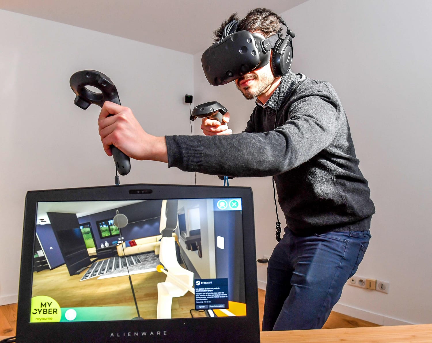
For years, 3D designs are known to attract people. It is a novel UI/UX design trend both for mobile and web. However, in 2021, the interest in designs in whole 3D scenes and 3D components has gone higher. Earlier 3D elements weren’t widely used as they put a heavy load on machines and weren’t in high demand as well. But with the modern front-end libraries and frameworks, page load time has significantly reduced, making 3D objects larger and more detailed.
Minimalism
This trend stands proudly as another latest UI/UX trend. People come across many advertisements daily. They get constant notifications and see various discount ads. People interact with various interfaces overwhelmed with information. Designers are looking for new methods to simplify the graphic elements and avoid any overload. Hence they limit the total colors and try different compositions and proportions. Presently, highlighting the functionality of an element is important. It is vital to underline the best quality of a product and convey the correct emotions from its use to clients.
Typography
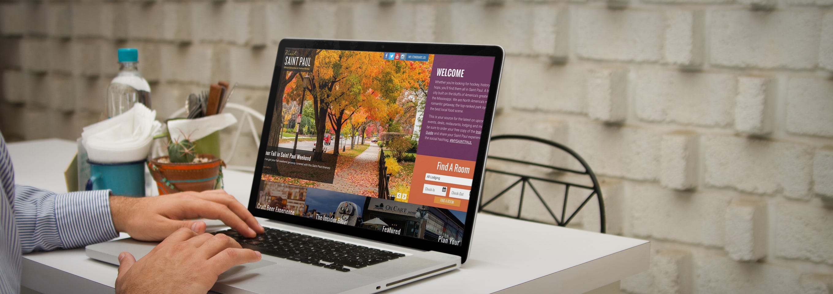
It has been long that mobile designers recognized the significance of typography. Moreover, every year gets new trends related to font size and types, their position, and prominence on a website. In this year, typography will go wild with jumbo fonts that can overlap images, spill out of the screen, and take the center stage. Designers are recommended to use different font types, scattered text, and contrasting colors. His will help build a solid visual hierarchy and make an appeal to prompt visitors.
Content Focused Designs
His list couldn’t have been complete without including the concept of content-focused design. The content-focused design trend doesn’t mean marketing a brand or business with taglines, CTAs, logos, or names. It refers to creating a space where all that is related to UI/UX design trends is covered while offering every piece of information innovatively. When it comes to content-focused designs, the designer and content manager should work together to make a design that includes fascinating form, readable fonts, a highly responsive menu, and more.
Touchless Interactions
Another great UI/UX mobile design trend that started due to the pandemic is how we interact with devices without touching them like air gesture control and Voice User Interface (VUI). Air gesture control tends to be the method that takes different gesture control mechanisms to a whole new level. Air movements will now make things work. The addition of a voice-user interface in a design can help expand its reach.
Simplified UX
Now, you should neither complicate interfaces nor force the users to take additional actions. Minimize the total fields and elements that clients should fill. Simple logging in and signing in has become the newest UX trend.
Augmented Reality Apps
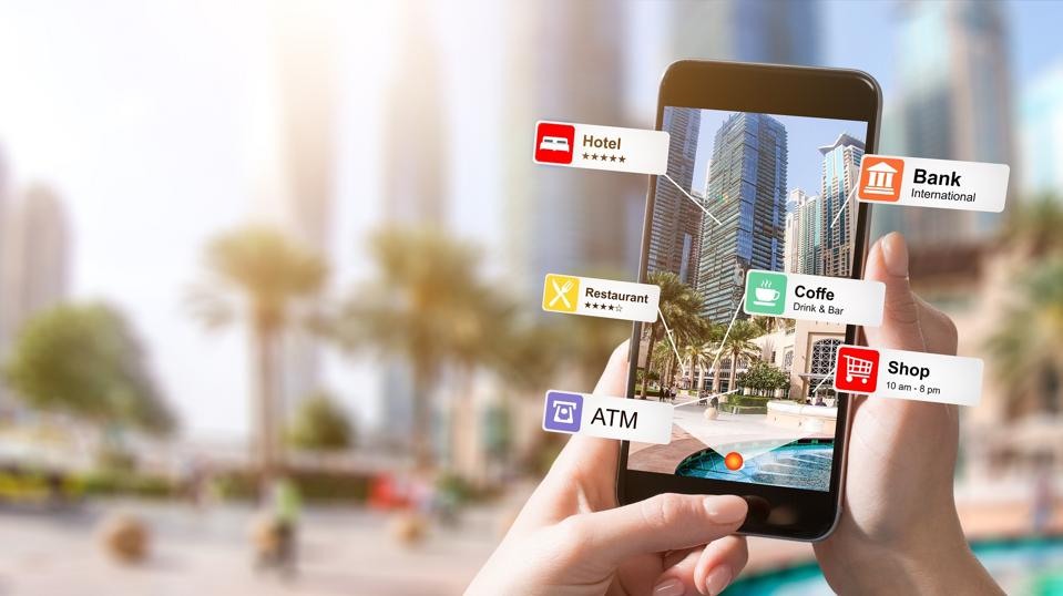
AR is not new when it comes to mobile designs. 2021 has brought new opportunities for creative AR apps since the worldwide revenue of AR-enabled mobile apps is anticipated to double in 2021. AR. Is known to push the mobile UX design boundaries by sustaining use experiences with immersive designs. Since it removes every physical barrier to user engagement, it reinvents the way individuals interact with businesses.
Disabled-People-Friendly Designs
For disabled people, it is pretty challenging to access apps. So, designers can create unique apps for disabled people. Some of them have already created such apps. The latest app trends direct the designers to make and conceive disabled-people friendly designs. Some must-have features that should be included in such apps include:
Touch-sensitive, responsive, and user-friendly designs
Easy accessibility
Gesture interpretation ability
Voice input
Microinteractions
Micro-interactions will take the users a step further by complementing visual perceptions with a tactile feel. You can add motion to icons, buttons, visual cues, menus, splash screens, and other elements to galvanize your app or site and trigger users’ responses faster. Microinteractions will give a boost to user experiences because they improve interactions, offers feedbacks, and keep the users engaged.
The best designers think ahead always, breaking every rule and inserting creativity to good usage to offer enthralling user experiences that turn into better exposure of the brand and a healthier bottom line. So, to do so, you should always keep a tab on the modern trends that amaze and delight your clients.
Conclusion:
Anteelo has 10+ years of experience with mobile and web design. Being a top Web design company in Canada, we know how to use the latest UI and UX trends in 2021 to design efficient and visually attractive digital solutions for any industry. For any queries, Feel free to contact us today.
It is a document that usually communicates ideas, various research outputs, and sets a direction for other designers and developers. Now, for design professionals, these deliverables are a tangible manifestation of the evolving design direction & communicate how that direction can be achieved. Each deliverable is structured in a way that helps provide solutions for the next phase. But not everyone understands this term often when discussing or presenting ideas during various phases of a design process. Thus, UI UX design deliverables are very much useful to break down complicated ideas or functionalities and thus making them easier to understand for everyone in the room.
What are the types of design deliverables?
In the initial stages of design, the focus should not be on high-quality UI, rather effectively communicating the initial ideas for the design solution. At every stage of the design process, the type of deliverables varies to an extent. With a view of adopting the best way for information transfer, there are three types of deliverables.
Creation deliverables – Used to provide low-fidelity ideas during the early stages of the design process.
Communication deliverables – Adopted to communicate everything that we learn from each design session to keep the team aligned.
Lollypop Design Agency in Silicon Valley is often asked by potential clients and design evangelists about various design deliverables that we and other design giants offer to meet business goals, keeping in mind the user needs and expectations.
No matter what industry we work for, from small startups to established companies, the deliverables for any project following the design process are more or less the same and vary according to the available resources, requirements, timelines, and budget.
Here are some of the major design deliverables that various Silicon Valley design agencies practice for their different projects as a part of their design methodologies.
Let us now understand these items one by one and their significance in the whole process.
Stakeholder Interviews takeaways
It is always a priority to understand brand perspectives, varying user behavior to compliment the importance of competitive brand stake in the marketplace & identify differentials. Also, stakeholder interviews play a pivotal role to help guide the flow of the entire project considering the business goals, technical constraints, usability problems, and what customers expect out of a final product or service.
User research document
User research is the most important part of the design process that encourages us to precisely discover how our target customers feel while collaborating with the product that is designed to meet their objectives. User research is done to gain the sharpest possible insights into the needs and pain points of the users while stakeholder interviews give us insights into the business goal of a product.
UX Audit
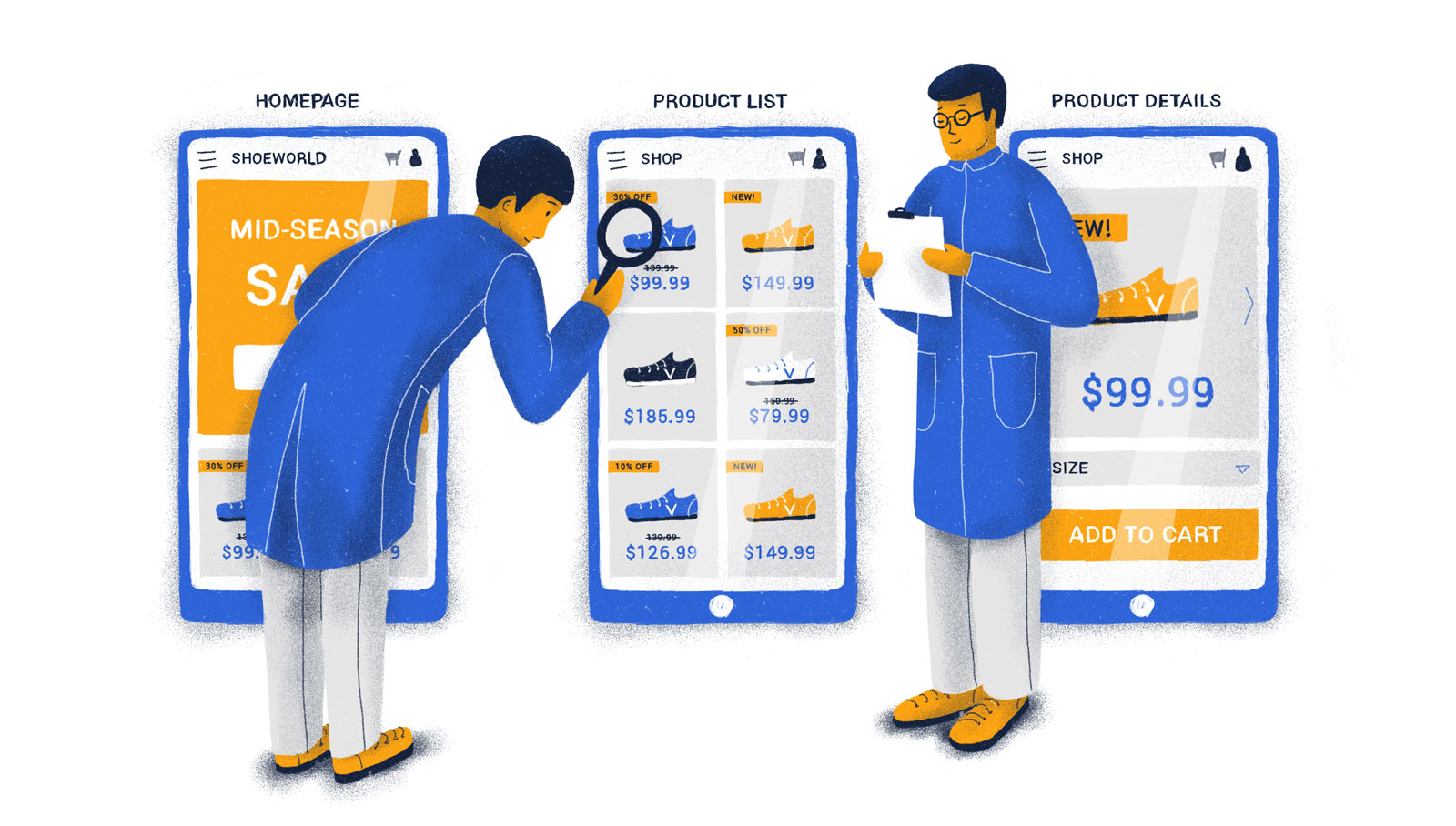
UX audit uses methods to expand an existing situation and offer heuristics-based recommendations for improvements or user-centric enhancements. Ultimately, a user experience audit helps us understand how to boost conversions by making it easier for users to achieve their goals on your site or software along with pointing out critical, mid-level, and major issues and how to prioritize issue resolution in any product. UX audit is a method to make sure the brand communicates consistently across all customer experience touchpoints.
Many of our Clients find this to be an invaluable investment with strong ROI in future development as this audit process helps to vet and validate the product roadmap, ensuring a highly successful product launch without costly redesign or redevelopment.
Information Architecture
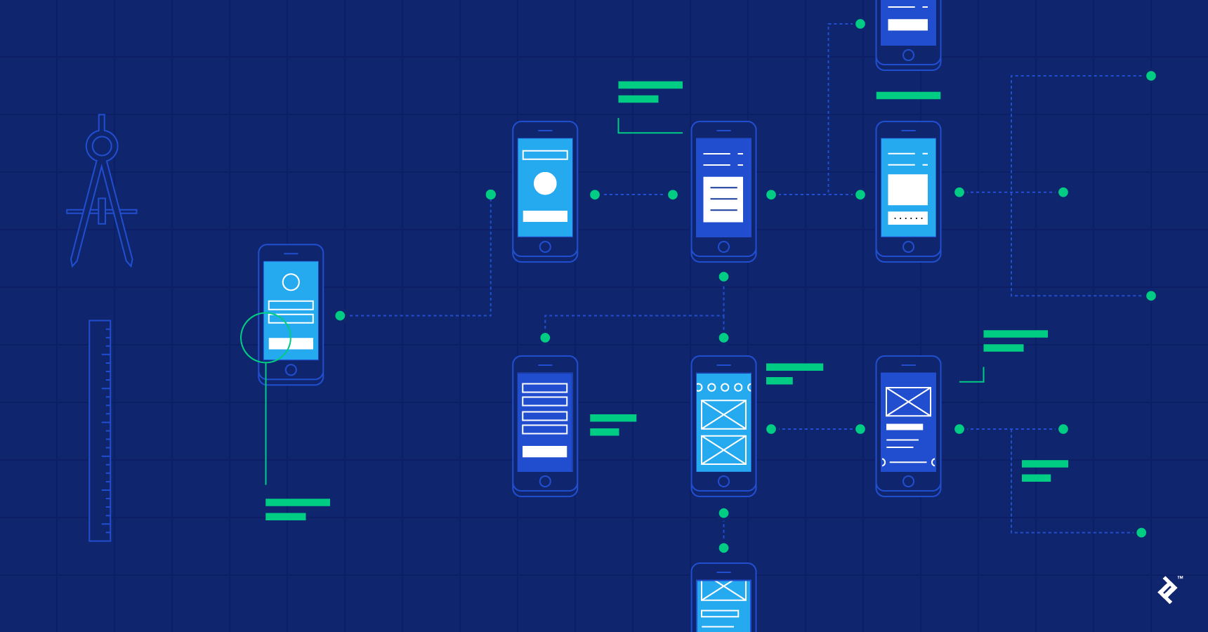
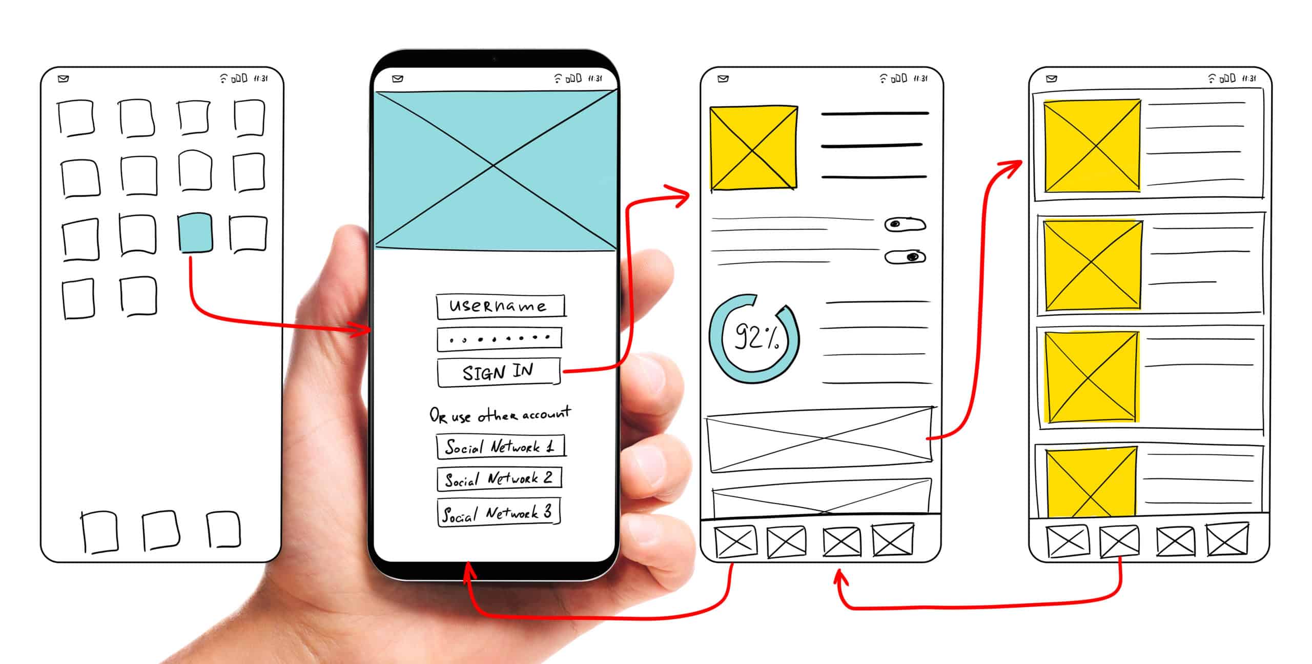
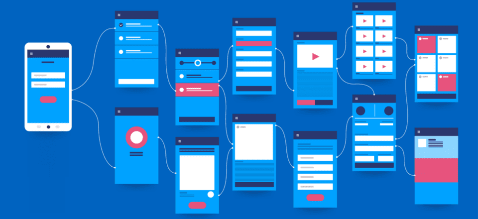
Information architecture and wireframes are all about organizing the content and flow of a website or an application so that users can complete their tasks and achieve their goals quickly. The focus is on creating usable content structures out of complex sets of information.
User flows
User flow can be considered as a series of user actions or simply the various states that the user needs to go through to achieve any expected goal. The main goal of any user flow is to provide designers & developers a detailed description of all the possible flows, including edge cases, errors, and various states. User flows also help businesses have a high-level view of the product and make sure their features, technical jargon, and workflows don’t confuse the user.
Wireframes
Wireframes generally give the first impression on how a website or app might look by incorporating the Information Architecture and arranging elements to best accomplish a particular purpose. Since it is the first phase of the version there is a scope of changing plans and ideas. These high-fidelity designs can be used for usability testing, and serve as an excellent reference for developers to get a good idea of the final product. Wireframes help connect the site’s information architecture to its visual design by showing paths between pages. It also helps prioritize content through the determination of how much space to allocate to a given item and where that item is located.
Visual designs
The visual design may be considered as the “final coat of paint” on the product but it’s not just that: visual design can greatly affect the UX of a product, and therefore must be approached very carefully. Hopefully, a lot of interaction design and usability heuristics were worked out during prior steps of the UX design process so that the designers can focus on the visuals. It’s one last opportunity to take the product to the next level. Visual design is the last step before handoff to developers and the phase where a style guide and final specs are crafted. It’s not just about “making things pretty,” but also an opportunity to strategically define & implement the brand’s identity into color schemes, usable layouts, creating contrast, and visual hierarchy.
Animations
Animations are used purposefully to enhance the overall user experience and guide users along the way. They are used for various purposes like feedback, continuity, directing attention, etc. These animations in the form of GIFs, videos, or Lottie files are used by developers to implement into the final product. When animation is used subtly, it can help users build mental models about how the system works and how they can interact with it. UI animations are subtle, unobtrusive, and brief micro-interactions, they can improve the user experience and can communicate feedback and state changes, prevent disorientation, and strengthen signifiers.
Also, animations offer a level of sophistication to an experience and help diversify the product experience in the marketplace.
Design system
A design system can be considered as a set of design-specification documents that are intended to be one single source of truth that groups all the digital elements for any brand/product. Style guides, rules for typography, colors, responsive behavior, photos, and visual designs as a comprehensive design system are usually the ultimate handoff to the clients and the developers. Some style guides and specifications are put together manually, and others are generated automatically. This design system can be thought of more like “bibles of style” on the shelf that everyone on the team can refer to.
Design Systems will also influence and compliment brand identity within digital marketing efforts by extension which is a value add to clients & marketing/product teams!
The final step in the design workflow is to create specifications for development teams. Margins, padding, assets, element measurements, color codes are various small details that need to be considered while building any product. These minor details if missed can impact the overall user experience of the product.
How hard will it be to add some new deliverables soon?
Design deliverables as mentioned, communicate how a direction can be achieved to lay that final product. Changes in these deliverables are expected over time according to the shifting user behavior and variance in business needs. Now, adding new deliverables is pretty easy but ensuring its consistency, accuracy, and quality is the most difficult part. Most importantly above and overall, is validating and carefully considering whether that deliverable is truly adding value to the entire project or the workflow to be specific.
Conclusion
UI UX design deliverables again vary according to the needs of the client and project priorities.
The deliverables and the way they are handed off, the methods per se are more than enough as a whole. Some parts of the documentation can be done parallel to the process or some are done before or after the process. Now the tools used for these deliverables can vary to an extent, but that’s a topic for another article.
Thank you for reading this blog & stay tuned for more articles on thought leadership.
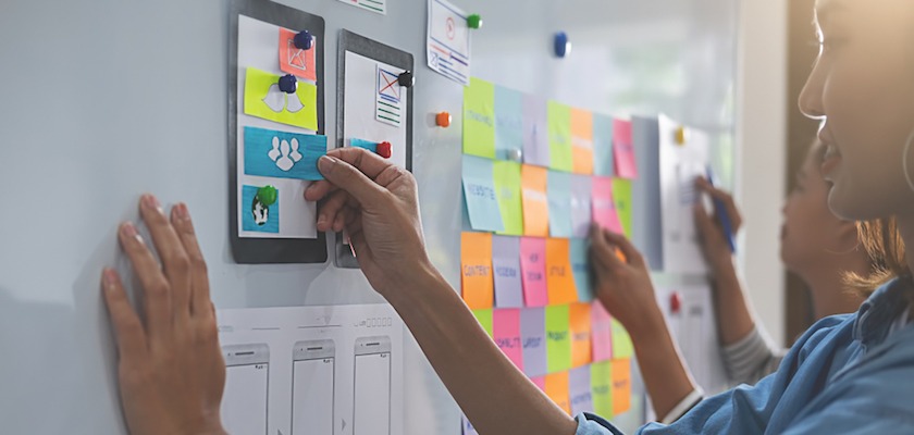
Only a few years ago, any and all forms of motion and animation was associated with the definition of a bad site UI. Remember the old age advertisement websites which showed offers in circular balls bouncing off from one corner of the screen to another? The case of motion in web design was a sad case.
But ever since the advent of mobile apps, the scenario has changed so much so that UI motion design has now become a popular design trend.
A modern-day interface is no more about static elements. With UI motion design, brands are now covering the void between software and human primal need of variety and connection.
“The most intuitive and pleasurable element of web and mobile application services are the one that involves Motion Design.”
Incorporated at different mobile app journey stages, motion design for apps can not only make the users swoon over your app movements but also increase the app session time. They have now become a symbol of fun, innovativeness, and a sure shot medium of binding users with the applications.
Why use motion design for apps?
There are a number of ways apps motion design has made the overall mobile interactions a completely interesting one. Here, let’s see how.
Slow App Loadings are Now Enjoyable
Slow loading apps are as common in occurrence as days and nights since they happen all the time. There can be a number of issues behind it such as low network from the users’ front, a technical issue on the backend, or too many requests being made on the server at the same time. But, irrespective of the reason, slow load time is the number one reason that takes the users away from the app.
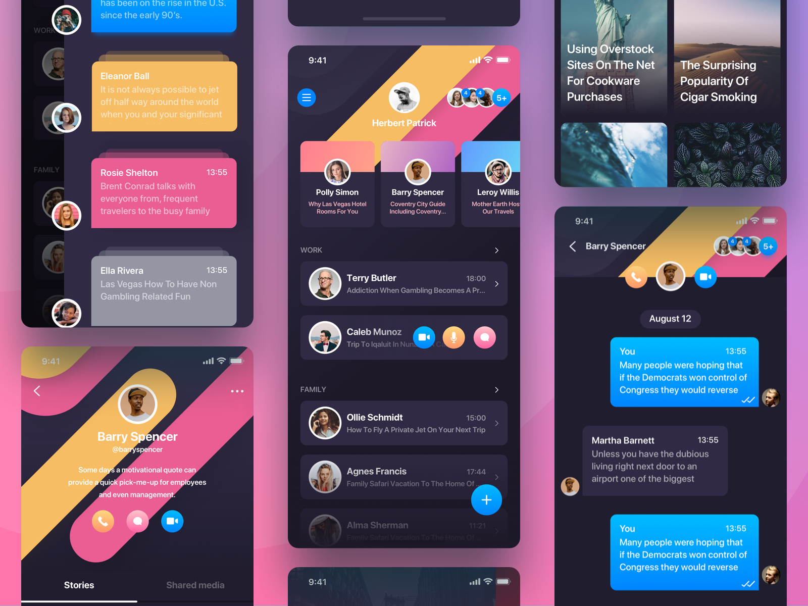
Well, this can be prevented completely by using animation in the app UI design which was one of the mobile app trends of 2018. By adding motion elements in every case of low load time, designers can keep the users hooked just to see the elements or the animation to glide on the screen. For instance, take Google Chrome’s offline page with a dinosaur game.
An Onboarding Experience for users
One of the most common use cases of Motion Design for apps is seen in the Mobile App onboarding stage of the app journey. Used to explain and make the user acquainted with the app, the animation is being incorporated by brands to make it easy for the users to find their way around for the first few runs.
Emboss App in Users’ Minds with Mental Map
Taking the Onboarding Experience to the next level, mobile UI designs help users create a mental map that fits the app flow in the mind. Ever noticed yourself pulling the top Gmail bar down to refresh your mailbox? We doubt it. The reason is that it has been embossed into us just like blinking of the eyes, so we no more have to think twice, it happens automatically.
Letting users know what’s wrong and what’s right
Motion elements can be one of the most impactful ways of letting the users know that they have encountered an issue or that they have crossed a level successfully. When designing to highlight an error, it is important to point out to users exactly what they are doing wrong.
Wrong password shake is the one animation that achieves it perfectly. Just like you show what users are doing wrong just with your motion, the feedback motion should also show the successful events. A simple mailbox popup with a tick mark animation would show the users that their mail was sent.
In the end, never keep the users wondering what they are doing wrong or if they were able to do something successfully.
Now that you have seen how motion elements make the app journey more fun and memorable, let us now look at the app UI design principles that you should employ to keep your motion elements from crossing over to the side of tackiness and uselessness.
The Walt Disney Articulated Principles that you Should Embody in Your Mobile App
Every app development company that has worked with motion elements know that the line between innovation and overdoing it is very thin and it is the place where they blur, the problem begins. Users become disinterested and apps go from being useful to becoming plain confusing.
To prevent your motion signs and movements from seeing a similar fate, you can follow these interaction design inspiration. These principles were first articulated by Walt Disney but are still capable of delivering a memorable enjoyable experience just like Mickey Mouse.
1. Motion Movement Trajectory
The design principle that has been prevalent in the industry follows the rule that animated shapes should mainly follow a straight trajectory movement. But we all know better. You cannot really offer an outwardly Web and Mobile Application Design Service with one leg in old traditions. To make users fall in love with your motion elements, you will have to add new movement trajectories such as curves, verticals, and even wave like and then show people those things visually.
2. The timing of when the Motion appears
Any motion prompt that comes at users’ screen out of the blue without any action motivating it, should be avoided. If you are incorporating motion in your app UI design, do it at a time which asks for it. There are times when it makes sense to add motion like when users enter the wrong password but an animated tick to show they have entered the right credentials can be ignored.
So, before you overboard with them, know at what stage they are actually needed.
3. Focus on the Focus of Animation
If your app has a lot happening on the screen in terms of content, design elements, image or video wise, have a motion element that comes with a tinted blinking background or blurs in and out so that users know what to do next. All your immovable motion features will lose their value if you fail to show their presence on the app screen.
4. Animation Speed
Assuming that you would be making a mobile app for ordinary humans and not Flash, your motion elements should move at the speed of a feather glide. Give users time to adjust their eyes to the movement instead of making it too fast for them.
A pro tip: Add rhythm to your motion. While adding movement into movement seems like a nonsensical thing to do but know that by doing it, you will be going one step ahead of the whole app resonance game straight from the users’ subconscious level.
5. Become an On-the-face Motion Piece
Used mostly in flashcard quiz based and eCommerce apps, these motion types makes the next move a no-brainer for the users. By moving too evidently, like in case of a discount countdown or the drop of location pin in case of Uber, you will be able to lead the users exactly where you want to be while creating a memorable brand image for yourself.
How is animation and motion used in mobile apps?
Like we said before, there is a thin line between doing it and overdoing it. There are places where you think you can use animation but in reality, you can simply avoid it. There are a few ways you can use motion design which makes the best UI design for apps. Let’s take a look at them:
Gamification
Adding emojis and animation mascots can do wonders for your app. These elements make the app addictive and likeable by all. Various messengers have animated mood stickers which give the app an edge over all the other plain messaging apps.
Progress animation
Waiting for something to load without knowing the progress tests a users patience. This is why apps have progress animations that show how much progress has been made while loading certain functions. Progress animation is one of the most liked features of motion design for apps.
Animated notifications
Notifications are usually quite boring but if proper animation is used then it improves the overall user experience. This will also make sure that users remember every important notification they get.
Loading animation
Loading animation is one of the most common types of animation used for app UI interactions. This type of animation informs the users that the process of loading is active and that the app is running well. This animation is a sub-type of progress animation.
Transition animation
Transition animation gives the app a classy look. It also conveys a positive user experience. By allowing transition, you give more life to the app when going from one page to another.
Marketing animation
Marketing animation is great for your brand. Animations used in logos is a great way of grabbing the attention of the users. This also creates a mental image of the brand on the users’ mind.
Scroll animation
Scrolling animation is another famous type of animation added in apps and is considered one of the best UI design for apps. Not only it makes the app beautiful but also gives it an elegant look. However, proper scroll animation needs proper coding otherwise the app may freeze or slow down.
Drawing attention
Attention drawing animation is usually applied when the attention of users needs to directed to certain areas. Suppose, you are ordering from an online food ordering app and as soon as you add items the price changes with a certain kind of animation. This would draw your attention to the numbers which is where the focus should be.
In the article, we have discussed how motion elements are the key differentiator between a boring app and an innovative one, the right stages for incorporating them and even the design principles that should be followed. We being best mobile app design company, follow a simple mobile app designing process to achieve the best results possible. Even though the steps are easy, the work is detailed. If you have any queries regarding motion designs or need interaction design inspiration, contact us at Anteelo.
With world in your palms, user experience is becoming a necessity in every domain. Everyone is looking for a memorable and seamless experience that is intuitive, intelligent and definitely a solution provider.
This is why today UX is gaining extreme importance and is playing a major role in simplifying the complexities. It is undoubtedly the foundation to success and all the passionate designers have proven this time and again. Many companies, be it product or service oriented are acknowledging the role of designing in the pavement of success like Fintech, Travel & Tourism, E-commerce, Enterprise Applications. But, there are few industries who needs to brace up like Healthcare, Oil & Gas, Insurance etc.
Today, I will share some insights from our experience in Healthcare and also touch upon the world of possibilities waiting to be discovered.
“How awesome it would be to have an intelligent system that calculates patients BMI, pointers of medical history, important notes of patients and then suggests drugs accordingly and doctors could pick up from that.”
We started in the field with ‘Context media’, a US based client that aimed at designing an interactive tab app that helped patients gain more knowledge about the chronic diseases. Though, it was not a big project but helped us touch the unanswered vacuum of the industry. Soon, we got our milestone project ‘Surgeon logbook’, a project of ‘Narayana Health’. Dr. Varun Shetty approached us to design an extremely simple app that would aid surgeons in maintaining their log book digitally. We spent hours with the doctors understanding their requirement (conscious and subconscious) and them. We were appalled User Experience in Healthcare to discover how healthcare industry was so heavily paper dependent in 21st century! With our mobile first approach and research, we were happy to unearth that the world of surgeon’s was looking forward to an App like this.
3 Years in Healthcare industry and after spending few thousand hours with doctors, nurses, surgeons and patients, we have been entrusted with immense knowledge and thrust to design many more healthcare products. We are on a mission to revamp health care with outstanding UX and ensure that it is way more accessible than shopping.
Let’s see the current scenario of EMR in Healthcare and later I have shared some tips for designing Healthcare products.
EMR – Electronic Medical Records
Today Healthcare is not just about cure it is more about prevention. We have power to access the knowledge with just a tap. But, it’s sad to observe that current Electronic medical records (EMR) in market is just another piece of software that can be used by doctors and patients only post formal training.
Seriously? Training for an EMR! We didn’t need any training for Facebook, LinkedIn, Amazon, did we? It’s not just about providing a technical solution but it is about providing a right solution that is empathetic towards users and intelligent enough to eradicate problems. Major software companies have spent months and years building EMRs, just to realize that hospitals, doctors and patients aren’t using it the way they were supposed to.
This is where User Experience Design and Emotional intelligent designs play a major role; every other day we read of medical errors that leads to loss of life, but with practicing a good UX practice, we can definitely avoid and overcome these errors.
Imagine an EMR with a seamless experience for doctor while he is prescribing drugs. The app that is as simple as an e-commerce checkout page and takes you through easy but essential steps. What if we design an experience where doctors can see side effects of drugs tailored to individual’s medical history before clicking Prescribe button. How awesome it would be to have an intelligent system that calculates patients BMI, pointers of medical history, important notes of patients and then suggests drugs accordingly and doctors could pick up from that. It’s about time to add a layer of intelligence to the app by creating an algorithm that offers helpful suggestion to users. A great example would be Tapgenes app Designed by us that takes data from embedded health tracker from iOS and suggests how can we better manage health of ours and our loved ones. This is way too exciting, I would rather stop, else I might end up building one.
Anyways, here are some tips to ponder on before designing UX for healthcare.
Start with Design Thinking aka Solution Based Thinking Session
This session with the stakeholders is the first and most crucial step. Involve the entire team, right from product owners, dev team and marketing team. Here are some links for a design thinking workshops.
Design Thinking. Thoughts by Tim Brown
What happens with a design thinking approach to healthcare? by Tim Brown
Keep it device friendly
Desktop version of EMR is history; let’s think of mobile or tabs. In one of our research, we found that doctors were more comfortable using EMR on iPad. IoT can be smartly used to supplement patient treatment through remote monitoring and communication, and to keep track of patients as they move through a healthcare facility or connect your EMR with smart wearables.
Create a UX Process
Every project has its own challenges, be it budget, timelines or development constraints. It is very important to understand them, sit back and draw your process that is adaptive to the project. We followed following steps for one of the healthcare projects:
Empathy: Understand users (doctors and Patients) wants and needs.
Discover: Research, create user scenarios, interview stakeholders, users and others playing a major role, create personas, competitor analysis.
Define: Create user journey, process flows. wireframes, clickable prototypes.
Test: Wireframes can be turned into clickable prototype, test it before you fine tune the pixels, heuristic evaluation.
Know your Users and Know them better than them
A good product is the result of good IA. Card sorting helps you group and organize necessary information by getting users involved. For example: What information doctor needs before prescribing medicine and in which flow can be easily determined by having an internal discussion and also by involving doctors involved.
Our team at Lollypop loves this activity, as Card sorting is simple, cheap, fast and user-focused. Card sorting also helps in bonding with clients and knowing the users better.
Understand HIPAA Compliance – Health Insurance, portability and Accountability.
Make sure you are aware of all the laws before you start designing fancy things. Few healthcare products fall under regulations that can impact the User Experience. Not being aware of these laws could delay the products release and could also lead to other issues. Understand the laws in handling and protecting personal healthcare information. Most of these laws are around who can access what information.
Once your personas are ready, map it to the roles and create user flows. Health insurances and their coverage are different in every country, it’s important to understand insurances role and regulations while building a product. As a designer be responsible and consider privacy of patient’s information.
Follow “Intelligent Devices, Dumb People” Rule
Yes, you read it right. We should not overweigh anyone to go out of their genre and become extremely tech savvy. Keep it simple, doctors are interested in treating patients and definitely not learning your software.
Conclusion
When you understand “What users need and not what they want” you are treading on a right path. We can order pizza, call for a taxi, maintain our finances, plan our holidays with few clicks, because, these products have appreciated the criticality of designing user centric interfaces and investing in UX to make the experience emotional intelligent. Now it’s time for healthcare to pace up and build an amazing product for hospitals and patients.
We will call it a winner when:
Patient would be able to maintain their health records and updates as seamlessly as FB posts.
Share medical records like sharing pictures in Instagram.
Doctors have all the information in few clicks.
Doctors can prescribe with easy reminders.
Doctors can concentrate on patients and not technology.
The strong shift towards e-commerce in India is ever more evident with India stepping into ‘1 billion mobile user club’. According to a new Bloomberg report, country now has around 1.03 billion mobile phone subscribers. SBI research report says the e-retail market was around USD 6 billion in 2015. And India expects 125 million online buyers with USD 19 billion (only through mobile) business by 2019.
One of the research held in India shows, ‘The largest digital properties in India (Facebook, Google) and e-commerce businesses have acknowledged that they receive 50% traffic from the web and 50% traffic via mobile (mobile web and app)’. However, mobile traffic is growing at a much faster rate. But, we most definitely cannot ignore the fact that only 7.8% of mobile users have smartphones. But the non-smartphones users heavily use the Internet!
125 million online buyers in India by 2019
Mobile Commerce sales to hit $19 billion by 2019
Just 8% of e-commerce addressable market lives in Top 8 cities, rest to be reached by mobiles.
The rapid change in e-commerce has strongly focused the entire design industry. Looking back, from print we shifted to web design and today we have stepped into the whole new era of designing for systems. It’s not just limited to that! We see highest level of personalization and customization taking place serving almost individual customer needs. The question here is ‘Who’ tracks the online behaviour and needs of your target consumer, ‘Who’ digs into the competitors product, ‘Who’ study the market trends and ‘Who’ gives you a solution that exceeds expectations?
The success mantra to stay ahead in the game for all online businesses lies in innovation and tactfulness of online platforms – the answer and key is with UX (user experience) and UI (user interface) experts. These are the people who ensure that your company makes a lasting impression on your potential consumers and convert them into loyal ones!
User should experience a complete bliss when they are navigating through your platform. An easy to use portal with all the necessary information and detail makes a big difference. These designers have an ability to get inside the heads of users and present you with answers to typical ‘What and How’s’ of your digital product! They are part researchers, observers, thinkers, developers and marketers. Remember, when you went to some website and in seconds, were fed up because you could not find the information you were looking for or you had to look up the entire page just to find one simple login; thus, is an example of a bad experience. Such that you would not want to go again. And then there are Websites like ‘Facebook and LinkedIn’ that generate high volume traffic mainly due to the enhanced user experience. Therefore, if you are interested in generating high volume traffic on your portal, you should ensure that it is user friendly and easy to navigate. And, more so serves needs of every individual customers in a way that they feel that they feel part of it.
Like, Beauty is incomplete without brains. Similarly, UX is imperfect without a great UI! A great User Interface is the part of the web interface (portal or mobile) that faces the user when he looks at the portal. The use of effective and simple user interface design will be of immense help in achieving the objectives of going online. Right from colors, fonts, graphics, animations, wordings, placement, almost everything is so beautifully inter-related and in a flow that users are bound to fall in love with your product and portal. A good user interface not only increases the usability but also leads to the smooth completion of any task at hand thereby making everything enjoyable and flexible as per the requirements of users. The visual appeal of a UI on portal or mobile has a significant impact on users as its information Architecture doesn’t enable engagement on its own.
To conclude, UX is as simple as making an online, digital world as human friendly as possible. And, UI makes it as pleasing as possible. The world of e-commerce, demands an expert guidance in offering a platform that would ensure that profits see an upward trend.
Travelling gives you wisdom and experience that is beyond words and I am extremely lucky to have been able to tour to various parts of the world, though, most of it has been work related; Lollypop has made me explore European and Western world mostly to meet either new clients or catch up with the old ones. And, this time I feel like I have struck a jackpot – Vietnam!
This city has energy and vibes that is so enthralling that you have to take a step back and let the moment sink in. It’s fascinating how this place has witnessed endless battles, survived worst of the times and yet is one of the south-east Asia’s fastest-growing economies. Honestly, humans and economies never fail to appal me, Vietnam, labelled as a third world (by Western Economy) has fought three decades of bitter wars against them itself to gain independence. It just took me mere FOUR days, to have an absolute new outlook of this country. I have gained an unparalleled respect and love for this country. The constant urge to explore and discover this city made me dig a bit further and I have broken this article into 3 parts that amused me the most – City, People and of course Design.
CITY – Ho Chi Minh
Fresh and sparkling; it just makes you fall in love with it. Though, it is 10 times poorer than India, it is way cleaner and better. I have nothing against my country but I have to mention this here because really it’s just about individual’s efforts and attitude that speaks for one’s country and we Indians need to learn this. Another amazing thing about this beauty is BIKES, I personally am a biker by heart and it was an unusual experience to realize that Bike here is the basic medium of travel with no social tags. Be it rich or poor everyone is on bike, there is absolutely no concept of classic, sports or adventure bikes, A Bike is A Bike, simple and plain. And, yes the best way to discover this city is to hop on a “Bike Taxi”.
Next thing that leaves you gaped is the Food; it is just everywhere for dirt cheap. You can gobble all the food you need for less than a quarter and I am talking about healthy, good and nutritious food, now that is what I call a heaven! The city has developed much beyond my expectations and I even heard that everyone is developing a good traffic sense. Unfortunately, during my travel it was raining and I had to travel mostly on taxi which was bit expensive.
PEOPLE
A country is made of its people and the beauty of Vietnam equally reflects in its masses. The warmth and welcoming nature of everyone leaves a never fading smile on your face. There is a massive difference between Bangkok & Vietnam; Vietnamese are extremely soft, welcoming and warm hearted. But, the challenge here is of language and communication as not many are well versed with English and one can get stuck if you are outside the city limits. City thrives on service driven attitude and people love their 9 to 5 jobs with 2 hours of break; yes! 2 hours, 1 for food and another for quick power nap. They believe in moving with the flow and have little appetite for innovation. However, when you interact with locals, the keenness to learn and grow throws you off guard and you feel as if you are in a diamond mine, surrounded by precious gemstones.
DESIGN & IT
The best designers are generally rooted in the artists and Vietnamese art has a long and rich history, the earliest examples of which date back as far as the Stone Age. They are amazing when it comes to art and it is wonderful to discover how they are exploring new arenas of branching out; few have opted for print and animation but majority of them have chosen digital design. I was lucky enough to meet few designers and phew, saw some real exceptional work! The most marvellous thing was to know that all designers there knew UI Development by default; an artist turned designer with technical know-how, now that is what I call a master stroke. Here are some of the design samples from the designers I met:
1) This Designer here is amazing visualizer and perfect with design tools, the only challenge was communication gap.
2) This one blew me away! Literally, think of anything that is related to design and she knows it all; an amazing artist, designer, animator and brilliant communicator. One of the jewels, I was talking about.
Though, designs and designers had great impact on me, one thing that did offset me a bit and that was lack of individuality and their own identity; the designs there are predominantly influenced by Western world. However, the willingness of Designers to explore this part of the world given the right opportunity has my hope pinned.
To conclude my experience, all I can say is that a little guidance now to these emerging designing sensations will most definitely take world by design storm. And, I am extremely glad to be discovering them at an early stage. And, I am definitely over-whelmed to realize that Designers around the globe are realizing their worth and they know this is there era.
“The text is too big.” “The words are placed too distantly.” “The words are not going with the image” Such comments have been passed continuously ever since the day user experience established itself as a crucial element of the mobile app design industry. With users spending a major portion of their day on applications, consuming information, and interacting with words, the importance of carefully crafted typography has come to the forefront.
Let’s walk you through the concept that holds the power to lower app abandonment and play a crucial role in increasing the app revenue – Typography.
A Basic Introduction to Typography
Typography, in simple words, is an art of organizing written text, point sizes, line-spacing, and other elements in a way that offer a pleasant and readable user experience. It is a craft that enables designers to transform human interactions into durable visual form.
Now, when talking about what is typography, it is good to have a familiarity with elements it comprises of – something we will discuss in the next section of this article.
6 Typography Elements You Must Know About
1. Typeface
Typeface refers to a set of symbols, numbers, letters, and characters that share similar features. For example, Garamond, Helvetica, and Baskerville is a typeface.
2. Font
Often used as a synonym of typeface, Font is basically a typeface that is set in a particular style, size, and height.
3. Line Length
Another typography design element you should be familiar with is line length. It refers to the area covered by a block of text positioned between the left and right margins.
It is usually calculated as the total number of words or characters in a particular line.
4. Line Spacing
Also termed as Leading, line spacing is the distance between two baselines, i.e, imaginary lines where the text resides.
5. Kerning
Kerning is defined as the spacing between two particular characters or letters.
6. Tracking
Tracking is another typography element used by UI designers for crafting a better experience. It is termed as the spacing between two individual blocks of texts and is also known as letter spacing.
Now as you know the definition and typography elements to consider for user interface design, it’s good to look into why is it necessary to focus on this UI design method.
So, let’s go through the advantages of focusing on Typography in UI design.
Reasons Why It Is Important to Consider Typography
1. It Sets a Mood/Tone
The foremost reason why typography is important in UI design is that it helps in setting the tone of the message. While plain and simple typography shows that content needs to be considered with seriousness, innovative typography adds fun and excitement to the screen.
2. It Helps Deliver Better Visual Experience’
Typography also boosts the visual appearance of a mobile app. When chosen wisely, it infuses positive vibes and helps to deliver a delightful experience to your target audience. Whereas, wrong typography ruins the user experience and compels them to exit the platform soon.
So, it is profitable to consider typography as a key element of your mobile app design process.
3. It Enhances Readability
Another reason why focusing on typography is one of the proven tips to enhance mobile app UI design is that it eases the process of reading content. It simplifies how users comprehend every single detail you mentioned in your app while helping in building better connections.
4. It Shows Professionalism
Typography also adds a tint of professionalism in your mobile app UI design. When you pick a typography which goes with your brand vision, customer behavior, and market standards, it brings a positive impression on the audience. It encourages them to trust in your brand and thus, support you in achieving expected goals in stipulated time and effort.
5. It Boosts Sales Conversion
Typography encourages users to spend more time on your application and understand the context more effectively. This increases the chances of motivating them to perform the desired actions and ultimately, boosts sales.
6. It Creates Brand Recognition
When you use a particular set of typography and use the same pattern throughout your content, users start relating it to your brand. They begin to remember your work via the typography you have used.
With this attended to, it is likely that you would be interested to know how to use typography in UI design, next.
So, let’s look at the list of apps that have over time, amazed users through their mobile design system typography.
5 Mobile Apps to Take Inspiration From
1. Hotel Tonight
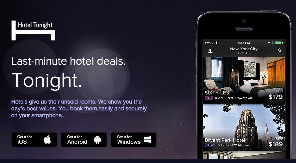
Hotel Tonight has used different fonts and styles on both platforms. While the brand implemented various weights of Google’s Roboto for its Android application, it used Gothan for its iOS platform.
2. FIFA
FIFA mobile application has used Miso for typography in UI design, though in different font sizes and weights to bring better emphasis on particular content elements.
3. Fancred
Fancred has also focused on using different typography elements in their app UI design. Besides, they have also experimented with the idea of adding text to pictures and did UX reviews to give a seamless user experience.
4. Citroen Lifestyle
Citroen Lifestyle is another impressive iOS application that has worked with the idea of using font pairing, text-in-picture, and other ways of implementing typography in their app design.
5. UltraVisual
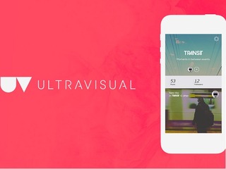
Another mobile application that has inspired users with its typography is UltraVisual. The application, in its iOS version, has used different fonts and added content on photos to deliver better information with minimal space.
Now, as we have seen what Android and iOS applications you can consider for getting an understanding of the rightful implementation of typography UI design, let’s take a look at what UI typography style guide to follow while creating a design strategy for your app.
8 Typography Principles to Focus Upon While Creating Your App
1. Complement Mood to the Message
As per the best mobile design experts, every typeface comes with a unique vibe. While some are fancy and friendly, others are simple and yet professional. In such a scenario, picking the one that goes with your brand message is a must.
So, do not overlook this fact while pondering upon how to improve your UI design through better typography.
2. Pick the Font’s Point Size as per Design Context
Choosing too small or too bigger fonts altogether makes it difficult for users to continue reading with the same flow. It affects the readability of the app content.
In such a scenario, it is important for mobile app designers to select the right font point size for their app’s UI design.
Now when talking about picking the right font point size, it is profitable to invest your time and effort in the general thumb rule-keeping body text between 10 and 12 points for print projects and 15 to 20 pixels for the web.
3. Stick to a Limited Number of Fonts
Adding too many fonts on the same page can be a barrier to readability. So, it is again vital to keep yourself limited to a certain number of fonts – usually those who are not drastically different in look and feel.
4. Build a Hierarchy
Another rule to follow when talking about typography in UI design is to create a good hierarchy. This will help in easier navigation, better organization of every element as well as simplifying the process of finding information.
Now, when focusing on creating a hierarchy, the basic things a UI designer must know are:-
Employing text size to prioritize information by importance.
Adding appropriate spacing to make content scannable.
Arranging related items together.
Introducing headings, subheadings, etc. in the content.
5. Focus on Grammar
Since a wrong spelling can break the flow and make it difficult for the audience to comprehend the whole meaning, it is again imperative to focus on the grammar aspect as well.
6. Don’t Overlook Spacing and Alignment
Spacing and alignment also make a huge difference in the overall app UI experience. When you introduce the right amount of spacing and alignment in your app content, users find it easier and faster to grasp the information and respond effectively.
For example, when you use center or justified alignment, users have to struggle with maintaining a continuous communication flow. Whereas, this is not so in the case of left-aligned content.
Likewise, when the letters in your app content are too tightly hugged or at significant distance, users fail to continue reading with the same pace and often exit the platform. But, this does not happen when you pay attention to proper spacing between all the words and letters.
So, do not forget to focus on this principle when considering how to use typography in UI design.
7. Prevent using Design Fads
Another thing you should focus upon is to prevent employing design fads. This is because the fads do not prevail in the market for longer. They have a shorter time span, implying you might have to change your app’s UI design with some other typography later.
So, do not prefer going with any such design fad.
8. Observe and Practice
Last but not the least, invest your time and effort into practicing different typography and evaluate their success rate. This will help you in receiving better user experience outcomes.
Now while these principles of typography will help you with crafting a perfect UI design plan, it is incredibly important to keep a watch on the typography trends as they were one of the crucial mobile app UI design trends for 2018.
So, taking the same thought into consideration, let’s end this article with a focus upon top typography trends to watch out for in 2019.
Typography Trends You Should Stick to in 2019
1. Hand-Drawn Fonts are Popular
The foremost typography trend to follow in 2019 is using hand-drawn fonts, i.e, the fonts resembling with our handwriting.
Such fonts are highly preferred by brands like Etsy and Fiverr because of the fact that they add a human touch to the app design and encourages users to connect more easily.
2. Glyphs are Gaining a Huge Momentum
Not only text fonts, but designers are also focusing on a varied set of symbols and non-alphanumeric characters like dividers and icons in their app UI design to enhance the user experience.
3. Font Pairing Will Go Trendy
Another answer to what are the typography trends to focus upon in 2019 is font pairing.
As the name depicts, it’s the practice of using a combination of two or more different font types in a particular design in order to add a surprising element in the content.
4. Variable is the New Responsive
Another typography UI design trend for designers to focus upon this year is to introduce variable fonts.
Unlike the traditional fonts that are static, these fonts showcase content in different smooth yet non-discrete transitions. This makes content more appealing and engaging.
5. Variant Sizes Will Create a Perfect Match
UI designers will also experiment with contrasting fonts this year and for some time to come. They will use the same font in varying sizes to create a ‘hierarchy like impression.
And in this way, direct users to focus more on particular texts instead of giving equal attention to all.
6. Photos Will Go Expressive
In 2019, UI designers are taking another route to deliver visual storytelling experience to their audience. They are adding text and other elements to photos. And in this way, delivering more information in minimal space and that too without making it unpleasant to eyes.
7. Geometric Typefaces Will Take a Lead
Last but not the least, Geometric typefaces will also take a lead in the marketplace this year. The typeface, created with the help of straight lines and round forms, will add a futuristic vibe to your content and make it easy to scan and readable.
It will be highly used in the process of creating branding and logo designs, especially in the field of Science, Technology, and Engineering.
Frequently Asked Questions About Typography in UI Design
1. What is good typography?
Good typography is defined as the one that complements the tone of the design while helping spread the desired message. When talking about picking good typography for any design, there can be more than one option available.
2. What are the principles of typography?
While there are various principles related to typography, the prime ones are:-
Pick typography that enhances the tone of the message.
Pick the Font’s point size according to the design’s perspective.
Set up a Hierarchy.
Pay attention to Spacing and Alignment.
Observe, Get Inspired, and Practice.
3. Is typography an element of design?
Yes, typography is a part of the design. The technique enables designers to present their app content in an engaging and knowledgeable manner – resulting in a better user experience.
4. Why is typography important in graphic design?
Typography is important in graphic design because it:-
Often, we hear the terms ‘UI’ and ‘UX’ being used in context of websites and mobile applications. Haven’t we all heard or made statements such as ‘I just couldn’t understand the UI of the application so I didn’t install it’ or ‘the UX of the website is so great I keep going back to it.’ What are UI and UX actually and how do they impact a mobile application’s performance? And more importantly, how can mobile application design be enhanced using UI and UX?
This blog will talk about the vital UI and UX aspects of a mobile application and also provide handy tips that are proven to improve an application’s UI and UX.
User Interface (UI) and User Experience (UX)
User Experience (UX) and User Interface (UI) are commonly used interchangeably, but the fact is that UI and UX are quite different from each other. “Design is not what a thing looks like or feels like; design is all about how anything works.” Steve Jobs’ legendary words sum up the co-dependence between UI and UX. A great product design strategy for your mobile app will keep end users’ needs in mind and meet the bottom line of conversion, every time.
Both UI and UX work hand in hand to make interaction with a mobile application as painless and smooth as possible.
User experience refers to the interactive side of a website or application. It governs the kind of experience a user has while interacting with a product. An application having a great UX will put new users to ease and actually encourage them to explore the application. So, UX developers have to actually anticipate how a user will think when they use a product and then design it in such a way that the interaction becomes seamless and intuitive. When talking about a website’s UX, site map, page load, responsiveness, and content are relevant aspects and for apps, navigation and layout are relevant UX aspects.
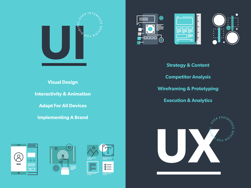
User Interface on the other hand refers to the visual elements in a website or app. The typography, color schemes, and layout of various design elements are usually a part of UI design. So, if a call-to-action button has to be placed on a webpage, its color and fonts will be decided by the UI developers but its placement, resolution, and functionality will be determined by a UX expert.
So, while UX professionals make designs centered on user’s needs and research, UI professionals create visual designs based on a client’s needs and requirements. But the end objective of both UI and UX is to please website visitors and app users and encourage them to return to the app or website again and again.
Tips to Improve Your Mobile App’s UI
Designing the perfect UX and UI is an art and a science. Your mobile application’s design can make or break its fate. While style certainly can’t beat substance, it’s a definite deal breaker for app users. All users love apps with familiar layouts, quick load times, and seamless experience across devices and screens, cohesive visual elements and strong branding. So, for your app to be a hit, it needs to be appealing inside and out.
Have a Unique app icon
A killer app icon will make your app stand out among the dozens crowding a user’s screen. Facebook, Google and WhatsApp icons are recognizable by people across the globe. Ensure that your app icon reflects your brand’s colors and style. Use the icon consistently across screens and pages and on all marketing collateral. The aim is to forge a strong bond between your brand’s message and its icons so that people make the connection instantly.
Keep in mind the following when designing your app logo:
Either use a unique image or your brand name’s initials in the icon. Your company’s logo is also a good choice as it might already have established repute and visibility in the market.
Avoid incorporating long words in the icon as it affects readability adversely and crowds the screen.
Submit several iterations of the icon while publishing your app.
Prioritize interaction design
Interaction design is an essential aspect of mobile app design. Apps with great interaction design are simple to use and seem like second nature. Users are able to figure out how to use these apps without reading lengthy tutorials or seeing complex demos. Each element of the app just fits together perfectly such that design becomes secondary and functionality gains priority.
The three pillars of interaction design that can enhance your app’s UI are:
Goal-driven design: User research and use case scenarios should be made for numerous situations so that you understand how a user will behave in a particular situation. Your app should not lose users at any point. Since it’s relatively easy to acquire an app from play stores, users don’t hesitate to abandon an app that isn’t meeting their needs instantly and opt for a competitor app. So your UI developers have to only attract visitors but also retain and convert them efficiently through brilliant design and interactivity. Customized workflows have to be designed for different use cases. Familiar navigation and simple layouts are best to guide users to the next steps. Uncluttered typography and contextual content are absolutely essential to maintain attention.
Usability: Usability testing is arguable the most important phase of app development. It allows real users to interact with an app under construction. Careful observation should be made to identify breakpoints and incoherence in the app’s UI. Usability testing should be repeated a number of times with different users and in different environments. This will probably give the most authentic feedback to your developers even before the app hits the market.
Feedback: Users need to be validated after they complete an action, especially new users unfamiliar with an app’s functioning. So, provide timely feedback in the form of visual cues, sounds or prompts as a user performs an action. It’s also a great strategy to include a prompt about the next step they should perform to guide them towards conversion stage.
Reduce, Reduce, Reduce
While mobile applications are becoming the go-to source for every kind of transaction, it’s a harsh truth that people’s attention spans are reducing by the second. Web users have no patience to read walls of text or go through lengthy how-to guides.
Keep your app copy clean and engaging. Also adhere to the context of the content. The aim is not to wow audiences with long, technical terms but to endear them with simple easy to understand content.
Use pictures and icons lavishly. They not only make your app attractive but also occupy less space and are more effective that textual cues. Keep in mind that pictures used should not be generic stock images. They should be customized to platform and screen size and have a comfortable resolution.
Mobile apps have trouble with multitasking. So focus on limited features. Don’t try to accomplish everything with a single app. Remove all extraneous elements and features and make your app screen uncluttered. This will appeal to users and also up your app’s performance.
Concentrate on Responsiveness
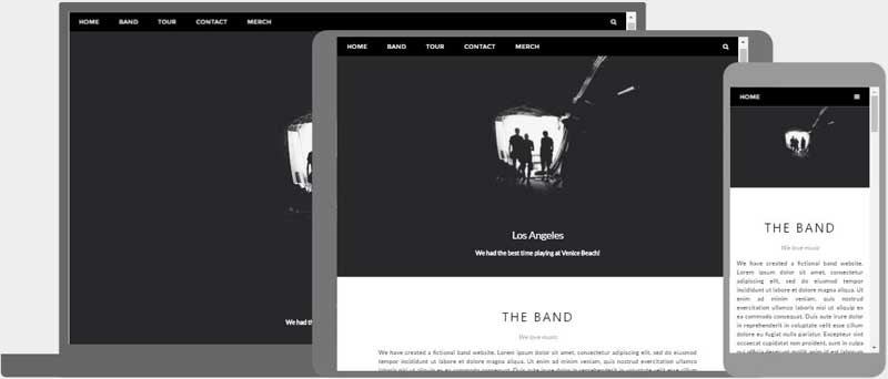
Finger-friendly design is a must for mobile applications. Your app should run flawlessly in different devices and screen sizes. Whether this requires tweaking media queries or JavaScript, no stone should be left unturned to keep users engaged when they switch between laptops, smartphones and tablets.
Use images in suitable format that fit the platform on which your app runs. Stretchable graphics are a great choice for Android app design.
Follow platform rules and design for best utilization of the particular platform. Don’t try to reinvent the wheel and create unfamiliar screen controls an interface elements. Take cues from the platform about the look and feel of your app. This will not only reduce redundancy of efforts but also delight users.
Adhere to the UI guidelines prescribed for mobile applications. There are norms for buttons, menus, widgets and every mobile element. All applications are scrutinized for these guidelines by play stores before they are published there.
Know Your Visual Elements
Visual elements such as fonts and colors although a part of UI, contribute substantially to the holistic user experience with an application.
When choosing typography for your app copy, focus on readability rather than attractiveness. The aim is not to distract users from your app’s features by using large, whacky fonts. Too small fonts become miniscule on smaller screen sizes. So, keep font size above 12 pt. at least.
Understand colors thoroughly and use them smartly to enhance visuals and show screen transitions. Fade out between screens will soften screen transitions. Highlighting a button can prompt a user to perform an action. Changing a button’s color after it’s been clicked will show a goal-driven action has been completed.
Use popular icons to show typical actions. For instance, a heart can be used to signify favorites and a tick mark to show completed action. Replacing text with representative icons will help your app’s international users who may not understand your app’s copy.
Keep an eye on app design trends as they keep changing rapidly. Material design, flat design, minimalistic design- choose wisely to give your mobile app a contemporary look.
Designing a mobile app with a great UI is a tough task. It requires years of patience and an in-depth understanding of user psychology. But practice makes perfect. So, keep iterating and testing to get the perfect mobile app design. Anteelo’s skilled UI and UX team has created more than 350 Android apps and iOS apps. We even provide comprehensive design consultancy to audit your app’s design elements and enhance its performance and usability.
Mobile Apps Designs continue to change with the changing demand of the industry’s million users. In the race of catching and keeping the attention of the crowd of impatient users, the UI design market keeps coming with new ideas and keeps revolutionizing the old ways to make the experience innovative and value offering.
2017 bid adieu to a number of UI elements that were making the product design old and boring – hamburger menu, content with less to no images, safe colors. While 2018 will be all about on the face, no nonsense designs.
There has been a new found demand for mobile app design agencies that can understand and help keep the brands in trend, when it comes to offering uniquely innovative experience to the users.
There are a number of UI elements that have together made a list of Mobile App Design Trends 2018.
Let’s get on them to keep you on trend this year.
1.Vibrant Colors
In 2016, UI designers reinvented flat designs in mobile apps and shifted their focus to offering greater personalization with their design elements.
Instagram was one of the first apps to modify their logo, move on from the flat, dull-muted tones to multi-colors. The trend was then trailed by a range of famous companies. Moving in the same direction, 2018 is going to be the time of vibrant colors, shooting up warmth, energy, and subtleties to your home screen.
It’s time for designers to be valiant and try out newer colors, but select and apply them wisely. Make sure the colors allow you to create unique, powerful, and eye-friendly experience.
2.Borderless Display
When Apple declared the launch of iPhone X with a borderless display, the major buzz was made around the effect of the design on UI design. They introduced the trend of transforming the usage of strict flat design ideas in mobile apps, boosting fluent storytelling. While it was still a lot restricted in 2017, Borderless Display specific designs have found themselves in the list of UI Design Trends of 2018. We will soon start seeing designs that cover the whole mobile from edge to edge.
3.Videos
2017 witnessed a rise in the fame of video content format. Hubspot stated that 78% of people watch online videos per week, and over 55% see online videos every single day.
In the context of the mobile apps, designers will be adapting the video formats in their apps in 2018.
The human attention period has reduced from 12 to eight seconds. Video-based UI is a result of this change in span.
2018 will see more of video-based content and more platforms coming up with live video options to convey information and feelings.
4.Cards
It was in 2015 that mobile devices overtook PCs as most used tools for surfing the web and doing the regular online activities. To cover the gap between desktop and mobile app usage, there had to be an element that would work well on both.
One of them is cards.
Although not an innovative addition in Mobile App UI Trends 2018, they play a crucial role in curating an effective UI design. Having all – video, photo, text, and link to a specific subject, cards are one of the most brilliant ways to display and organize large amounts of content on screen. Above all, they are aesthetic, easy to digestible, and properly-optimized for clicks and taps. This is why they have found themselves as the prime UI design mode on Pinterest, Netflix, and Newsfeed.
5. Sounds
The newest element in 2018 UI Design Trends is sound layers. This trend are with respect to the sounds which users listen when they open a website, send comments, select emojis, etc. The sound element of UI design adds features like enjoyment and pleasure in user experience. 2018 has come with an expansion to this trend and is set to take user experience to new levels.
6.Big Typography
Typography is another feature for the UI designers to experiment when designing uber personalized app designs. When added with images, colors, video, animations, and innovative layouts, the element brings about exceptional user experience.
Solely because of the reason, Typography has become crucial piece of UI design world in 2018, helping designers transform from the traditional font styles to a more experimental, creative space. What you should expect this year, is fancy and bold fonts in place of done till death system fonts, which have been applied since forever.
7.Overlapping
Overlapping of graphics, fonts, and colors not only makes UI design distinctive and eye-catching, but also add a false sense of white space. Creating an illusion of open space in the crowded real estate of a device, is the number one reason why designers are adding overlapping feature in their mobile apps.
Furthermore, in most cases, the overlapping of the same elements, combined with shadows, makes the mobile app interface designs impressive and fantasy like. All these reasons combined, make overlapping an important part of Mobile Application User Interface Design Trends 2018.
8.Gradients
In 2018, one can expect to see bright vivid colors and much greater use of the gradients.
In the last some years, we have been seeing a rise in the number of app designers who are adopting color gradients in design when designing buttons, logos, and backgrounds.
The reason behind this adoption is when you chose a specific color, you can show a hierarchy while drawing a picture and combining it with different graphics and color gradients.
This sense of hierarchy will continue to make Gradients famous in 2018 as they did in 2017.
9.Opacity
Same components tend to have diverse effects once you adjust or play around with their transparency level. When designing mobile app interfaces, adding opacity in components can be an excellent design work. Furthermore, the opacity settings for various graphics or colors can also help create colorful glass like texture to the app elements.
Overall, irrespective of how you add opacity to your UI design in mobile apps, they will see a concrete rise in demand in 2018.
10.Animation
Introducing motion design or animations in fonts, icons, buttons, and photos always have an optimistic impact on app users giving them more enjoyable experiences. The trend will continue in 2018.
11.Responsive Logos
The idea of modifying logos to fit in with the n number of devices, has been a very recent doing of the app design world. Brands have now started refreshing the logos in simplified, modern versions since last some years and making them responsive is the only logical next phase when it comes to meeting the today’s demands.
12.Real Life Photography
It’s very energizing to see authentic, real-life images return to the mainstream again.
The demand for real photos rose greatly in 2017 and is set to grow massively in 2018, with brands seeking to bond with users, and designers looking to get rid of tawdry stock photos.
13.Highly-Detailed Vintage
Vintage is nothing new, but its usage will grow stronger in 2018. Although it contradicts the mainstream need for minimalism, finely crafted images are timeless. This year, brands will be looking to attain top-shelf expression that shouts sophistication and distinction.
While not everyone’s cup of tea, food and beverage domain—specifically those involved with organic food and wine—will be leveraging the style in 2018.
14.Voice Enabled
Voice-activated elements of apps helps simplify users’ operations. In 2017, apps with voice dependent services finally found their fair share of demand from the industry. The popularity of voice-activated mobile apps will only grow in 2018.Other than the voice-activated elements, fingerprint-activated ones will also play a very crucial part in defining mobile app interface designs for 2018.
15.Emoticons
In 2018 we can expect to see emotional intelligence getting integrated in mobile experience to a much greater level. It is no more about animated effects that are shown when users complete any specific action. EI has now become a mainstream way to make users experience delightful and engaging.
In the year of mobile apps, we will see more emoticons in the list. They will see an integration with Face recognition elements that will be used for providing an array of reactions. One such technology that have been doing this perfectly is Animoji — the animated emoji that responds to iPhone X camera’s facial expressions.
UI design has proven to play a crucial role in mobile app success. It has positioned itself as a ladder to reach the hearts and minds of the users and customers by displaying engaging visual content and more.
But, is everyone able to relish its benefits? Do all the designers and entrepreneurs know about the best mobile app UI design tips that work in the customer-centric world?
Sadly, no.
So, with the intention to simplify their journey of figuring out what the UI of future apps look like, we have prepared a list of tips and trends that will be popular in the mobile world in 2021.
But first, let’s take a recap of the benefits of UI design.
Now that we have taken a visual walkthrough of the importance of good user interface design during app development, let’s peep into a few mobile apps that are giving serious UI designing goals to others in the industry.
Best Apps That You Can Get Inspiration From
1. Netflix
Netflix app – the one that has changed the landscape of the movie streaming industry – tops the list with its breathtaking UI design.
The application introduced incredible layout and color options to the mobile domain. It has not just worked on simplifying the navigation process but also ensured that all the reported bugs are solved in real-time. In this way, it has increased the chances of offering a positive experience to their audience.
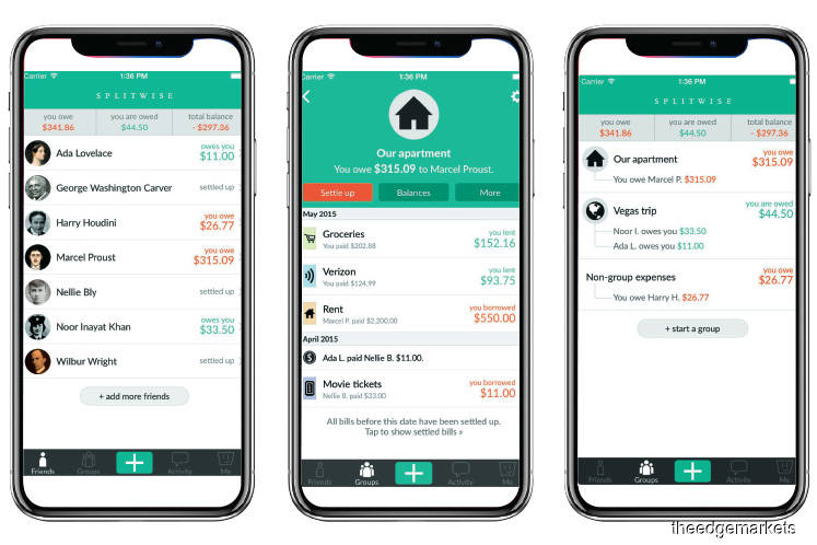
2. Splitwise
The UI design of the application is simple, sophisticated, and pleasant. The color scheme is chosen in a way that it complements app elements as well as employs the center of the device effectively.
3. Spring
Spring, the popular shopping app, is also a good option to consider while looking for design tips for mobile apps.
The mobile application offers a simple and interactive experience – using icons to give a hint of the functionality of each element. The app uses different font styles and sizes along with a card layout to deliver an enhanced UI experience.
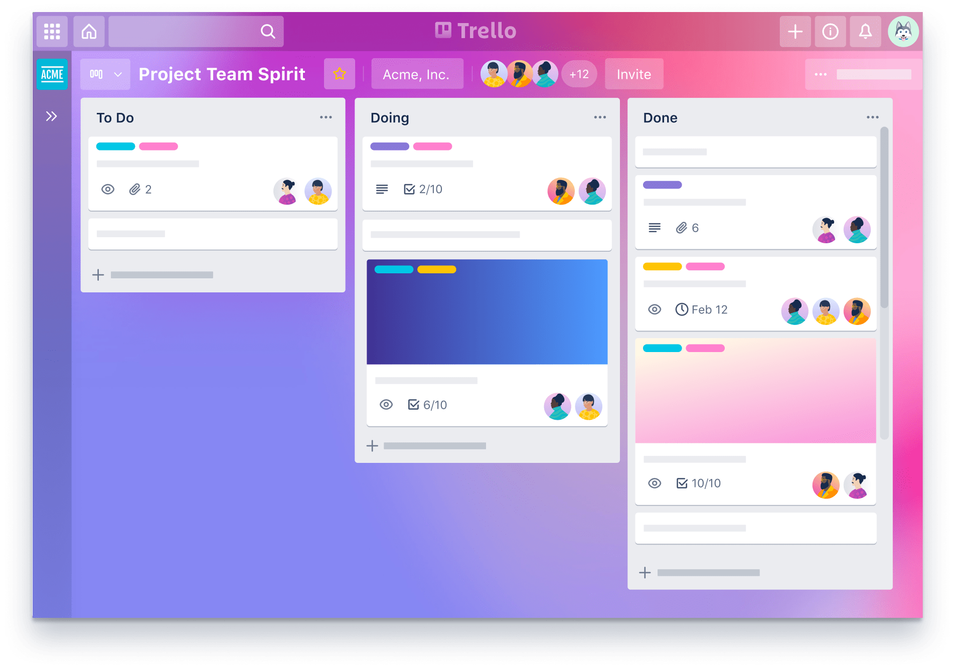
4. Trello
Trello is yet another application you can consider for deciding the type of UI design to create.
This productivity app is easy to use and gives the facility of creating boards for managing their tasks. It comes with a clean and sophisticated look and feels along with its tactics of arranging all the pins in a ‘pipeline’ manner. Also, it offers tons of cool backgrounds and labels colors to amp users’ experience.
5. Shine
Another application that has enhanced its customer experience via the user interface is Shine.
The mobile app uses custom and abstract aesthetics to match the mood of users. It also relies on soft shapes and calm colors to make them experience some peaceful moments.
6. Coursera
Coursera is yet another mobile application whose User interface offers some real goals in the design world.
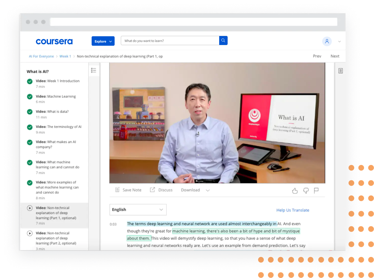
The app design is simple and smooth, offering the ease to navigate from a well-organized syllabus. It uses different font styles and colors to give users an idea of what they have covered, what they are interacting with, and what’s next.
Now that we have taken inspiration from different mobile applications, let’s turn towards the main part of the article, i.e, best mobile app UI design tips to follow in 2021.
Mobile app UI Design Tips To Follow While Designing Your App
Keep It Simple
The foremost tip for designing a better mobile app is to keep the UI simple.
When you restrict the number of app UI elements, users do not get drifted by unnecessary details. They find it easier to focus on the prime elements of the application, which eventually improves the user retention rate.
Make it Responsive
Concentrating on responsiveness is also one of the proven tips to enhance mobile app design by improving its UI.
This is because when you design elements that fit the screens, regardless of the device users are using, they find ease in performing actions. This, in turn, encourages them to spend more time on your platform and add higher value.
Use Popular Icons
Users, when interacting with various mobile apps on a daily basis, become familiar with certain icons. They can easily relate those icons to particular functionalities without even reading the label.
In such a scenario, using those icons can cut down the hassle of making users understand what an app element is for. This eventually enhances customer engagement and delivers higher ROI. So, introduce popular and similar icons in your UI designing strategy.
Maintain Consistency
Another best practice for app designing that UI mobility experts follow is showing consistency. That implies using the same font style, color, design, and icons throughout the app screens – and that too in the same order.
This simplifies the user journey and helps them make an action without getting a feel of being on some other platform. So, keep it into consideration while planning the app UI design.
Follow Platform-Based Rules
Both Apple and Google have set guidelines for mobile app design for iOS and Android platforms
. Following those guidelines improves the look and feel of your application on the respective platform.
So, do not overlook these Google and Apple UI design guidelines while crafting your app design.
Do not Forget about Loading Speed
Focusing on speed is also one of the best design tips for enhancing user interaction. This is because when UI elements take too much time to load, users get frustrated. They decide to exit the platform soon, because of which all of your efforts could go in vain.
So, think about optimizing your app speed frequently.
Invest in Testing
Many times, the elements you introduce in your app UI design do not work effectively. In such cases, they ruin the user experience instead of adding value to it.
So, it is good to invest your efforts into mobile app UI testing. For when you test your app icons and other elements for different conditions, it ultimately helps bring a positive impact on the users.
When talking about app testing, one thing that UI/UX designers must consider is the depth to which they should test their UI screens.
While educational and commercial apps require thorough UI testing across all the devices and OS versions, business apps can skip investing in extensive testing. This is because their audience, in most cases, is trained to employ the application.
In a nutshell, the depth of UI testing depends on the app’s purpose and the market it will target. However, it is a must to test your app UI on at least three different OS versions.
Iterate Regularly
Since user behavior and market trends keep on changing with time, it is again effective to upgrade your app UI design timely. And eventually, gain higher conversions.
As previously mentioned when talking about the latest mobile UI design trends 2021, changing market trends also influence the success of the user interface you design. So, let’s uncover what are the future mobile design trends 2021 to pay attention to.
The State of UI in 2021: Technologies and Trends That Will Dominate the Industry
1. Conversational Interface
Conversational Interface is one of the leading UI design trends for the future.
Just like Apple, Amazon, Google, Facebook, and Microsoft, various startups, and established brands will invest in Chatbot development to deliver the next level of conversational experience to their user base.
2. The Overlapping Effect
In 2021, UI/UX designers for a mobile app will embrace the idea of overlapping different elements, like text, image, and colors in a single screen.
The concept will help in creating a well-organized interface and create an illusion of space. This will eventually enhance the user experience to a great extent.
3. Typography
Just like last year, considering typography in-app UI design will be one of the best mobile app design trends in 2021.
While brands have been applying bold San-Serif fonts and strong typography for some time now, they will now focus more on typography that reflects motion-based and three-dimensional effects.
4. Voice-Powered Interfaces
By 2021, 50% of the search engine queries will be performed via voice. Because of this, voice-governed interfaces will also become one of the popular mobile application design techniques which are poised to deliver higher output.
5. Simple Curves and Geometry
Another UI design trend that will transform our future is the use of simple curves and geometry.
These curves and geometry will lower down confusion that might arise when multiple illustrations, pictures, catches, and animations are present in the design
6. Custom Illustration Interfaces
Illustrations will also be one of the popular mobile application design techniques to follow in the future.
Both brands and designers will turn towards introducing custom illustrations into their application – just like how Uber did.
7. White space
White space will also continue to be one of the core elements of mobile app design strategies.
With white space, designers will be able to deliver an uncomplicated experience to their target user base. They will find ease in making them focus upon the main part of the application over others. And ultimately, add value to their business.
8. Artificial Intelligence (AI)
Another technology that will bring a major impact in the field of UI design is Artificial Intelligence.
AI will not just help designers with creating multiple versions of any particular landing page or screen, but would also introduce personalized elements backed by thousands of studies and visual analysis. This, as a whole, will encourage them to look into how to use AI for better user interface design.
9. Contrasting Font Color/Shapes
Using contrasting font colors/shapes for mobile UI design will increase its popularity in 2021.
Mobility experts will infuse contrasting colors and shapes into their design to break the regular flow and add a tint of surprise into user interactions.
10. Animation
Animation, which was one of the key app UI design trends for 2018 and 2021, will also continue to enjoy the same momentum in the future.
Brands will embrace the technique to introduce micro-interactions in their design process. And, in this way, prompts users to spend more time on their platforms.
11. Opacity
Setting the opacity of different UI elements will be considered among the top key app design trends 2021. The technique will be used to bring more emphasis on certain elements while maintaining smoothness and seamlessness.
12. Augmented Reality (AR)
In 2021, UI/UX design experts will turn towards Augmented Reality (AR) for creating real-world interactions. They will embrace the technology to add immersion effects to their apps and products and help users comprehend the information more efficiently.
Besides, the technology will also be considered for building 3D brand impressions in the coming years.
13. Storytelling
Storytelling, i.e. the art of engaging users by narrating a story, will also be seen as one of the best UI/UX mobile design trends in 2021.
Mobile app designers will put more effort into crafting a story that highlights the purpose of the app and make users feel like a part of it. They will turn towards the best visual storytelling guides, tools, and techniques to make a story that keeps their audience hooked to their platform.
14. 3D Graphics
3D graphics will also land on the list of top UI/UX trends to consider in 2021.
Mobile app designers will incorporate sophisticated textures and 3D images into their designs to add a realistic feel. Also, users will demand more 3D designs and marketing content to enjoy a vivid, fresh, and engaging experience.
15. Placement of Navigational Elements
Another trend that will change the future of the mobile app design world is the placement of navigational elements.
As we have already seen in our blog upon the impact of Phone X’s new design on mobile apps, the absence of a home screen button will influence the navigation process. This will urge mobility UI experts to discover new ways to deliver a seamless navigational experience to their users.
16. Virtual Reality (VR)
Last but not least, the incorporation of Virtual Reality (VR) in UI design will also be in trend in the coming years.
The technology, after redefining the healthcare, marketing, and gaming industry, is expected to boost interaction levels in-app UI design. It is expected to emerge out as the ‘Internet of experiences’ by spilling out the app elements in the real world and prompting users to feel them.
While these were some of the mobile app design tips and trends that are predicted to revolutionize user interface in 2021, many more are hoping