Developing App? Here’s Angular Practices & Tips

Angular has been the most famous javascript framework among the developer community. It’s an MVC framework which provides pre-built components for developing the software application.Angular(2+) is based on Typescript , which is a superset of JavaScript. It comes with its most important advantage of static type checking that provides compile-time checking for any variable declarations and definitions.This blog is based around some best practices for Angular which I figured out while developing applications. There are also some bonus tips which I believe would help you with Angular development.

Essentials of mobile app development lifecycle that appreneurs must know - Business of Apps

Major Factors That Authenticate The Use Of AngularJS - Creative Tim's Blog

Follow the component based approach

Angular comes with the component-based paradigm which is also one of its best practices. It helps in maintaining modular and readable code.

While developing an angular code, if you think that something can be used multiple times as an independent piece of code, make it a component. A very basic example can be a simple dropdown which shows a list of options. The drop-down can act as an independent component with its own methods and template.

Few more examples could be – breadcrumbs for navigating throughout our web application, a simple alert box showing error/success messages or a loader. We tend to ignore these while thinking of modular approach but all these above examples can be thought of as independent components which can be reused over and over again.

Avoid using one huge global CSS

Angular’s current structure includes individual folder for every component. This folder includes-

  • .ts file for component logic
  • .html file
  • .css file for the component

So, keeping all of your CSS in one common CSS file would not only make your code less readable, it would make it less maintainable.

The best approach to style your components is to separate the global CSS with the local CSS (here local CSS refers to the component CSS). You should write your CSS in global CSS only when the CSS is written for the entire application and then if you need to style your component specific to a certain page, you can surely write in the local CSS.

Use CSS preprocessors for faster development

We can also use CSS preprocessors like SCSS/SASS for our Angular projects and I prefer them instead of writing plain CSS as they provide a lot of advantages over writing plain CSS. To mention one, the use of partials so that you can also separate your styles into multiple files for maintainability. If you guys want to know about partials, I would suggest you to go through this link.

You can divide your styling into multiple SCSS files just as we divide our application into multiple components. SCSS/SASS helps in writing smaller code which would ultimately get converted into CSS. So, why not save time and use it to our advantage.
CSS preprocessors | PSDtoWP.net

Save your time by using build tools

Tools like angular-cli have come up as a lifesaver for angular developers. It’s basically a boilerplate for an Angular application which helps in quickly setting up the angular application for your new project. It comes with all dependencies required for building your application and also has an inbuilt webpack which helps in bundling all your code and assets. Angular CLI helps to increase developers productivity through scaffolding by creating a component file, template file, stylesheet file etc. It comes with few basic commands which help in faster development like:-

  • ng g component my-new-component – it will create a new component with the name my-new-component.
  • ng g service my-new-service – it will create a new service with the name my-new-service.
  • ng g module my-module  – it will create a new module. A module is basically a collection of components which help to serve or attain a particular functionality.

Use ES6 paradigm and approach

Interfaces in Vanilla ES6 JavaScript – Full-Stack Feed

Though right now ES-8 is the current drafted version for ECMAScript but ES-6 came up with its own new features that are still widely used by developer community as they produce the same results with fewer lines of code and for best practices, every developer should know how to use them.

  • Arrow Function – In javascript, we use this keyword to refer to the current execution context. Previously, when we had to write javascript functions, this keyword would refer to the function context and we had to use a temporary variable to store the current execution context, so that we never lose it but with the arrow functions, the current execution context is never lost. For e.g., we could use an arrow function like this;

// ES5

var sum = function(x, y) { return x + y };

// ES6 (arrow function)

var sum = (x, y) => { return x + y };

Now, see the ES6 arrow function is just so compact and easy to understand and we can easily use this keyword inside this function to refer to the current execution context.

  • Template Literals – Template literals have come up with how we deal with printing strings having dynamic content.

For example, without template literals if we had to print a hello and goodbye message to a person, we would write something like :

const name = ‘AMAL’

console.log(‘Hello ’ + name +’ !’);

console.log(‘Goodbye ‘ + name + ‘ !’);

Now using template literals, it would be something like this:

const name = ‘AMAL’

console.log(`Hello ${name} !`);

console.log(`Goodbye  ${name} !`);

Now, who wouldn’t like to use the second syntax as it’s really easy to use and we don’t have to care about putting the spaces at right places so that the formatted output is correct.

Apart from these, const and let keywords came up as a replacement for global var variable so as to enable effective scoping of variables.

For a detailed overview of ES6 features, I would recommend having a glance over this.

Use Lazy Loading wherever possible
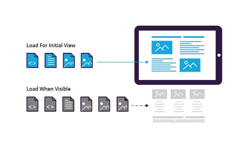
What is Lazy Loading | Lazy vs. Eager Loading | Imperva

Lazy loading is based around loading modules only when you want them to show.

We know about Angular’s modular architecture where a code is divided into modules with each module having its own components.

These components are basically views which might have some dynamic data. These components are rendered with the help of angular routing.

Lazy loading is one of the best things that angular framework comes with.

It’s based around one principle – ‘load/use it when you need it’. Oh, yeah what a lame
explanation I’ve given. There is a routing.ts file in every module which defines a URL for rendering each and every component.

Now when it comes to implementing lazy loading technique, what we do is we define a routing file for each and every module and we import each module only when the URL changes and it corresponds to rendering a component defined in the routing file of that module.

This technique requires a bit of patience to learn but take my words, it’s worth implementing. I can tell you with my personal experience; we reduced the loading time of our website by 3-5 seconds by implementing lazy loading.

Previously, we imported the whole bundle each and every time the user hit our website URL making our site slow while rendering. Then after implementing lazy loading, we only imported the module containing component required to render our index page and we just loaded other modules only based on what URL the user is switching to.

The Angular docs surely cover the lazy loading technique and it’s worth reading. You can check this link to learn more about it.

Follow DRY principle, extensively use services and directives

Services

DRY – This keyword is very famous in the developer community and it just stands for Don’t Repeat Yourself. So, when writing any code- be it Angular or any language- if you feel that you are basically writing or repeating the same code in every component, then you must pause then and there and rethink whether the code can be placed at a suitable place and can be shared by every component.

For example, if you want to call an API that updates user data, don’t call it in every component. What I would do it, I would rather make a service for it in the .service.ts file and would call that function whenever I need any component.

Also, it serves the purpose of using services in angular. Services help us in saving and fetching data and also help us write common functions which could be used by multiple components.

Directives

Now switching over to directives. A directive is a piece of code which is used to perform a specific task. Directives are of 3 types in Angular – component, structure, attribute.

  • Components are as we all know templates with logic to handle data.
  • Structure directives modify DOM by adding or removing an element.
  • Attribute directives change appearance or behavior of an element.

Once, I was wondering to restrict input elements to accept only numbers when a user types in for a phone number field which shouldn’t accept alphabets. For this, I built an only number directive which would only allow input elements to accept numbers through the keycode. So just by using this directive as an attribute on an HTML input element, I can modify/change its behavior.

Conclusion

Following best practice is never a compulsion. There are many ways of doing things and you may choose any path. However, using best practices mean that you are following a method or a technique which is tried and tested through experiments and has proved to be effective to attain desired results.

Design Thinking in Healthcare

Design Thinking, at its core, is a creative process to solve everyday problems with a human-centered approach. While the word ‘creative’ may sound like something do only with designers/artists, the good news is- it’s not. Anyone can implement design thinking. The only thing that you really need is- listen to your customers as people who need your help. Once you understand their needs, their hopes, their fears and the friction they face while dealing with a particular problem- Bang! You are halfway through it.

Let’s hear a story. The story is about a woman named Elisa (yeah! I made that pseudonym). Elisa is an eighty-one-year-old woman suffering from age-related macular degeneration (AMD). When she was told she needs to take an injection in the eye for treatment, she was petrified. And why wouldn’t she? It’s not just any injection on the skin, it’s a needle in the eye. At the age when you are struggling with survival, it’s terrifying to think of ways in which you can go blind.

Why Design Thinking in Healthcare Matters

Apart from this particular case, it’s a fact that many of us dread getting an injection. Diabetic patients go through this painful experience, every day. Sometimes they have to administer these injections themselves, and sometimes they have to deal with a less skilled, less empathetic nurse.

Don’t you think we need a better solution to this? Can’t we develop something which makes this experience less scary? Can we go that extra mile and feel the pain of these patients? Can we somehow make them suffer less than they are already suffering?

An organization called Portal Instruments has now challenged this 160-year-old needle & syringe technology with design thinking. They have created a needle-free computerized injection system which fires a jet of liquid into the human skin. The handheld, low-cost unit is highly precise and accurate. The device is easy to use and its digital health features empower the patients to holistically manage their chronic condition interactively.

Design, particularly in healthcare, is about efficiency, usability, and a better user experience for patients as well as medical practitioners. And Design Thinking is a very powerful approach to solve customer’s problems. So where can you apply design thinking in healthcare?

Design Thinking in Patient Care

How Healthcare Organizations Can Start to Use Design Thinking | PreCheck

Patient care is not just about exchanging pleasantries and moving ahead with the treatment. When you apply Design thinking to this process, you will uncover ways in which care goes beyond the treatment.
A customer empathy map will help you understand your patient’s pain, concerns, fears and go beyond the clinical treatment. For instance, simply by listening to the concerns of expectant mothers, you can help them ease their anxiety. After quality research & brainstorming viable solutions, you can arrive at a proposed solution to help them be better informed about the labor process.

Design Thinking in Clinical Experience

Memorize the last time you were sitting in the emergency-room and recollect your waiting experience. Wait times are difficult to pass. You are in a troubled state of mind. Patients and their families spend a considerable amount of time in waiting rooms, sometimes waiting to be treated and other times waiting to see the doctor.

Design thinking may bring forth innovative ways of helping patients feel comfortable and make their experience bearable. You can start by asking questions and understanding their mindset. Must the patient be left alone while they wait for care? Is there a better way in which family wait time can be utilized? If you can not reduce the wait time, think of ways to utilize it. Once you answer these questions, you’ll be able to elevate the user experience of your users.

Design Thinking in Websites

If you are building a healthcare app/website, then you have to take care of the reliability and accuracy of the information that you provide. A person’s medical records can be critical information while monitoring health patterns or detecting disease symptoms.
Prioritize the most important information & fields for your users. Boil down to basics. Take all age groups into account and design keeping in mind their ailments.
They (might) want more information with less number of clicks, they (might) wish for larger and readable fonts. And while you may get away with frequent ‘small’ updates on social media apps, here it (might) frustrate them.

How to design a great Healthcare Experience

You know why every superhero is veiled behind a mask? Because creators of comic heroes want you to believe that even superheroes are like any other human. Their only superpower is endurance and resilience. They understand people; they want to solve their problems. They put people before anything else.
Much like Spidey! Or Batman.

Design thinking is same. It’s about organizing those mindful scattered ideas that everybody forgot to care about. Design thinking is about subtle differences which make you outshine from the ordinary. Yet it’s not so easy to put yourself in some else’s shoes. It takes a lot of efforts in brainstorming and generating ideas. Then, you should quickly pivot on a prototype and gather user feedback for continuous improvements.

Design thinking has already made it to healthcare. But, as we all are aware of the sad state of product design and innovation in Healthcare, there are still areas where it remains underused, such as patient transportation, the communication gap between doctors and patients, to name just a few. Here’s one approach that might be useful to you-

Research and define the problem statement

If you are dealing in the food business, wouldn’t you start talking to the farmers? So, start with conversations. Talk to patients/families about their problems.
Build customer personas. A persona is an imaginary character that embodies your real customer. Learn about your user’s lifestyle, their goals, their values, the challenges they face. Empathize with your users & their problems.
If you are designing an online appointment experience, you need to involve every single person associated. Right from the doctor to the patient. Even the receptionist. You need to understand their roles and most importantly, where they fit in together. Once you understand their pain points, then you’ll be able to create the experience for patients who need care.

Ideate

Design Thinking in Healthcare – IDEO U

Enough talking! Time for some action. Gather all that you have talked and use the outcome of Research phase to generate interesting ideas. Not all ideas will be usable; so try and stay close to ‘potential solutions’. Use techniques like high-level drawings, user-mapping and plot a user’s experience map to arrive at innovative solutions.
For instance, while building a SaaS-based mobile engagement platform for one of our client, our design team took conscious efforts to understand the whole journey- health plan benefits, treatment requirements, appointment details, communication medium, medication instructions etc.

Putting down our ideas on paper helped us a lot in working on user workflows. We were able to visualize a smarter workflow which connects with patients through mobile messaging for more effective communication.

Prototype and iterate

Giving your ideas a shape is crucial to the design thinking process. Otherwise, it will just be castles in the air. Prototyping is something that pushes you into making things tangible so that you keep moving forward.
Prototypes will be a proof of concept of your ‘ideation exercises’. They will help you in demonstrating and validating your concepts and understanding. Moreover, they are important because you would want to test your functionalities in a real environment with real users.

Prototypes need not be beautiful. It can be a black and white template of your colorful understanding. It must answer a simple question- as simple as “How would you like to reach out to your members?”

Depending on your application (web/mobile), prototypes can be interactive or static. What really matters is that they must convey the user experience flow.

The advantage of building a prototype is that it’s something substantial and not just some thought process going on in our mind. Once you have pushed that into a real environment, you can take feedback from users and iterate to simplify functionalities.

Designing for healthcare won’t be a joyride. Unlike social media apps like Snapchat, your healthcare platform will grow slowly. And that’s not your mistake. The user base that you are catering to, is not looking for socializing or entertainment. So the only solution lies in applying design thinking to approach problems.

Before aiming for success, first, offer a service that’s valuable. Offer a service that solves a real problem. Offer a service which makes them forget that they are interacting with a machine.
Let’s build a better healthcare experience. Let’s be more human.

Basics of Espresso

Unit testing is an essential part of any development lifecycle. Writing unit test cases can come in handy when we want to make sure that our code still works as expected even after code changes have been implemented.Espresso Testing Tutorial - TutorialspointIn Android, we have two types of unit tests that we can write:
  1. JUnit Test Cases
  2. Android Instrumentation Test Cases

JUnit test cases are test cases that can run on the JVM. It is preferred to write JUnit test cases as they can run directly on the JVM and are much faster. While writing local unit test cases, if there is any dependency on the Android system, those dependencies can be mocked using a mocking framework like Mockito.

Android Instrumentation test cases, on the other hand, need the Android system to run. They need an actual Android device to run on. They should be used if the test cases rely heavily on the Android system like the Android UI. As they first need to be deployed on an Android device before they can run, they are usually slower than local unit tests.

In this blog, I will talk about how we can write basic Espresso test cases to test the Android UI.

Espresso has 4 main components which are:

Espresso Recipes for Android - Part 1 - Hearth | by Dogan Kilic | Medium

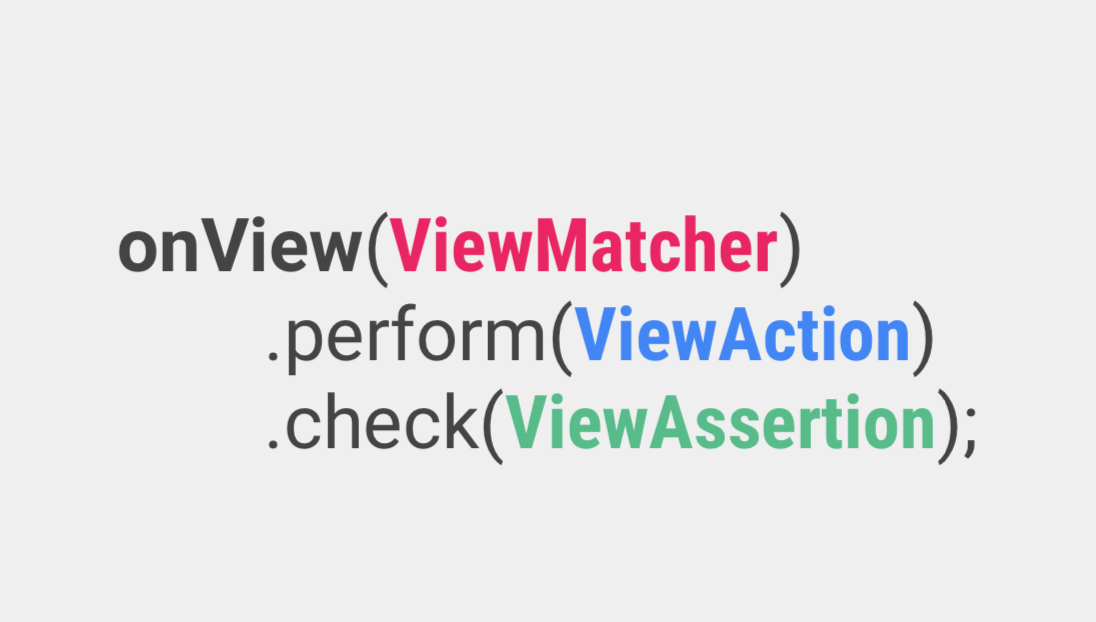
  1. Espresso – It is the entry point for any interaction with views (using onView() and onData()). It also exposes certain APIs that are not specifically linked with any view, like pressBack().
  2. ViewMatchers – They are a collection of objects implementing the Matcher <? super View> interface. One or more matchers can be passed to the onView() method to find a view inside the current view’s hierarchy. In case the view that we are trying to match is not present in the view hierarchy, Espresso throws a NoMatchingViewException.
  3. ViewActions – They are a collection of actions (ViewAction) that can be passed as an argument to the ViewInteraction.perform() method to perform some action on the view, such as click().
  4. ViewAssertions – They are a collection of assertions (ViewAssertion) that can be passed as an argument to the ViewInteraction.check() method to assert some state of the view. Most commonly used ViewAssertion is the matches assertion, which uses a ViewMatcher to assert the state of the currently selected view.

A complete list of the available ViewMatcher, ViewAction, and ViewAssertion can be found in this Espresso Cheat Sheet.

Now that we know the basic components of Espresso, let’s see how we can integrate Espresso into our Android projects. Let’s start with setting up our test environment.

It is recommended to turn off system animations on the device on which the tests will be run. This should be done in order to avoid test flakiness. Go to Settings -> Developer Options and turn the following 3 animations off:

  1. Window animation scale
  2. Transition animation scale
  3. Animator duration scale

We can override beforeActivityLaunched() to execute any code that should run before our Activity is created and launched.

We can override afterActivityLaunched() to execute any code that should run after our Activity is created and launched but before any test case is executed.

We can override afterActivityFinished() to execute any code that should run after our Activity has finished.

Methods annotated with @Before annotation are executed after the activity is launched and before the test case is executed.

Methods annotated with @After annotation are executed after the test case is executed and before the activity finishes.

ActivityTestRule rule provides functional testing of a single activity, that which is specified in the ActivityTestRule. This activity will be launched before executing every test annotated with the @Test annotation. ActivityTestRule has 3 constructors:

The activityClass parameter indicates the activity class that needs to be launched before every test.

The initialTouchMode parameter indicates whether the activity should be launched in touch mode.

The launchActivity parameter indicates whether the activity should be launched by default before every test case is executed.

Let’s see how we can pass some data to the activity before any test cases are executed. There are two ways in which this can be achieved.

First, we can use the 3rd ActivityTestRule constructor along with the @Before annotation to achieve this. Passing the launchActivity parameter as false indicates that the activity will not be launched by default. The method annotated with the @Before annotation will be executed before every test case

The second way is to implement the ActivityTestRule constructor and override the getActivityIntent method. The getActivityIntent method returns the custom intent that we build and this intent is then available to the activity under test after it’s launched.

We have seen how to setup Espresso and how simple test cases can be written. I hope this article motivates you to implement Espresso in your Android applications for UI testing.

Android: Applying Shared Element Transitions

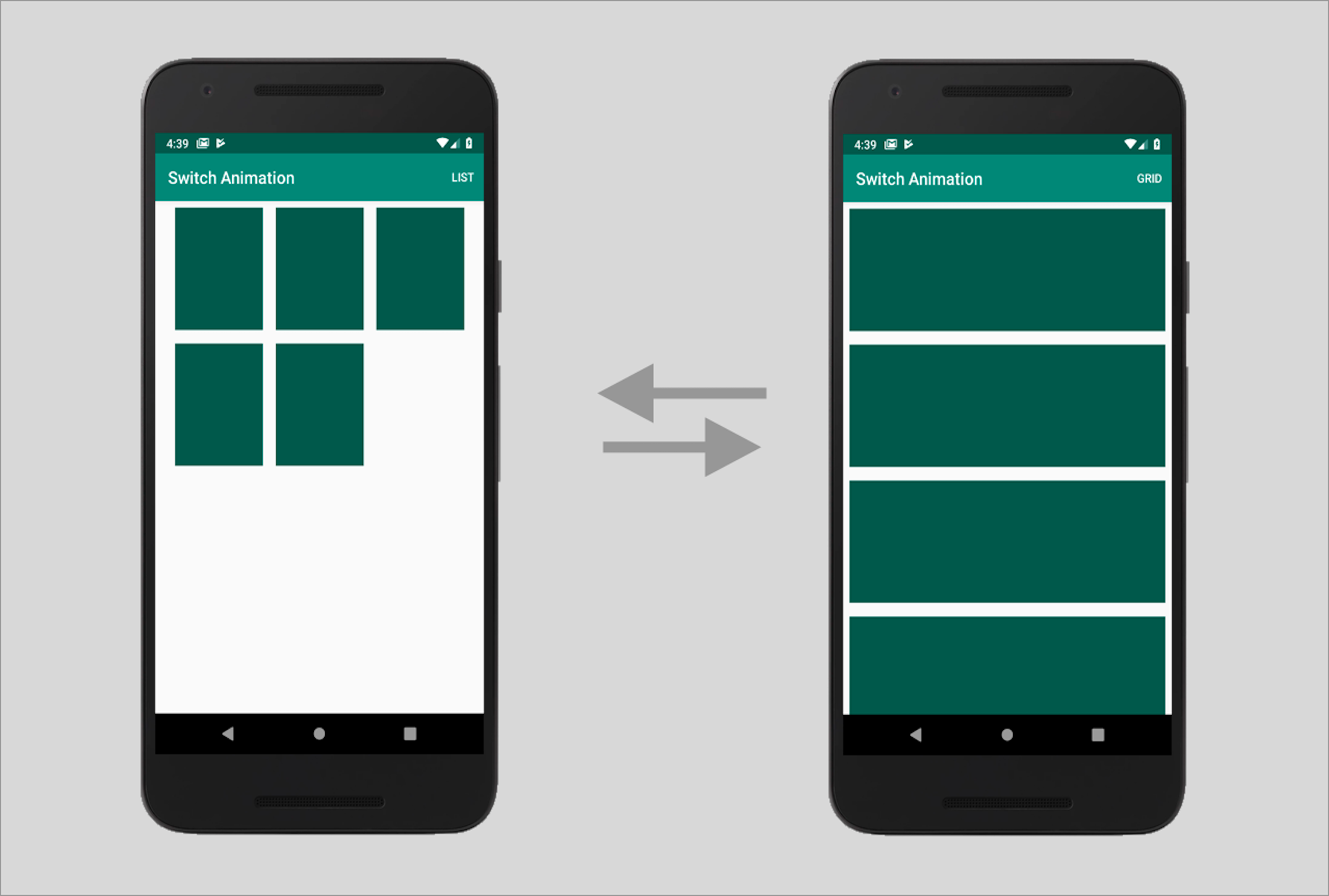
Doesn’t it look cool when one view appears to move across screens without breaking the continuity of motion? It just adds to the flair of your app, thus improving the app’s UX.Now, this can be achieved using Shared Element Transitions; but here is the catch. This transition effect is available only on devices running on Lollipop (Android 5.0 – API level 21) and higher.Shared elements transitions were introduced in Android 5.0 to make view transitions across screens more seamless and easy to implement. Using this transition, the switch between Activities or Fragments seems more natural and unforced.

Before Android 5.0, transition effects across Activities were available, but they would animate the entire root view of our screen. Using shared element transitions, we can animate any number of views, regardless of their view hierarchies.

Android - Shared Element Transition

Now, let’s see how we can implement shared element transitions in our Android apps-

Step 1 : Enable Window Content Transitions in styles.xml

Step 2: Set a Common Transition Name for Respective Views on Both Screens

For the transition to work across screens, you have to assign a common transition name to the shared elements (views) in both layouts. The views don’t have to be of the same type or have the same id, only the transition name must be same.

The transition name can be set using the android:transitionName attribute in xml or using the setTransitionName() method in Java.

Step 3: Open Activity with Element Transition

In order to get the transition effect, you have to specify a bundle of the shared elements and view from the source activity while starting the target activity.

When we specify the source view along with its corresponding transition name, it ensures that even if multiple views exist in the the source view hierarchy with the same transition name, it picks the correct view to start the animation from.

While specifying multiple shared elements transitions, make sure that you import android.support.v4.util.Pair. Please ensure that you do not overdo the transitions, as that can distract the user and degrade the user experience.

Step 4: Close Activity with Reverse Element Transition

In order to get the reverse element transition effect while finishing the second activity, you need to call the Activity.supportFinishAfterTransition() method instead of the Activity.finish() method. Also, you need to make sure that you override the Activity finish behavior everywhere in your activity, for example if you have a back button in your Toolbar or if the user presses device’s back button.

Shared Elements Transitions with Fragments

How to use Shared Element Transitions with Fragments

We can achieve shared elements transitions with Fragments as well.

Step 1: Set a Common Transition Name for Respective Views on Both Screens

Step 2: Define a Custom Transition:

Step 3: Specify the Shared Elements Transition in FragmentTransaction:

Custom Shared Elements Transitions:

In Android Lollipop (Android 5.0), the default shared elements transition is a combination of 4 transitions:

  1. Change Bounds – It captures the layout bounds of target views before and after the scene change and animates those changes during the transition.
  2. Change Transform – It captures scale and rotation for Views before and after the scene change and animates those changes during the transition.
  3. Change Image Transform – It captures an ImageView’s matrix before and after the scene change and animates it during the transition.
  4. Change Clip Bounds – It captures the getClipBounds() before and after the scene change and animates those changes during the transition.

In most cases, the default transition is sufficient. However, there might be cases in which you might want to customize the default behavior and define your own custom transitions.

You can set the window content transitions at runtime by calling the Window.requestFeature() method.

Exclude Elements from Window Content Transitions

Sometimes you might want to exclude the use of the status bar, ActionBar and navigation bar from the animation sequence. This might be particularly required when your shared elements are drawn on top of these views.

You can achieve this by excluding these elements from the transitions. This can be done by adding a <target> tag and specifying the ID of the element you want to exclude.

Shared Elements Transitions with Asynchronous Data Loading

There might be cases when the shared elements require data that might be loaded from a web API or URL. The most common example is when a URL needs to be loaded into an ImageView which also happens to be the shared element we want to animate. However, the shared element transition might get started by the framework before that data is received and rendered.

We can overcome this by temporarily delaying the transition until we know that the shared elements have been rendered with the fetched data.

We can delay the shared element transition by calling postponeEnterTransition() (For API >= 21) or supportPostponeEnterTransition() (For API < 21) in your second Activity’s onCreate() method.

Once you know that the shared elements have been rendered with the data, you can call startPostponedEnterTransition() (For API >= 21) or supportStartPostponedEnterTransition() (For API < 21) to resume the paused transition.

We can start the paused transition in an onPreDrawListener which is called after the view layout and before the view is about to be drawn.

Results

You can expect to see something like this once you are done with all of the steps above.

How to apply Shared Element Transitions in Android | Humble Bits


Employing Automation to test Data Interface

Say, you got a DB comprising of huge data with billions of records. You have to showcase it on UI only after making sure that everything you want to represent on UI is accurate and as expected. Incorrect data could impact your business in unknown and serious ways that can lie undetected for months.So, here you might need to plan a new strategy, which should lead to answers of all your questions.One of the finest approach among this strategy should be- to make sure that everything you are showing is validated and verified. This leads to a special type of testing called as Data Interface Testing.

What is Data Interface Testing ??

What is Interface Testing? Types & Example

Before we go ahead with Data Interface Testing, let’s first discuss about data interface. Lots of application in the market are nowadays based on Data Mining or Big Data concept. This helps to streamline the big data and showcase on UI in an adequate manner.

Now, as many people say that there is always some pros and cons for each process. Similarly, even this one has few. One of the biggest one is showcasing huge data. But I have a solution.

There is always a challenge to show the huge data on UI where everything is placed at their respective place with correct data set and correct orientation (if you’re showing the data in graphical representation).


So, the interaction between database and User Interface brings the term Data Interface. And to make sure that it works well both ways i.e. request and response results, we call it as Data Interface testing.

Big Question !! 

Can I test this much of data and all of that manually??

Answer is yes, it is possible. But practically not a good way to do the same.

So what …?? Automation ??

Yes.

But what if I don’t have any good knowledge for it ?

Don’t you worry, we got a cheat for you !!!  A tool to test data interface automatically, with a very basic knowledge for Automation/coding.

Automation Tool

Some Info Regarding this tool
This tool is made to test validation and verification of data between database and user interface. To make this tool useful, one can easily use it on it’s own working environment, by customizing the details in provided file and coding as per their requirements. .

How this tool works ?

With it’s main class, it reads multiple files which further executes the methods written in those properties.

For reference, the source code is mentioned below:

Representing Main Class of Tool

Method written in above class is dependent upon various files. One of them is called as Property_Reader file.

This is a custom made file, which executes multiple methods and brings result for main class.

1. Property_Reader_Method

2. db_property

This file comprises of all properties, which helps in setting up connection with server/DB.

Following are the properties used in this file.

  1. Url=jdbc:presto://10.0.11.198:8080/test/default
  2. UserName=root
  3. Password= 12345
  4. ClassName=com.facebook.presto.jdbc.PrestoDriver
  • You can change your URL and credentials as per available server(s).
  • Password can be null too. Depends upon the server details.
  • For current we are using presto as DB.

3. query_column

This comprises of column name for which data needs to be fetched from DB. For every query there should be a unique query name which must be identical in all property files for that query.

For below mentioned example. “testA_count” is the name of query which is unique from rest of the two but same in other property files for queries with same conditions.

Apart from that, irrespective of number of columns available in expected and actual query, it will only bring data for “Column A” column in the result set.

Same case for others too.

4. query_actual

This property file contains the queries created by developers or fetched through server logs file which are created while accessing the application through UI.

5. query_expected

This property file contains the queries created by testers.

By running the above mentioned code for main class, it will create a new result file every time. This file will comprise of end result for executed queries, having expected and actual result with numbers and pass/fail result.

For Failed Case:

Let’s change the actual query to-

Points to be considered:

  • Make sure that the query name should always be the same in all expected, actual and column property file.
  • For every query there should be a unique query name.

Benefits of using this tool are:

  • Any Structured DB can be used for this eg. Presto, MySQL, MS-SQL etc.
  • Platform independent. Can be run on Windows/Ubuntu/Linux.
  • Can be run on a project written in any language.
  • Doesn’t require any prior coding skills or automation knowledge.
  • One can easily put the expected and actual test case in respective property files and can have the result set, with complete information.
  • Can be easily customized as per available resources/requirements


UX Designer vs UI Designer vs Web Designer

What Does a UI/UX Designer Do?

To the laymen, digital design can be a puzzling world of systems, acronyms, and programs. Web creation is not just about making a landing page and adding content anymore but a complex world of coding for site function and protection. It is also a fun and artistic adventure to create something visually alluring. If you combine this with the psychology behind all the systems of a webpage, and you have the basics of web development. Sounds simple enough, right? Not for everyone. The software industry has skyrocketed, and many people are still trying to understand key differences in standard terms. Terms like UI design, web design, and UX design are often thrown around and are incorrectly interchanged. However, following the aim of each tool is as simple as knowing the various parts of a house. Web design is the base or the foundation, UI design is the architecture, and the UX design is the electric, plumbing, and other wiring needed.  Before we get into defining these terms, we can say there can be a lot of overlap between them. UX, UI, and Web Designer difference is nothing but a fine line but can have great impacts on your project. However, to excel in any of them, you must have a comprehensive knowledge of all three of them.

UX, UI, and Web Designer differences:

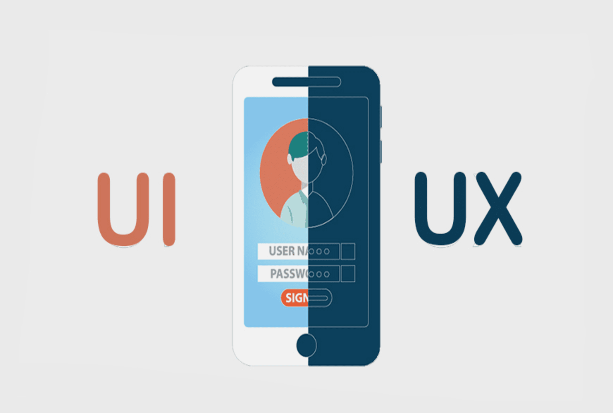
35,084 Ux Design Illustrations & Clip Art

Web Designer UX Designer UI Designer
A web designer is a professional who generates content for a website following the latest trends. They are responsible for designing the layout of the website, along with its aesthetics, utility, and functionality. UX is the abbreviation for User Experience. It brings in creativity. A UX designer handles the whole procedure of obtaining and coordinating a product, including parts of marking, development, convenience, and utility. It is a process that starts before the product reaches the customer. UI stands for User Experience. A UI Designer is responsible for creating the interfaces between the user and the product and ensure that the interaction between the customer and the product is a seamless one.
The role of the web designer is to compile everything, including the UI and UX, and turn it into a highly-functional and efficient website that people can easily interact with using their smartphones or computers. A web designer might emphasize more of the aesthetics of the site rather than how a user might deal with it. UX design is all about having a deep understanding of the customer, which includes their preferences, behaviors, habits, requirements, and feelings. UX designers must comprehensively understand the issue along with the client whom they are working for so as to design an optimal and streamlined solution. The UI design is the complement of UX Design. UI designers work on the point of interaction between the user and the service/device and try to improvise the product in a way that is user-friendly and adds value to the users. UI designers work on the look, design, and especially the feel of the product.
A web designer must have in-depth knowledge of programming languages like HTML and CSS, Scripting languages like JavaScript and PHP, web designing packages like Flash, Photoshop, etc. A good UX designer is expected to have fluent communication, agile and lean development skills, rapid prototyping, revising skills, crowdsourced designing, and relevant soft skills. In contrary to UX designers, UI designers are in charge of making UX designers’ dreams a reality. Numerous UI designers have a decent comprehension of front-end development along with some coding abilities.
Contemporary Web designers are usually modern era graphic designers trained in visual design to be experts in:

  • Color theory
  • Creative conceptualization
  • Diagrams
  • Interactivity, rollovers, drop-down menus, digital slideshows, call-to-action-buttons, and forms.
  • Icon development
  • Info-graphics
  • Typography
A UX Designer plays a very crucial role in an organization. They have to make sure that a customer is having a good time with the brand. They primarily focus on:

  • Understanding user psychology
  • Comprehending product specification
  • Finalizing the right interaction model
  • Create personas through user surveys
  • Collaborate with UI designers to create attractive and useful designs
A UI designer primarily focuses on:

• Color and typeface choices.

• Designing the monotonous but necessary stuff: buttons, icons, sliders, and scrollbars.

• Forming a style guide for the app or website to ensure consistency for the user.

• Responsive designing

• The interactive parts

•  The layout of each screen

Website designers might be visual designers or engineers who have built enough aptitudes to make beautiful and aesthetic websites or applications. Website designers do not tend to adopt the human-focused strategy of UX design. Most website designers don’t dive as deep to consider every element that a UX designer remembers. A website designer will, in general, be less iterative, while UX design is tied in with coordinating persistent enhancements by interacting with users. UX applies to whatever that can be experienced—be it a site, a cup of tea, or a visit to the supermarket. The “client experience” part alludes to the connection between the client and service or product. UX structure, at that point, considers all the various components that shape this experience. A UX designer considers how the experience makes the client feel and how simple it is for the client to achieve their ideal errands. UI design is simply a digital approach. It considers all the visual, intuitive components of a product interface—including buttons, symbols, checkboxes, typography, color scheme, and responsive design. The objective of UI design is to outwardly guide the client through an item’s interface. It’s tied in with making an intuitive encounter that doesn’t require the user to think excessively! UI design delivers the brand’s qualities and visual resources for a product’s interface, ensuring the design is predictable, intelligible, and tastefully satisfying.

CONCLUSION

So a UX designer chooses how the UI functions while the UI designer chooses how the UI looks, and the web designer puts it all together into a cutting-edge website. This is a community-oriented procedure, and these three domains will, in general, work intently together. While the UX group is working on the flow of the application, how buttons guide you through your website, and how the interface effectively presents the data that the client’s need, the UI group is chipping away at how these interface components will show up on the screen and the web designers are integrating it all.

If Web Design is the umbrella, then UX and UI design are specialties and focuses on it. Anyone who regards themselves as a web designer should be well-versed in UX and UI. These terms are also industry-specific. Startups and tech companies mostly hire specifically for UI/UX roles. Every so often, a UX role will focus more on research and information architecture. Occasionally, a UI role will include UX. Sometimes, companies are looking for a web designer who can do it all. It’s all a bit of a mess unless the aim is precise. Whichever direction you take, it’s vital to remember that design is not just about making things look pretty, but it’s about problem-solving communication and people.

Mobile App Interface: With UX-UI Strategies

When was the last time you bought a movie ticket from the multiplex counter? When was the last time you went out to Crosswords to buy a new release from your favorite author? Or when was the last time you went out for dinner without reading its reviews on Zomato? And oh! When was the last time you went to bank for checking your monthly statement?Take your time!Ages ago, no?

Life is sorted. Everything is available on mobile apps now. We’re living in revolutionary times. The power that web has given to us is enormous. It has made our life, both, easy and difficult. Every one of us has now access to a plethora of information. A swarm of mobile applications is available on the store to make your life easy. For things as small as which baby stroller to buy, we have become dependent on our mobile devices.

UI/UX Strategies to develop Mobile App Interfaces | Humble Bits

Our eyes and ears are always open to that new cool app which is making waves in the market. And every mobile app which becomes a craze among its users has one reason behind it- excellent User Experience. A lot of people believe that design is about making applications look pretty. Ofcourse, a part of it is true. Anything which looks good improves the user experience. But what if it doesn’t satisfy customer needs?

A good design includes creating each and every interaction to delight users. Remember what Steve Jobs said?

“It’s not just what it looks like and feels like. Design is how it works.”

A bad user experience will give you a thousand thumbs down within minutes. The application must delight its users, both with functionality and experience. The mobile app interface should appeal to the users. I am sure you can relate to the experience when the mobile application works perfectly but doesn’t excite user to use it? What if the application looks pretty but its functionalities are broken? In these cases, you need to look at what works for users and what doesn’t.

Well, there is no one-size-fits-all solution. But here are some strategies that you can implement which have always worked wonders-

Design long-lasting products

7 Winning Design Tips and Strategies For App UI/UX Developers - iqonic

The argument to stay up-to-date with all the latest trends might clash with this but when we say design long-lasting products, we mean that the products should not age prematurely. The product should not become out of style with time. Design something neutral, which can live longer and is not just a passing design fad.

Dieter Rams, a very famed industrial designer, says-

You cannot understand good design if you do not understand people; design is made for people.

He conceived these 10 design principles fifty years ago. He says he didn’t intend these principles to be set in stone forever. If you read them, you will understand why these didn’t mutate with time. They are still accepted and implemented till date. So your design should follow the latest design trends, but do it while keeping in mind your end user.

Keep It Simple, Stupid!

Less is More– this famous proverbial phrase emphasizes on why you should keep things simple and clear. The idea is that simplicity and clarity in thoughts lead to good design. When you are designing, take instances from your real life. How do you like to keep your stuff at home? Clean and organized? Use that thought in your design. Move away from clutter.

Every element in your design should serve a purpose. It shouldn’t just sit there as a pretty object. Minimalism is a tricky thing. Offer your user space where they can find action buttons easily. Reduce the load of information, keep navigation flow easy and let the user win. So, even if you are designing a web page to sell potato or onions, don’t make the user think!

The large clear fonts set the message straight- loud and clear. The background color places the user’s mind into the right frame of mind. The CTA buttons allow users to move directly to the action. Minimalism does not mean you start removing elements from the design, it’s about removing the unnecessary and keeping just enough which can depict your story.

Make an impressive user-onboarding flow

Follow these 7 steps for creating a bulletproof UI/ UX strategy

A lot many people uninstall apps they just downloaded when their onboarding experience is ruined. If you ask for too many permissions (camera, Gallery, contacts, location) then the user might become irritated. Collect only relevant information which is usable for you. Give your user flexibility to log in from different platforms- Facebook, Twitter, being two very popular options.

After you have made the user signup successfully, offer him a quick tour of what is the app about- where are the profile settings, where is the action button, which features are available and where. Even here, provide an option to ‘Skip’.

Use appropriate colors to make a connection

According to the color theory, if we apply logic to the selection of colors, it can greatly enhance our user experience. In visual experiences, colors should be pleasing to the eye. Anything which is pleasing increases engagement of the viewer and encourages him/her to get involved. On the other hand, when something is not pleasing to the eye, it is either dull or chaotic.

If the visual experience is boring and dull, then the monotonic appearance will keep user disengaged. The human mind will not perceive that information effectively. On other extremes, if the use of colors is overdone, it becomes chaotic. So much so that the user cannot comprehend the motive.

So color harmony which delivers visual interest to the user and a sense of structure is essential. And that is why it is important to create emotions with colors in UX Design.

Make Navigation Simple

Gps Navigation designs, themes, templates and downloadable graphic elements on Dribbble

You can have a pretty website with colorful and stylish design and astonishing images, but it pains my heart to say that it will be an utter failure if users don’t make any purchase from it. Simple and intuitive navigation helps them take an action. Every step should guide them to a result and help them understand trivial things, like:-What brand they are looking at
-What is the particular page about
-Where can they find the menu
-How can they get back to the previous page or next page
-Is there a way they can apply filters or search a particular product
-How can they make a purchase
-From where can they contact a concerned person
-How can they give feedback or suggestions

All this is vital and needs to be designed with utmost care because if user is made to waste time on these crucial things then they will immediately switch to a better option.
The digital era is here to make our experience faster & more convenient as compared to real life experiences. Make it worthwhile!

Conclusion

Just as a well dressed and a well-mannered person will always attract attention; similarly a mobile app interface with good design which solves users’ problems will always attract user’s attention. The most important thing which you need to keep in mind is to make sure that your design is both useful and intuitive. The world of app development is bursting and it will continue to grow by leaps and bounds. You, my friend, must learn to create an outstanding user interface that makes your mobile application amazing.

Browser specific hacks for Frontend developers

If you are a web developer then it’s unlikely that you haven’t faced this situation-You spent days and weeks writing perfect code. Everything is perfect from the CSS stylesheet to the meta tags. You test it in Google Chrome and it works perfectly fine. You go home and sleep in peace. But when you come back to the office the next day, everything is broken and you find a hundred bugs allocated in your name.Browser specific hacks for Frontend developers | Humble Bits


Culprit? Internet Explorer.

And, Mozilla Firefox.

And, Opera.

Happens to all of us, right?

So, is there a way out of this mess? Well, there isn’t. At least not a full proof one. 100% cross-browser compatibility is a myth. It’s almost impossible to write a code which works perfectly fine in all the internet browsers. It comes with experience and you need a lot of patience to learn that craft.

But you can always start small. I learned some browser specific hacks during my journey and I thought it’s a good idea to share them with fellow developers.

Browser Specific CSS Hacks | W3REIGN

Implementation

It is as simple as you write your simple CSS code, just pick the hack you want. Copy it into your stylesheet. Add the style you want between the braces. Enjoy the new styles for the browser that you’ve targeted!

Google Chrome and Safari Browsers

Google Chrome and Safari browsers are mainly the same as they both use WebKit, but sometimes they behave differently in the case of forms, fonts etc.

Css hacks

@media screen and (-webkit-min-device-pixel-ratio:0){

.selector{

property:Value;

}

}

Media Query Hacks

@media all and (-webkit-min-device-pixel-ratio:0) and (min-resolution: 1280px){

.selector {}

}

Javascript hacks

var isChrome = !!window.chrome && !!window.chrome.webstore; // for Google chrome

var isWebkit = ‘WebkitAppearance’ in document.documentElement.style; // for Chrome and Safari

Firefox (any version)

Css hacks

@-moz-document url-prefix() {

.selector { Property: Value; }

}

Media Query Hacks

@media all and (min–moz-device-pixel-ratio:0) and (min-resolution: 1280px) {

.selector { Property: Value; }

}

Javascript hacks

var isFF = ‘MozAppearance’ in document.documentElement.style;

Opera – Opera 10 and above

Css hacks

@media not all and (-webkit-min-device-pixel-ratio:0) {

.selector { Property: Value; }

}

Media Query Hacks

@media all and(-webkit-min-device-pixel-ratio:0)and(min-resolution: 1280px){

.selector {

Property: Value;

}

}

Javascript hacks

var isOpera = window.opera && window.opera.version() == X;  //replace x y the version

Internet Explorer

Css hacks

:root .selector {

Property: Value\9; color: red\9;

}

Conditional Comments

<!–[if IE 9]> Internet Explorer 9 <![endif]–>

<!–[if lte IE 9]> Internet Explorer 9 or less <![endif]–>

<!–[if gte IE 9]> Internet Explorer 9 or greater <![endif]—>

For example:

<!–[if IE 9]>

<link rel=”stylesheet” type=”text/css” href=”all-ie-only.css” />

<![endif]–>

IE 10 and above

_:-ms-lang(x), .selector { property:value; }

@media screen and (-ms-high-contrast: none), (-ms-high-contrast: active) {

.ie10up {property: value;}

}

@media all and (-ms-high-contrast: none), (-ms-high-contrast: active) {

.ie10up {property: value;}

}

IE 11 and above

_:-ms-fullscreen, :root .ie11up { property:value; }//Works for IE 11 and above

*::-ms-backdrop, :root .selector { property:value; }//Works for IE 11

IE 11+, Microsoft Edge Browser

/* Put this code in external stylesheet: ie11up.css */

@charset “&lt;Any Modern Browser but MSIE 10- or FF 18- &gt;”;  _:-ms-lang(x), .selector { property:value; }

Javascript hacks

var isIE = ‘behavior’ in document.documentElement.style && ‘- ms-user-select’ in document.documentElement.style;

var isIE = window.navigator.msPointerEnabled;

var isIE = document.body.style.msTouchAction !== undefined;

MeteorJS

What is MeteorJS?

What is MeteorJS? | Guide to What is MeteorJS with Career Scope

MeteorJS is a javascript framework to create web applications. It is built on the top of NodeJS and uses MongoDB as a storage layer.

Components of Meteor

There are 5 major components on which MeteorJS is built upon.

How does ddp work in meteor? - Quora

BlazeUI

Blaze UI | Tracxn

This library of MeteorJS is helpful to give live updates to users. This library is responsible for updating DOM. It is just like AngularJS where in DOM you have to just tell what you want and if there is any update, it will take care of that.

MongoDB

Thousands of MongoDB databases compromised and held to ransom – Naked Security

Meteor project comes with MongoDB, without writing any configuration file. It can be accessed from the remote by adding 2 in the Meteor server port. For instance, if Meteor is running at 3000 then MongoDB will run at 3002 port. The MongoDB files are in the .meteor directory of the Meteor project.

DDP

Distributed Data Protocol(DDP), is a communication layer between client and server. It is based on web sockets. Everything that happens between client and server is only through DDP. The client and server do not know each other. Client and server both don’t need to be of Meteor. Meteor clients can talk to other servers who understand DDP and Meteor servers can talk to other clients who understand DDP.

Live Query

It is a communication layer between and server and database. It continuously listens to the database and sends updates to the server if anything happens in the database. So if anything happens in the database, you will get updated results on the screen without hitting the refresh button. In general, it requires a separate implementation for each database.

Benefits of Meteor

1. You can get real-time updates without writing an extra code for it.
2. Packaging system – You can save lots of time by using MeteorJS packages. Many built-in packages can be used as it is. Using packages and writing your package for others is also very easy. Rails developers can think of a gem as a package.
3. Learning curve is low. You need to have command over javascript because MeteorJS uses javascript on both the client and server-side.
4. Meteor itself minified the javascript and CSS in production mode.
5. Meteor automatically syncs the state between client and server.
6. The community of Meteor is very active and supportive.

An Example

Below are the few commands that will install MeteorJS and then it will create the project for authentication.

Installation

$ curl https://install.meteor.com/ | sh

To create an application with name authentication

meteor create authentication

The output of the above command will be-

Run Application

Go to authentication directory – cd authentication

Type command – meteor
Open the browser and go to http://localhost:3000
By executing the above commands you will see something

Add package

meteor add accounts-base
meteor add accounts-password
meteor add accounts-ui

The above 3 commands will add authentication packages

Display buttons on UI
Add below line in authentication.html and comment {{> hello}} line

{{> loginButtons}}

The above line will give you the ‘Sign in’ link on your browser and when you click on that link you will get ‘Sign in Form’ and other links that are required for authentication


Software Metrics for your Product Development

Developing a quality software product falls under the realm of software engineering. The ever changing user requirements and harsh project timelines pave way for cost overruns or delays in the delivery schedule. So, bigger the scope of your project, more complex the functionality becomes. With so many factors it is very easy to lose control over the quality processes to develop an excellent product. We know that no engineering is complete without accurate measurements; which further brings us to the point that all measurements are done by applying certain metrics.For this reason we need software metrics for transparent and quality delivery of the product. Because when you measure what you speak about, you have numbers to express your failure or success. You have a calculated expression which shows you where you lacked and places you stood well. In Bob Parsons’ words-‘Anything that is measured and watched, improves.

Software Metrics to Improve Development: What and How to Track

Now the question arises- which software metrics to use?

One option is to pick a set of predefined metrics. The other one is you can first define the product requirements, discuss with the various stakeholders and then set the required metrics.

For a better understanding, consider an analogy when you are backpacking for an adventure activity. Would you pack a parachute if you are going for kayaking?


Absolutely not.


Instead, you would first decide upon the adventure sport, do a bit of research and accordingly pack your adventure gear. So, if you are going for paragliding, pack your bag with a helmet and a harness.

You can leave the oars behind for the next time.

Defying the law of gravity? It’s okay. But make sure you don’t cause more harm than good in the project. For this reason, it is important to apply the right metrics at the right stage in the product development cycle. As a software development company which builds engaging products.

1. Team Velocity Points

In simple words, team velocity measures the average speed of your team towards achieving its goal during one sprint. The fact that a typical sprint goes on for about 2-4 weeks, calculation of team velocity points proves to be a valid metric to gather the team’s efficiency.

If you want to calculate your team’s velocity, sum up the story points that were completed during that Sprint. To decide the team’s velocity, a three sprint’s average is usually considered.

Why? It’s an industry standard and it determines the project’s pace at which the functionality is being developed. In simple terms, it tracks the velocity of a Scrum team over time. This metric helps in deciding whether the team can take up more work over time or is the team already overloaded and it need to be reduced.

2. Sprint Burndown

What is Burndown Chart in Scrum?

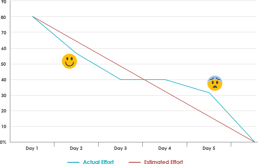
Sprint burndown chart is the most effective tracking metric to visualize the health of the project. It helps in reviewing how much work is pending and if the team needs to speed up or slow down. You can also predict the expected completion date of the sprint. A deviation from the expected burndown will send a red flag to the scrum master to take appropriate actions.

For instance, if burndown goes up at any point during the sprint, it reflects an addition to the existing scope. At this time, it’s important for a team to achieve ‘team’s goal’ first before fetching new items from the backlog.

Why? The Burndown chart indicates the progress of work within a sprint. It shows whether amount of work a team is accomplishing every day will lead to a successful sprint completion or not.

3. Release Burnup

How to Create a Release Burn-Up Chart — Rob Frohman

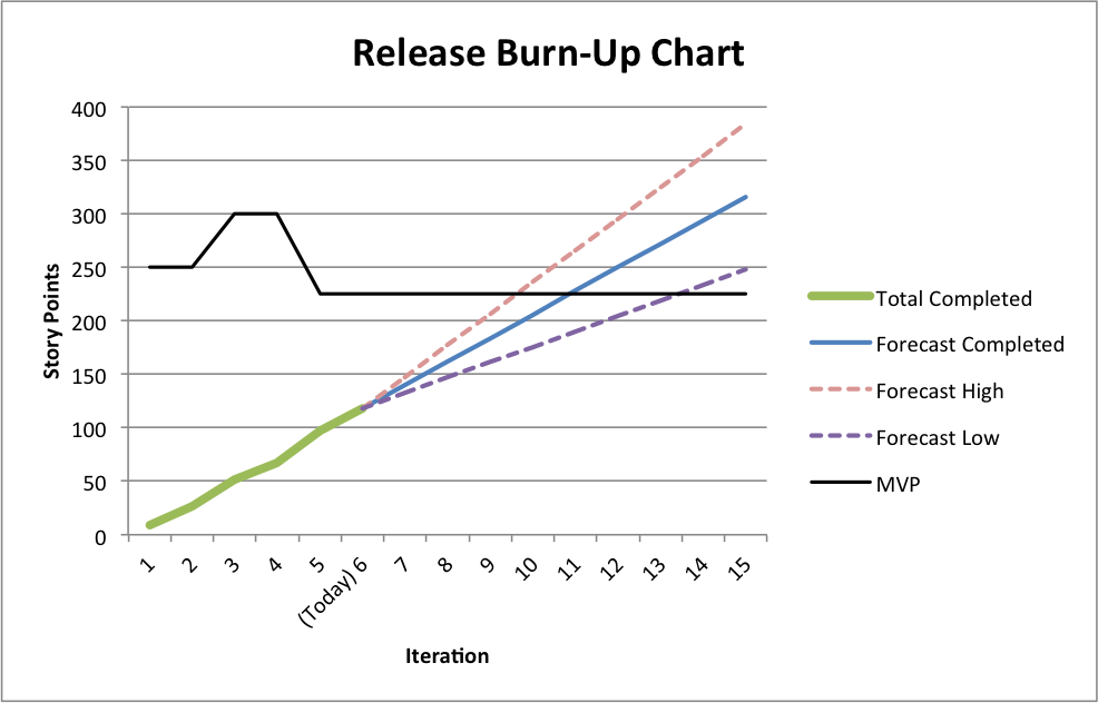
Product owners need to evaluate what should be out in the market first based on their discussions with other stakeholders. Release Burnup helps POs to continuously prioritize product backlog based on how the work is progressing.

If the release date is fixed and there has been a few additions to the initial scope, this is an important metric to align scope with the actual release date by either removing low priority backlog items or attempting to increase velocity by taking suitable measures.

Why? The Release Burnup chart indicates whether the sprints are progressing towards a successful project completion in terms of functionality achieved. Also, gives us a projected date of completion of the project.

4. Estimated Cost vs Actual Cost at Completion

Often there are gaps between the estimated cost projection during the start of the project and the actual cost at completion of the project. This metric gives a measurement of what deviations could have led to this difference in the cost.

Although, almost always the project cost goes higher than the expectation (just like we tend to overspend while shopping), this metric helps you understand what could be the possible cause of cost overrun- be it some design error or some changes in the scope of product development.

Why? Helps us understand what cost we had estimated and what cost was incurred. This helps us in improving our planning.

5. Number of major bugs per sprint

The number is an indicator of the overall quality of the product. When you are working in an agile project, it becomes important to put a budget i.e. count on the number of major defects open in a project at any point of time.

How can we stay within the budget? Reduce the count of defects reported.

How can we reduce the number of defects? Do Not Report!

Yes, I’m kidding.

Here is a better solution- focus at the time of planning, look-ahead and clearly define acceptance criteria before jumping on a sprint backlog item.

The priority of resolving any major bug is over and above implementing any new feature. Because if you can’t resolve what your did wrong, you can not pick a new feature.

At the same time, keep a close watch at the number of bugs reported after production release. If you have not been proactive in refactoring and improving quality of your code, chances are you will receive nasty numbers in this metric. This will help you to identify gaps in testing and take corrective measures

error: Content is protected !!